Chart of the Day: Don't Wait to Feel Better
Contents
About the Author

In observance of Juneteenth, all of our locations will be closed on Friday, June 19.
Start investing with as little as $10, right from your Crews Bank & Trust online or mobile banking platform. Learn more.
Not FDIC Insured; No Bank Guarantee; May Lose Value
FDIC-Insured - Backed by the full faith and credit of the U.S. Government
BankFind
This bank is insured by the Federal Deposit Insurance Corporation. The FDIC Certificate ID is 8021. Click on the Certificate ID # to confirm this bank's FDIC coverage using the FDIC's BankFind tool.
EDIE
EDIE lets consumers and bankers know, on a per-bank basis, how the insurance rules and limits apply to a depositor's accounts-what's insured and what portion (if any) exceeds coverage limits at that bank. Check your deposit insurance coverage >>

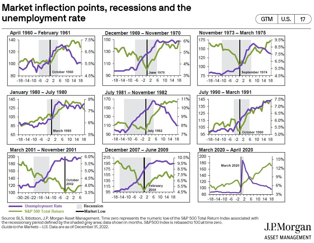
Today’s Chart of the Day comes from J.P. Morgan Asset Management.
These charts show the last nine recessions, going all the way back to 1961, including the stock market return, unemployment level, and the market’s lowest point during that time period.
To put it briefly, these charts show historically you cannot wait until you “feel better” before you invest because the market is forward looking and starts to recover six to 10 months before employment returns and recessions end.
Experienced professionals from our wealth management services team can help you achieve a bright financial future through investment strategies tailored to you. We’ll show you all of the options available and help you choose the ones best suited to you. We’ll provide high-quality, personal service as we work toward your goals together. Our Portfolio Managers do not receive commissions on trades; our recommendations of investments are based solely on your best interests.
Investments are not a deposit or other obligation of, or guaranteed by, the bank, are not FDIC insured, not insured by any federal government agency, and are subject to investment risks, including possible loss of principal.