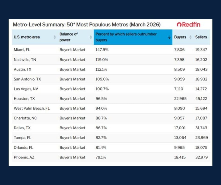
Skip to content

In observance of Juneteenth, all of our locations will be closed on Thursday, June 19.

Attend a free seminar to learn the tools of a proper estate plan so you can choose the right path for you and your loved ones.

Need to upgrade your car or want to buy an RV? Our loans can help meet your needs. Loans subject to credit approval. 

Get Started 863-222-7005

Blog

Your Weekly
Financial Forecast


Stay informed with sound financial know-how

Bar graph showing share of US adults who bought clothing from various apparel brands.

Chart of the Day: Top Brands

Today’s Chart of the Day is from Statista and shows America’s favorite clothing brands.

Read More

Consumer Loans: We Have a Loan Option for Your Lifestyle

Consumer loans play an important role in helping our customers manage financial needs, whether for purchasing or refinancing a car, consolidating..

Read More

Stack chart illustrating the number of US households by the highest priced home they can afford.

Chart of the Day: Housing Un-Affordability

Today’s Chart of the Day is from @kobeissiletter with data from the National Association of Home Builders (NAHB) showing the number of US households..

Read More

bar chart with black and blue bars

Chart of the Day: Value of Advice

Today’s Chart of the Day from JP Morgan shows that as of May 15, 2025, the average retail investor is underperforming the market by 2%.

Read More

Distressed looking middle-aged blonde woman talking on the phone and looking at a laptop screen

Microsoft is NOT Contacting You!

There is a myriad of scams that we need to be wary of these days. A very common scam that is easy to fall for is a tech support scam.

Read More

Peaks and valleys of mortgage rates shown with blue line

Chart of the Day: Mortgage Rates are Back to Normal

Today’s Chart of the Day from re:venture shows the difference between mortgage rates and inflation going back to 1955.

Read More

red bar chart

Chart of the Day: Home in 1985 vs. 2022

Today’s Chart of the Day comes from Realtor.com and shows the difference between the average price of homes vs. incomes. It took 3.5 years of income..

Read More

bar chart with top ten inflow in blue and outflow in orange

Chart of the Day: Inflow/Outflow of the Wealthy

Today’s Chart of the Day from First Trust shows the top inflows and outflows of high-net-worth individuals (HNWI) who have $1,000,000 or more in..

Read More

line chart showing global poverty levels decreasing over time, less than $30 a day in green, less than $10 in blue, less than $5 in purple, extreme poverty in red

Chart of the Day: Long Term Optimism

Today’s Chart of the Day from OurWorldData.org was shared by @petermallouk on X showing the share of the world living in poverty.

Read More

various shades of green bar chart showing GDP percentages in different countries

Chart of the Day: Family Business by Share of GDP

Today’s Chart of the Day and comments are shared by my fellow Portfolio Manager Angie Parsons. The chart from Visual Capitalist shows the percent of..

Read More

investment in the market is shown in blue and cash is shown in red

Chart of the Day: Not Risking is the Highest Risk

Today’s Chart of the Day from @petermallouk on X and shows the value of a dollar invested in the S&P 500 vs. sitting in cash for the last 30 years.

Read More

aerial view of house with hurricane damage - blue tarps and missing shingles on roof and tree blown down onto fence.

Home Equity Line of Credit: An Unexpected Safety Net for Storm Season

Hurricane season in Southwest and Central Florida can be unpredictable and we’ve certainly had our share of storms recently. The sight of snapped off..

Read More

chart dated from 1960 to 2020 with market peaks in green and lows in red

Chart of the Day: Corrections are Loud, Recoveries are Quiet

Today’s Chart of the Day is provided by my colleague and fellow Portfolio Manager Angie Parsons. The chart, prepared by YCharts, shows the “Bull..

Read More

bar chart showing poorest in orange and richest in yellow

Chart of the Day: Worst Except for All Others

Today’s Chart of the Day from Visual Capitalist ranks the poorest 10% and richest 10% daily personal incomes in various countries.

Read More

chart, spanning from 1990-2025, with lines showing the 30-year mortgage rate and 5-year treasury yield and comparing them to interest rates over that time.

A Case for Not Waiting for Interest Rates to Drop

There has been much debate about whether the rising loan interest rates over the last five years (in some cases almost by 200%) are the primary..

Read More

On Our Minds

List Grid
Browse by topic

Chart of the Day: Top Brands

Today’s Chart of the Day is from Statista and shows America’s favorite clothing brands.

More

Consumer Loans: We Have a Loan Option for Your Lifestyle

Consumer loans play an important role in helping our customers manage financial needs, whether for purchasing or refinancing a car, consolidating debt, or covering unexpected expenses. Understanding how these loans work and the different types available can help you make informed borrowing decisions.

More

Chart of the Day: Housing Un-Affordability

Today’s Chart of the Day is from @kobeissiletter with data from the National Association of Home Builders (NAHB) showing the number of US households broken down by the highest priced home they can afford.

More

Chart of the Day: Value of Advice

Today’s Chart of the Day from JP Morgan shows that as of May 15, 2025, the average retail investor is underperforming the market by 2%. 

More

Microsoft is NOT Contacting You!

There is a myriad of scams that we need to be wary of these days. A very common scam that is easy to fall for is a tech support scam.

More

Chart of the Day: Mortgage Rates are Back to Normal

Today’s Chart of the Day from re:venture shows the difference between mortgage rates and inflation going back to 1955.

More

Chart of the Day: Home in 1985 vs. 2022

Today’s Chart of the Day comes from Realtor.com and shows the difference between the average price of homes vs. incomes. It took 3.5 years of income in 1985 versus 6.3 years in 2022.

More

Chart of the Day: Inflow/Outflow of the Wealthy

Today’s Chart of the Day from First Trust shows the top inflows and outflows of high-net-worth individuals (HNWI) who have $1,000,000 or more in investable assets.

More

Chart of the Day: Long Term Optimism

Today’s Chart of the Day from OurWorldData.org was shared by @petermallouk on X showing the share of the world living in poverty.

More

Chart of the Day: Family Business by Share of GDP

Today’s Chart of the Day and comments are shared by my fellow Portfolio Manager Angie Parsons. The chart from Visual Capitalist shows the percent of GDP (gross domestic product) that comes from family-owned businesses.

More

Chart of the Day: Not Risking is the Highest Risk

Today’s Chart of the Day from @petermallouk on X and shows the value of a dollar invested in the S&P 500 vs. sitting in cash for the last 30 years.

More

Home Equity Line of Credit: An Unexpected Safety Net for Storm Season

Hurricane season in Southwest and Central Florida can be unpredictable and we’ve certainly had our share of storms recently. The sight of snapped off trees and blue tarped roofs has become all too familiar with locals. We can't stop Mother Nature from doing her thing, but we can take a proactive approach to protecting what is typically one's most valuable asset - our home.

More

Chart of the Day: Corrections are Loud, Recoveries are Quiet

Today’s Chart of the Day is provided by my colleague and fellow Portfolio Manager Angie Parsons. The chart, prepared by YCharts, shows the “Bull Market” (when the market is up 20%) and “Bear Market” (when the market is down 20%) and highlights the duration of each.

More

Chart of the Day: Worst Except for All Others

Today’s Chart of the Day from Visual Capitalist ranks the poorest 10% and richest 10% daily personal incomes in various countries.

More

A Case for Not Waiting for Interest Rates to Drop

There has been much debate about whether the rising loan interest rates over the last five years (in some cases almost by 200%) are the primary driver of the real estate affordability problem. However, as shown in the chart above from Bloomberg, today’s rates are nearly identical to the 35-year average, shown as the dotted red line, and are lower than they were 30 years ago.

More