Chart of the Day: Really Bad Timing May Not Be as Bad as You Think
Contents
About the Author

Small business? Turn your phone into an on-the-go card reader with Tap2Local.
Take the first step toward securing your legacy. Attend a complimentary estate-planning seminar.
Investment products are not insured by the FDIC, are not deposits, and may lose value.
FDIC-Insured - Backed by the full faith and credit of the U.S. Government
BankFind
This bank is insured by the Federal Deposit Insurance Corporation. The FDIC Certificate ID is 8021. Click on the Certificate ID # to confirm this bank's FDIC coverage using the FDIC's BankFind tool.
EDIE
EDIE lets consumers and bankers know, on a per-bank basis, how the insurance rules and limits apply to a depositor's accounts-what's insured and what portion (if any) exceeds coverage limits at that bank. Check your deposit insurance coverage >>

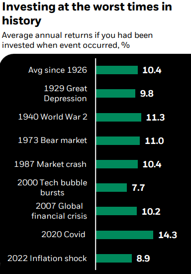
Today’s Chart of the Day is from Mark Peterson with BlackRock. The chart, going back to 1926, shows the returns if you had been invested on the day when each of the eight worst major events occurred, and then experienced the subsequent stock markets.
The average return since 1926 is 10.4%. Keeping that in mind, the worst was the 2000 tech bubble burst which still resulted in a 7.7% return, and the highest was the 2020 COVID pandemic which had a return of 14.3%.
Even if one experienced one (or several) of the eight worst events in history, the ranges of returns are not that different than you would expect during less chaotic times. My advice is to ignore the noise, buy good investments, hold steady and repeat.
Experienced professionals from our wealth management services team can help you achieve a bright financial future through investment strategies tailored to you. We’ll show you all of the options available and help you choose the ones best suited to you. We’ll provide high-quality, personal service as we work toward your goals together. Our Portfolio Managers do not receive commissions on trades; our recommendations of investments are based solely on your best interests.
Investments are not a deposit or other obligation of, or guaranteed by, the bank, are not FDIC insured, not insured by any federal government agency, and are subject to investment risks, including possible loss of principal.