
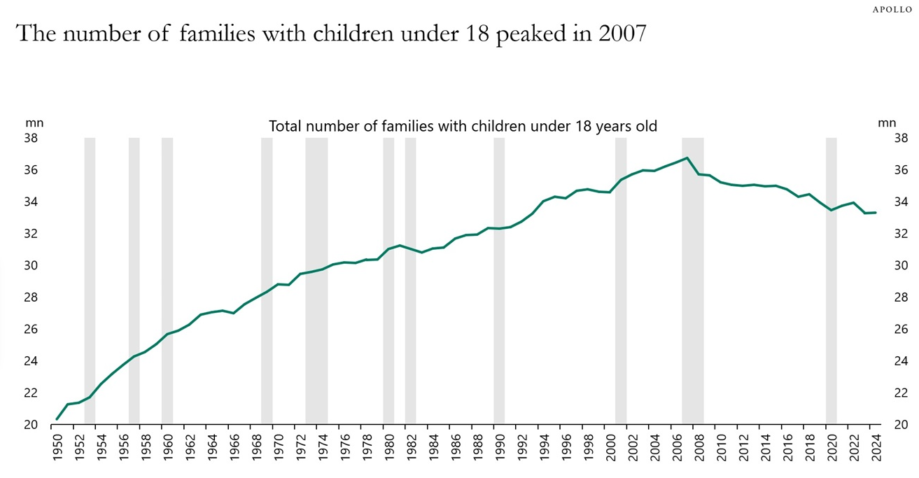
Chart of the Day: Age 18 Peaked in 2007
Today’s Chart from Torsten Sløk with Apollo shows that the number of families with children under the age of 18 peaked in 2007 at 37 million and has..
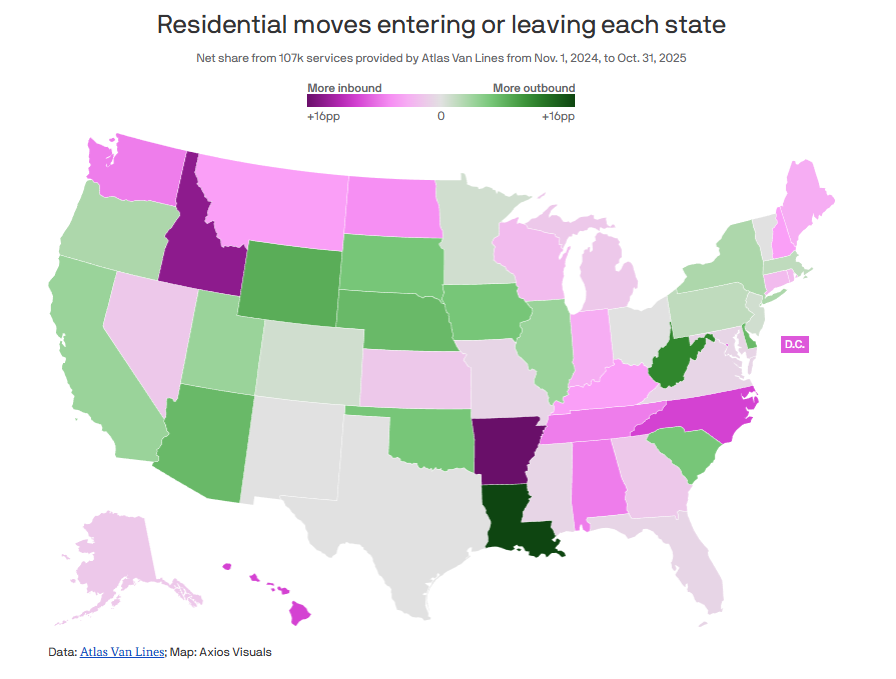
Chart of the Day: Inbound vs. Outbound
Today’s Chart of the Day is from Axios, with data from Atlas Van Lines of their 107,000 residential moves over the last year and shows the percent..

Chart of the Day: Life Changes
Today’s Chart of the Day is from Wealth.com and shows the various reasons why you should revisit (or obtain one if you don’t) your Estate Plan, which..
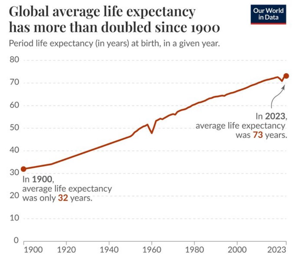
Chart of the Day: Life is Longer
Today’s Chart of the Day is from Our World in Data showing that the global average life expectancy went from 32 years in 1900 to 73 years as of 2023.
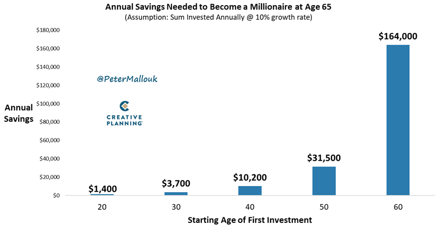
Chart of the Day: How Much to Save
Today’s Chart of the Day from @PeterMallouk is a good one to share with the friends and family who are still working and saving.
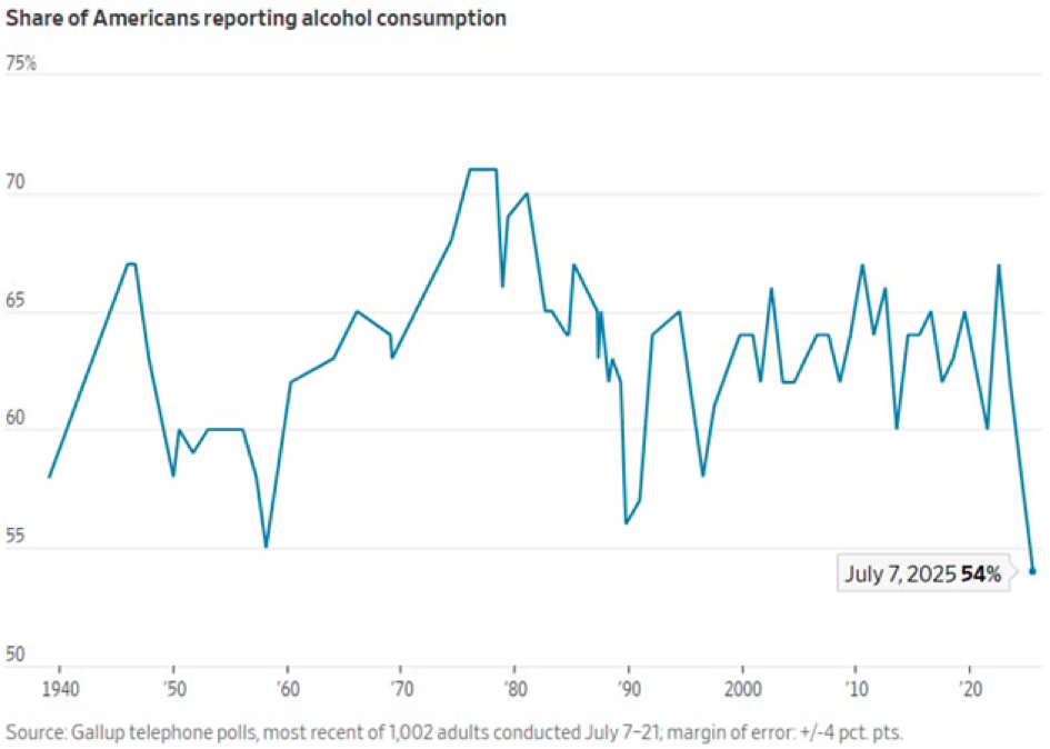
Chart of the Day: Lowest Ever Alcohol Consumption
Today’s Chart of the Day is from Gallop and shows the share of Americans that drink alcohol since 1940.
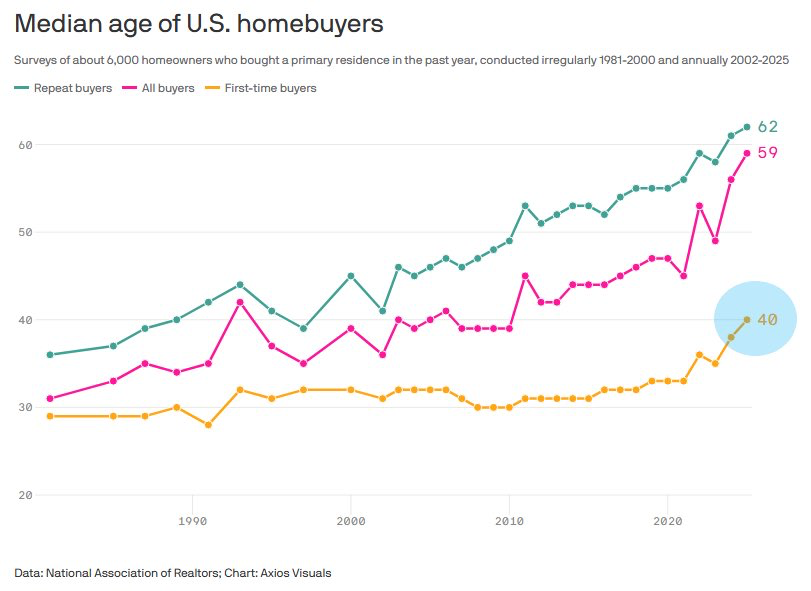
Chart of the Day: First-Time Home Buyers Are Holding Off
Today’s Chart of the Day is from Axios Visuals with data from the National Association of Realtors.
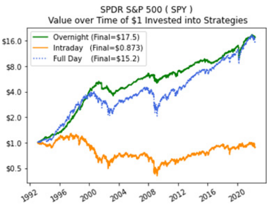
Chart of the Day: Day or Night Trading
The topic of Today’s Chart of the Day is something that often crosses my mind in the morning when I look at how the market is going to open.
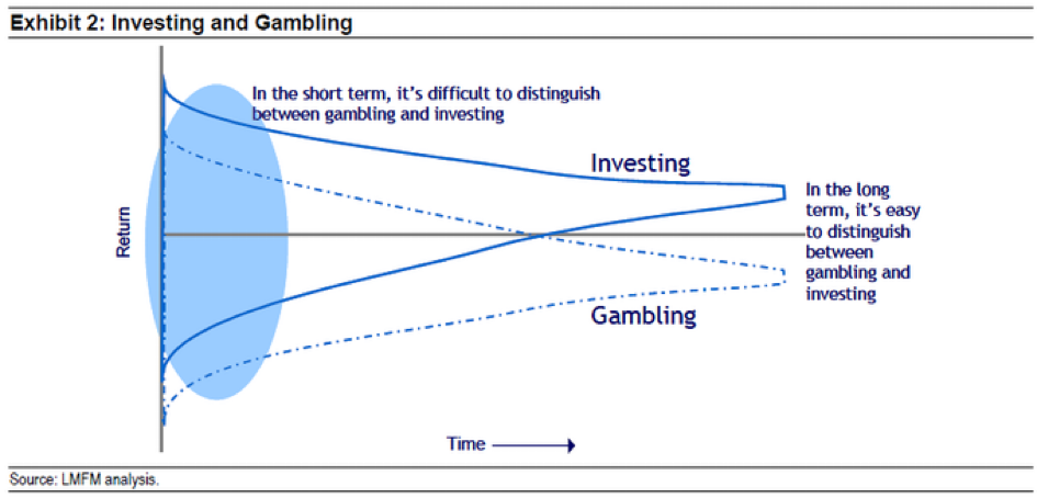
Chart of the Day: Investing vs. Gambling
Today’s Chart of the Day is from Michael Mauboussin and highlights the difference between investing vs. gambling.