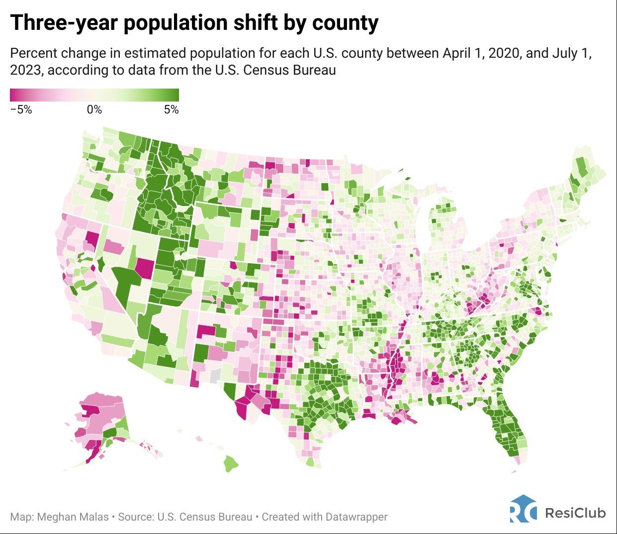
Chart of the Day: Population Shift

Turn your smartphone or smartwatch into a secure payment tool by adding your Crews Bank & Trust debit card to your mobile wallet. It's a safe, simple way to pay with Apple Pay™, Samsung Pay, or Google Pay. Learn more.

Today’s Chart of the Day is from Meghan Malas with data from the US Census Bureau. It shows the change in population, per county, for the last three years, ending in July 2023. The migration to Florida is something to behold.

Experienced professionals from our wealth management services team can help you achieve a bright financial future through investment strategies tailored to you. We’ll show you all of the options available and help you choose the ones best suited to you. We’ll provide high-quality, personal service as we work toward your goals together. Our Portfolio Managers do not receive commissions on trades; our recommendations of investments are based solely on your best interests.
Investments are not a deposit or other obligation of, or guaranteed by, the bank, are not FDIC insured, not insured by any federal government agency, and are subject to investment risks, including possible loss of principal.

