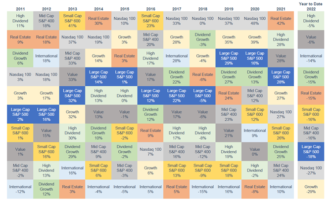
The "Chiclets Chart"
Contents
About the Author

Small business? Turn your phone into an on-the-go card reader with Tap2Local.
Take the first step toward securing your legacy. Attend a complimentary estate-planning seminar.
Investment products are not insured by the FDIC, are not deposits, and may lose value.
FDIC-Insured - Backed by the full faith and credit of the U.S. Government
BankFind
This bank is insured by the Federal Deposit Insurance Corporation. The FDIC Certificate ID is 8021. Click on the Certificate ID # to confirm this bank's FDIC coverage using the FDIC's BankFind tool.
EDIE
EDIE lets consumers and bankers know, on a per-bank basis, how the insurance rules and limits apply to a depositor's accounts-what's insured and what portion (if any) exceeds coverage limits at that bank. Check your deposit insurance coverage >>

One of our clients calls this the “Chiclets Chart” because of its resemblance to that classic brand of candy-coated chewing gum.
Each column in the box represents a specific year, and the color of each box is a “style” of various equity indexes. Returns for each year are ranked from highest to lowest.
Lots going on in this chart, but it’s important to notice how random the returns are: Some equities do well for one year and then the next year do not. Others do well for several years, then the next year do not.
The chart reminds us that holding all of these investments in various allocations reduces both price swings and risk.
As Portfolio Managers, from time to time we use this information to identify opportunities in portfolio construction. For instance, if you wanted to “buy low” you could buy Growth Funds, which are down 29% year to date, and to fund this, you could “sell high” your Value Funds which are only down 6%.
Experienced professionals from our wealth management services team can help you achieve a bright financial future through investment strategies tailored to you. We’ll show you all of the options available and help you choose the ones best suited to you. We’ll provide high-quality, personal service as we work toward your goals together. Our Portfolio Managers do not receive commissions on trades; our recommendations of investments are based solely on your best interests.
Investments are not a deposit or other obligation of, or guaranteed by, the bank, are not FDIC insured, not insured by any federal government agency, and are subject to investment risks, including possible loss of principal.