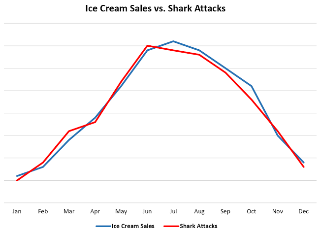
Chart of the Day: Ice Cream vs. Shark Attacks
Contents
About the Author

Buying a home? Check out our great rates. Terms and conditions apply. Loans subject to credit approval. NMLS #406389
FDIC-Insured - Backed by the full faith and credit of the U.S. Government
BankFind
This bank is insured by the Federal Deposit Insurance Corporation. The FDIC Certificate ID is 8021. Click on the Certificate ID # to confirm this bank's FDIC coverage using the FDIC's BankFind tool.
EDIE
EDIE lets consumers and bankers know, on a per-bank basis, how the insurance rules and limits apply to a depositor's accounts-what's insured and what portion (if any) exceeds coverage limits at that bank. Check your deposit insurance coverage >>



Today’s Chart of the Day is a little different than what I usually share. The chart compares ice cream sales and shark attacks over the course of a year, both which peak during the summer.
While it's a tongue-in-cheek example, it proves this point: correlation (when two things move together) does not equal causation (that one thing causes the other).
Always keep this in mind when interpreting charts - just because things happen at the same time doesn't mean one thing is responsible for the other. And remember to think twice before eating ice cream in the ocean during the summer.
Experienced professionals from our wealth management services team can help you achieve a bright financial future through investment strategies tailored to you. We’ll show you all of the options available and help you choose the ones best suited to you. We’ll provide high-quality, personal service as we work toward your goals together. Our Portfolio Managers do not receive commissions on trades; our recommendations of investments are based solely on your best interests.
Investments are not a deposit or other obligation of, or guaranteed by, the bank, are not FDIC insured, not insured by any federal government agency, and are subject to investment risks, including possible loss of principal.