
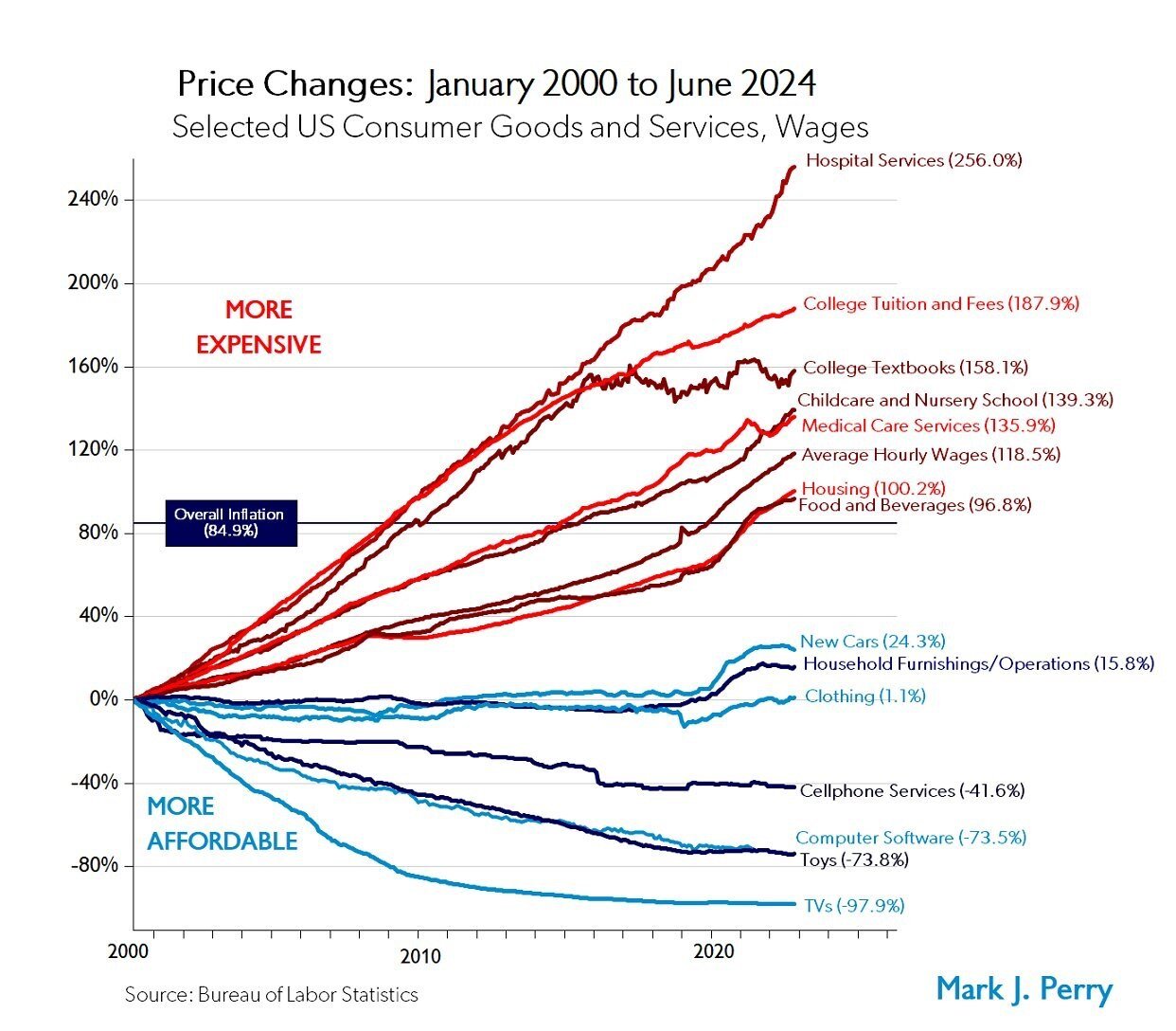
Chart of the Day: Price Changes
Today’s Chart of the Day from Mark Perry shows the price changes for various goods and services over the last 24 years, from January 2000 to June..
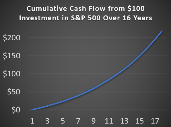
Chart of the Day: 7, 11, 17 Years
Today’s Chart of the Day is based on calculations I did from discussions with a client. It is important to remember, there are only two ways to get..
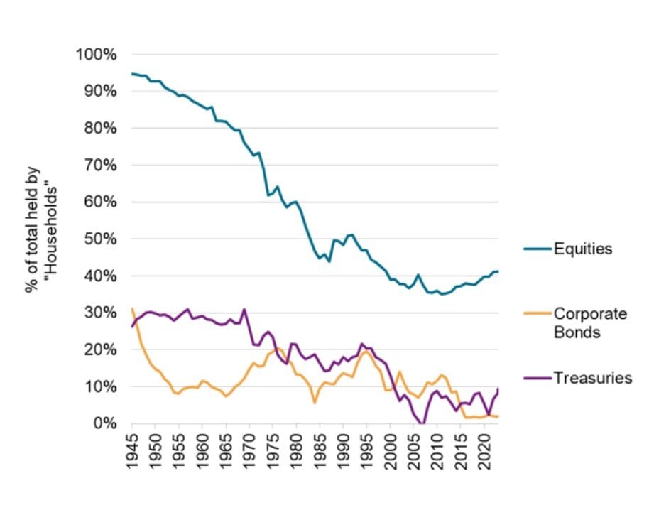
Chart of the Day: More Professional, Less Individual
Today’s Chart of the Day from S&P Global shows the overall market share owned by individuals.
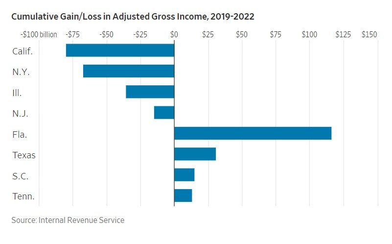
Chart of the Day: California's Downward Spiral vs. Florida's Rise
Today’s Chart of the Day is from a Wall Street Journal article recommended by Doug F., a subscriber of Chart of the Day. It is called “The Blue-State..
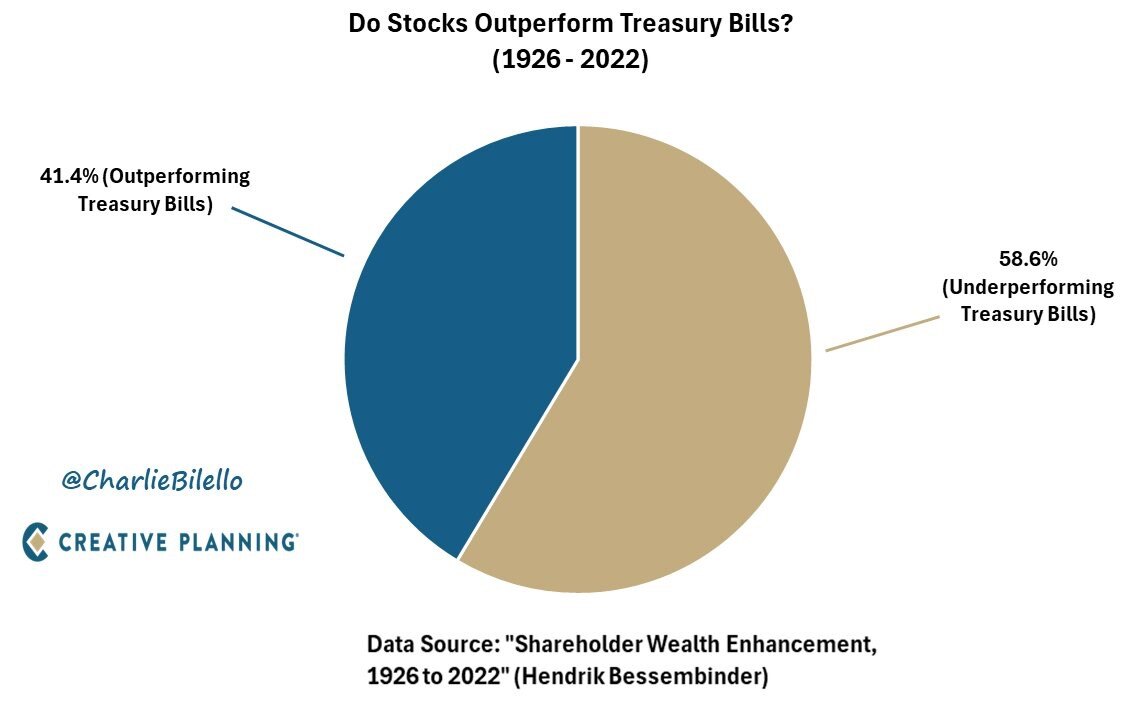
Chart of the Day: Only 42% of Stocks Outperform
Today’s Chart of the Day was prepared by @CharlieBilello on X using data from a groundbreaking paper in 2022 by Hendrick Bessembinder.
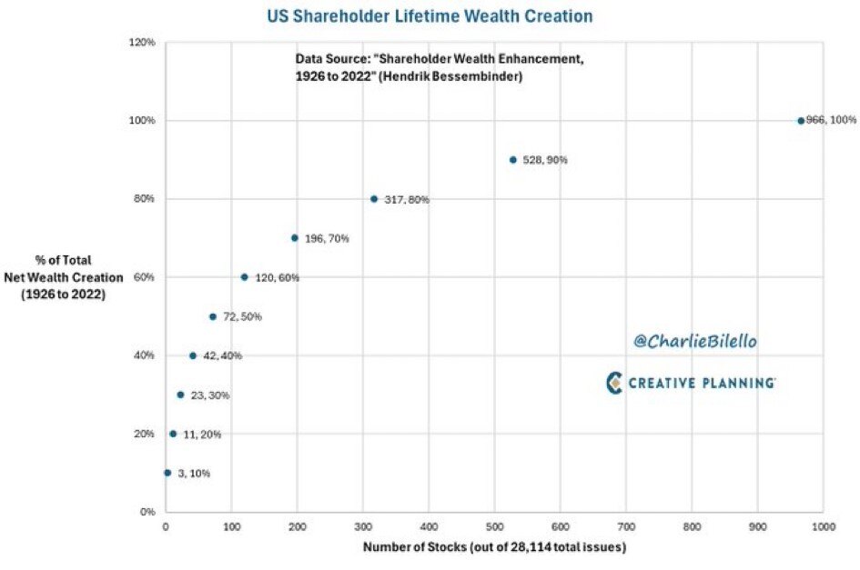
Chart of the Day: 2% Created 90% of Returns
Today’s Chart of the Day is from @CharlieBilello from the Hendrick Bessembinder paper called “Shareholder Wealth Enhancement” published in 2023.
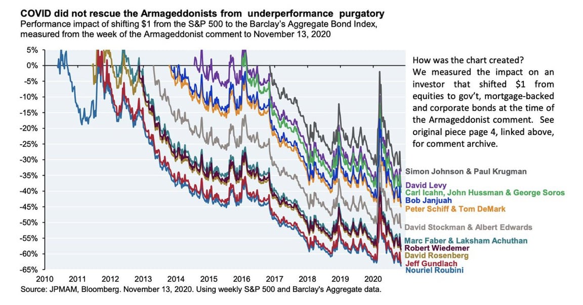
Chart of the Day: Chart of the Doomsday
Today’s Chart of the Day from JP Morgan shared by @StevenKelly49 on X shows the results of popular economists who predicted “Doomsday” scenarios and..
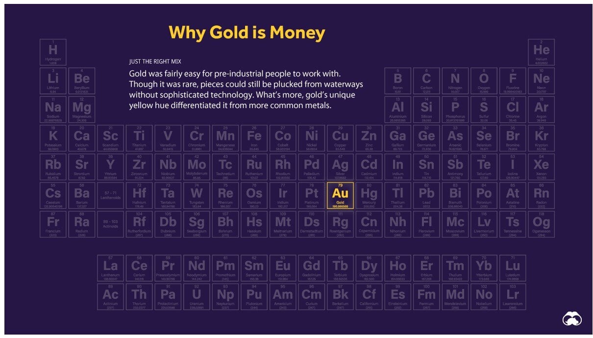
Chart of the Day: Why Gold is Money
Today’s Chart of the Day is a classic from Visual Capitalist outlining why “Gold is Money” and the other 117 elements are not.
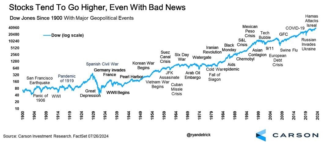
Chart of the Day: 124 Years
Today’s Chart of the Day from Carson Investment Research shows the 35 major “bad news” events in the stock market going back to 1900.