Chart of the Day: $35-Million Million
Contents
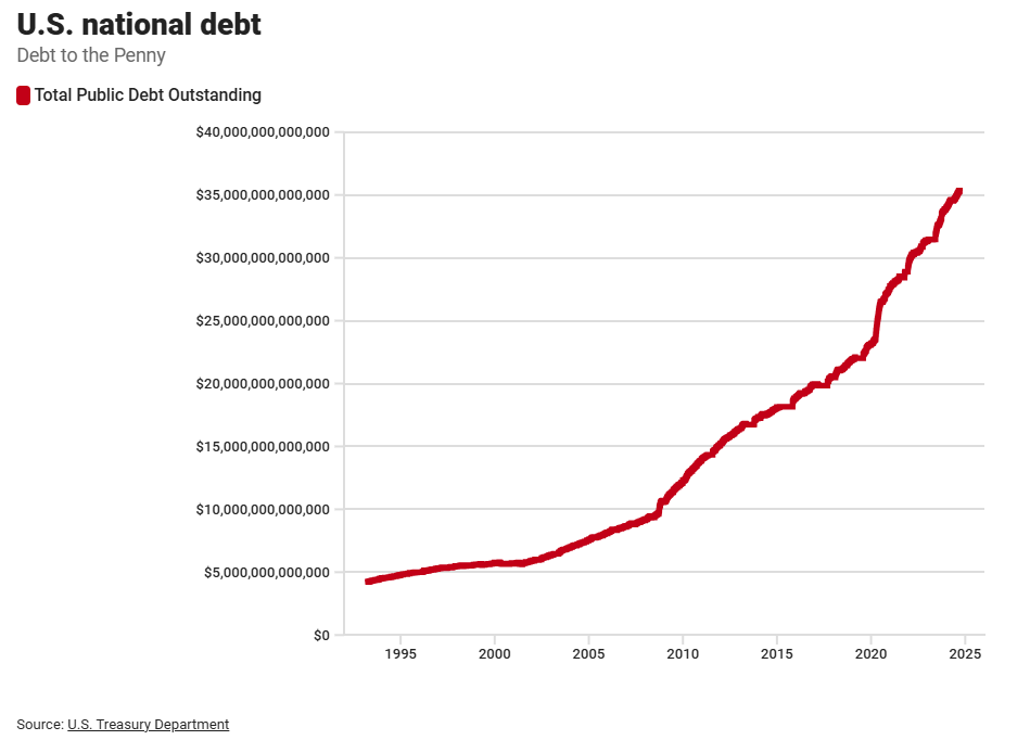
Today’s Chart of the Day is from the US Treasury and shows the growth of the US National Debt from $5 trillion in 1995 to $35 trillion in 2025. A trillion can be a tricky number to wrap your head around, but the visual in this chart illustrates the enormity of the increase.
Sometimes I like to frame a trillion as "$35-million million." It's notable that we are the most indebted country in the world, twice as much as China which ranks second. When broken down, this debt equals roughly $76,000 per person, including every man, woman, and child.

Interestingly, the bonus chart above shows that while our per-person debt is high, it’s still far below that of some smaller nations such as Luxembourg, for example, which has a debt of $5.9 million per citizen.
About the Author