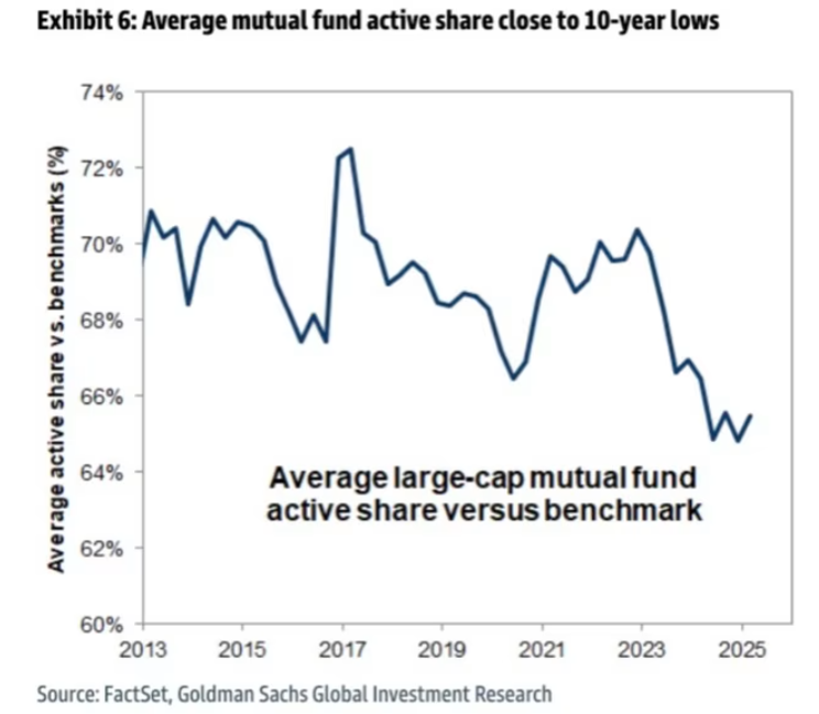
Chart of the Day: Lower Active Shares
Contents
About the Author

Small business? Turn your phone into an on-the-go card reader with Tap2Local.
Take the first step toward securing your legacy. Attend a complimentary estate-planning seminar.
Investment products are not insured by the FDIC, are not deposits, and may lose value.
FDIC-Insured - Backed by the full faith and credit of the U.S. Government
BankFind
This bank is insured by the Federal Deposit Insurance Corporation. The FDIC Certificate ID is 8021. Click on the Certificate ID # to confirm this bank's FDIC coverage using the FDIC's BankFind tool.
EDIE
EDIE lets consumers and bankers know, on a per-bank basis, how the insurance rules and limits apply to a depositor's accounts-what's insured and what portion (if any) exceeds coverage limits at that bank. Check your deposit insurance coverage >>

Today’s Chart of the Day is from Goldman Sachs and was featured in an article in the Financial Times. It illustrates the trend in “Active Share Vs. Benchmarks" since 2013.
The active share measures the percentage of a portfolio that differs from its benchmark index. For example, a 0% active share means the portfolio mirrors the index exactly, while a 65% active share indicates that 65% of the portfolio is actively managed and deviates from the index.
The chart shows that active share levels are currently near historic lows. This suggests that many active fund managers are increasingly aligning their portfolios with their benchmarks—a practice known as “closet indexing.”
We pay close attention to this trend when evaluating a fund’s fees, historical performance, and potential for diversification.
Experienced professionals from our wealth management services team can help you achieve a bright financial future through investment strategies tailored to you. We’ll show you all of the options available and help you choose the ones best suited to you. We’ll provide high-quality, personal service as we work toward your goals together. Our Portfolio Managers do not receive commissions on trades; our recommendations of investments are based solely on your best interests.
Investments are not a deposit or other obligation of, or guaranteed by, the bank, are not FDIC insured, not insured by any federal government agency, and are subject to investment risks, including possible loss of principal.