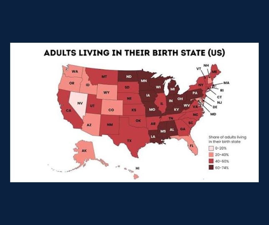
Chart of the Day: Adults Living in Birth State
Contents
About the Author

Buying a home? Check out our great rates. Terms and conditions apply. Loans subject to credit approval. NMLS #406389
FDIC-Insured - Backed by the full faith and credit of the U.S. Government
BankFind
This bank is insured by the Federal Deposit Insurance Corporation. The FDIC Certificate ID is 8021. Click on the Certificate ID # to confirm this bank's FDIC coverage using the FDIC's BankFind tool.
EDIE
EDIE lets consumers and bankers know, on a per-bank basis, how the insurance rules and limits apply to a depositor's accounts-what's insured and what portion (if any) exceeds coverage limits at that bank. Check your deposit insurance coverage >>



Today’s Chart of the Day from mapsobsession on Instagram shows the percentage of adults who still live in the state where they were born, offering an interesting look at regional demographics and migration patterns across the United States.
The highest concentrations of adults remaining in their birth state are found throughout the Midwest and Appalachian regions, while several western states show much lower percentages, reflecting greater population movement and migration over time.
Factors like family ties, career opportunities, climate, and lifestyle preferences influence whether people stay close to home or relocate elsewhere. For many, keeping roots where they’re already planted holds a strong appeal.
John joined Crews Bank & Trust as a Trust Investment Associate in September 2025. He holds a Bachelor of Science in Business Administration with a focus in Finance and Banking from the University of Missouri, along with an Investment Certificate. In his role, he supports portfolio maintenance and analysis while helping clients work toward their financial goals.
Investments are not a deposit or other obligation of, or guaranteed by, the bank, are not FDIC insured, not insured by any federal government agency, and are subject to investment risks, including possible loss of principal. Past performance is not indicative of future results.