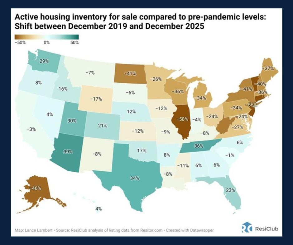
Chart of the Day: Housing Inventory
Contents
About the Author

All of our locations will be closed on Saturday, July 4, in celebration of Independence Day.
Take the first step toward securing your legacy. Attend a complimentary estate-planning seminar.
Investment products are not insured by the FDIC, are not deposits, and may lose value.
FDIC-Insured - Backed by the full faith and credit of the U.S. Government
BankFind
This bank is insured by the Federal Deposit Insurance Corporation. The FDIC Certificate ID is 8021. Click on the Certificate ID # to confirm this bank's FDIC coverage using the FDIC's BankFind tool.
EDIE
EDIE lets consumers and bankers know, on a per-bank basis, how the insurance rules and limits apply to a depositor's accounts-what's insured and what portion (if any) exceeds coverage limits at that bank. Check your deposit insurance coverage >>

Today's Chart of the day from ResiClub illustrates how today’s housing inventory compares with pre‑covid levels.
The pandemic sparked widespread adoption of flexible work arrangements, enabling many people to relocate and reshaping regional housing demand.
Over the past five years, this shift contributed to a surge of new construction in sought‑after mountain areas and Southeastern states. This activity has recently cooled, resulting in an oversupply of homes in certain markets.
In the years to come, regional migration patterns and supply trends will be essential for anticipating which markets may face renewed pressure or fresh opportunities.
Gregory is an experienced financial manager specializing in investment holdings for individuals, trusts, IRAs, private foundations, and nonprofit organizations across Florida. A Mercy College graduate with a degree in government, he began his career in technology before transitioning to financial management in 2009.
Investments are not a deposit or other obligation of, or guaranteed by, the bank, are not FDIC insured, not insured by any federal government agency, and are subject to investment risks, including possible loss of principal.