


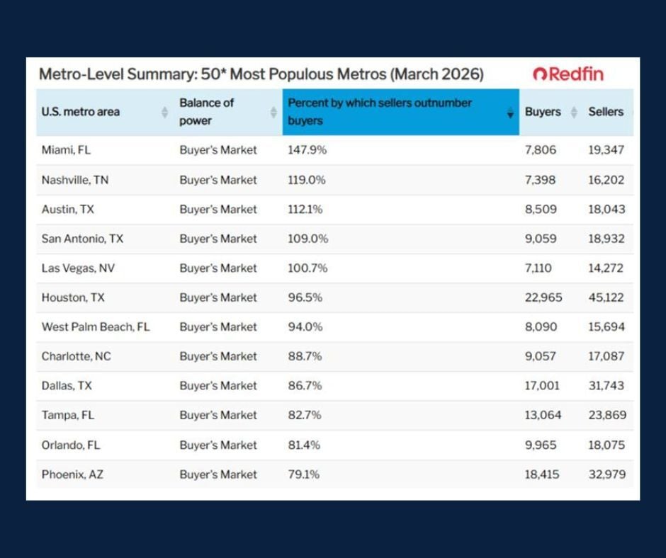
Chart of the Day: America's Strongest Buyer's Markets
Today's Chart of the Day, "Metro-Level Summary: 50* Most Populous Metros (March 2026)", comes from The Week in Charts (6/8/26) - Charlie Bilello's..
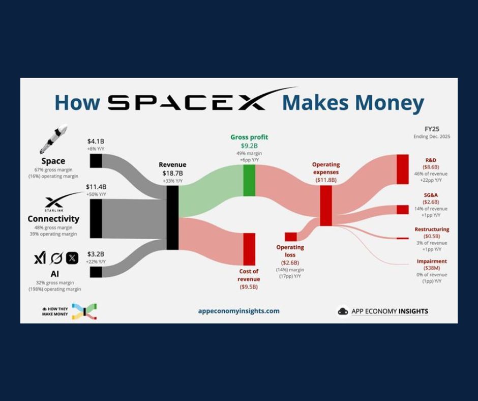
Chart of the Day: How SpaceX Makes Money
Today’s Chart of the Day is "How SpaceX Makes Money" from an article in App Economy Insights and illustrates the key drivers behind the SpaceX..
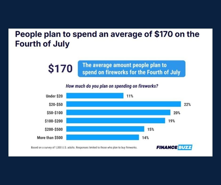
Chart of the Day: Fourth of July Spending
With the 4th of July approaching, and as we prepare to celebrate America’s 250th anniversary, today's Chart of the Day from a FinanceBuzz blog,..
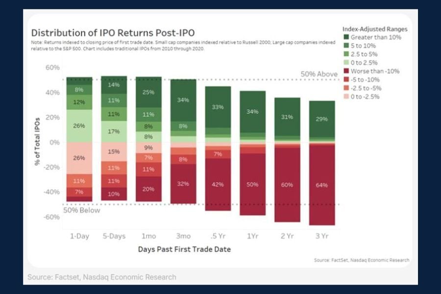
Chart of the Day: IPO Returns - Post IPO
Today’s Chart of the Day, found in arvy weekly's "The IPO Class of 2026" illustrates how stocks have historically performed following an IPO, or..
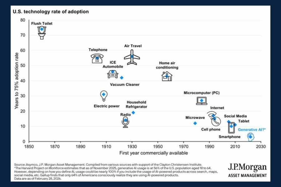
Chart of the Day: US Technology Adoption Rates
Today’s Chart of the Day from J.P. Morgan Asset Management highlights decades of technological innovations that have shaped modern life.
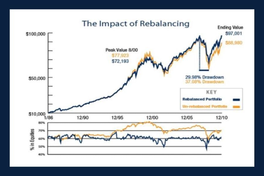
Chart of the Day: The Impact of Rebalancing
Today’s chart from AllGen Financial’s "Maximizing Investments with a Rebalancing Strategy" illustrates a 25‑year simulation of a 60/40 portfolio to..
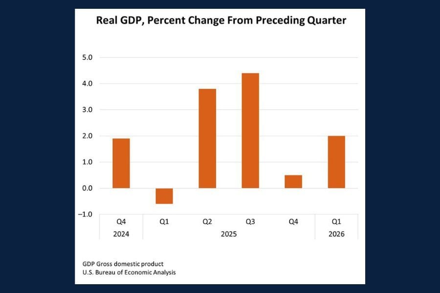
Chart of the Day: GDP Quarterly Change (Q2-2026)
Today’s Chart of the Day comes from the Bureau of Economic Analysis (BEA) and shows the published results for real Gross Domestic Product (GDP) in..
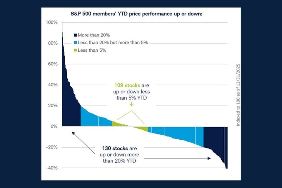
Chart of the Day: S&P 500 Member Performance
Today’s Chart of the Day from Schwab Market Insights illustrates individual stock performance across all 500 constituents of the S&P 500 index during..
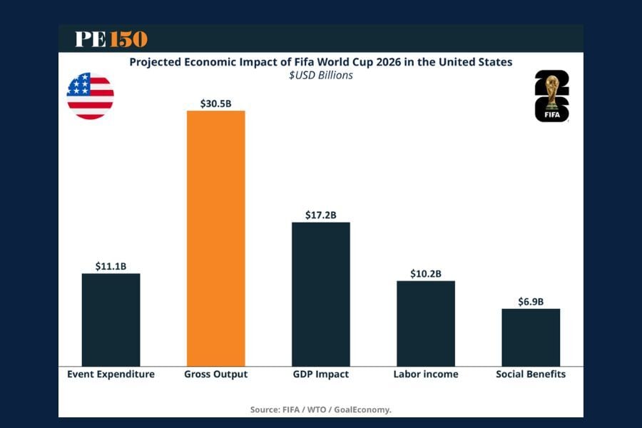
Chart of the Day: The $80 Billion Tournament
Today’s chart from PE150’s article, "The $80 Billion Tournament: How the 2026 FIFA World Cup Becomes a US Economic Engine," highlights the projected..