
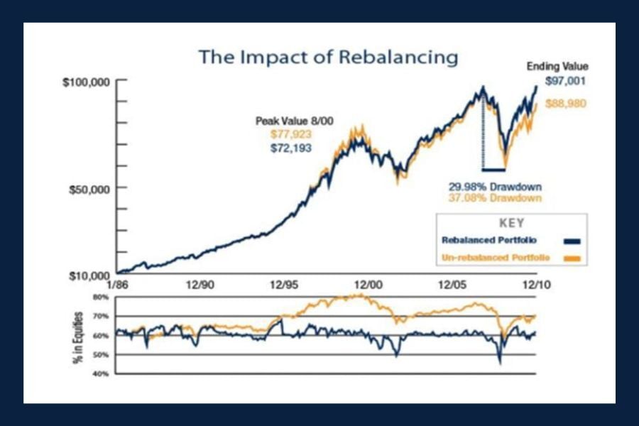
Chart of the Day: The Impact of Rebalancing
Today’s chart from AllGen Financial’s "Maximizing Investments with a Rebalancing Strategy" illustrates a 25‑year simulation of a 60/40 portfolio to..
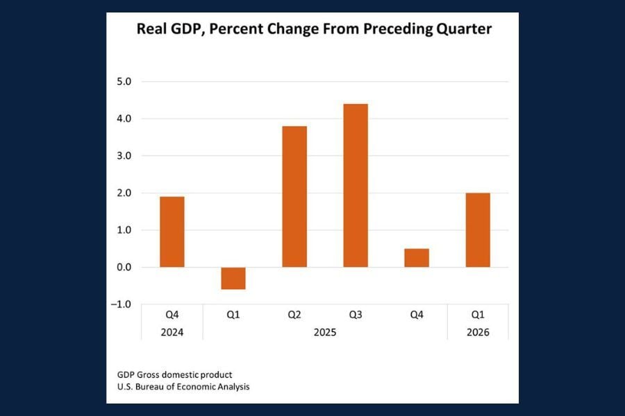
Chart of the Day: GDP Quarterly Change (Q2-2026)
Today’s Chart of the Day comes from the Bureau of Economic Analysis (BEA) and shows the published results for real Gross Domestic Product (GDP) in..
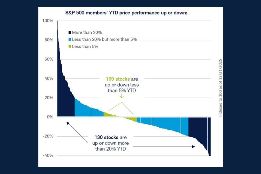
Chart of the Day: S&P 500 Member Performance
Today’s Chart of the Day from Schwab Market Insights illustrates individual stock performance across all 500 constituents of the S&P 500 index during..
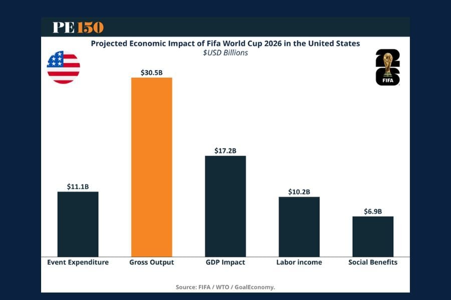
Chart of the Day: The $80 Billion Tournament
Today’s chart from PE150’s article, "The $80 Billion Tournament: How the 2026 FIFA World Cup Becomes a US Economic Engine," highlights the projected..
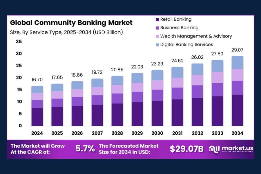
Chart of the Day: Global Community Banking
Today’s Chart of the Day, courtesy of Market.us, highlights the projected growth of the global community banking market through 2034.
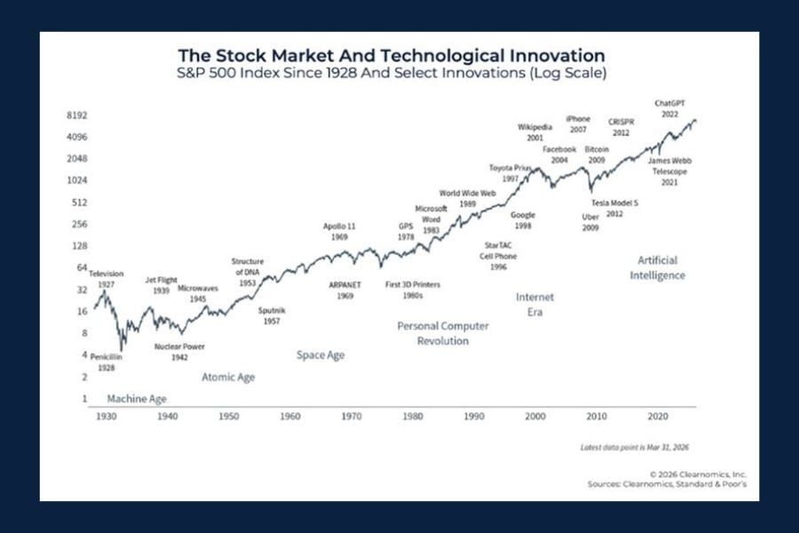
Chart of the Day: The Stock Market and Tech Innovations
Today's Chart of the Day from Kitces.com, "10 Charts To Address Concerns On 2026 Geopolitical Conflict," presents an interesting timeline of market..
Chart of the Day: IPO Class of 2026
Today’s Chart of the Day from arvy's "The IPO Class of 2026" offers a snapshot of two highly anticipated IPO candidates for 2026, comparing their..

Chart of the Day: Tenancy by Entirety
Today’s Chart of the Day from World Population Review highlights which U.S. states recognize Tenancy by the Entirety (TBE) as a form of asset titling.
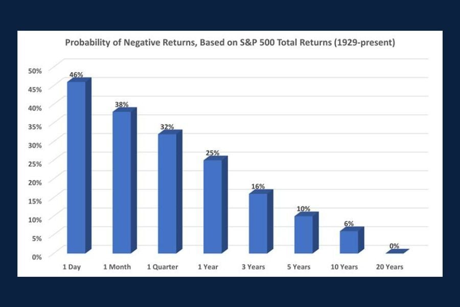
Chart of the Day: The Probability of Negative Returns
Today's Chart of the Day, "The Most Important Investment Chart You'll Ever See," is from The Motley Fool and serves as a good reminder for investors..