


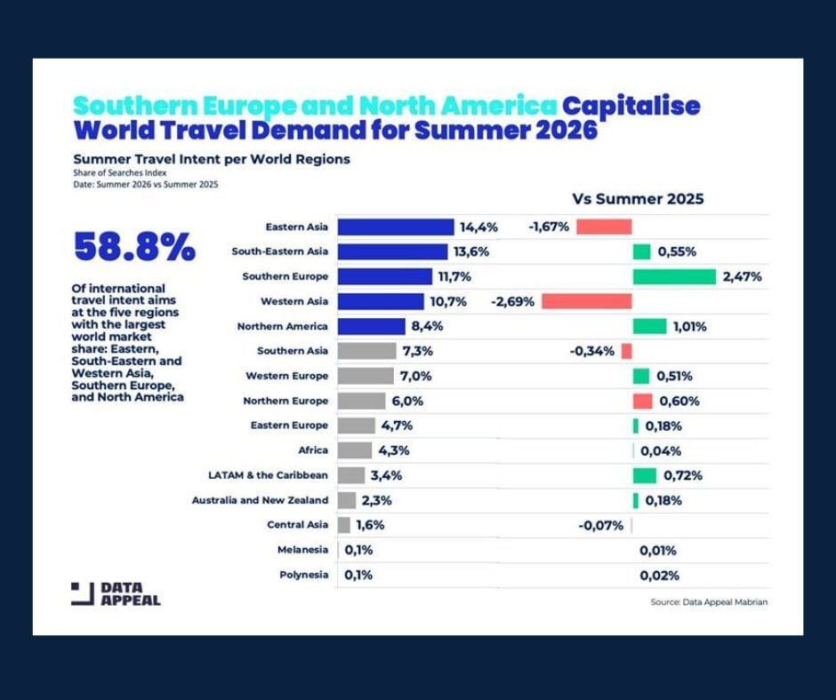
Chart of the Day: Summer Travel Demand
Today’s Chart of the Day from Data Appeal Mabrian and featured in the GTP's (Greek Travel Pages) Headlines article "Athens Leads Southern Europe in..
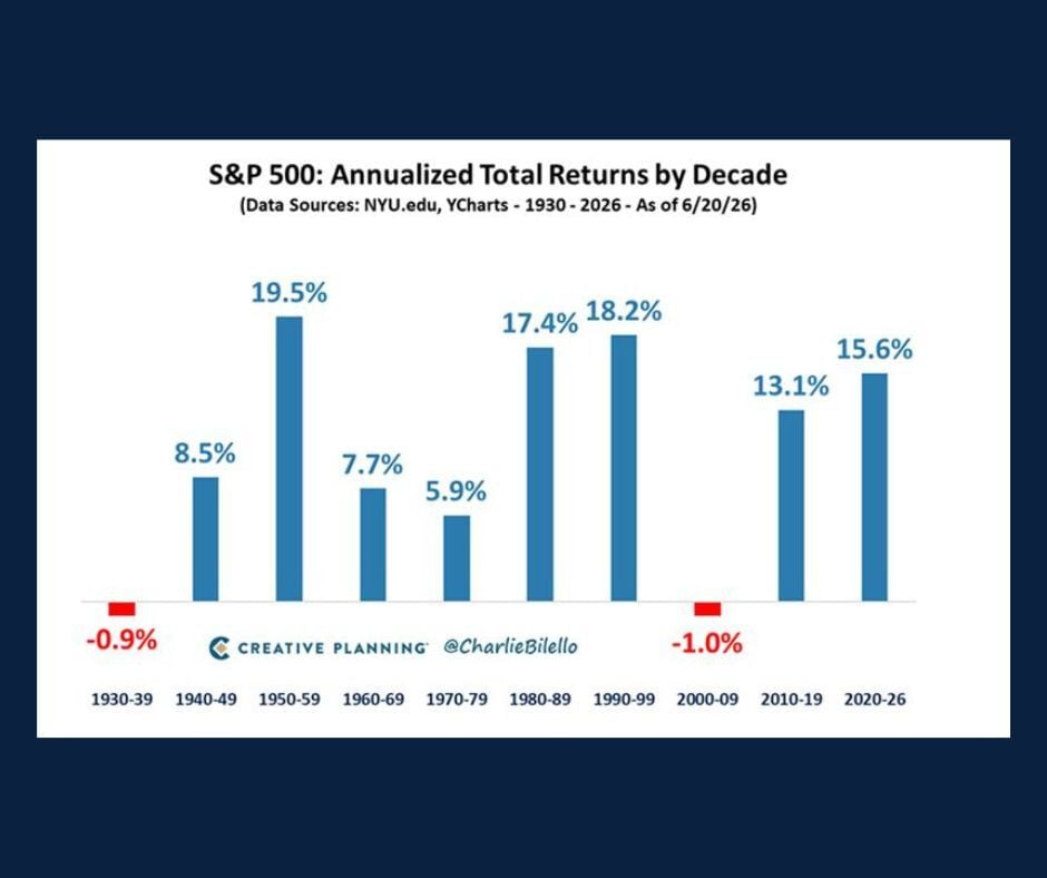
Chart of the Day: S&P By Decade
Today's Chart of the Day from Charlie Bilello’s blog, "The Week in Charts," from June 24, 2026, examines the S&P 500's performance by decade, with..

Chart of the Day: Elon Musk is Bigger
Today’s Chart of the Day comes from indmoneyapp on Instagram and compares Elon Musk’s ~ $1 trillion net worth to the market values of five well known..
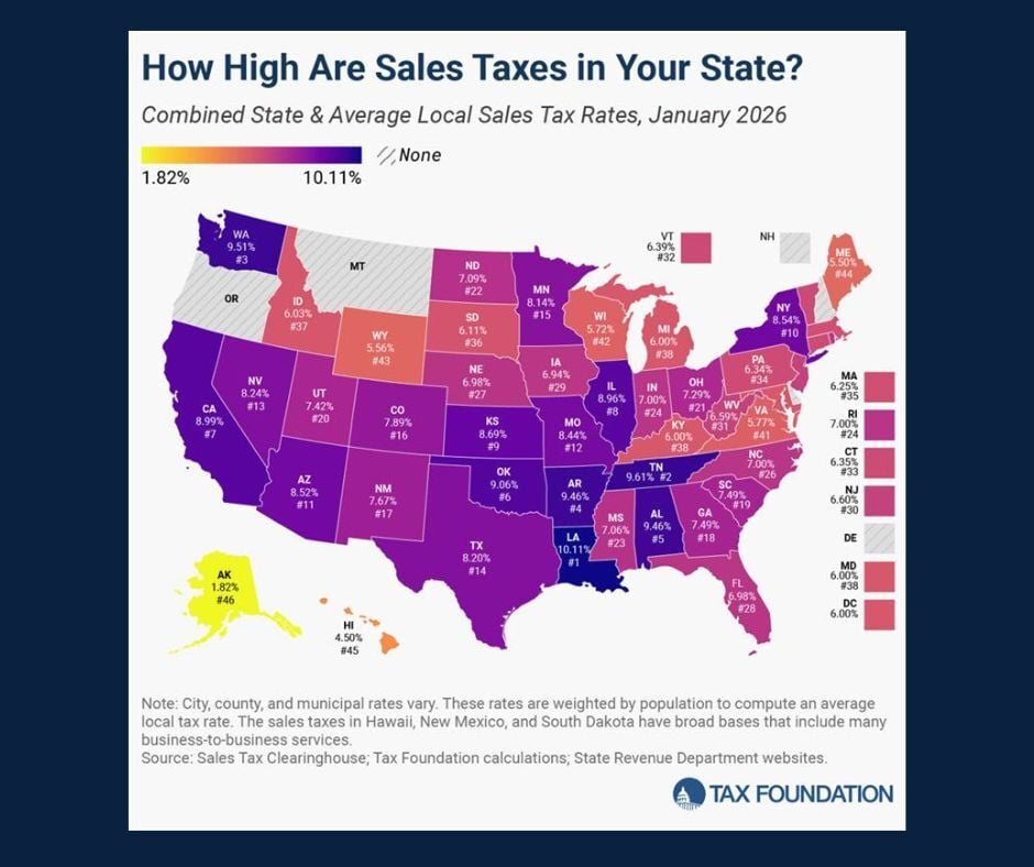
Chart of the Day: How High Sales Tax by State?
Today’s Chart of the Day from the Tax Foundation’s "2026 Sales Tax Rates | Sales Taxes by State" highlights combined state and local sales tax rates..
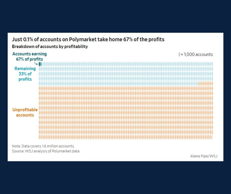
Chart of the Day: Why Almost Everyone Loses
Today's Chart of the Day from The Wall Street Journal article "Why Almost Everyone Loses—Except a Few Sharks—on Prediction Markets" explores what..
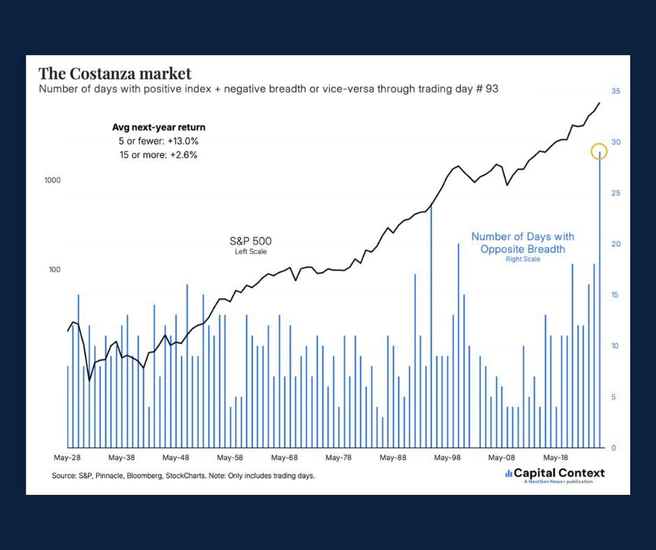
Chart of the Day: The Costanza Market
Today's Chart of the Day is from Jason Goepfert on X: "It has been a Costanza market* to a historic degree. Never before has the S&P 500 index gone..
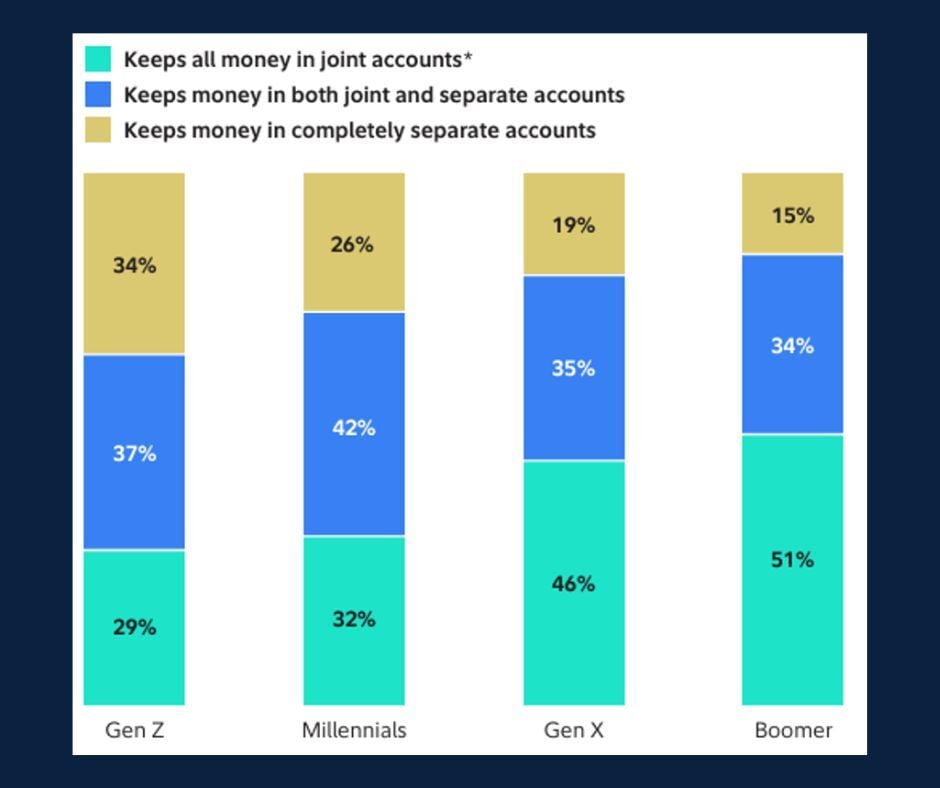
Chart of the Day: Couples and Money
Today's Chart of the Day from Fidelity’s "2026 Couples and Money Study" highlights some key findings on how couples manage their money.
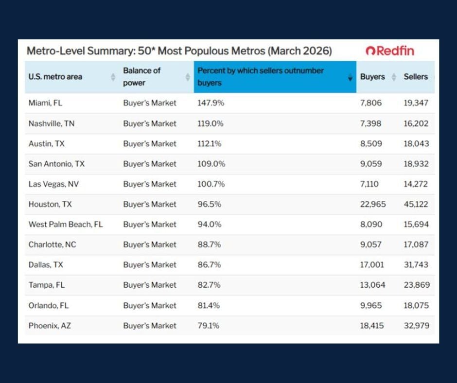
Chart of the Day: America's Strongest Buyer's Markets
Today's Chart of the Day, "Metro-Level Summary: 50* Most Populous Metros (March 2026)", comes from The Week in Charts (6/8/26) - Charlie Bilello's..

Chart of the Day: How SpaceX Makes Money
Today’s Chart of the Day is "How SpaceX Makes Money" from an article in App Economy Insights and illustrates the key drivers behind the SpaceX..