
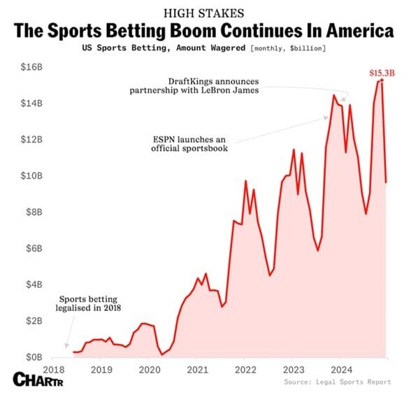
Chart of the Day: Online Sports Betting
As we near the Super Bowl, today’s Chart of the Day is from Chartr and shows the boom in online monthly sports betting.
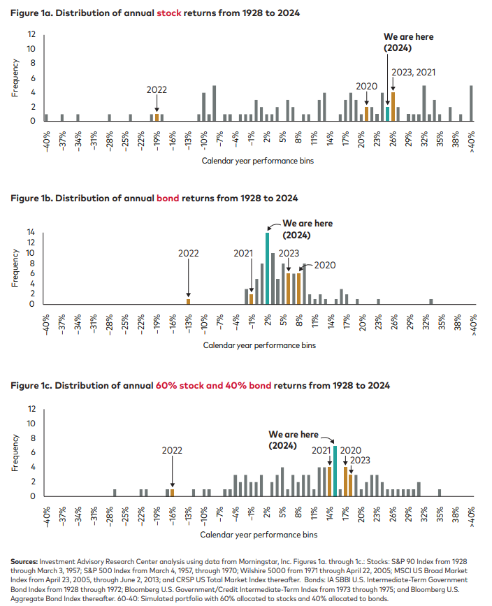
Chart of the Day: Return Distributions
Today’s Chart of the Day from Vanguard shows the distribution of returns from 1928 to 2024, for stocks, bonds, and a combined 60% stock/40% bond..

Chart of the Day: Atomic Habit of 1%
Today’s Chart of the Day is a little different than others, but one to think about. It’s from the book Atomic Habits by James Clear written in 2018.
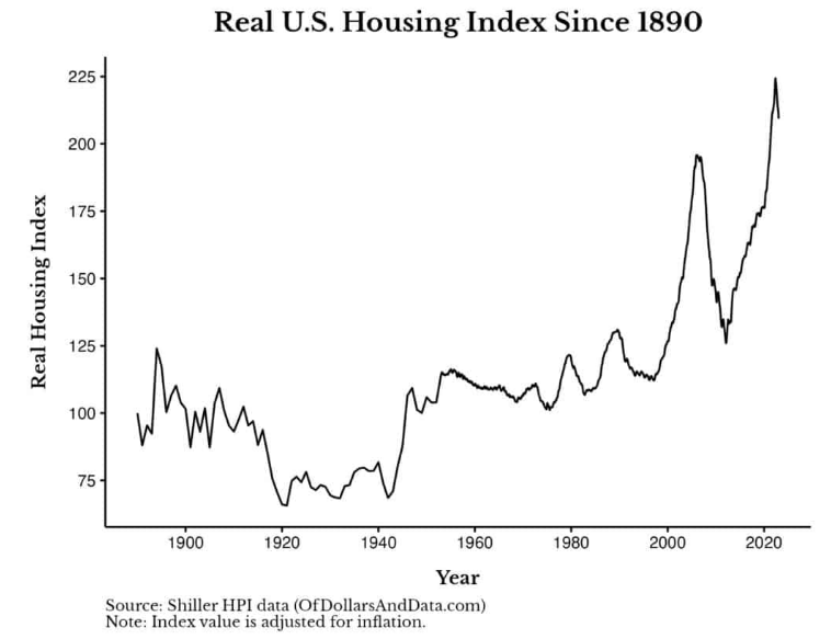
Chart of the Day: Long Term Real Estate Prices
Today’s Chart of the Day, from OfDollarsndData, shows the Shiller inflation-adjusted value for US housing since 1890 and is the longest historical..
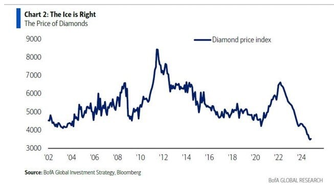
Chart of the Day: Are Diamonds Not Forever?
Today’s Chart of the Day comes from Bank of America and shows the price of diamonds going back 22 years. After spiking in 2022, diamond prices are..
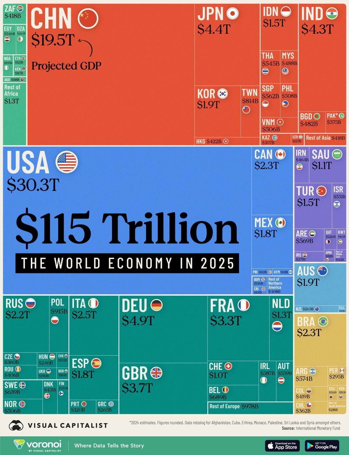
Chart of the Day: Size of the World
Today’s Chart of the Day is from Visual Capitalist, looking at the $115 trillion world economy in 2025, broken down by county.
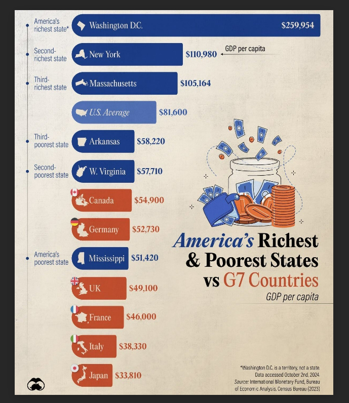
Chart of the Day: US vs. the Rest of the G7
Today’s Chart of the Day comes from Visual Capitalist showing the annual production per person of America’s richest states vs. the rest of the G7..
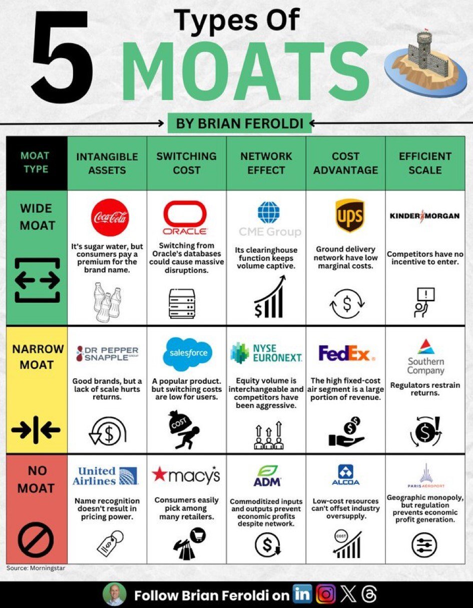
Chart of the Day: Stock Moats
Today’s Chart of the Day is from Brian Feroldi and talks about the Five Types of Moats.
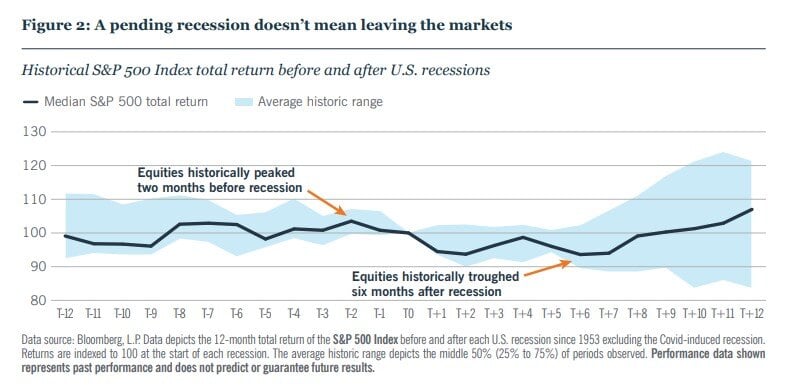
Chart of the Day: Eight Months
Today’s Chart of the Day from Nuveen shows that in all the recessions going back to 1953, on average, stocks hit their bottom six months into a..