

Chart of the Day: How Long Will It Last?
Today’s Chart of the Day is from the National Association of Home Builders showing the life expectancy of parts and systems in your home.
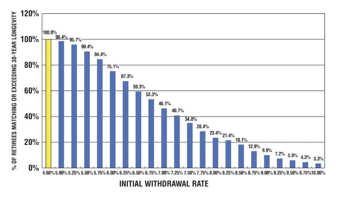
Chart of the Day: 4.0% to 5.5% Rule
Today’s Chart of the Day is from an article called “ Why the 5% Rule is the New 4%” by Nick Maggiulli and includes a chart from Bill Benger’s new..
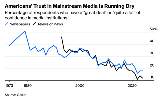
Chart of the Day: Trust in Media
Today’s Chart of the Day is from Gallup and shows Americans' trust, or lack of, in mainstream media over the past 50 years.
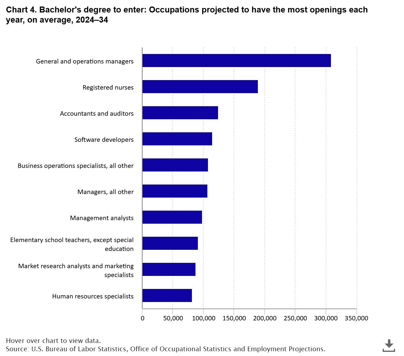
Chart of the Day: Lack of Accountants
Today’s Chart of the Day is from the BLS (Bureau of Labor Statistics) and shows projected job openings from 2024-2034 for those with a bachelor’s..
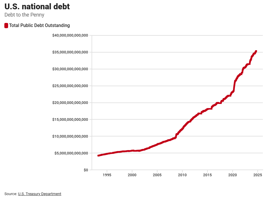
Chart of the Day: $35-Million Million
Today’s Chart of the Day is from the US Treasury and shows the growth of the US National Debt from $5 trillion in 1995 to $35 trillion in 2025.
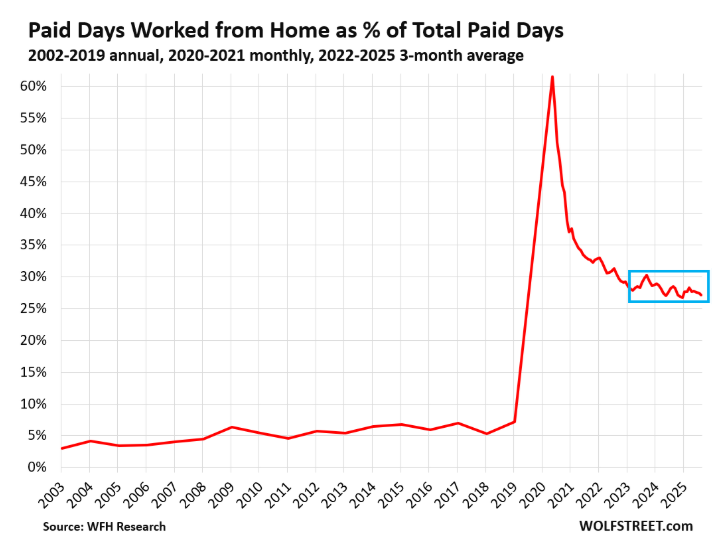
Chart of the Day: 30% Work from Home
Today’s Chart of the Day is from Wolfstreet.com with data provided by WRH Research showing that the RTO (Return to the Office) trend has stalled..
Chart of the Day: 50-Year Trump Account
Today’s Chart of the Day comes from a conversation with a client about the new “Trump Accounts” for minors, which would automatically enroll every..
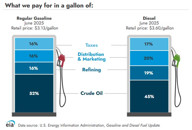
Chart of the Day: Gallon of Gas
Today’s Chart of the Day is from the US Energy Information Administration, which is part of the US Department of Energy.

Chart of the Day: EFTs > Stocks
Today’s Chart of the Day shows that there are now more ETFs (Exchange Traded Funds) than stocks.