
Chart of the Day: Real Estate Down 5%, but Still Up 40%
Today's Chart of the Day is of the S&P CoreLogic Case-Shiller Home Price Index published yesterday, March 28.
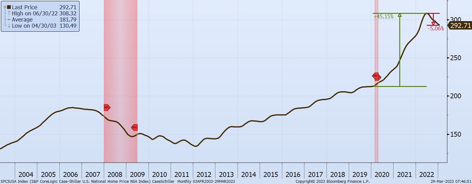
Today's Chart of the Day is of the S&P CoreLogic Case-Shiller Home Price Index published yesterday, March 28.
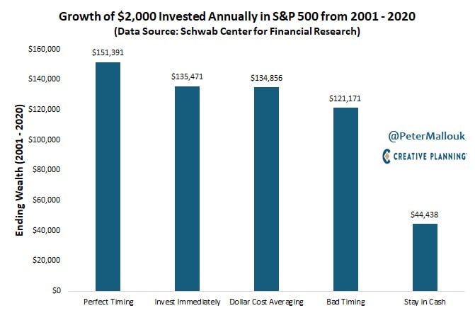
“Time it right,” and “Don’t buy the peak” are attractive goals; however, the chart from @PeterMallouk shows the difference between perfect timing and..
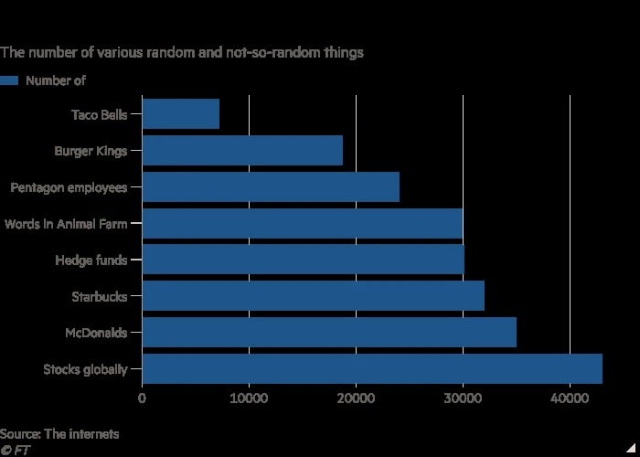
Today’s Chart of the Day comes from the Financial Times and shows a variety of things, the oddest being that there are more hedge funds than Burger..
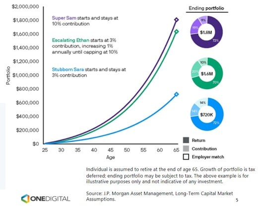
Today’s Chart supports the idea of, “Save early; save often.”
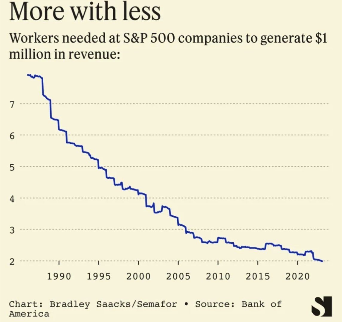
I often joke that when I started banking in 1996 there were three of me that do the level of work I do now. This chart supports it.
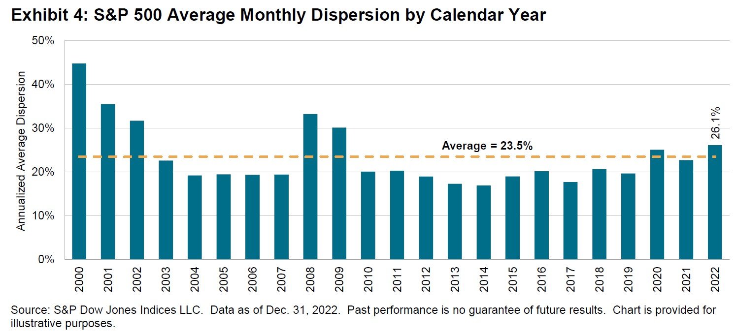
The semi-annual SPIVA (S&P Index Vs. Active) report was recently released.
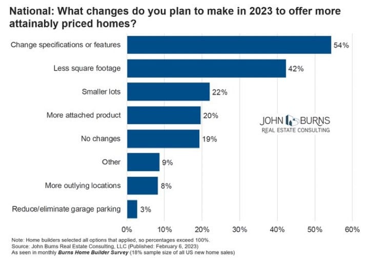
Today’s Chart of the Day is a survey of builders with data provided by John Burns Real Estate Consulting.
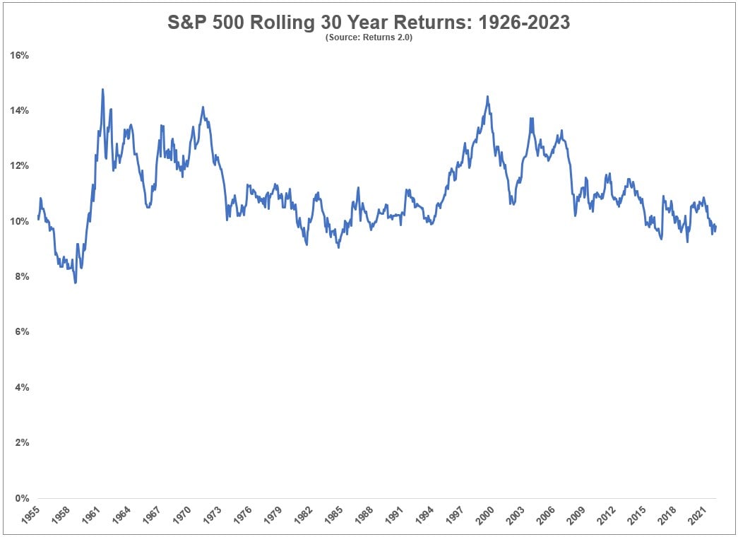
Today’s Chart of the Day comes from an article written by Ben Carlson on A Wealth of Common Sense. The chart shows rolling 30-year returns of the..
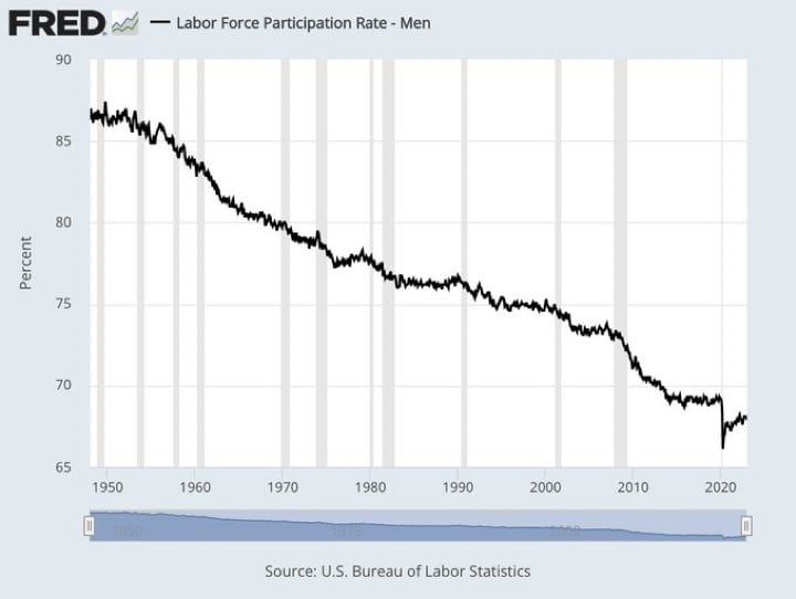
Today’s Chart of the Day comes from FRED (Federal Reserve Economic Data), a fascinating website for charts of economic data.
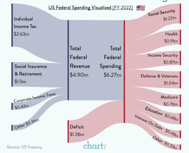
Today’s Chart of the Day comes from chartr with figures provided by the US Treasury to help us understand where our Federal Government taxes and..
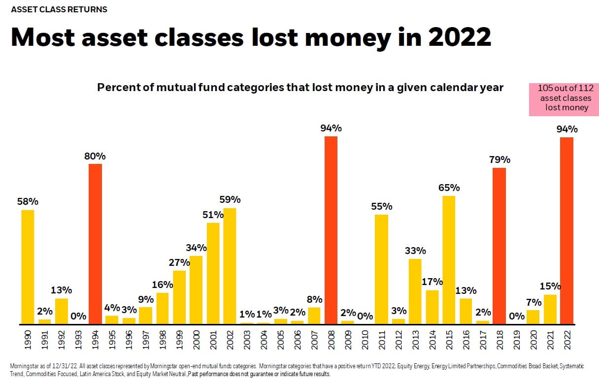
Today’s Chart of the Day comes from BlackRock and shows that 105 of 112 asset classes lost money in 2022.

As our communities continue to recover from recent hurricanes, and with everyone knee deep in tax season, we are updating a blog from December with..
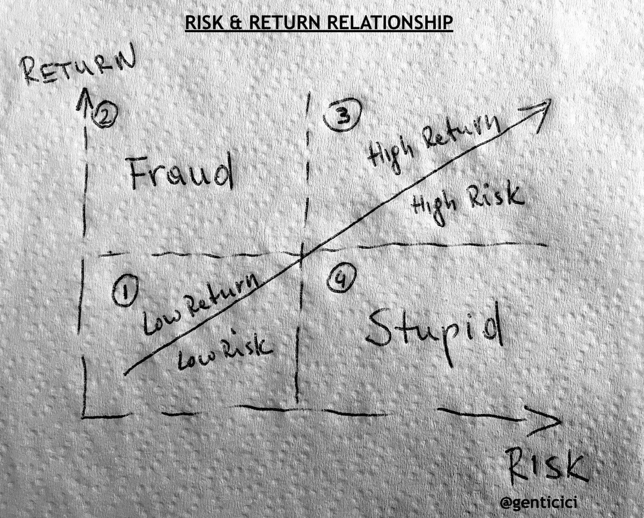
Today’s Chart of the Day comes from @genticici on Twitter. I was impressed by the simplicity of the concept, and it's very apropos to be on the back..
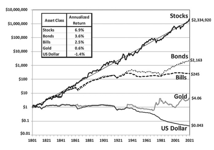
Today’s Chart of the Day is a reoccurring one we like to keep updated with current data.
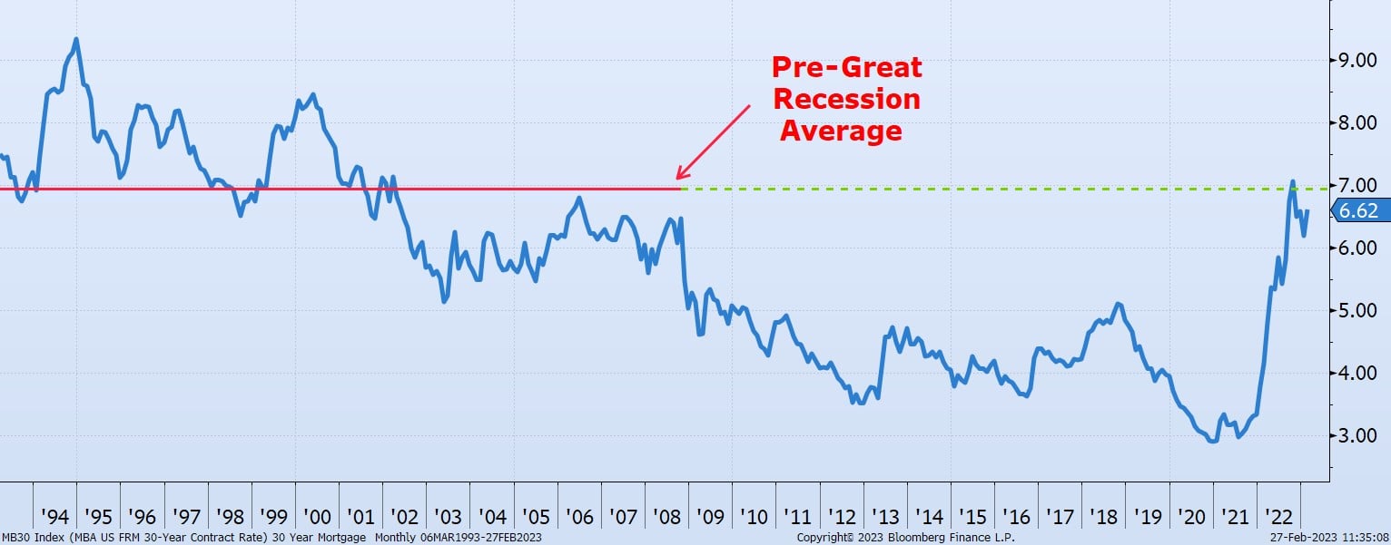
Today's Chart of the Day, compiled from information from the Mortgage Bankers Association, shows the 30-year residential rates dating back to 1993.