


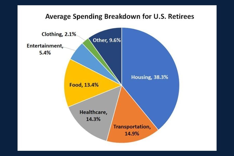
Chart of the Day: Retiree Spending
Today’s Chart of the Day from The Motley Fool breaks down key data on retirement spending.
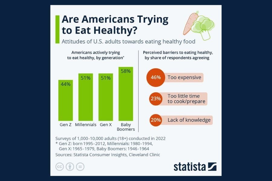
Chart of the Day: Are Americans Eating Healthier?
Today's Chart of the Day from Statista shows us the attitudes of US adults towards eating healthy foods.
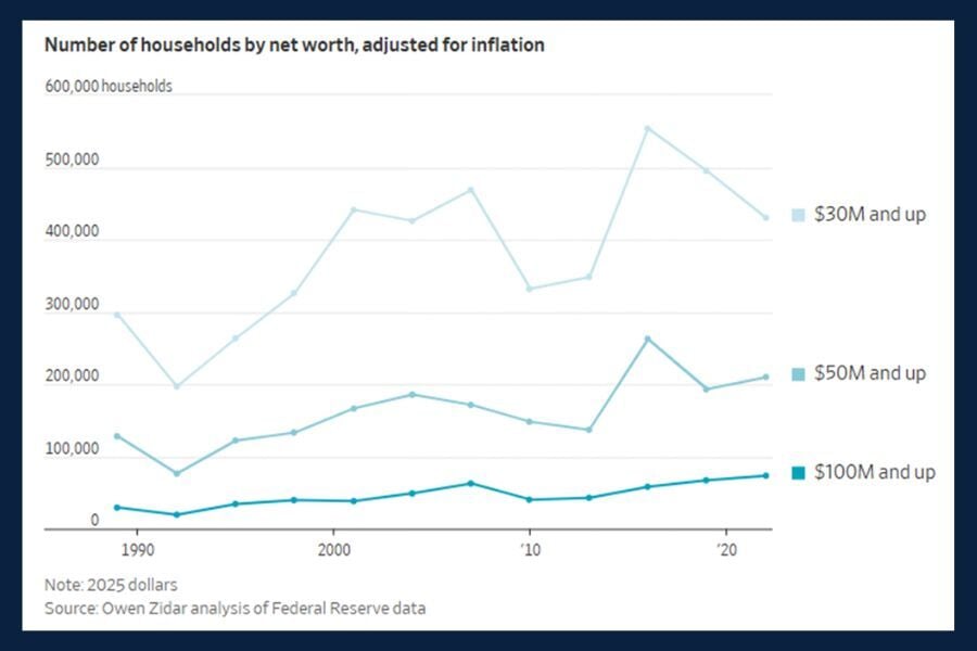
Chart of the Day: U.S. Households' Net Worth
Today’s Chart of the Day from the article "They're Rich but Not Famous - and They're Suddenly Everywhere," in the Wall Street Journal highlights..
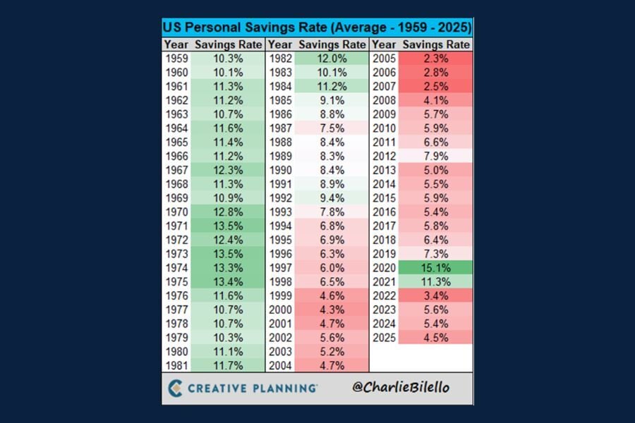
Chart of the Day: U.S. Personal Savings Rates
Today’s Chart of the Day from CharlieBilello gives us data for over 60 years of U.S. personal savings rates.

Chart of the Day: Adults Over 60 Report the Most
Today's Chart of the Day from USAFacts highlights cybercrime trends across different age groups.
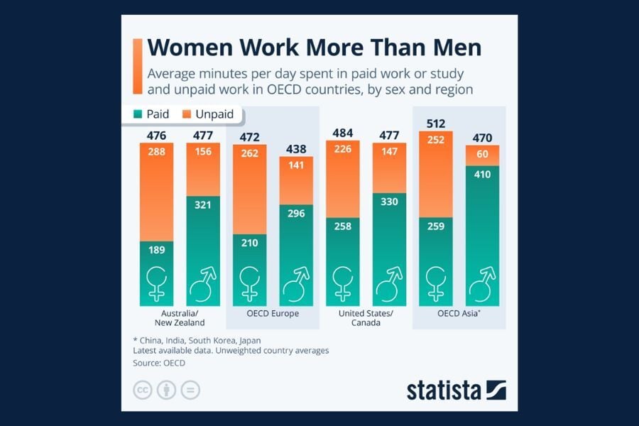
Chart of the Day: Women Work More Than Men
Today’s Chart of the Day from Statista breaks down how men (arrow) and women (cross) around the world spend their time on both paid and unpaid work..
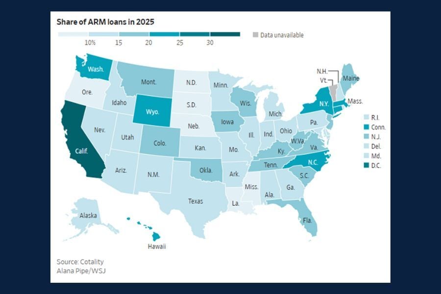
Chart of the Day: ARM Loans
Today's Chart of the Day from the Wall Street Journal article " How Homeowners Are Turning to Adjustable-Rate Mortgages, in Charts" addresses the..
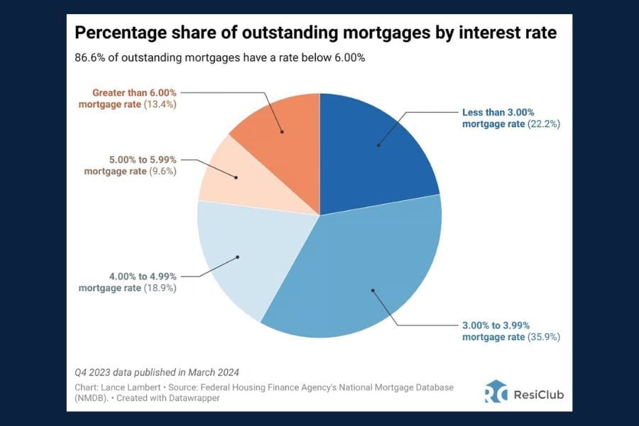
Chart of the Day: Outstanding Mortgages by Interest Rates
Today’s Chart of the Day from ResiClub gives a clear snapshot of the interest rates attached to currrent outstanding mortgages.
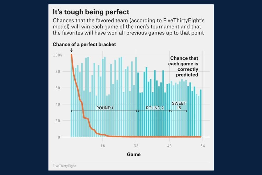
Chart of the Day: It's Tough Being Perfect
Today’s Chart of the Day from FiveThirtyEight highlights some truly eye‑popping statistics surrounding the NCAA March Madness Tournament.