
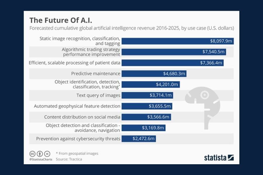
Chart of the Day: The Future of A.I.
Today’s Chart of the Day, "The Future Of A.I." from Statista, breaks down where artificial intelligence revenue is really coming from.
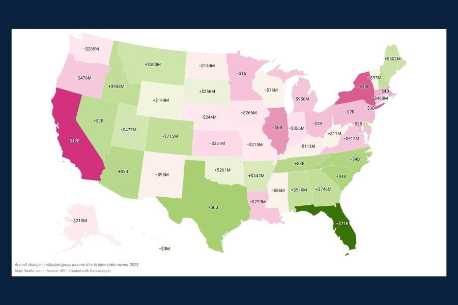
Chart of the Day: Post-Pandemic Wealth Migration
Today’s Chart of the Day, sourced from the article "New Map Shows Extent of Post-Pandemic Wealth Migration", found on Realtor.com, gives a snapshot..
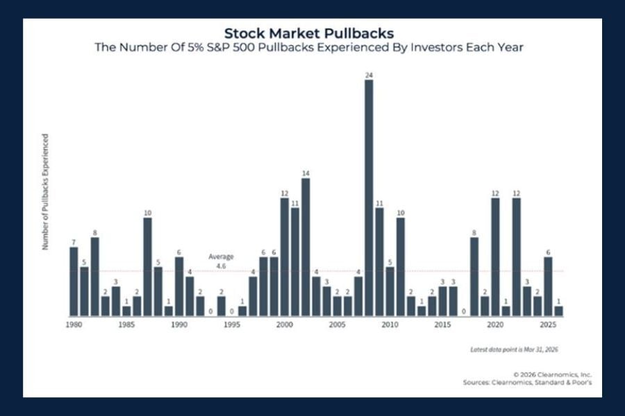
Chart of the Day: Stock Market Pullback
Today’s Chart of the Day, 10 Charts To Address Concerns On 2026 Geopolitical Conflict, comes from Kitces.com and reminds investors that market..
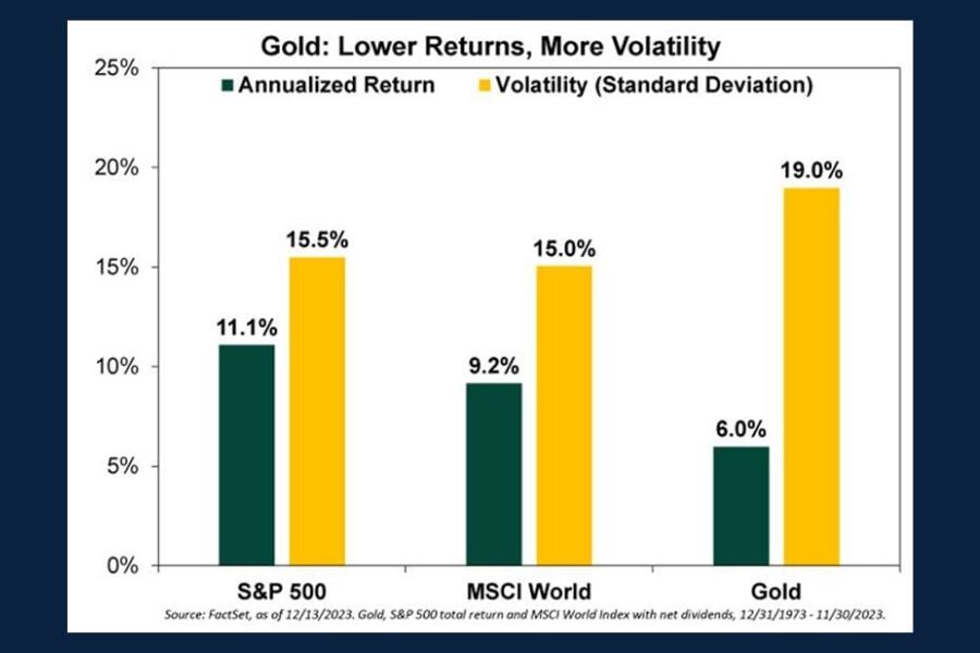
Chart of the Day: Investing in Gold
Today's Chart of the Day from the New York Post article "Bullish or Bearish on Bullion? How to think about gold investing in 2024" shows the..
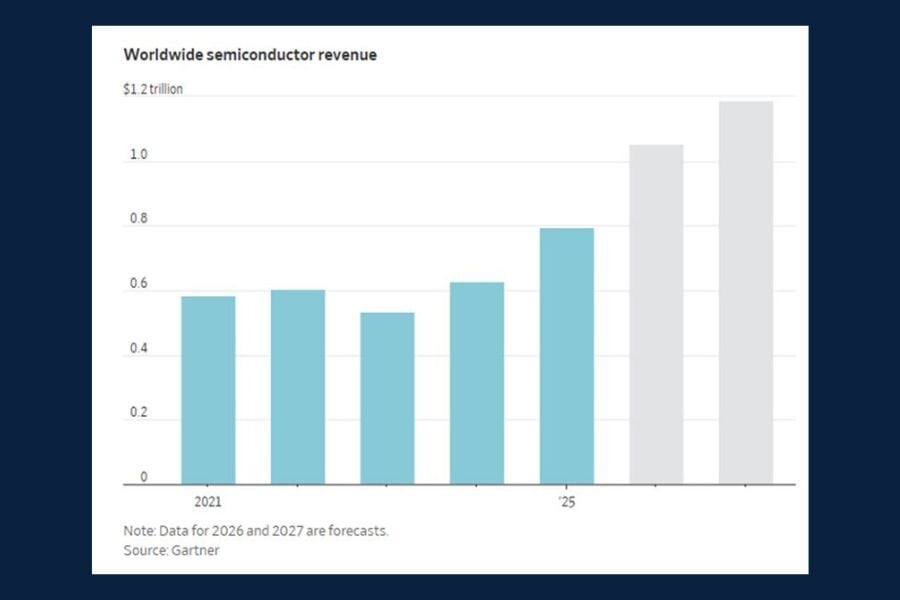
Chart of the Day: Global Semiconductor Demand
Today’s Chart of the Day is from the article "How the AI Boom Has Transformed the Chip Industry into a Market Monster" in the Wall Street Journal and..
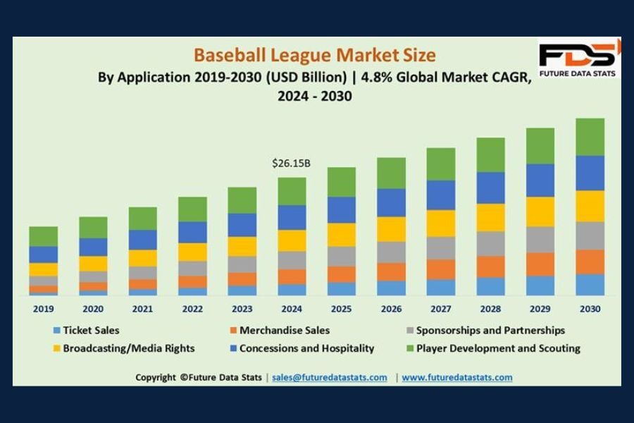
Chart of the Day: M.L.B. Market
With baseball season in full swing, today’s Chart of the Day from Future Data Stats displays "striking" growth across the global market projected..
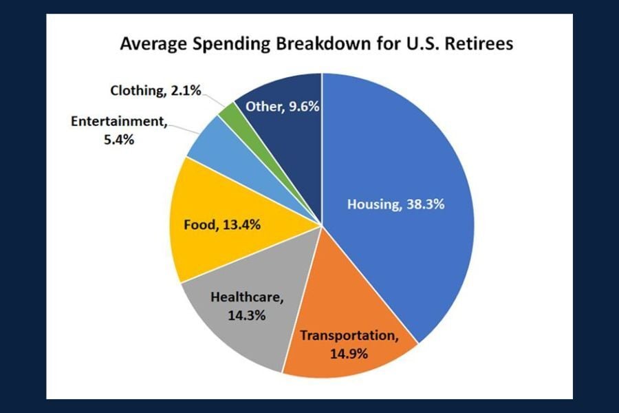
Chart of the Day: Retiree Spending
Today’s Chart of the Day from The Motley Fool breaks down key data on retirement spending.

Chart of the Day: Are Americans Eating Healthier?
Today's Chart of the Day from Statista shows us the attitudes of US adults towards eating healthy foods.
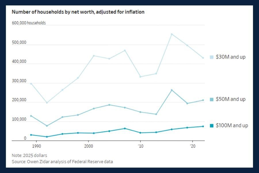
Chart of the Day: U.S. Households' Net Worth
Today’s Chart of the Day from the article "They're Rich but Not Famous - and They're Suddenly Everywhere," in the Wall Street Journal highlights..