
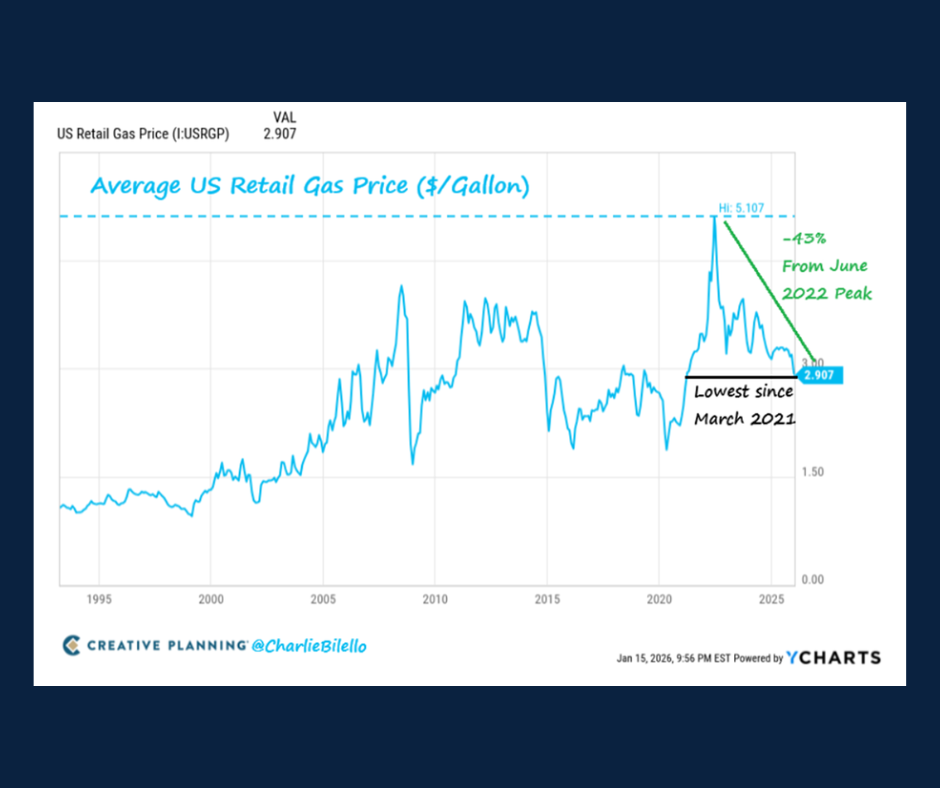
Chart of the Day: Average US Retail Gas Price
Today’s Chart of the Day from @CharlieBilello shows the trend of US retail gas prices. Down 43% from the 2022 peak, prices are falling close to a..
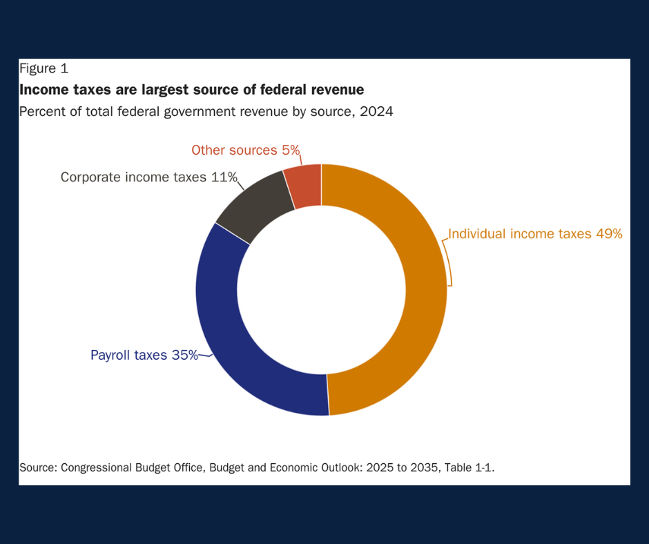
Chart of the Day: Largest Source of Federal Revenue
With tax season officially upon us, today's Chart of the Day from Liberty Taxed gives us an idea of the projected federal tax revenue over the coming..
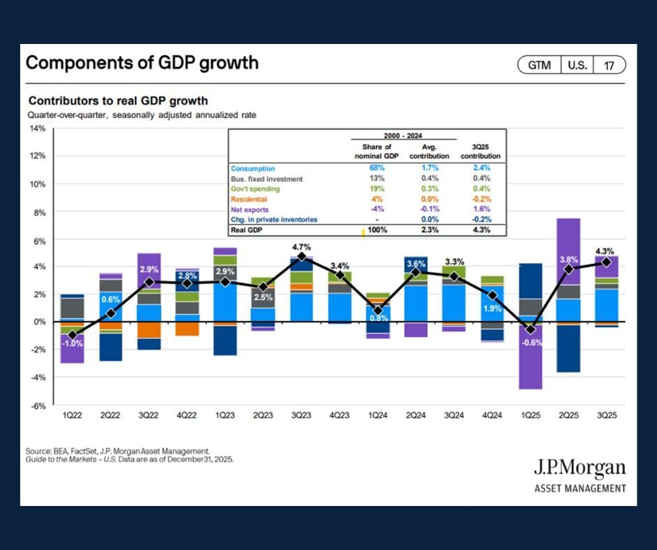
Chart of the Day: Components of GDP Growth
Today’s Chart of the Day comes from JP Morgan Asset Management and highlights the key components of GDP growth.
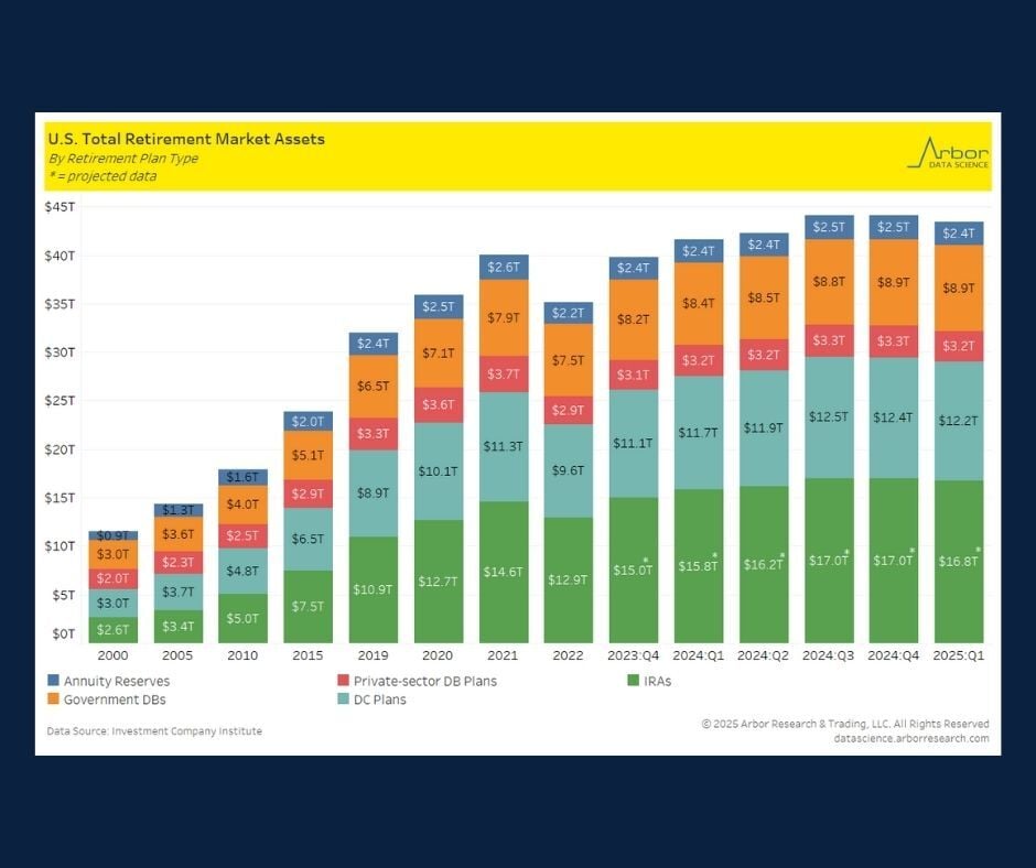
Chart of the Day: Value of Retirement Assets
Today's Chart of the Day, from Arbor Data Science using data from Investment Company Institute, shows the value of the assets that make up the..

Chart of the Day: AI = Improved Productivity + Efficiency
Today's Chart of the Day comes from a Gallup poll and shows the positive impact of AI in the workplace.
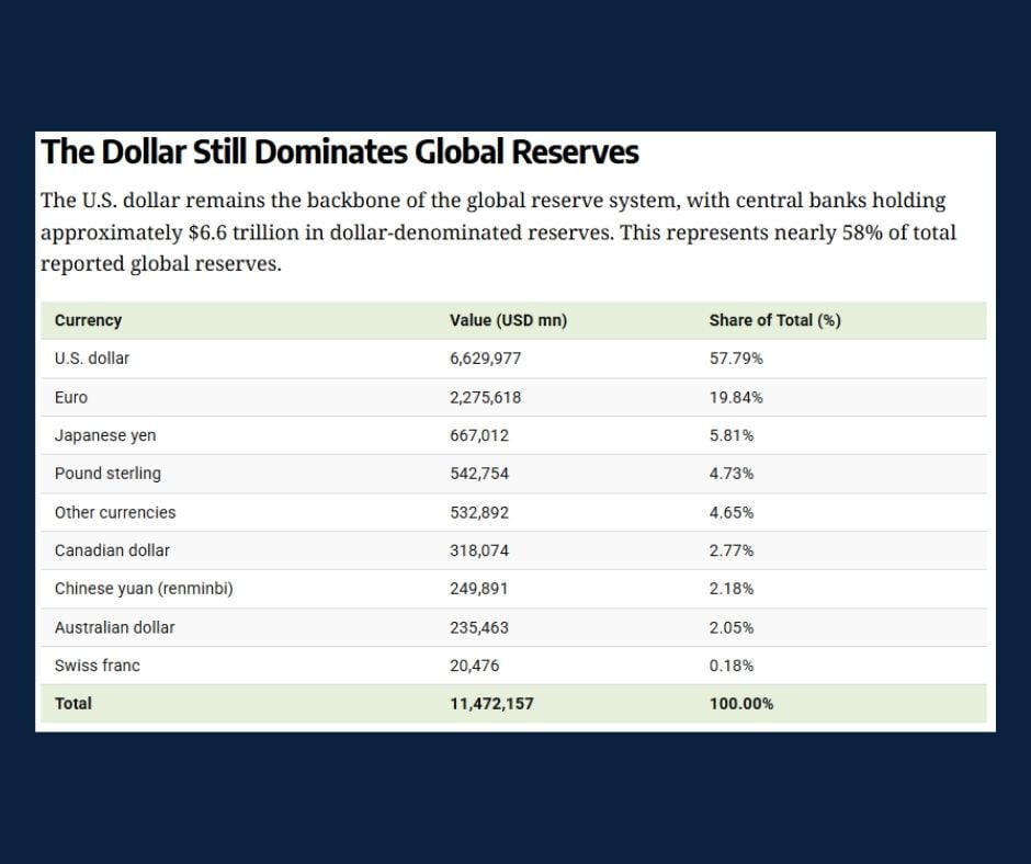
Chart of the Day: US Dollar Dominates
Today's Chart of the Day, from YCharts, highlights the market share of the US dollar.

Chart of the Day: Top New Year's Resolutions
This chart comes from Statista and displays New Year’s resolution data for 2026.
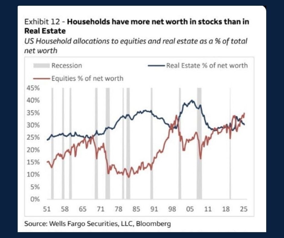
Chart of the Day: Net Worth in Stocks
Today's Chart of the Day, shared by dc_economics on Instagram, highlights a shift from historical trends related to household net worth.
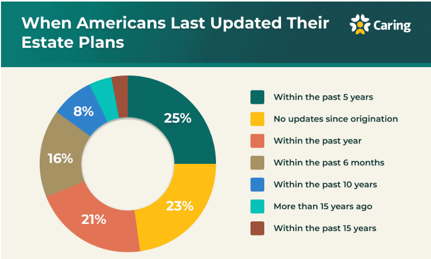
Chart of the Day: Estate Plan Updates - When and Why
Today’s Chart of the Day, prepared by Victoria Lurie at Caring.com, highlights findings from the 2025 Wills and Estate Planning Study.