
Chart of the Day: Treasury vs. Real Estate
Today’s Chart of the Day comes from Re:venture Consulting and shows the history of the 10-year treasury rate (in yellow) vs. the CAP, Capital Asset Pricing, rate (in blue).
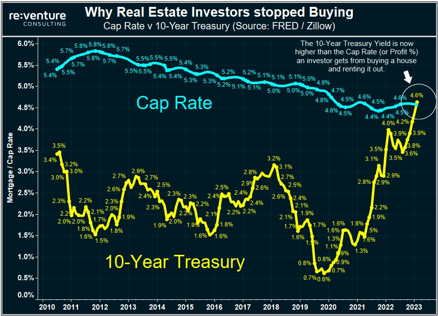
Today’s Chart of the Day comes from Re:venture Consulting and shows the history of the 10-year treasury rate (in yellow) vs. the CAP, Capital Asset..
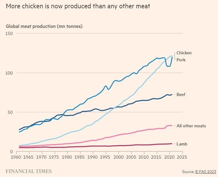
Today’s Chart of the Day from the Financial Times shows that chicken meat recently overtook pork as the most produced meat on the planet. Why?
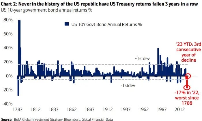
Today’s Chart of the Day from Bank of America shows that the increase in the 10-year treasury interest rates in 2022 caused the worst price decline..
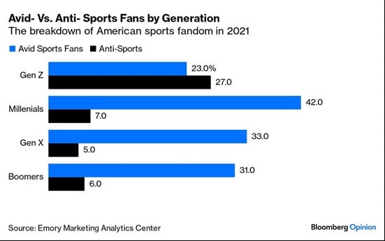
Are sports losing their shine? Today’s Chart of the Day is from Bloomberg and shows that 27% of Gen Z (currently ages 15 to 30) are decidedly..
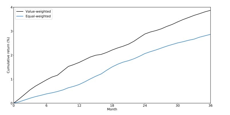
Today’s Chart of the Day comes from an academic paper by Chengyu Bai with the Shanghai Jiao Tong University. It shows that funds with “attractive”..
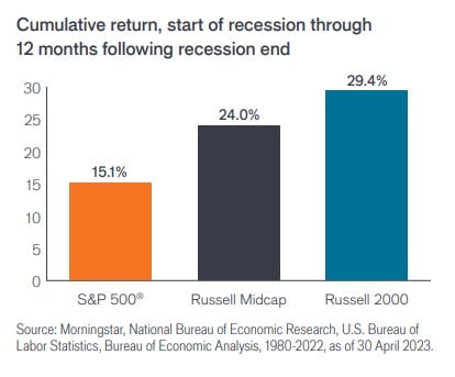
Today’s Chart of the Day is from Janus Henderson’s 2023 Outlook and shows the returns of the S&P 500 (large-cap stocks), Russell mid-cap, and Russell..
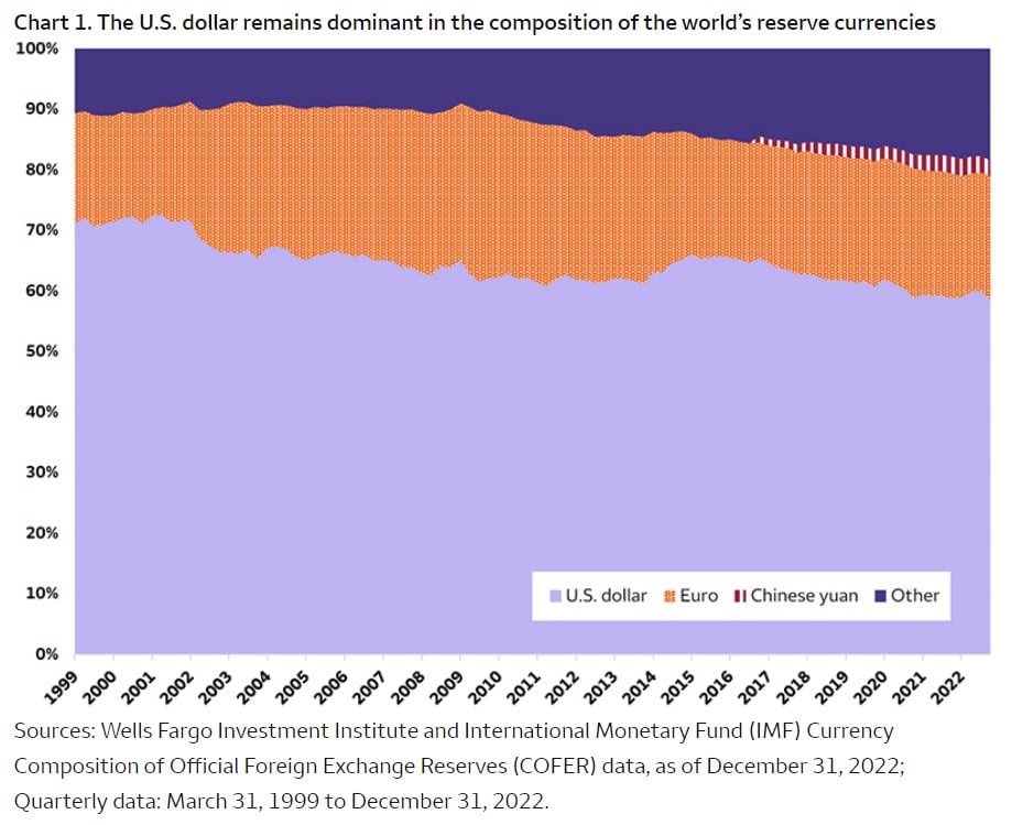
Today’s Chart of the Day was shared by Crews Bank & Trust Portfolio Manager Angie Parsons and comes from Wells Fargo Advisors. It shows that for all..

Join Samuel A. Kiburz, Chief Investment Officer, Senior Vice President, for a virtual macroeconomics presentation.
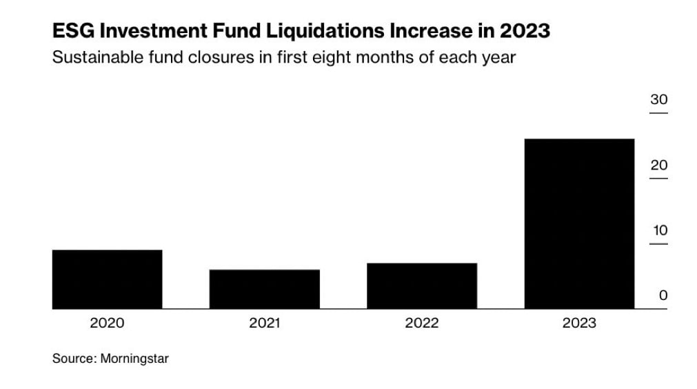
Today’s Chart of the Day from Morningstar shows an increase in the closing of ESG Funds (Environmental, Social, and Governance funds).
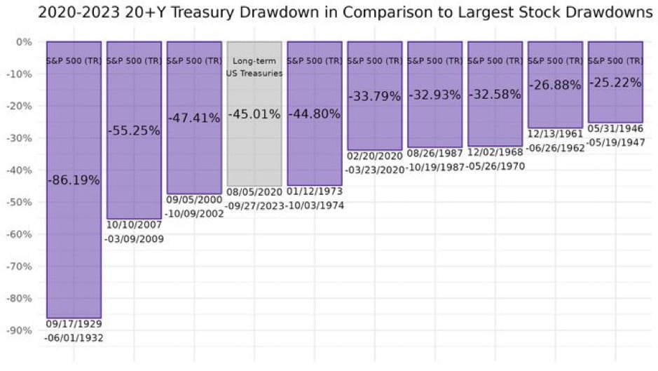
Today’s Chart of the Day from Michael Gayed, @leadlagreport on X, shows the decline in the price of stocks and bonds going back to the Great..
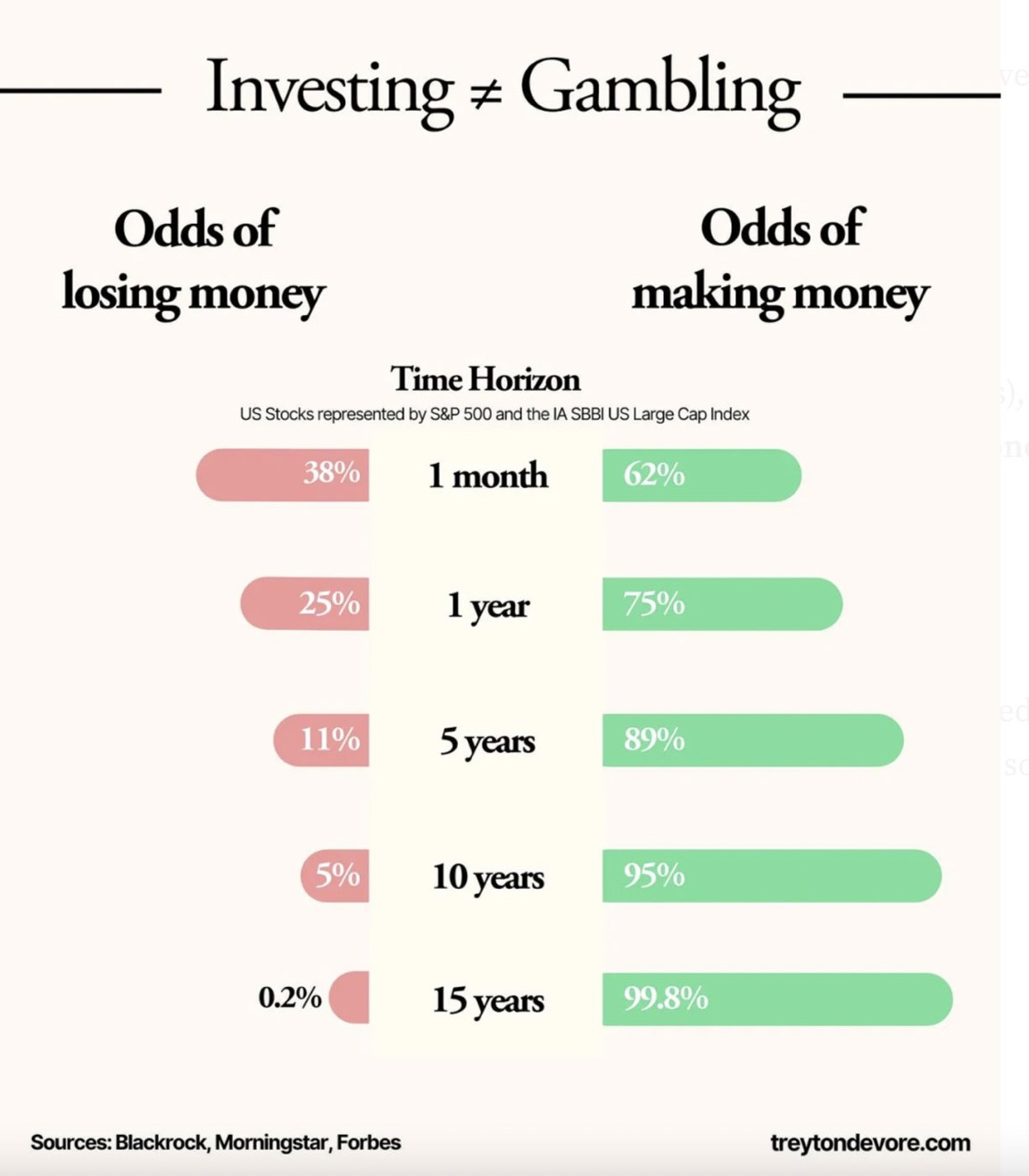
Today’s Chart of the Day from Treyton Devore shows the odds of losing vs. making money.
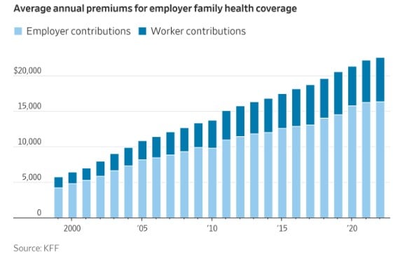
Today’s Chart of the Day comes from Charlie Bilello, @charliebilello on X, and shows the average annual premiums for employer family health coverage...
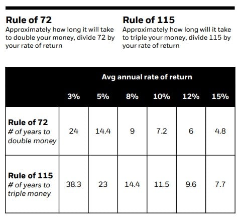
Today’s Chart of the Day from BlackRock shows a great “thumbnail” rule that finance professionals use to do quick math: The Rule of 72. However, one..

Today's Chart of the Day from Visual Capitalist shows the richest billionaire in every state.
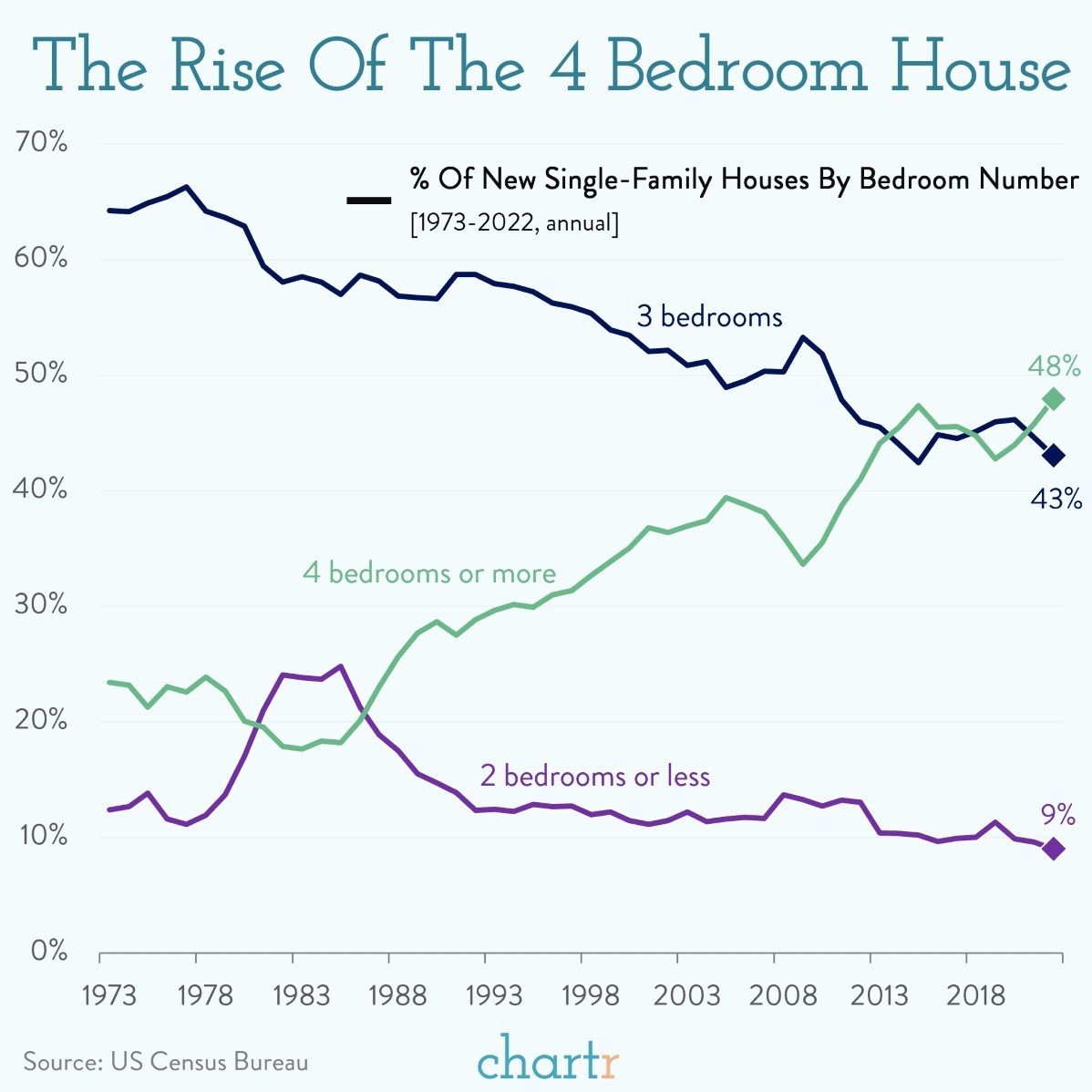
Today’s Chart of the Day from Chartr shows that 4+ bedroom houses went from being 25% of homes in 1973 to just under 50% of the nearly one million..