
Chart of the Day: Life is Longer
Today’s Chart of the Day is from Our World in Data showing that the global average life expectancy went from 32 years in 1900 to 73 years as of 2023.
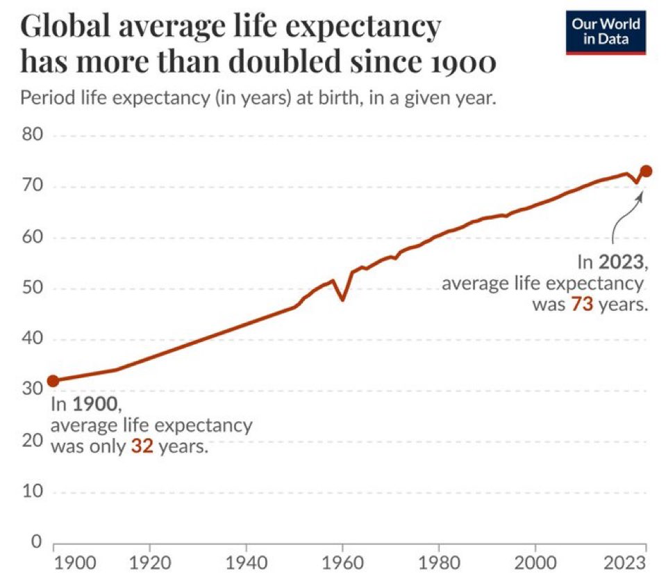
Today’s Chart of the Day is from Our World in Data showing that the global average life expectancy went from 32 years in 1900 to 73 years as of 2023.
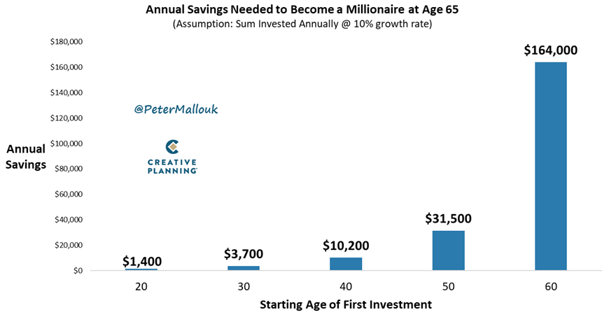
Today’s Chart of the Day from @PeterMallouk is a good one to share with the friends and family who are still working and saving.
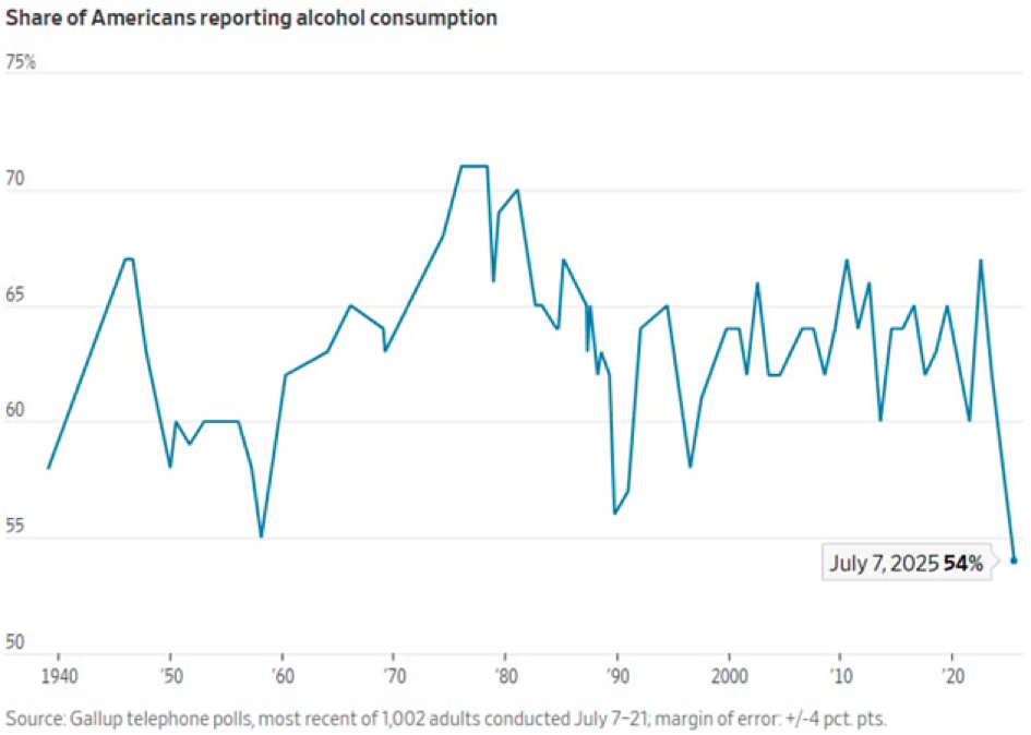
Today’s Chart of the Day is from Gallop and shows the share of Americans that drink alcohol since 1940.
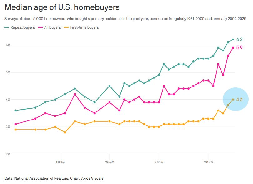
Today’s Chart of the Day is from Axios Visuals with data from the National Association of Realtors.
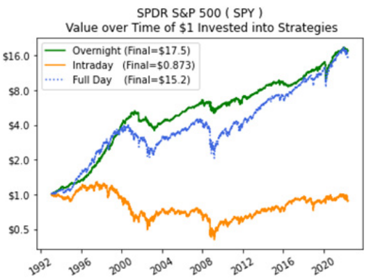
The topic of Today’s Chart of the Day is something that often crosses my mind in the morning when I look at how the market is going to open.
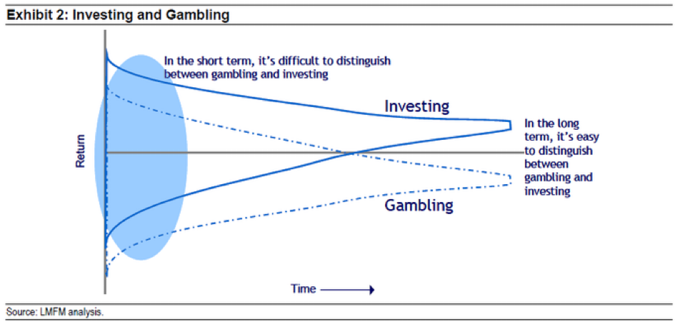
Today’s Chart of the Day is from Michael Mauboussin and highlights the difference between investing vs. gambling. 
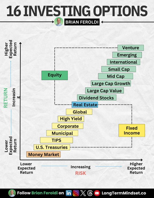
Today’s Chart of the Day is from Brian Feroldi with a great infographic breaking down all investments into 16 options.
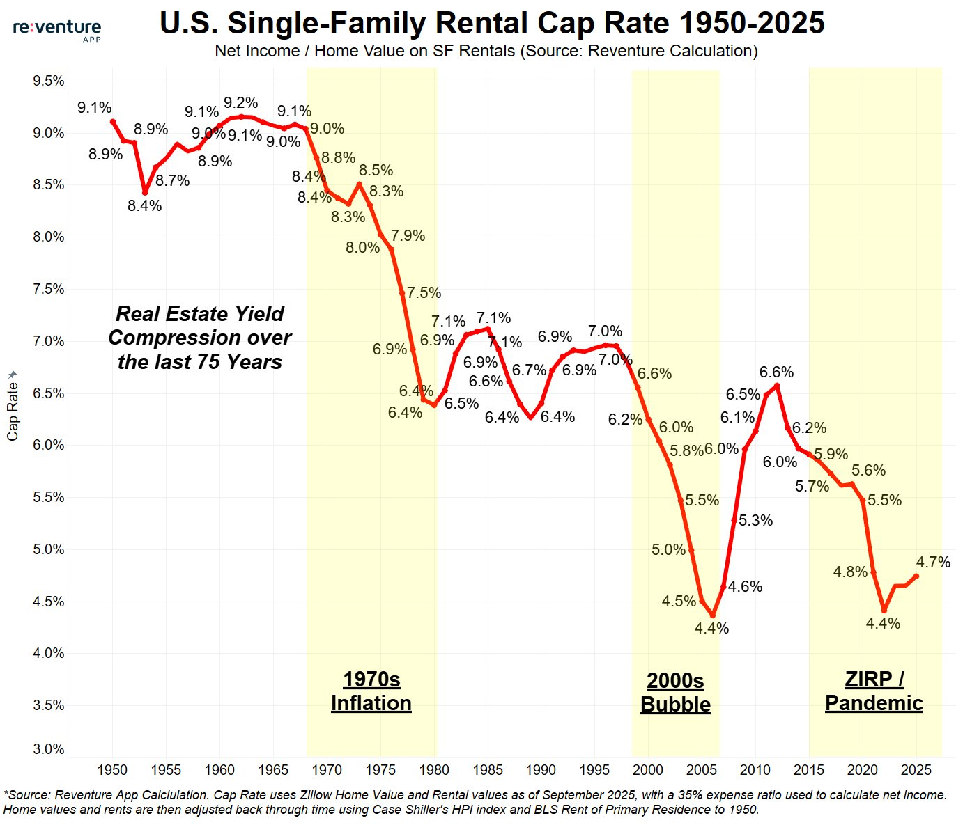
Today’s Chart of the Day comes from re:venture, a provider of real estate market data. The chart highlights single-family rental capitalization (cap)..
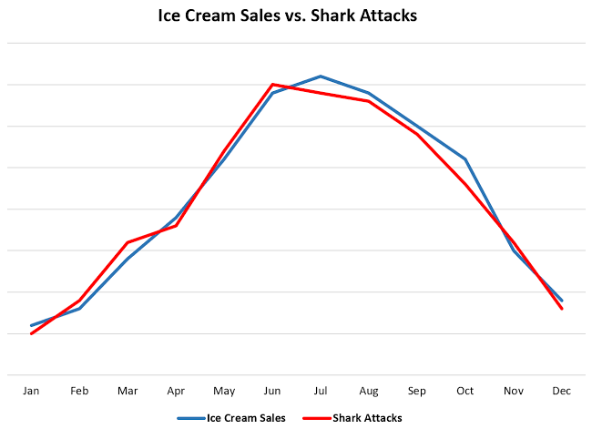
Today’s Chart of the Day is a little different than what I usually share. The chart compares ice cream sales and shark attacks over the course of a..
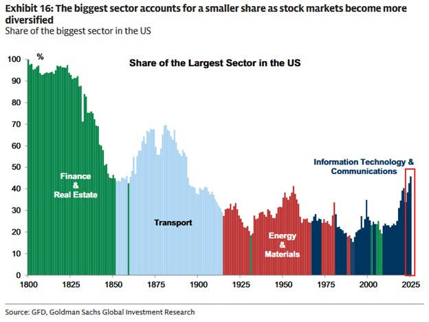
Today’s Chart of the Day from Goldman Sachs takes a look at how the biggest sector in the U.S. stock market has changed over time, from 1800 to..
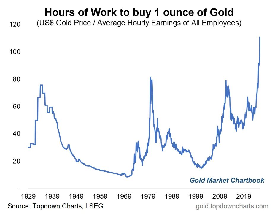
Today’s Chart of the Day comes from the Gold Market Chartbook and shows how many hours of work it takes to buy one ounce of gold.
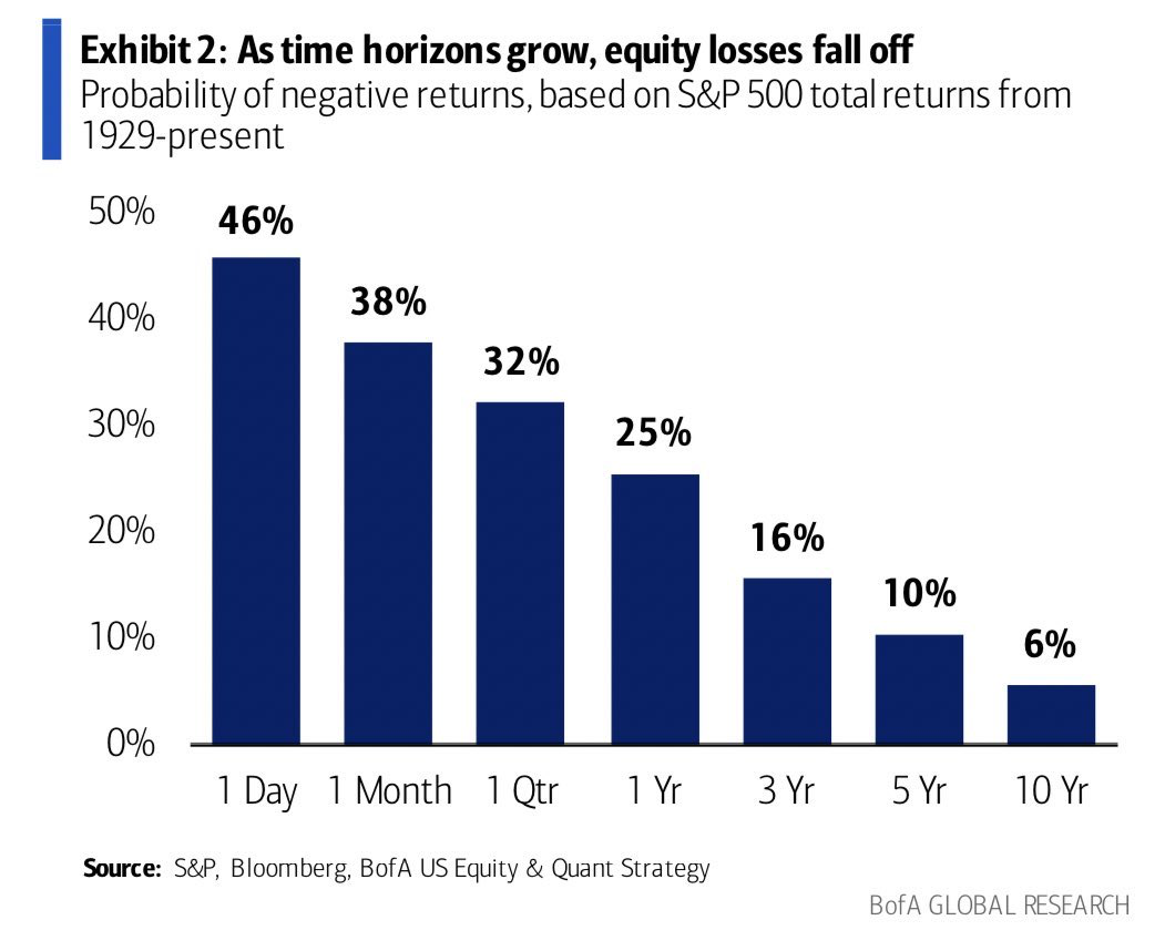
Today’s Chart of the Day is from Brian Feroldi from Bank of America Global Research, showing a chart from 1929 that shows as time horizons grow, the..
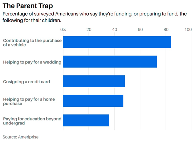
Today’s Chart of the Day is from Barrons with data from Ameriprise showing the percentage of Americans who fund or are preparing to fund certain..
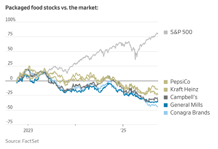
Today’s Chart of the Day from FactSet was included in an article titled, “Startups Are Eating Big Food’s Lunch”, featured in the Wall Street Journal.
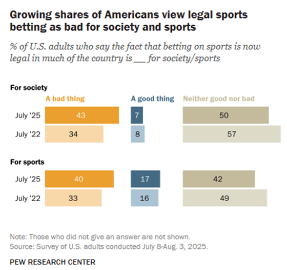
With a nod to all the sporting events that take place in the fall, sharing today’s Chart of the Day from Topley’s Top 10, with data from the Pew..