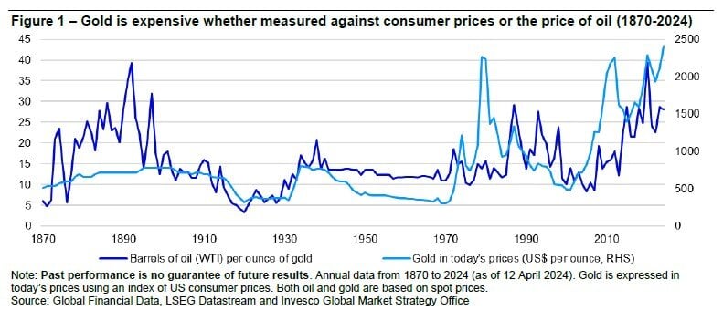
Skip to content

Learn how you can achieve your financial goals for yourself and your loved ones at a free seminar. Visit our seminars page to view dates, topics and locations.

Fraud Alert: We will never text, email, or call you to ask for your PIN or password.

Get Started 863-222-7005

Blog

Your Weekly
Financial Forecast


Stay informed with sound financial know-how

Year Zero Coupon Treasury (ZROC) in blue vs. the 20 Year US Treasury Yield in orange.  Since the peak at $189 in 2020, the value of the PIMCO fund has declined 70% to only $90

In Fixed Income, the Dip is Not Always an Opportunity

Today’s Chart of the Day is the five-year performance of the PIMCO over 25-year Zero Coupon Treasury (ZROC) in blue versus the 20-year US Treasury..

Read More

three charts speaking about indexing

Why Indexing Works

The theory that index/passive funds perform better than actively managed funds is backed by the fact that 90% of active funds underperformed their..

Read More

Least-regretted majors include: Computer and information sciences, Criminology, engineering, Nursing, Health, Business administration and management, Finance, Psychology, Construction trades, and Human resource management

Least Regretted Majors

As high school seniors finish out the school year, some may be asked, “What are you going to major in at college?” Today’s Chart of the Day comes..

Read More

chart explains how bond ETFs are absorbing cash amid record exodus from mutual funds, years shown 2013 - 2022

Bonds to ETFs

We often talk about how over the last 10+ years investors have, in general, been moving out of mutual funds and into Exchange Traded Funds, also..

Read More

chart showing car prices going down

Car Prices Are Falling

Today’s Chart of the Day is from S&P Dow Jones Indices. Year-to-date, the S&P Composite 1500® Automobiles is down 43%, and is the

Read More

infographic includes comic strip that explains the fence paradox

The Fence Paradox

Today’s Chart of the Day is an infographic from Pasquale Cirillo, @DrCirillo on Twitter. We see this often when investors say, “They wouldn’t be..

Read More

during this time the cumulative return has been an incredible 18,750%, which works out to an annual return of 10.4%

That's a lot of Down Time

Today’s chart comes from Wealthmanagement.com. It shows the drawdowns, which is the percent the market is down from the previous record high, going..

Read More

chart shows the cumulative returns based on 1, 5, 10, and 20 years for all stocks (in green), all bonds (in blue), and a 50/50 mix (in grey) since 1950

Longer Equals Higher Probability

Today’s chart from JP Morgan Asset Management’s Guide to the Markets quarterly presentation shows the cumulative returns based on 1, 5, 10, and 20..

Read More

the yield went from 1.50% to the current 4.00%, which equates to a 166% increase, causing the price to fall an incredible 20%

Worst Since 1788

Today's chart comes from Bank of America’s Global Investment Strategy team. We have all heard that this was a bad year for longer term bonds, but how..

Read More

chart shows that $100 invested 30 years ago is still worth only $100 today

China's Lost 30 Years

Today's chart from Refinitive shows that over the last 30 years, China has delivered a cumulative return of zero dollars, meaning $100 invested 30..

Read More

computer with crypto symbols

Crypto / FTX Bankruptcy

Today we’re taking a quick side note away from the Chart of the Day to make a couple of comments on cryptocurrencies and FTX’s bankruptcy. FTX is a..

Read More

US dollar went from $1.00 to only worth $0.04 and that the value of gold only went up to $4.06

Stocks for The Long Run

This chart shows the value of $1 going all the way back to 1802 and was previously shared as a Chart of the Day. However, I'd like to share it once..

Read More

 Long-term Treasury Bonds noted in orange from 2014 - 2022

The Trouble with Treasuries

It’s been a challenging few years for Long-Term Treasury Bonds, which are defined as bonds that have maturities of 20+ years and are noted in orange..

Read More

Chart shows the growth of total index assets and cumulative savings from 1996 - 2021 index funds

Why Pay More and Earn Less?

Today’s Chart of the Day comes from S&P Dow Jones Indices and shows the cumulative savings from using index funds vs. actively managed funds, as well..

Read More

The rate of 6.81%, previously reached in 2006, and the low of 2.90%, reached two years ago in December 2020, are displayed.

Elevated Premiums in Mortgages

The history of the Mortgage Banker’s 30-Year Home Rate, in blue, going all the way back to when they started the index in 1990 is displayed in..

Read More

On Our Minds

List Grid
Browse by topic

In Fixed Income, the Dip is Not Always an Opportunity

Today’s Chart of the Day is the five-year performance of the PIMCO over 25-year Zero Coupon Treasury (ZROC) in blue versus the 20-year US Treasury Yield in orange.  Since the peak at $189 in 2020, the value of the PIMCO fund has declined 70% to only $90.  

According to VettaFi, “ZROZ invests exclusively in . . . the final principal payments of U.S. Treasuries with at least 25 years remaining until maturity. As such, this product will be very sensitive to changes in interest rate movements, performing very well when rates fall but likely struggling if rates begin to climb.”

The reason for the volatility is the fact that there are no interest payments during the life of the loan, and only one payment of principal at the end, there is no chance to reinvest periodic interest payments at higher rates when rates rise. Or conversely, run the risk of reinvesting the interest payment at a lower rate when rates decline.

Why invest in such a product you may ask? Where does the stated return of 3.80% come from? Well, as an example, when a zero coupon bond was issued it could be purchased for $40, then held for 25 years until you get $100 back at maturity.  

When the 20-year rates were 1.00% in the summer of 2020, the 3.80% guaranteed appreciation in your principal for the 25 years looked very attractive, hence the near doubling of the price.  However, when rates are at their current yield of 4.00% the price fell just as dramatically and is now back to its normal “pre-pandemic” price. 

What can we learn?

We can learn that in fixed income, just because bond’s price is down 70%, this does not mean it is “on sale” or provide an opportunity to “buy the dip.” The 3.80% yield you see is what you get when you hold it to maturity. No more, no less. The rate will not change and therefore provides no real “buying opportunity.”

This is evident in this investment, since despite the wild ride up and back down, the investor simply is back to where they started, earning their original 3.8% for the next 25 years.  

More

Why Indexing Works

The theory that index/passive funds perform better than actively managed funds is backed by the fact that 90% of active funds underperformed their benchmarks over the last 10 years. So, it begs the question, “Why?”

Firstly, index funds do not have the added expenses of investment analysists and advisors, lowering overall cost and ultimately leaving more returns for investors to keep.

The chart above from S&P Dow Jones Indices shows the average actively managed fund costs 0.68% versus index funds of only 0.06%. So, right off the bat, every year the actively managed fund starts 0.62% in the hole.

More

Least Regretted Majors

As high school seniors finish out the school year, some may be asked, “What are you going to major in at college?” Today’s Chart of the Day comes from CNBC.com who surveyed 1,500 job seekers for the percentage of graduates who would choose the same major again. The article also included the “most regretted” majors; however, you’ll have to click on the link to see that.

More

Bonds to ETFs

We often talk about how over the last 10+ years investors have, in general, been moving out of mutual funds and into Exchange Traded Funds, also known as ETFs. However, this year the pattern is even more prevalent with bonds. So far this year, a record $446 billion exited bond mutual funds and went into bond ETFs and bank accounts.

Why do we use bond ETFs instead of actively managed bond mutual funds? Bond ETFs have substantially lower costs, more liquidity, increased transparency, and over the last 10 years had a better return than 90% of actively managed mutual funds.

More

Car Prices Are Falling

Today’s Chart of the Day is from S&P Dow Jones Indices.

Year-to-date, the S&P Composite 1500® Automobiles is down 43%, and is the

More

The Fence Paradox

Today’s Chart of the Day is an infographic from Pasquale Cirillo, @DrCirillo on Twitter. We see this often when investors say, “They wouldn’t be allowed to sell this, if it wasn’t safe.” Yes, there needs to be fences, but don’t let their security lull you into forgetting the risks on the other side.

More

That's a lot of Down Time

Today’s chart comes from Wealthmanagement.com. It shows the drawdowns, which is the percent the market is down from the previous record high, going back to 1970. As you would expect, the chart shows most the time the market is “down” and investors spend a lot of time having “lost” money.

More

Longer Equals Higher Probability

Today’s chart from JP Morgan Asset Management’s Guide to the Markets quarterly presentation shows the cumulative returns based on 1, 5, 10, and 20 years for all stocks (in green), all bonds (in blue), and a 50/50 mix (in grey) since 1950.

Essentially, the longer you hold your investments, the higher probability you have of positive returns. In fact, there was never a period over 20 years that any of the options lost money.

The chart also shows the average annual total return for stocks was an impressive 11.5% during last 20 years. It will be interesting to see how the next 20 years look.

More

Worst Since 1788

Today's chart comes from Bank of America’s Global Investment Strategy team. We have all heard that this was a bad year for longer term bonds, but how bad? Well, for the 10-year treasury this is the worst year since 1788, so basically the worst year ever.

The reason is, since the beginning of this year, the yield went from 1.50% to the current 4.00%, which equates to a 166% increase, causing the price to fall an incredible 20%.

More

China's Lost 30 Years

Today's chart from Refinitive shows that over the last 30 years, China has delivered a cumulative return of zero dollars, meaning $100 invested 30 years ago is still worth only $100 today.

More

Crypto / FTX Bankruptcy

Today we’re taking a quick side note away from the Chart of the Day to make a couple of comments on cryptocurrencies and FTX’s bankruptcy. FTX is a popular online cryptocurrency exchange, and its bankruptcy may turn out to be the biggest in history.

More

Stocks for The Long Run

This chart shows the value of $1 going all the way back to 1802 and was previously shared as a Chart of the Day. However, I'd like to share it once again as the figures were updated to include data from 2021. The chart was created by Jeremy Seigel in his book called “Stocks for the Long Run” published in 2014.

More

The Trouble with Treasuries

It’s been a challenging few years for Long-Term Treasury Bonds, which are defined as bonds that have maturities of 20+ years and are noted in orange on today's Chart of the Day. Since 2020, they have lost 42% of their value, erasing all the accumulated value for the last six years.

More

Why Pay More and Earn Less?

Today’s Chart of the Day comes from S&P Dow Jones Indices and shows the cumulative savings from using index funds vs. actively managed funds, as well as the growth of indexed funds since 1996.

Index funds have reached a staggering $7 trillion in total assets. Since active funds costs more vs. indexed funds, investors have saved an equally impressive $400 billon in fees, which is more than the entire market value of Wal-Mart.

The reason for growth in index funds? Since S&P started keeping score 20 years ago, only a paltry 6% of active funds have outperformed them.

As you can see in the chart, more and more are starting to say, “Why pay more and earn less?” and moving their investments accordingly.

More

Elevated Premiums in Mortgages

The history of the Mortgage Banker’s 30-Year Home Rate, in blue, going all the way back to when they started the index in 1990 is displayed in today's Chart of the Day.  

More