Chart of the Day: Investing in Gold
Today's Chart of the Day from the New York Post article "Bullish or Bearish on Bullion? How to think about gold investing in 2024" shows the risk-reward tradeoff of gold compared to other asset classes.
Be financially ready for hurricane season. Access funds when you need them with a Home Equity Line of Credit (HELOC). Loans subject to credit approval. NMLS #406389
FDIC-Insured - Backed by the full faith and credit of the U.S. Government
BankFind
This bank is insured by the Federal Deposit Insurance Corporation. The FDIC Certificate ID is 8021. Click on the Certificate ID # to confirm this bank's FDIC coverage using the FDIC's BankFind tool.
EDIE
EDIE lets consumers and bankers know, on a per-bank basis, how the insurance rules and limits apply to a depositor's accounts-what's insured and what portion (if any) exceeds coverage limits at that bank. Check your deposit insurance coverage >>

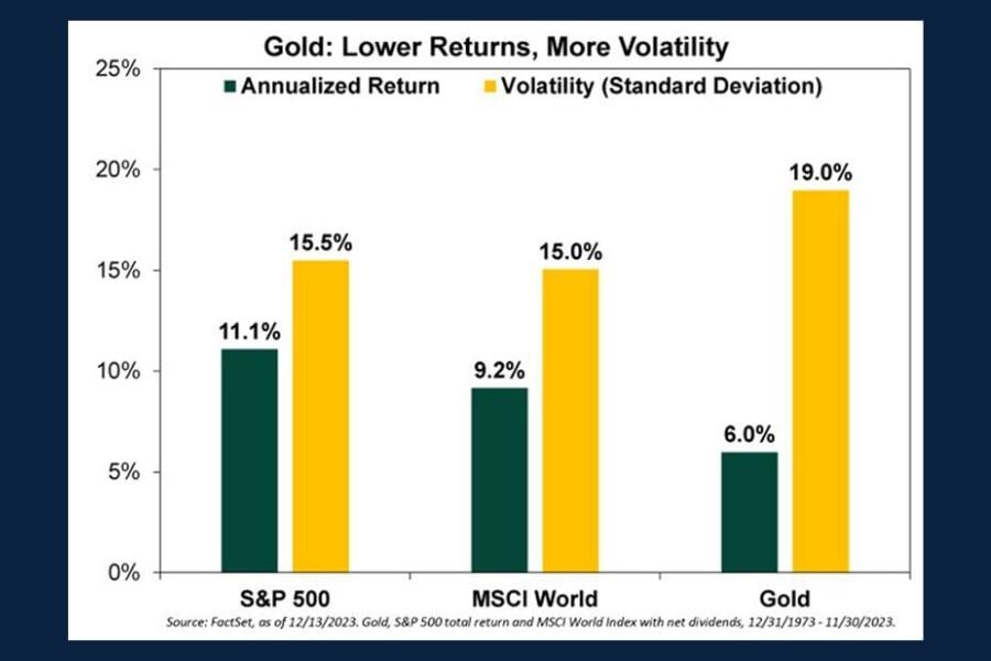
Today's Chart of the Day from the New York Post article "Bullish or Bearish on Bullion? How to think about gold investing in 2024" shows the..
Today’s Chart of the Day is from the article "How the AI Boom Has Transformed the Chip Industry into a Market Monster" in the Wall Street Journal and..

Between 2020 and 2025, Floridians in Central and Southwest Florida were impacted by five major hurricanes. With hurricane season looming once again,..

With baseball season in full swing, today’s Chart of the Day from Future Data Stats displays "striking" growth across the global market projected..
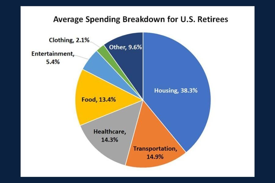
Today’s Chart of the Day from The Motley Fool breaks down key data on retirement spending.
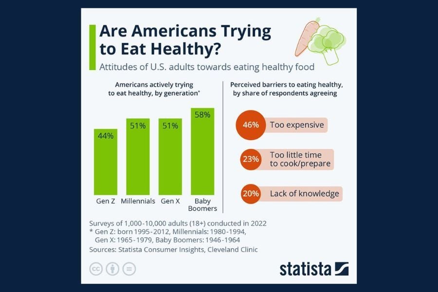
Today's Chart of the Day from Statista shows us the attitudes of US adults towards eating healthy foods.
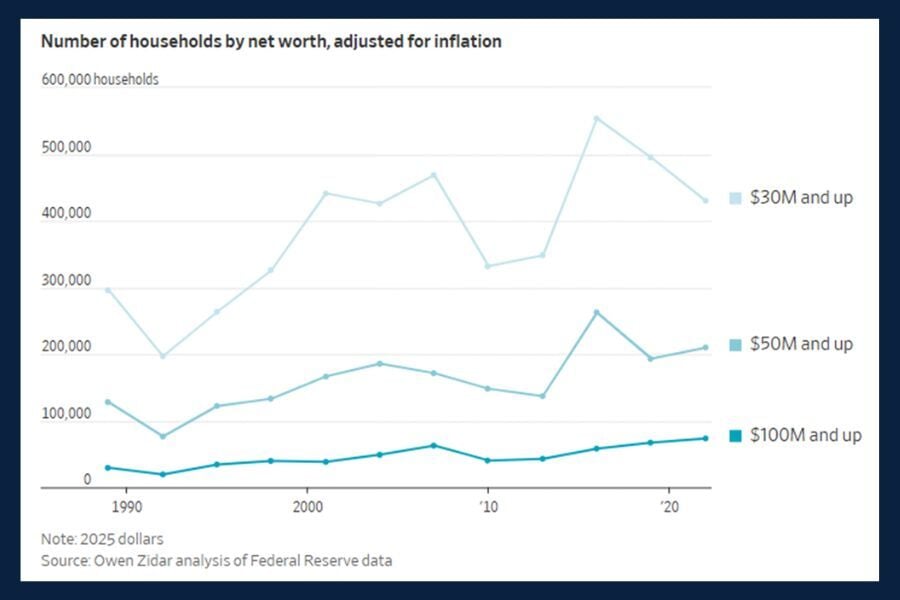
Today’s Chart of the Day from the article "They're Rich but Not Famous - and They're Suddenly Everywhere," in the Wall Street Journal highlights..
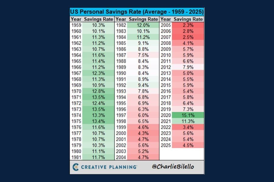
Today’s Chart of the Day from CharlieBilello gives us data for over 60 years of U.S. personal savings rates.

Today's Chart of the Day from USAFacts highlights cybercrime trends across different age groups.
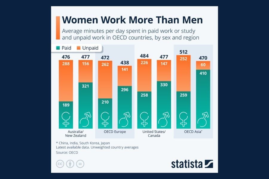
Today’s Chart of the Day from Statista breaks down how men (arrow) and women (cross) around the world spend their time on both paid and unpaid work..

Credit cards, cash and checks all have their place, but if you are looking for simplicity with security and budget control, look no further – your..
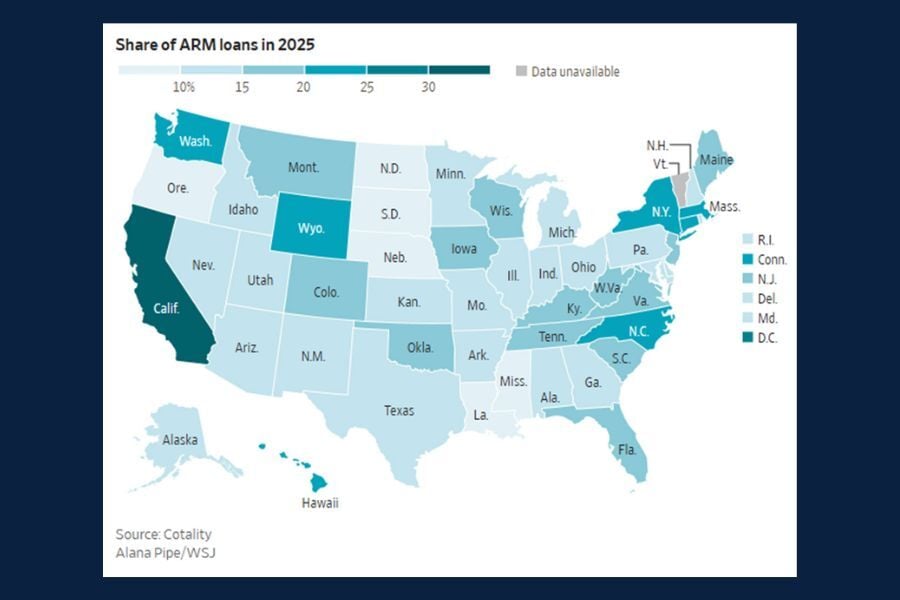
Today's Chart of the Day from the Wall Street Journal article " How Homeowners Are Turning to Adjustable-Rate Mortgages, in Charts" addresses the..
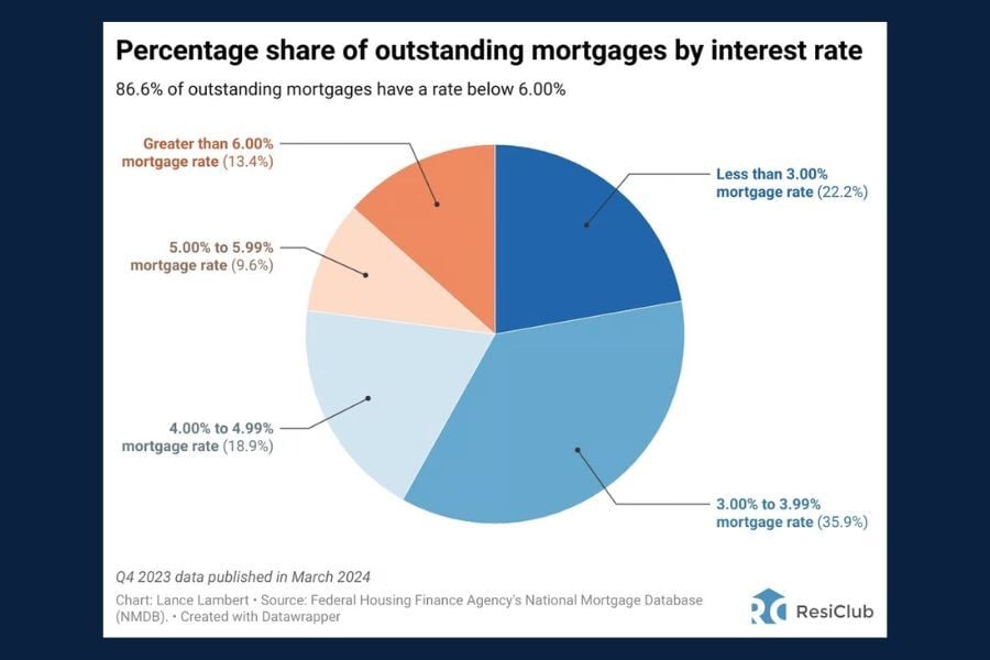
Today’s Chart of the Day from ResiClub gives a clear snapshot of the interest rates attached to currrent outstanding mortgages.
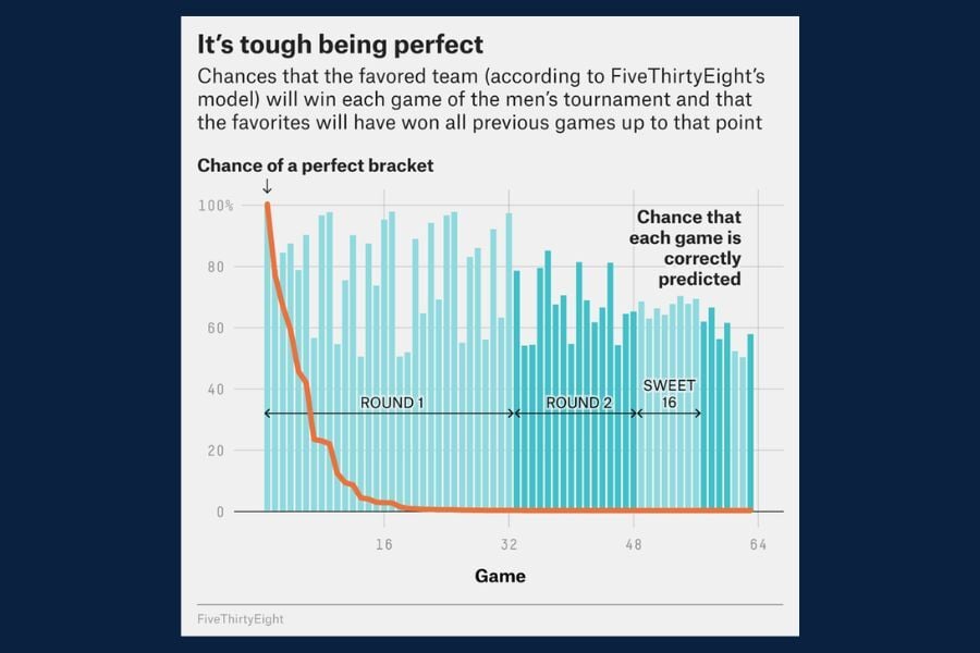
Today’s Chart of the Day from FiveThirtyEight highlights some truly eye‑popping statistics surrounding the NCAA March Madness Tournament.
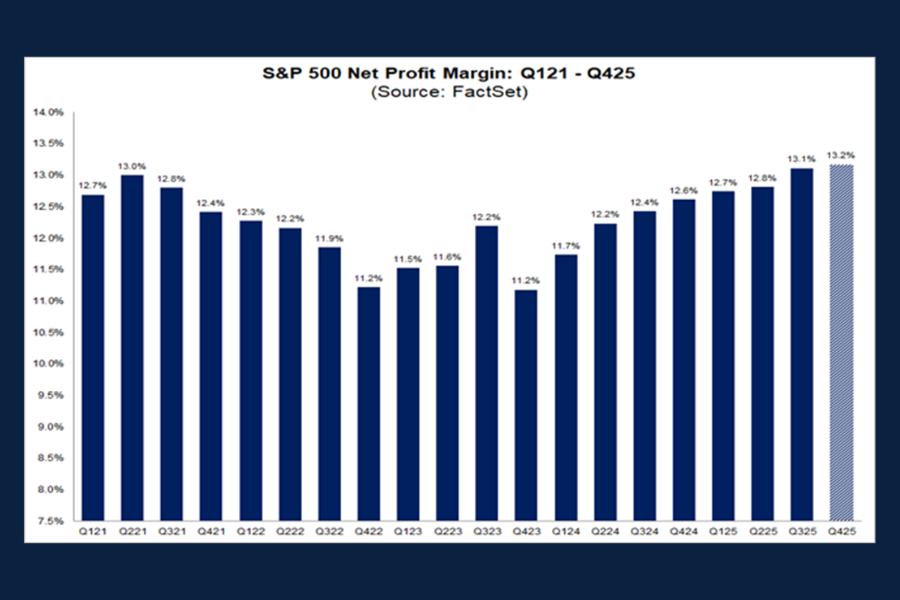
Today’s Chart of the Day, sourced from FactSet, highlights five years of quarterly data on the S&P 500’s net profit margin.
Today's Chart of the Day from the New York Post article "Bullish or Bearish on Bullion? How to think about gold investing in 2024" shows the risk-reward tradeoff of gold compared to other asset classes.
Today’s Chart of the Day is from the article "How the AI Boom Has Transformed the Chip Industry into a Market Monster" in the Wall Street Journal and shows how artificial intelligence is reshaping global demand for semiconductors.
Between 2020 and 2025, Floridians in Central and Southwest Florida were impacted by five major hurricanes. With hurricane season looming once again, it’s time to begin preparing our homes for the possibility of more severe weather. Because your home is likely one of the biggest investments you will ever make, protecting it before a storm and repairing it afterward is a top priority.
With baseball season in full swing, today’s Chart of the Day from Future Data Stats displays "striking" growth across the global market projected through 2030.
Today’s Chart of the Day from The Motley Fool breaks down key data on retirement spending.
Today's Chart of the Day from Statista shows us the attitudes of US adults towards eating healthy foods.
Today’s Chart of the Day from the article "They're Rich but Not Famous - and They're Suddenly Everywhere," in the Wall Street Journal highlights inflation-adjusted net worth across major wealth tiers.
Today’s Chart of the Day from CharlieBilello gives us data for over 60 years of U.S. personal savings rates.
Today’s Chart of the Day from Statista breaks down how men (arrow) and women (cross) around the world spend their time on both paid and unpaid work each day.
Credit cards, cash and checks all have their place, but if you are looking for simplicity with security and budget control, look no further – your Crews Bank & Trust Visa debit card will do all that for you. And by adding it to your mobile wallet, you have that option wherever and whenever you need it. Below are eight reasons why using your debit card is a smart choice.
Today’s Chart of the Day from FiveThirtyEight highlights some truly eye‑popping statistics surrounding the NCAA March Madness Tournament.
current_page_num+2: 3 -
