
Chart of the Day: Record Super Bowl Tickets
Today’s Chart of the Day from Bloomberg.com shows that ticket prices for Super Bowl LVIII are reaching a record-breaking average of $9,815 each.
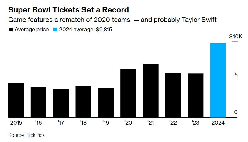
Today’s Chart of the Day from Bloomberg.com shows that ticket prices for Super Bowl LVIII are reaching a record-breaking average of $9,815 each.
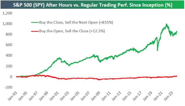
Today’s Chart of the Day comes from Bespoke Investment Group showing stock market returns since 1993. The green line shows the returns if you only..
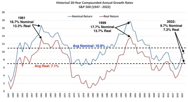
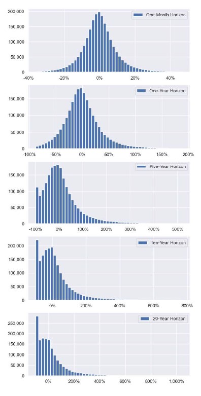
Today’s Chart of the Day shows historical 20-year annual returns going back to 1947 compiled by Nicholas Colas with DataTrek.
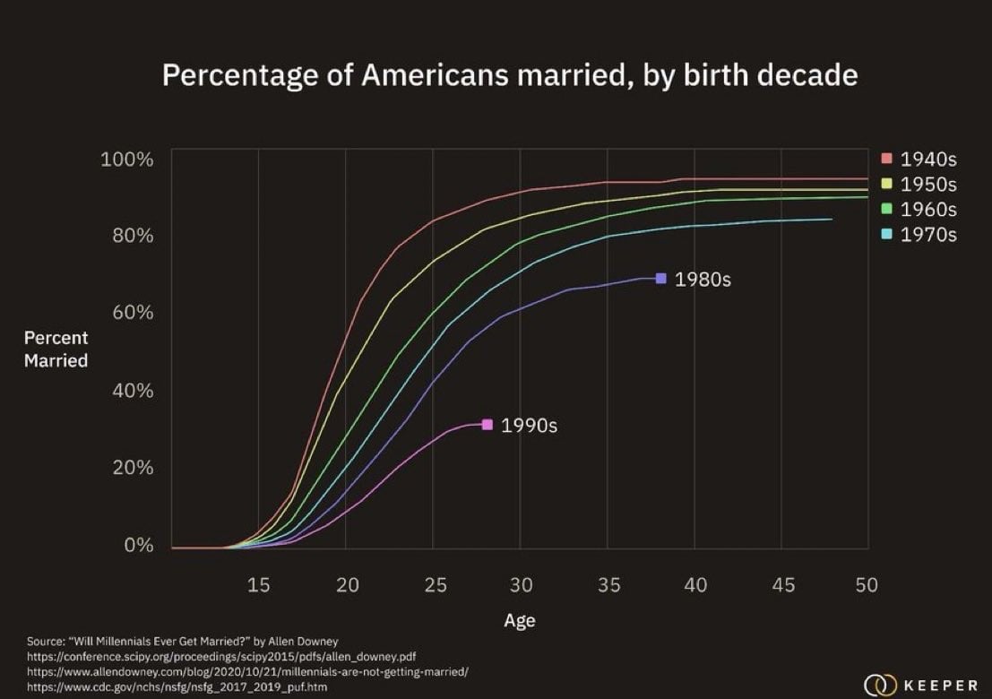
Today’s Chart of the Day from Allen Downey shows the increasing trend of delayed marriages among Millennials.
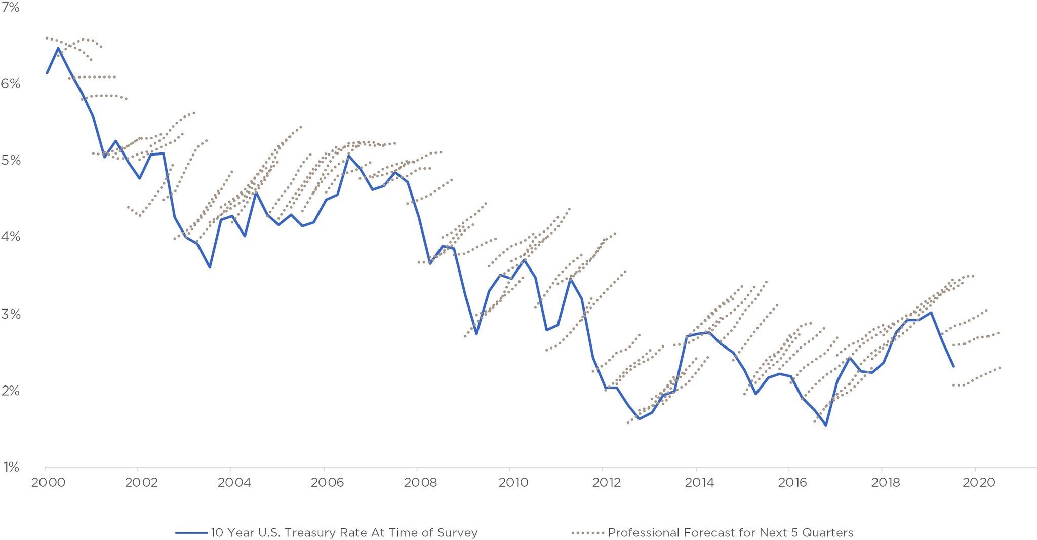
Today’s Chart of the Day has been around a while and is often in the back of my head when we see “forecasts.”
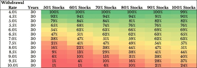
Today’s Chart of the Day was produced by Ofdollarsanddata’s Nick Maggiulli and shows the probability of success between your withdrawal rates, the..
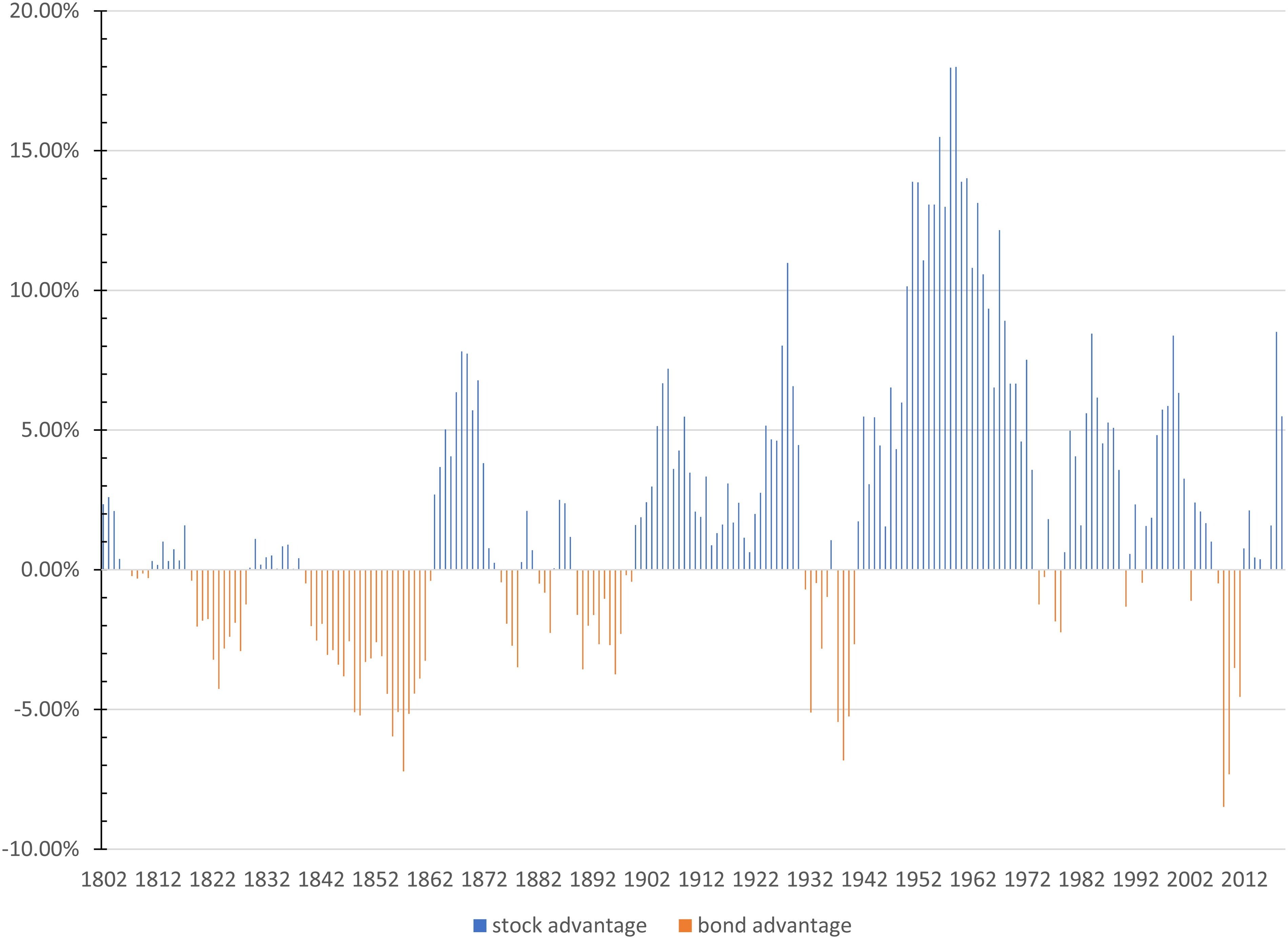
Today’s Chart of the Day is from an article called, “Stocks for the Long Run? Sometimes Yes, Sometimes, No.” by Edward McQuarrie from Santa Clara..
Today’s Chart of the Day was sourced by my Crews Bank & Trust colleague, Jackson Garner, Trust Relationship Associate, from a research paper called,..
Financial theory says that when there is unexpected inflation, monetary assets (things that use dollars to satisfy contractual obligations, such as..
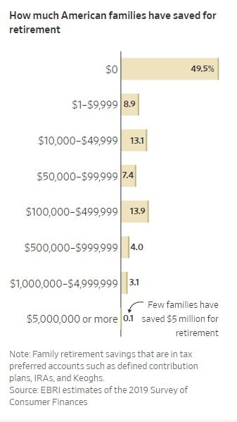
Today’s Chart of the Day shows how much American families have saved for retirement. Notably, 50% have $0 saved and just under 80% have less than..
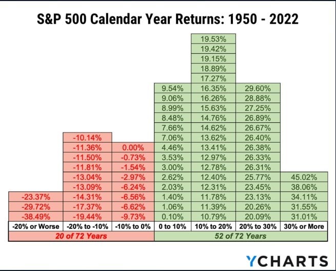
Today’s Chart of the Day was sourced by my Crews Bank & Trust colleague Jackson Garner, Trust Relationship Associate. The chart is from YCharts, an..
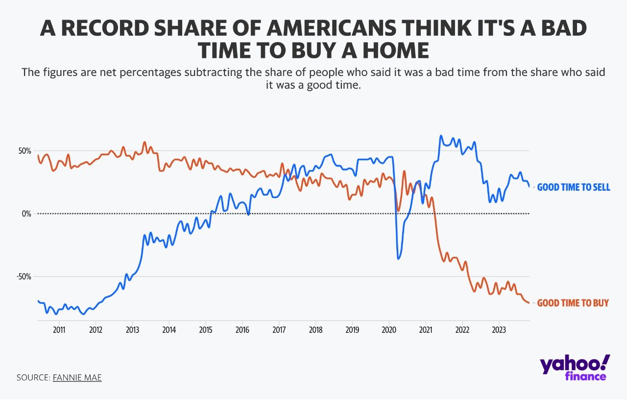
Today’s Chart of the Day was prepared by Yahoo Finance with data from Fannie Mae, a government-sponsored agency that allows mortgages to be traded..
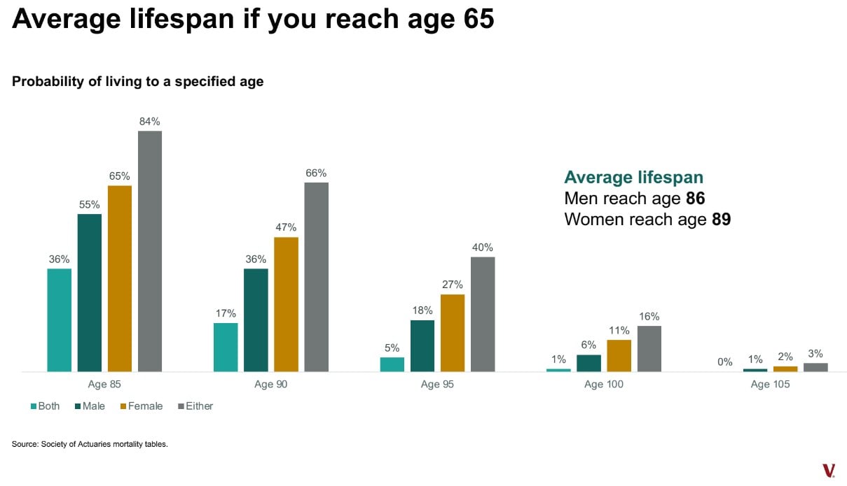
Today’s Chart of the Day from Vanguard shows that the average lifespan once someone reaches the age of 65 is 86 for men and 89 for women.
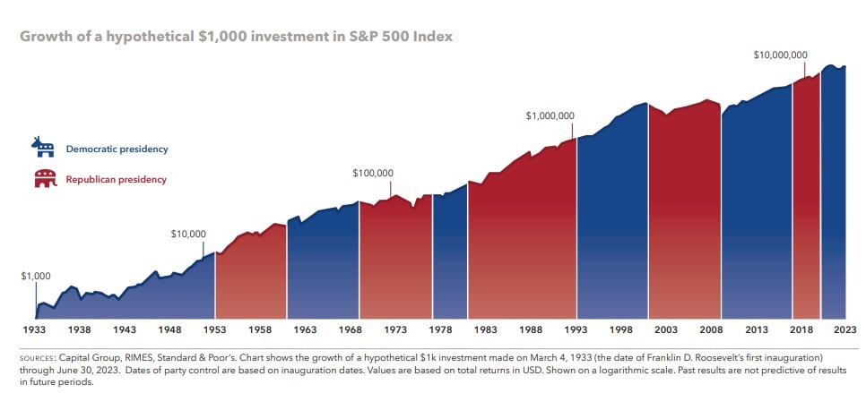
Happy New Year! With 2024 being a presidential election year, today’s Chart of the Day is from Capital Group and shows the hypothetical growth of..
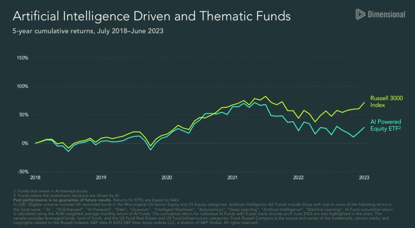
Today’s Chart of the Day is from Dimensional Advisors