

-1.jpg)
No More Heydays for Hedge Funds
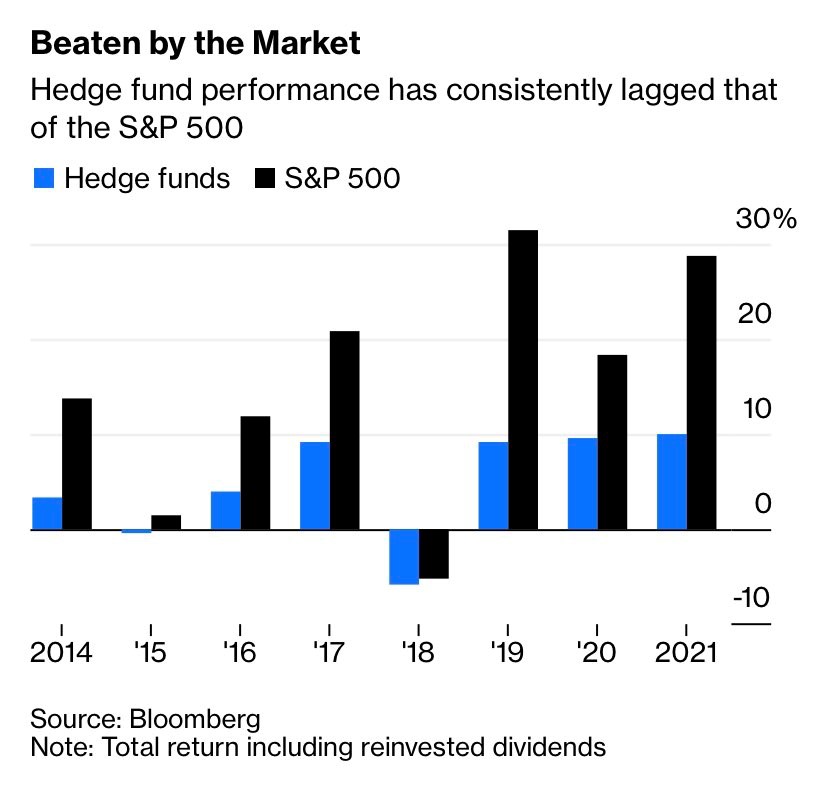
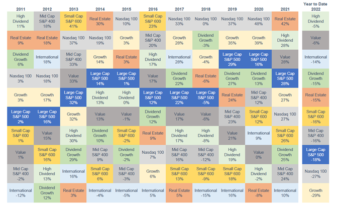
People may ask, “Why not use hedge funds?” Today's chart comes from Bloomberg and shows us the reason why. In addition to their typical expense ratio of 2% and 20% of gains above a benchmark, hedge funds have consistently underperformed the stock market, denoted by the S&P 500 index, every year since 2014. In fact, they haven’t performed well since their heydays in the 1980s, and even less so since 2007.