
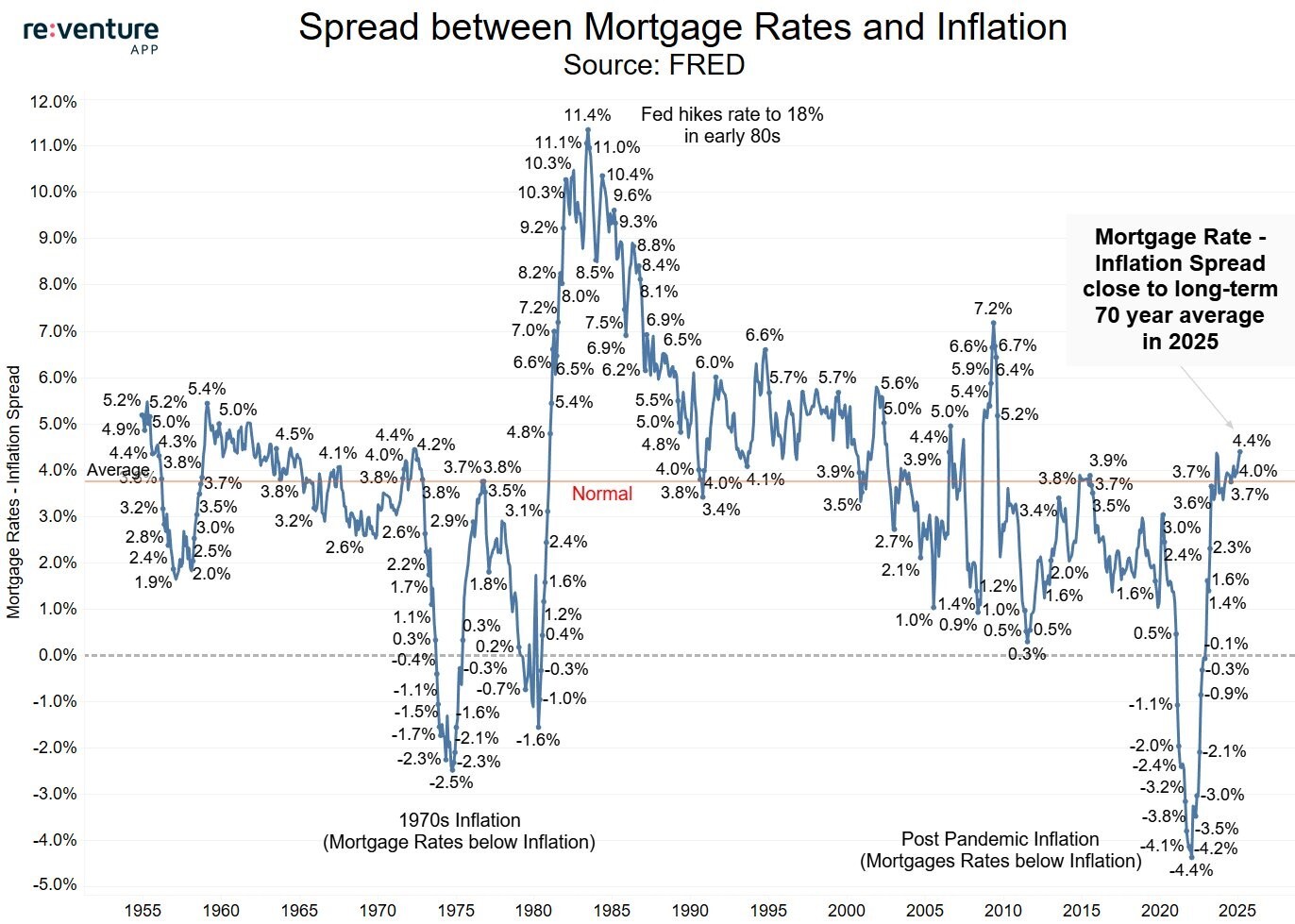
Chart of the Day: Mortgage Rates are Back to Normal
Today’s Chart of the Day from re:venture shows the difference between mortgage rates and inflation going back to 1955.
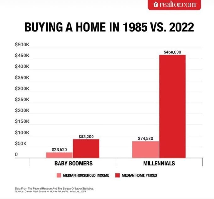
Chart of the Day: Home in 1985 vs. 2022
Today’s Chart of the Day comes from Realtor.com and shows the difference between the average price of homes vs. incomes. It took 3.5 years of income..
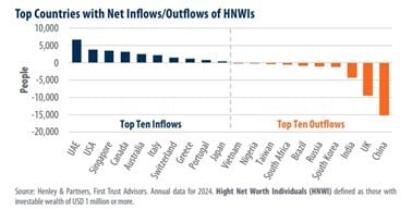
Chart of the Day: Inflow/Outflow of the Wealthy
Today’s Chart of the Day from First Trust shows the top inflows and outflows of high-net-worth individuals (HNWI) who have $1,000,000 or more in..
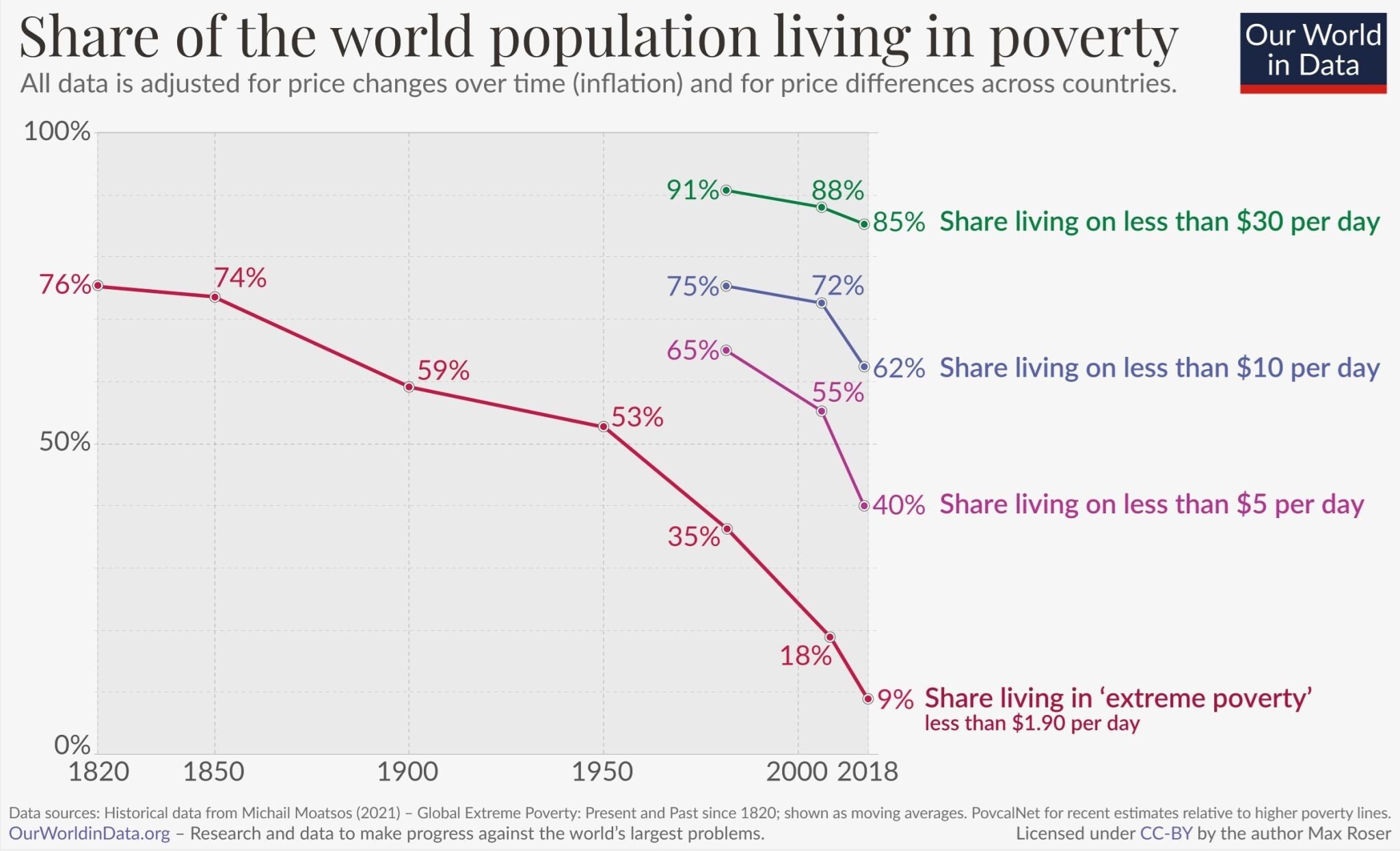
Chart of the Day: Long Term Optimism
Today’s Chart of the Day from OurWorldData.org was shared by @petermallouk on X showing the share of the world living in poverty.
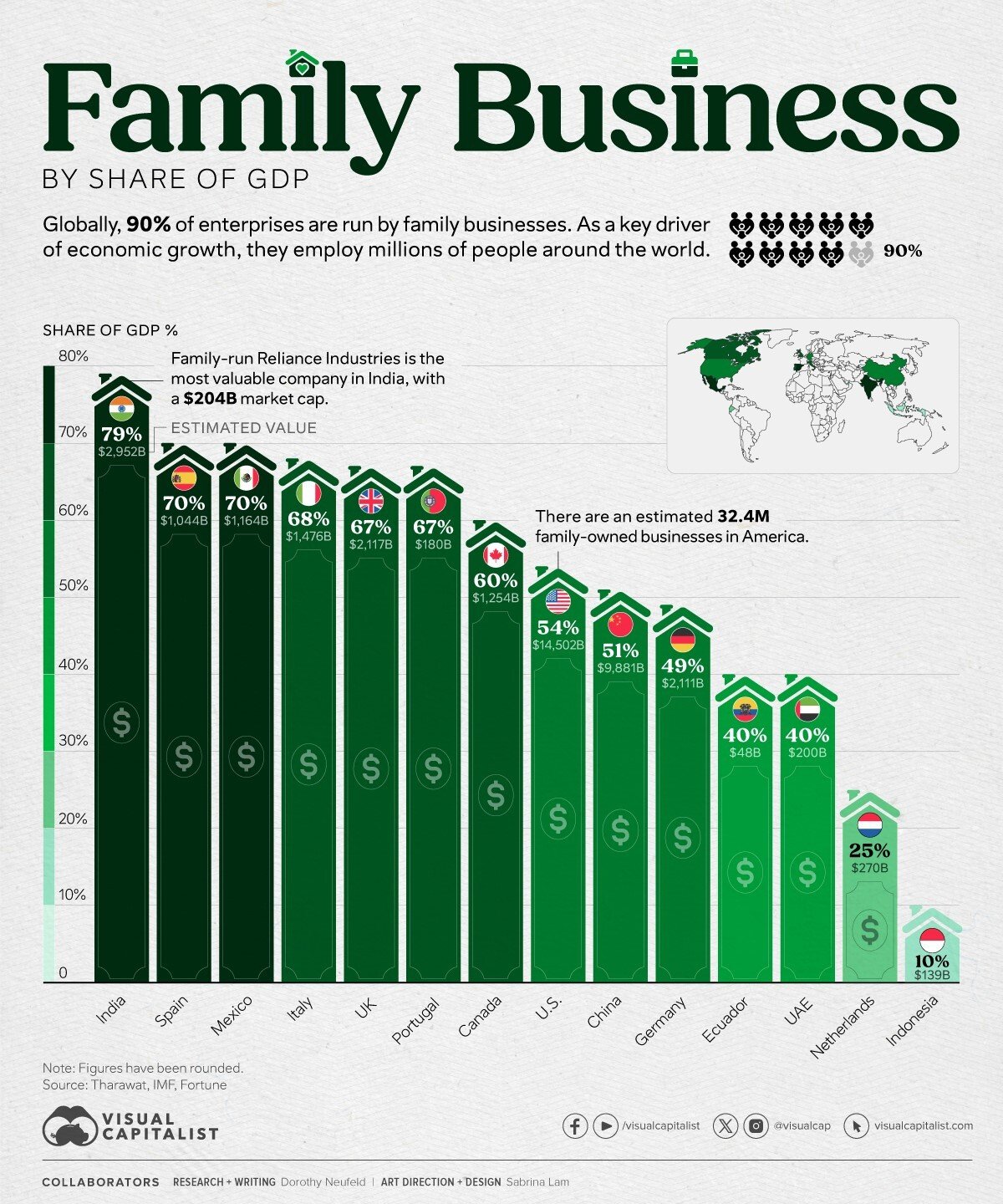
Chart of the Day: Family Business by Share of GDP
Today’s Chart of the Day and comments are shared by my fellow Portfolio Manager Angie Parsons. The chart from Visual Capitalist shows the percent of..
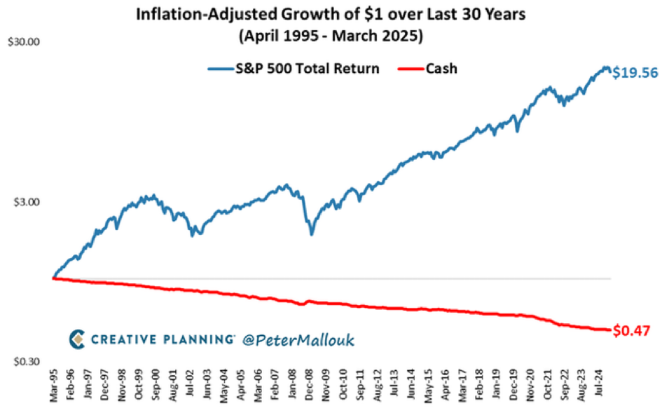
Chart of the Day: Not Risking is the Highest Risk
Today’s Chart of the Day from @petermallouk on X and shows the value of a dollar invested in the S&P 500 vs. sitting in cash for the last 30 years.

Chart of the Day: Corrections are Loud, Recoveries are Quiet
Today’s Chart of the Day is provided by my colleague and fellow Portfolio Manager Angie Parsons. The chart, prepared by YCharts, shows the “Bull..
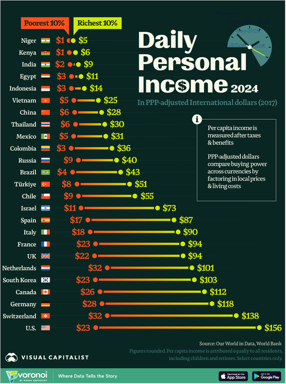
Chart of the Day: Worst Except for All Others
Today’s Chart of the Day from Visual Capitalist ranks the poorest 10% and richest 10% daily personal incomes in various countries.
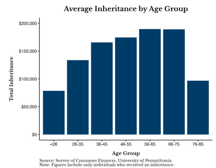
Chart of the Day: Average Inheritance
Today’s Chart of the Day is the Average Inheritance by Age Group from a University of Pennsylvania survey of individuals who have received an..