


Lack of Persistence in Mid- and Small-Cap
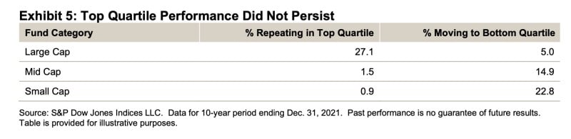
Today’s Chart of the Day from S&P Dow Jones shows the percentage of time the top 25%, or top quartile, of active investment managers stayed in the top 25% after five years. A higher-than-average figure will tell us if the active managers have genuine skill or merely experienced good luck.
If you flipped a coin, randomness would assume 25% of them would stay in the top 25%; however, the evidence does not support this. Yes, 27% of large-cap managers do, which shows that by and large their performance is merely good luck. However, the chilling figures are only 1.5% mid- and 0.9% of small- do. These are terrible odds. To add insult to injury, 15% and 23% of mid- and small-cap managers end up at the bottom 25%, meaning that even in the unlikely event you picked a good one, odds suggest you should sell it right afterward.
There are many theories to why this is, and we’ve discussed them in previous blogs including Why Indexing Works.
In the end, the significantly worse than average probability of active managers constantly beating the market in mid- and small-cap stocks is why we only use passive index funds.