
Chart of the Day: Old Tech vs. New Tech
Today’s Chart of the Day from Bank of America is more of a “buyer beware” to those oversaturated in AI. It's important to understand the risks that other new technology experienced.
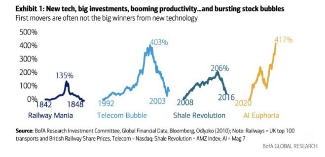
Today’s Chart of the Day from Bank of America is more of a “buyer beware” to those oversaturated in AI. It's important to understand the risks that..
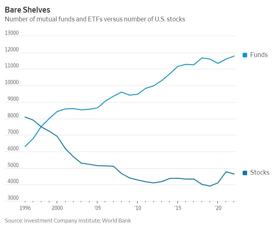
Today’s Chart of the Day is from a Wall Street Journal article titled “Where Have All the Good Stocks Gone?” and shows the amount of investment funds..

Mixed use properties are becoming increasingly popular, offering investors a versatile and strategic way to diversify their portfolios. These..
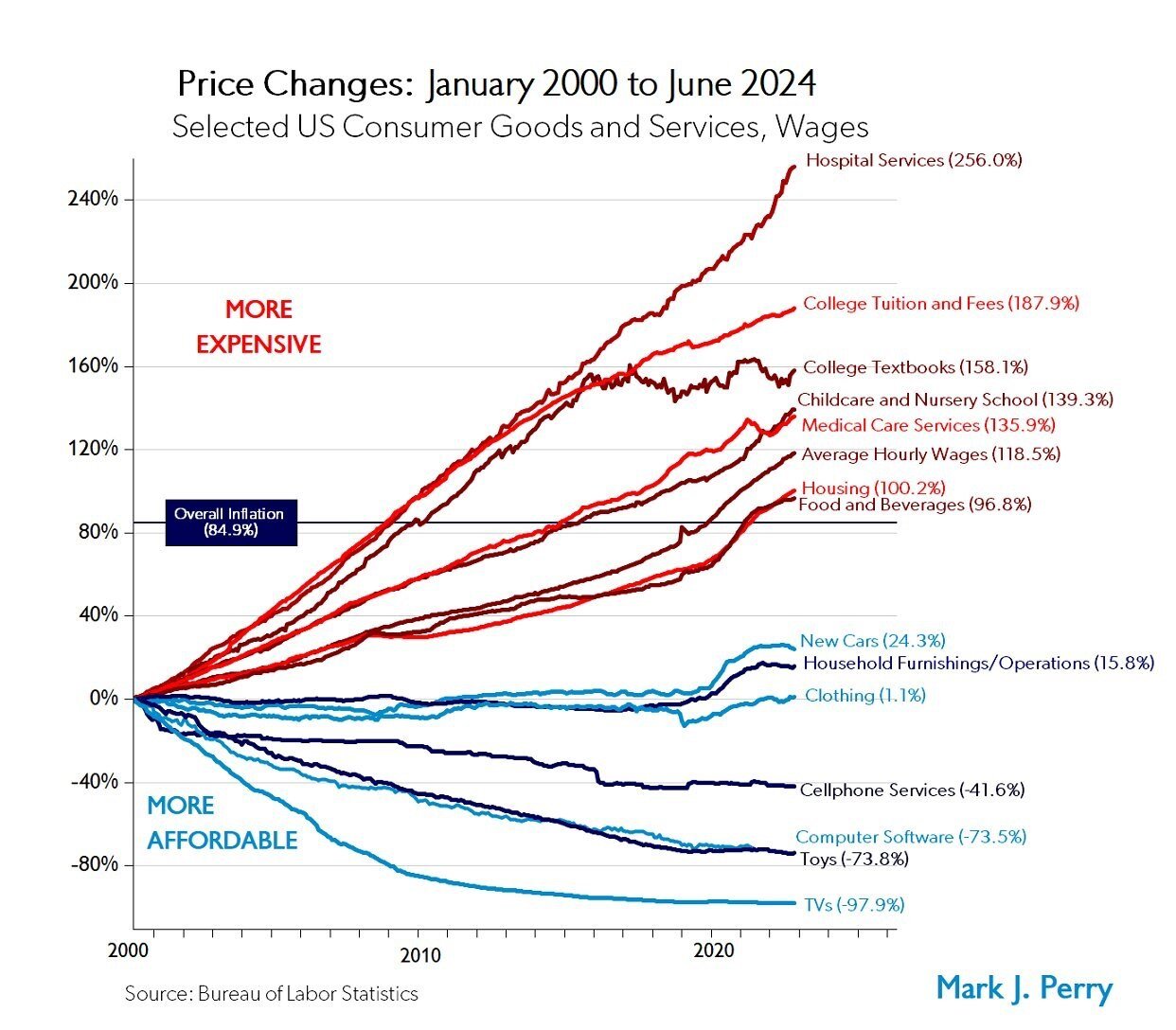
Today’s Chart of the Day from Mark Perry shows the price changes for various goods and services over the last 24 years, from January 2000 to June..

Securing a commercial real estate loan can be a pivotal step in expanding your business, investing in property, or achieving various financial..
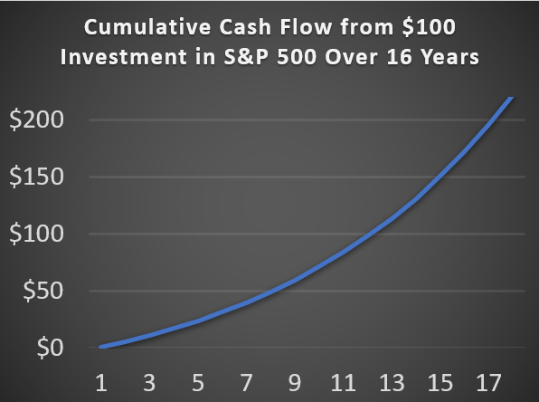
Today’s Chart of the Day is based on calculations I did from discussions with a client. It is important to remember, there are only two ways to get..
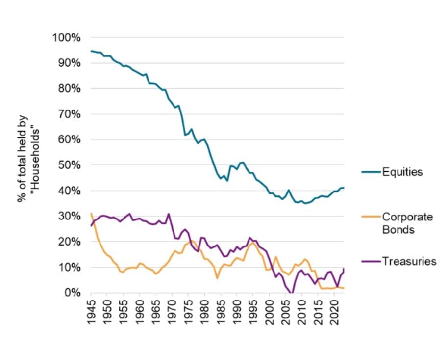
Today’s Chart of the Day from S&P Global shows the overall market share owned by individuals.

When it comes to financing a small business, navigating loan options can be overwhelming. Small Business Administration (SBA) loans and conventional..
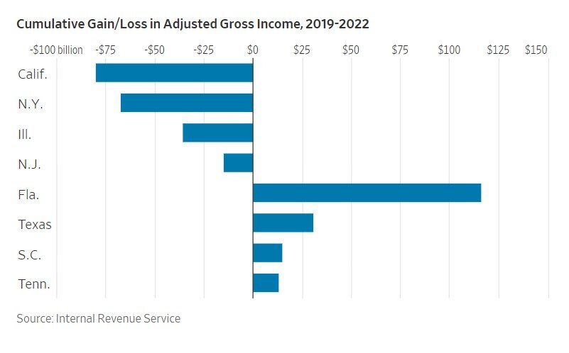
Today’s Chart of the Day is from a Wall Street Journal article recommended by Doug F., a subscriber of Chart of the Day. It is called “The Blue-State..

Building your dream home is an exciting journey, but financing the construction can be a complex process. One financing option that simplifies this..
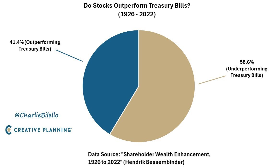
Today’s Chart of the Day was prepared by @CharlieBilello on X using data from a groundbreaking paper in 2022 by Hendrick Bessembinder.
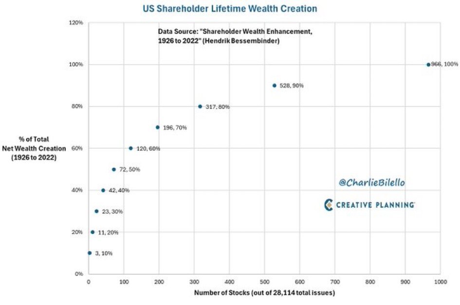
Today’s Chart of the Day is from @CharlieBilello from the Hendrick Bessembinder paper called “Shareholder Wealth Enhancement” published in 2023.
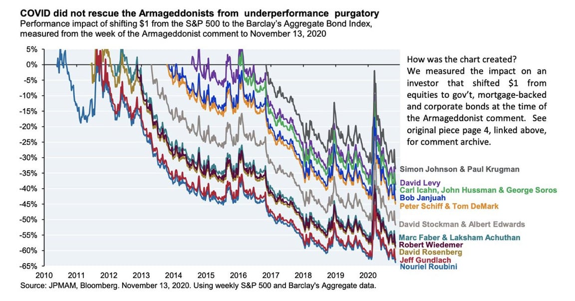
Today’s Chart of the Day from JP Morgan shared by @StevenKelly49 on X shows the results of popular economists who predicted “Doomsday” scenarios and..

Creating a will is something one often procrastinates about, assuming there’s plenty of time to do so. It can be overwhelming to think about, and you..
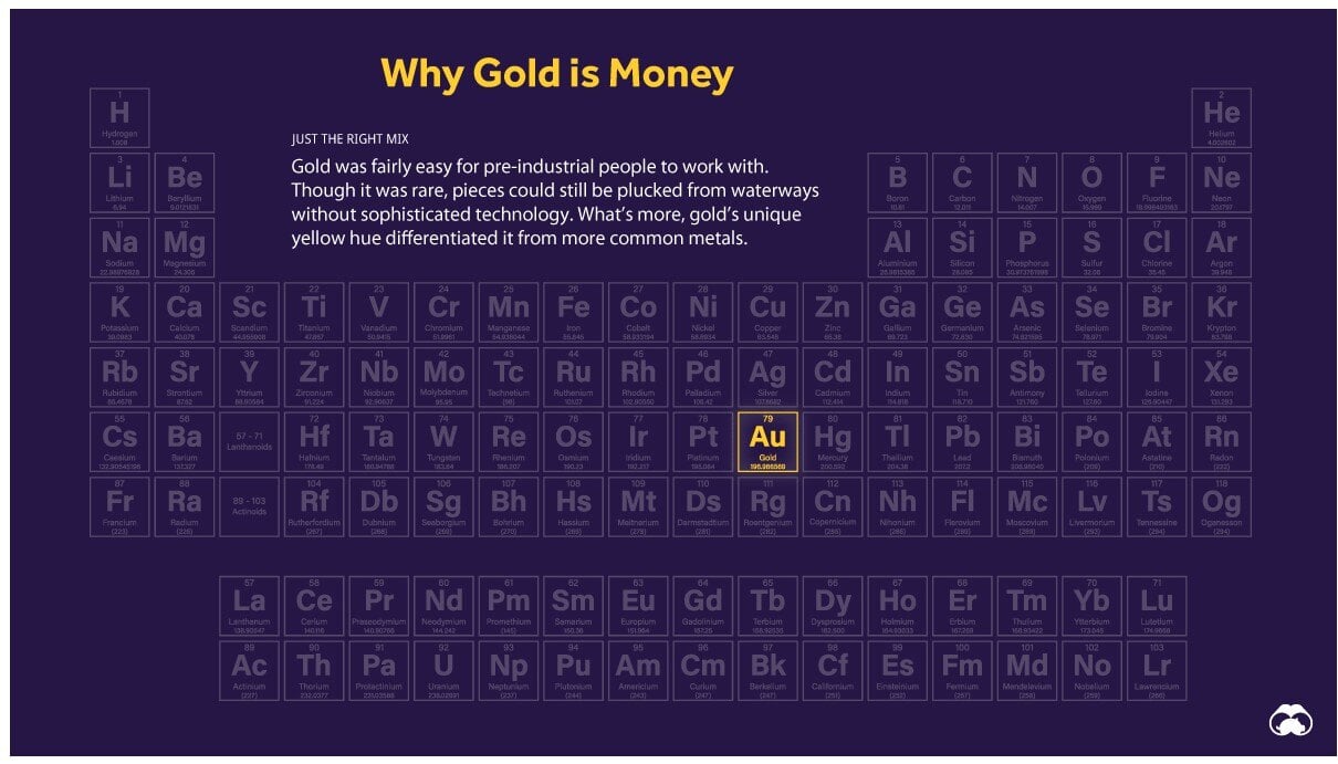
Today’s Chart of the Day is a classic from Visual Capitalist outlining why “Gold is Money” and the other 117 elements are not.