


%2011.5.2024.jpg)
.jpg)

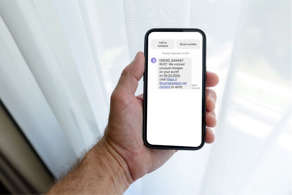
DON’T CLICK THE LINK! How to Prevent Falling Victim to Phone Scammers
According to Consumer Affairs, in 2023, there were over 310 million smartphone users in the US. Text message open rates are estimated to be as high as 98% compared to only a 20% open rate for emails, so it’s no wonder cyber criminals are focusing on texts! If you own a smart phone, you’ve likely been the recipient of a smishing text. Would you be able to tell?