


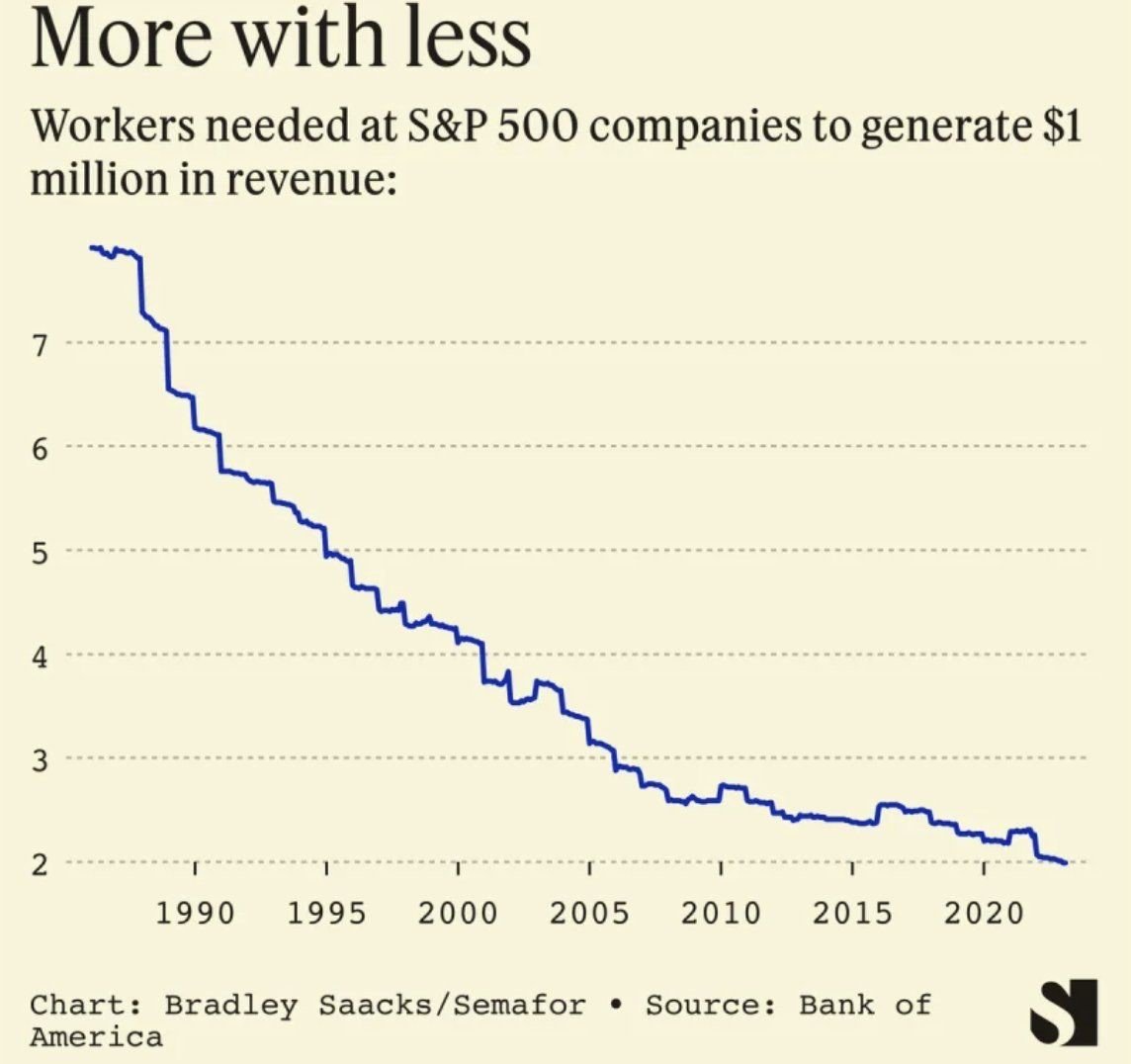
Chart of the Day: More with Less
I often joke that when I started banking in 1996 there were three of me that do the level of work I do now. This chart supports it.
Buying a home? Check out our great rates. Terms and conditions apply. Loans subject to credit approval. NMLS #406389
FDIC-Insured - Backed by the full faith and credit of the U.S. Government
BankFind
This bank is insured by the Federal Deposit Insurance Corporation. The FDIC Certificate ID is 8021. Click on the Certificate ID # to confirm this bank's FDIC coverage using the FDIC's BankFind tool.
EDIE
EDIE lets consumers and bankers know, on a per-bank basis, how the insurance rules and limits apply to a depositor's accounts-what's insured and what portion (if any) exceeds coverage limits at that bank. Check your deposit insurance coverage >>
I often joke that when I started banking in 1996 there were three of me that do the level of work I do now. This chart supports it.
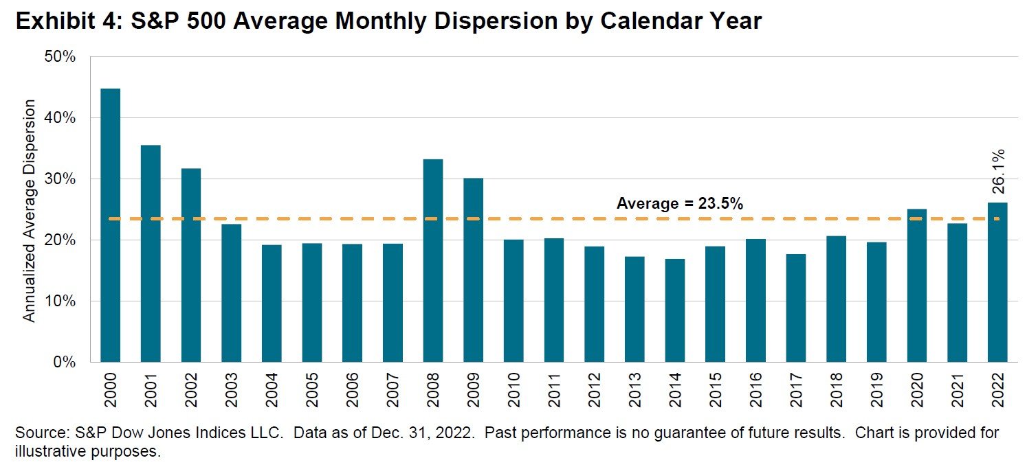
The semi-annual SPIVA (S&P Index Vs. Active) report was recently released.
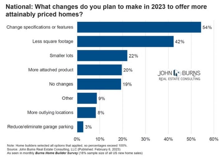
Today’s Chart of the Day is a survey of builders with data provided by John Burns Real Estate Consulting.
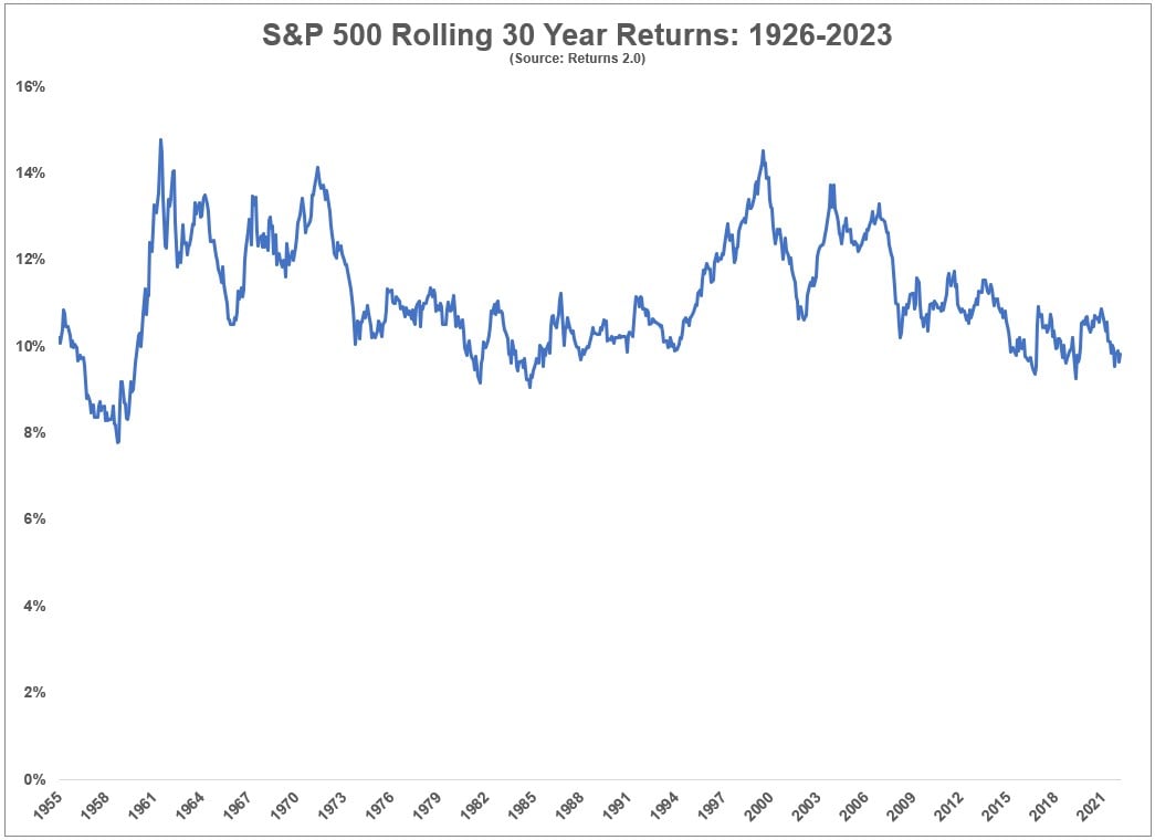
Today’s Chart of the Day comes from an article written by Ben Carlson on A Wealth of Common Sense. The chart shows rolling 30-year returns of the..

Today’s Chart of the Day comes from chartr with figures provided by the US Treasury to help us understand where our Federal Government taxes and..
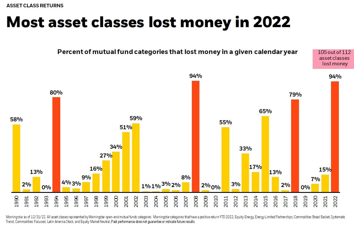
Today’s Chart of the Day comes from BlackRock and shows that 105 of 112 asset classes lost money in 2022.

As our communities continue to recover from recent hurricanes, and with everyone knee deep in tax season, we are updating a blog from December with..

Today’s Chart of the Day comes from @genticici on Twitter. I was impressed by the simplicity of the concept, and it's very apropos to be on the back..
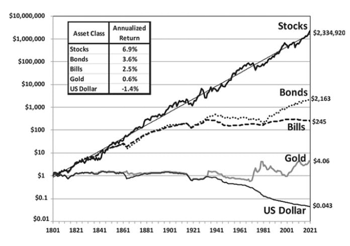
Today’s Chart of the Day is a reoccurring one we like to keep updated with current data.
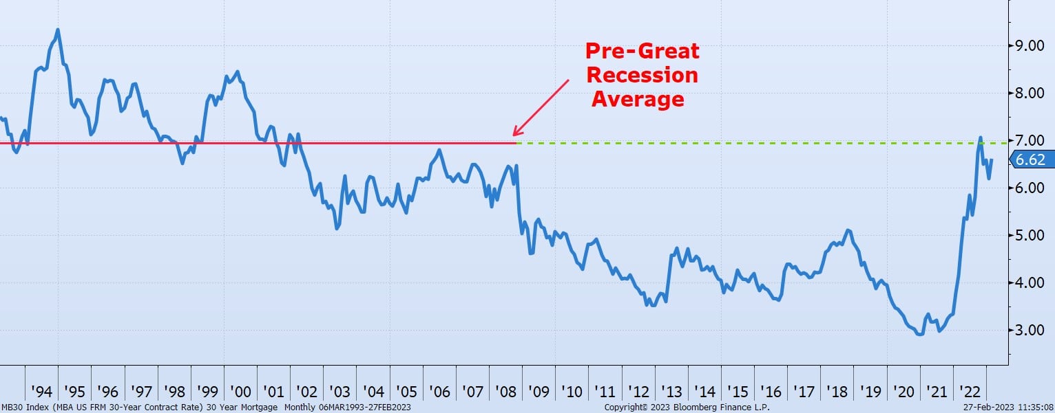
Today's Chart of the Day, compiled from information from the Mortgage Bankers Association, shows the 30-year residential rates dating back to 1993.
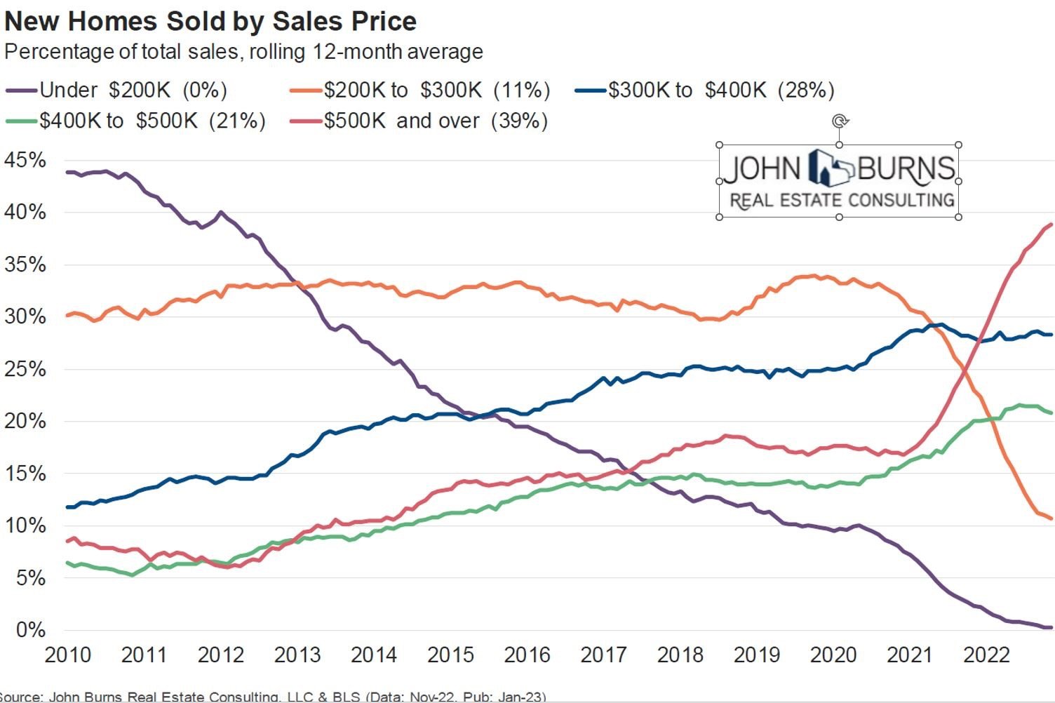
Today’s Chart of the Day comes from John Burns and shows the historical percentages of homes sold by sales price going back to 2010.
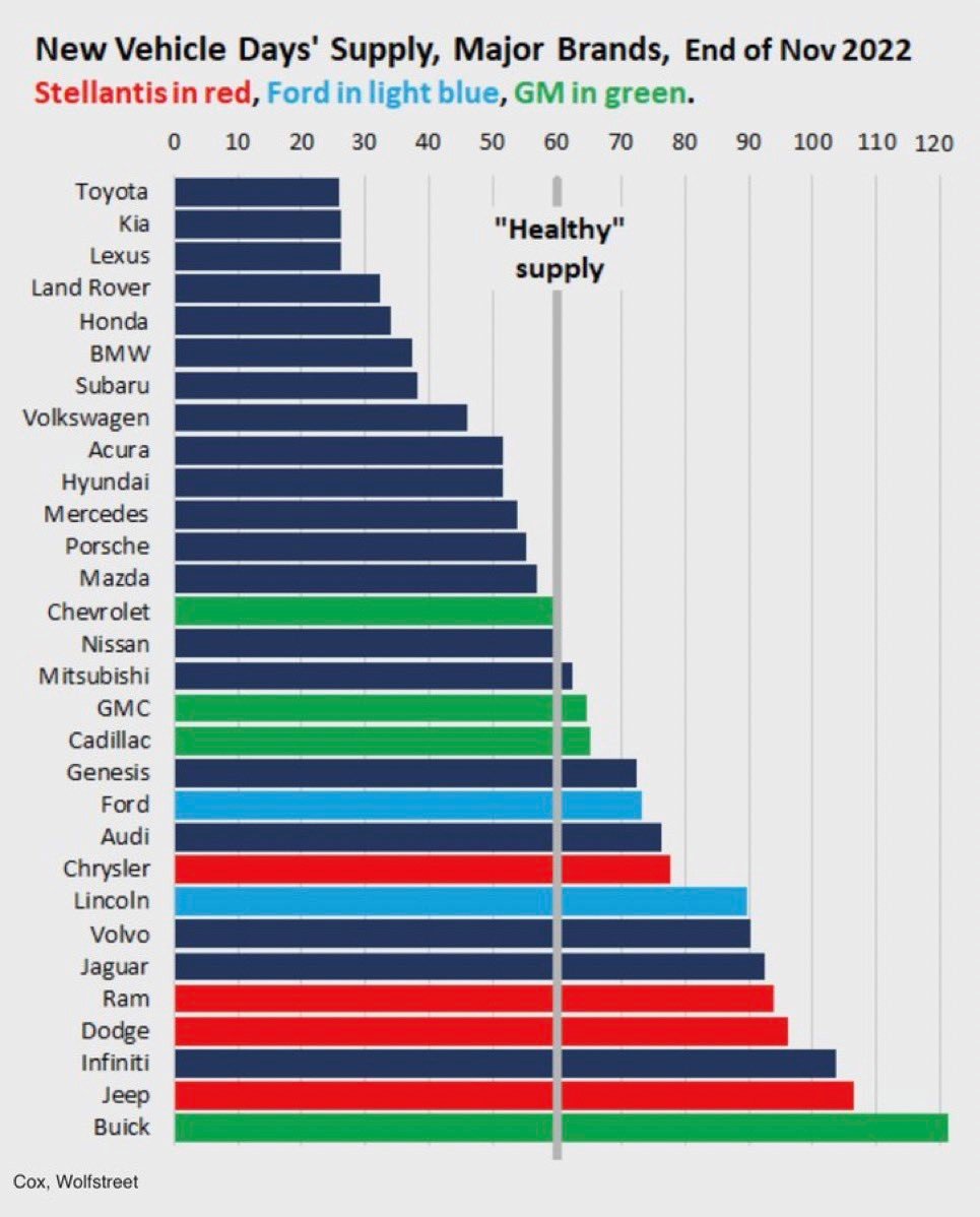
Today’s Chart of the Day comes from Wolfstreet and shows the supply of new vehicles in number of days.
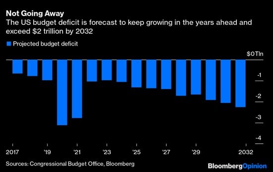
Today’s Chart of the Day is the projected budget deficits for the next 10 years provided by the Congressional Budget Office. It is not a rosy picture.
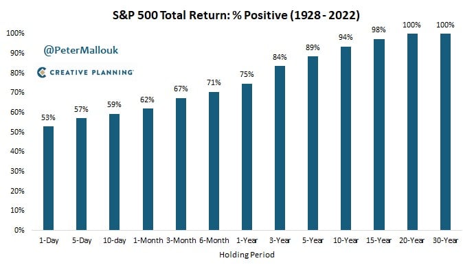
Today’s Chart of the Day comes from @PeterMallouk on Twitter and shows the percent of time the S&P 500 is positive, depending on your holding period,..

Today’s Chart of the Day is from the Federal Reserve Bank of St. Louis supporting the mantra, "Save early, Save often."
I often joke that when I started banking in 1996 there were three of me that do the level of work I do now. This chart supports it.
The semi-annual SPIVA (S&P Index Vs. Active) report was recently released.
Today’s Chart of the Day is a survey of builders with data provided by John Burns Real Estate Consulting.
Today’s Chart of the Day comes from an article written by Ben Carlson on A Wealth of Common Sense. The chart shows rolling 30-year returns of the stock market dating back to 1926.
Today’s Chart of the Day comes from chartr with figures provided by the US Treasury to help us understand where our Federal Government taxes and spends.
Today’s Chart of the Day comes from BlackRock and shows that 105 of 112 asset classes lost money in 2022.
As our communities continue to recover from recent hurricanes, and with everyone knee deep in tax season, we are updating a blog from December with information from local tax professionals that might help those who have losses or damage.
Today’s Chart of the Day comes from @genticici on Twitter. I was impressed by the simplicity of the concept, and it's very apropos to be on the back of a napkin.
Today’s Chart of the Day is a reoccurring one we like to keep updated with current data.
Today's Chart of the Day, compiled from information from the Mortgage Bankers Association, shows the 30-year residential rates dating back to 1993.
Today’s Chart of the Day comes from John Burns and shows the historical percentages of homes sold by sales price going back to 2010.
Today’s Chart of the Day comes from Wolfstreet and shows the supply of new vehicles in number of days.
Today’s Chart of the Day is the projected budget deficits for the next 10 years provided by the Congressional Budget Office. It is not a rosy picture.
Today’s Chart of the Day comes from @PeterMallouk on Twitter and shows the percent of time the S&P 500 is positive, depending on your holding period, going all the way back to 1928.
Today’s Chart of the Day is from the Federal Reserve Bank of St. Louis supporting the mantra, "Save early, Save often."
current_page_num+2: 27 -