
Recessions are Painful; Expansions are Powerful
This chart comes from the Visual Capitalist. Since 1950, the average economic expansion lasts 67 months. The average recession, though painful, only lasts 11 months.
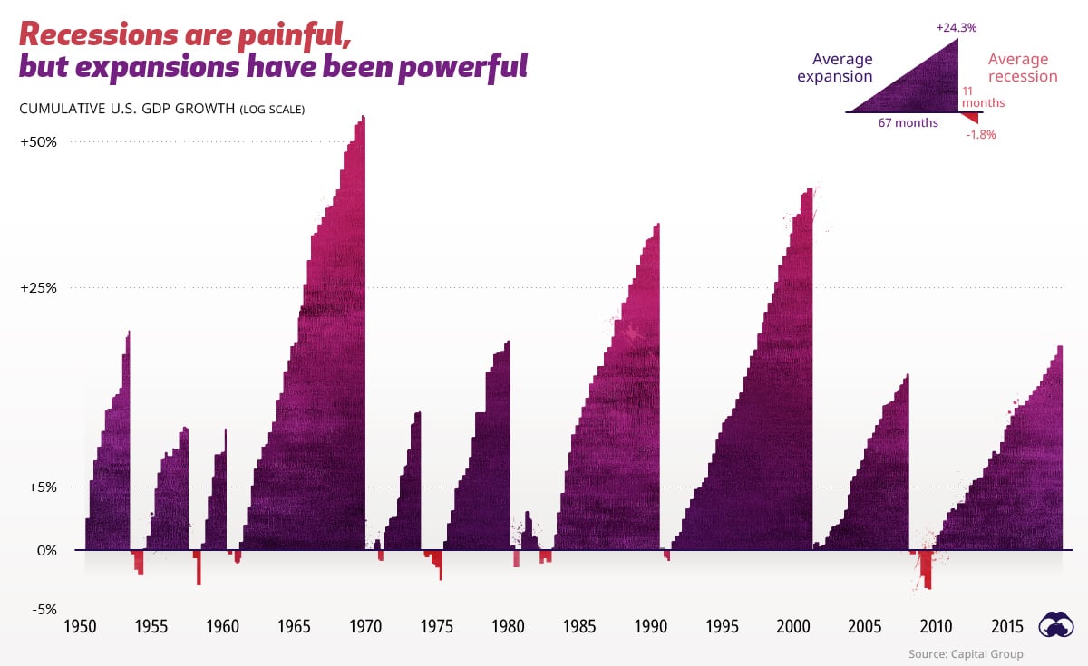
This chart comes from the Visual Capitalist. Since 1950, the average economic expansion lasts 67 months. The average recession, though painful, only..
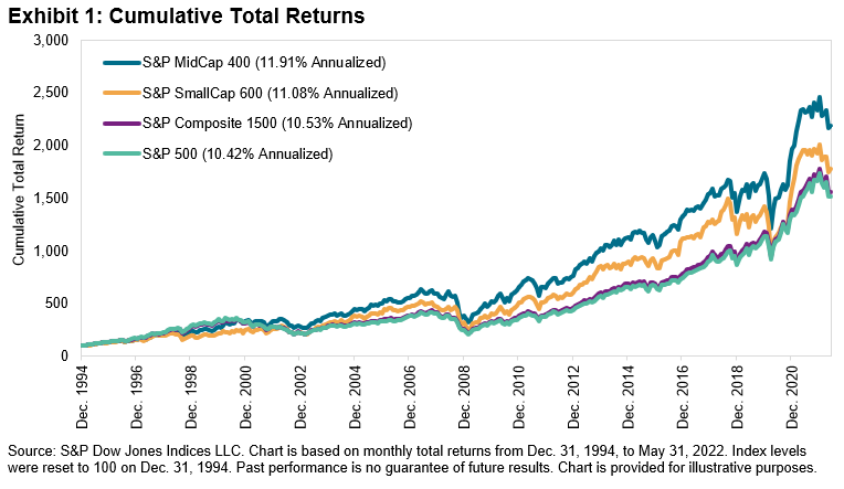
As of today, small- and mid-cap stocks on a year-to-date basis are performing better than their large-cap counterparts by 3% and 2%, respectively...
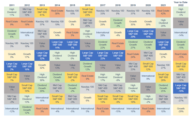
One of our clients calls this the “Chiclets Chart” because of its resemblance to that classic brand of candy-coated chewing gum.
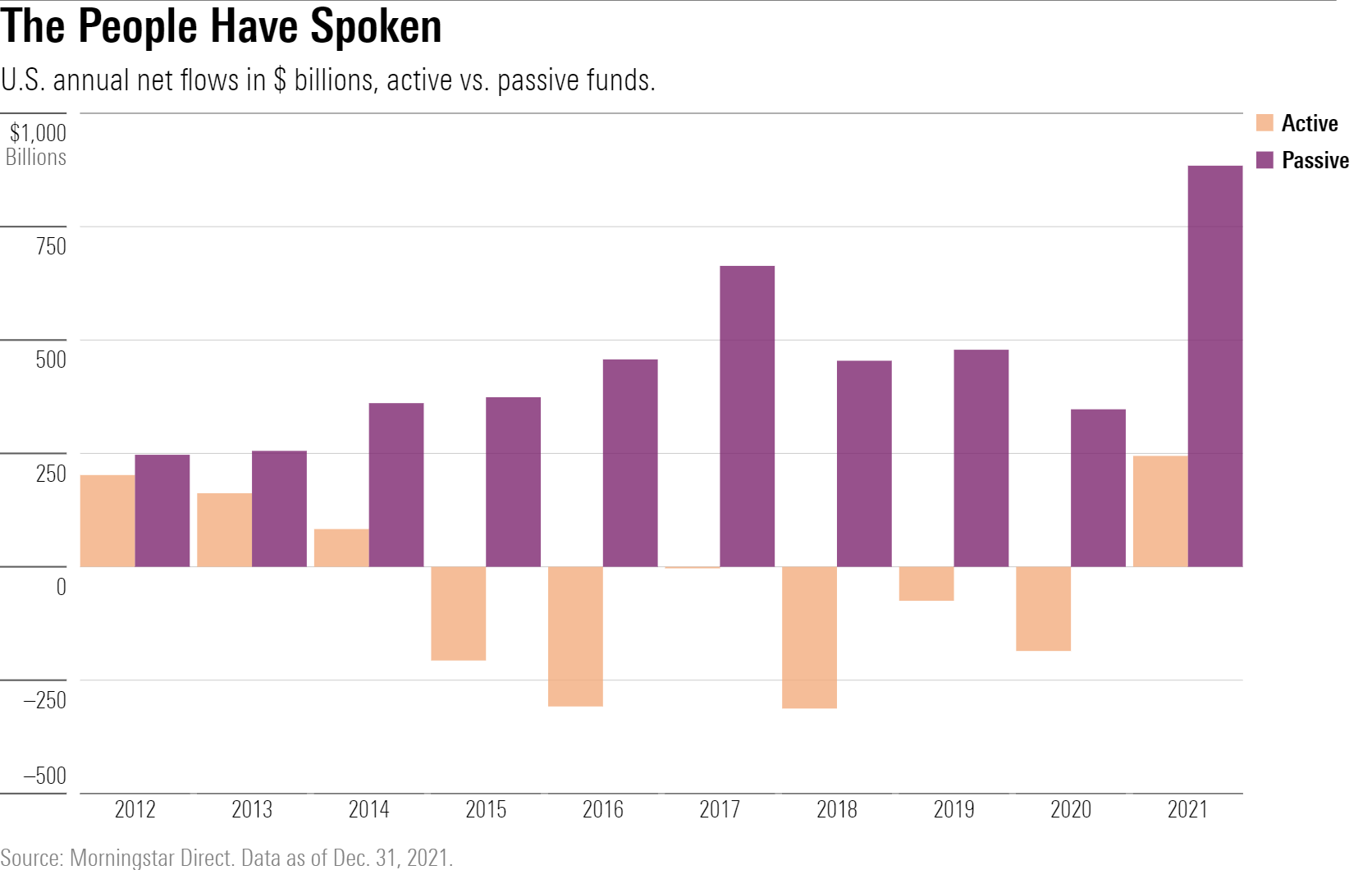
Today’s chart from Morningstar shows annual net flows into passive funds (in purple) vs. active funds (in orange), and their dominance for the last..
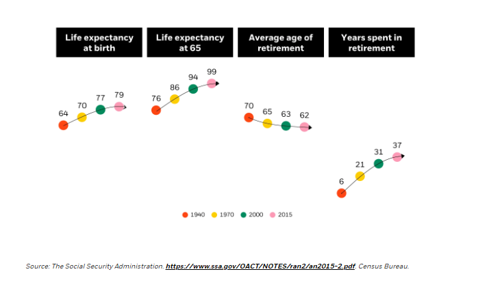
Today’s chart from BlackRock shows that from 1940 to 2015 life expectancy went up 15 years and the average years spent in retirement went from six to..
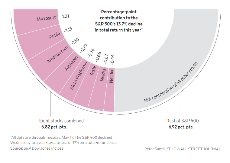
This chart is from today’s Wall Street Journal. Because of their heavy weights in the S&P 500 index, eight companies make up half of the stock..
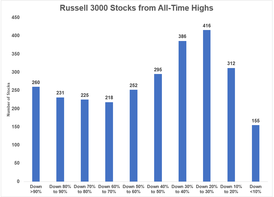
The Russell 3000 Index is made up of the largest 2,750 stocks in the United States.
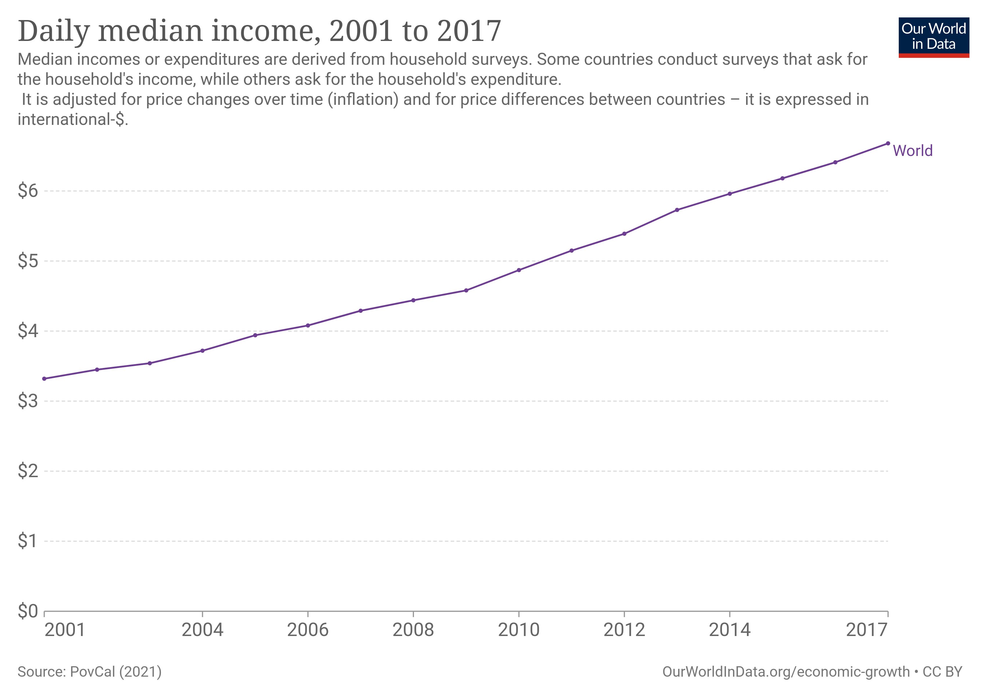
From 2001 to 2017, the daily median income doubled for everyone in the world.
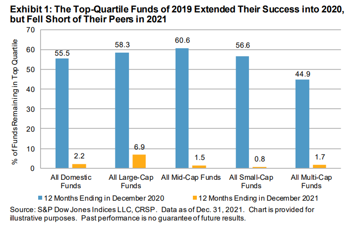
S&P Dow Jones Indices has published their updated U.S. Persistence Scorecard. A mere 2.2% of actively managed U.S. domestic equity funds in the top..
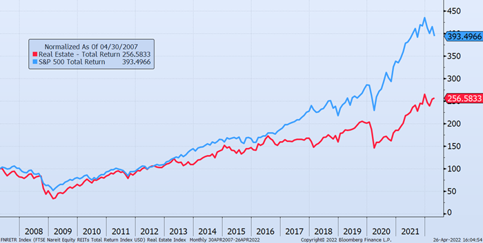
Past performance is no predictor of future success, but it is interesting to compare the past performance of different investments. These charts show..
There are two ways to make money in stocks:
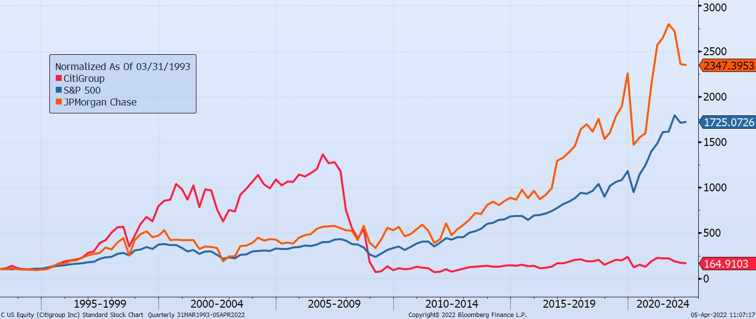
I think about this chart often during discussions with clients on having too much exposure to single stocks.
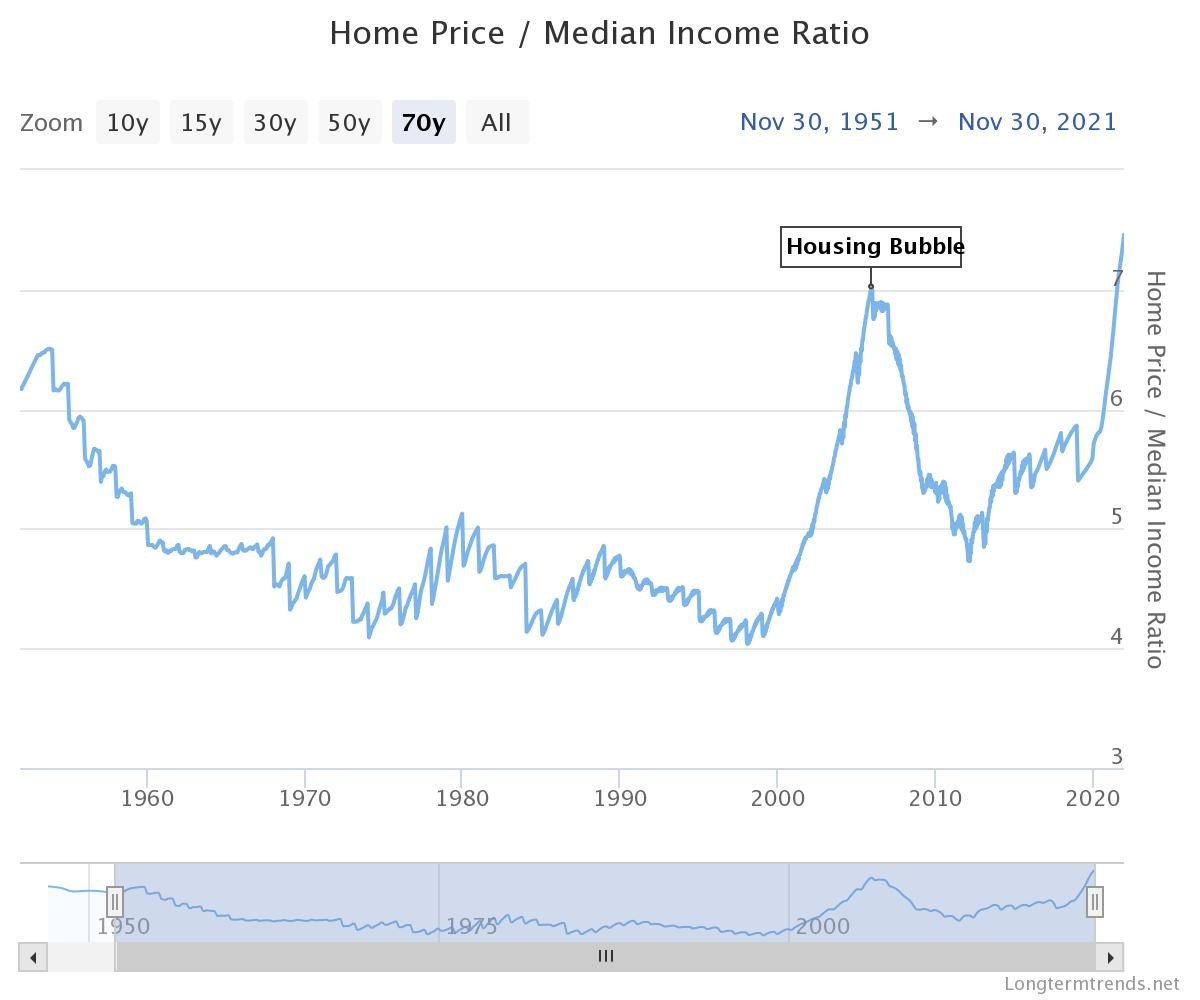
Real estate is unique since humans need a physical place to live and work. Economics says the price of those physical places is constrained by the..
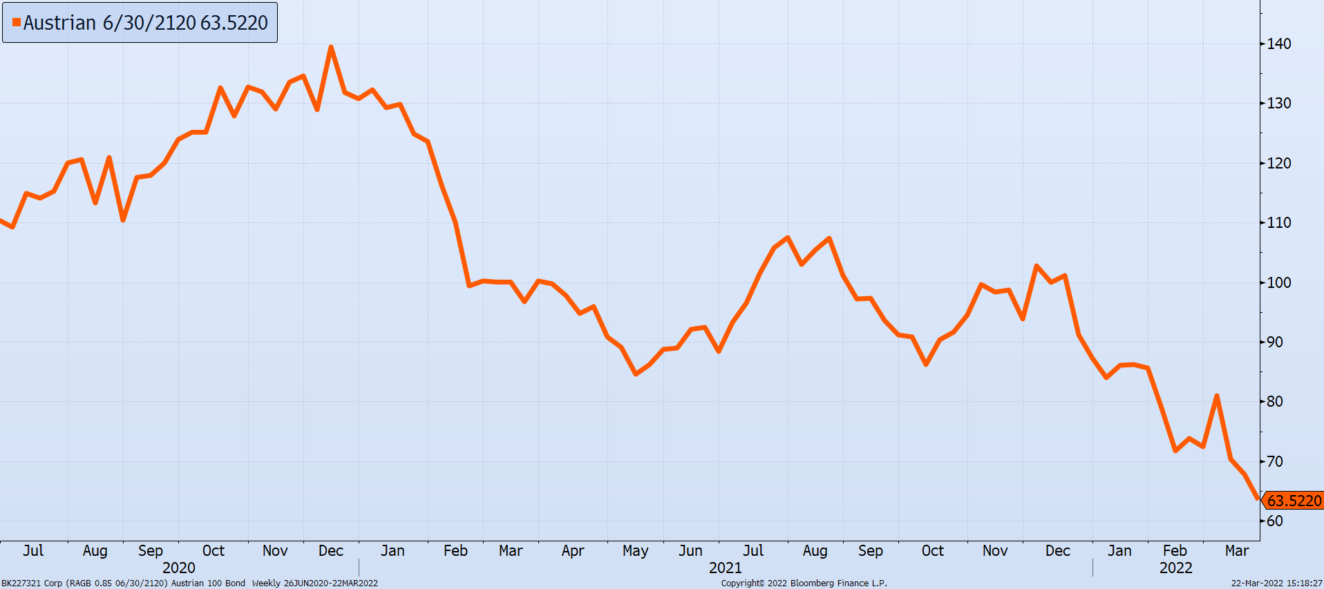
Duration describes the time it takes for a bond holder to get all their money back and/or the change in price for each 1% change in the interest rate.