
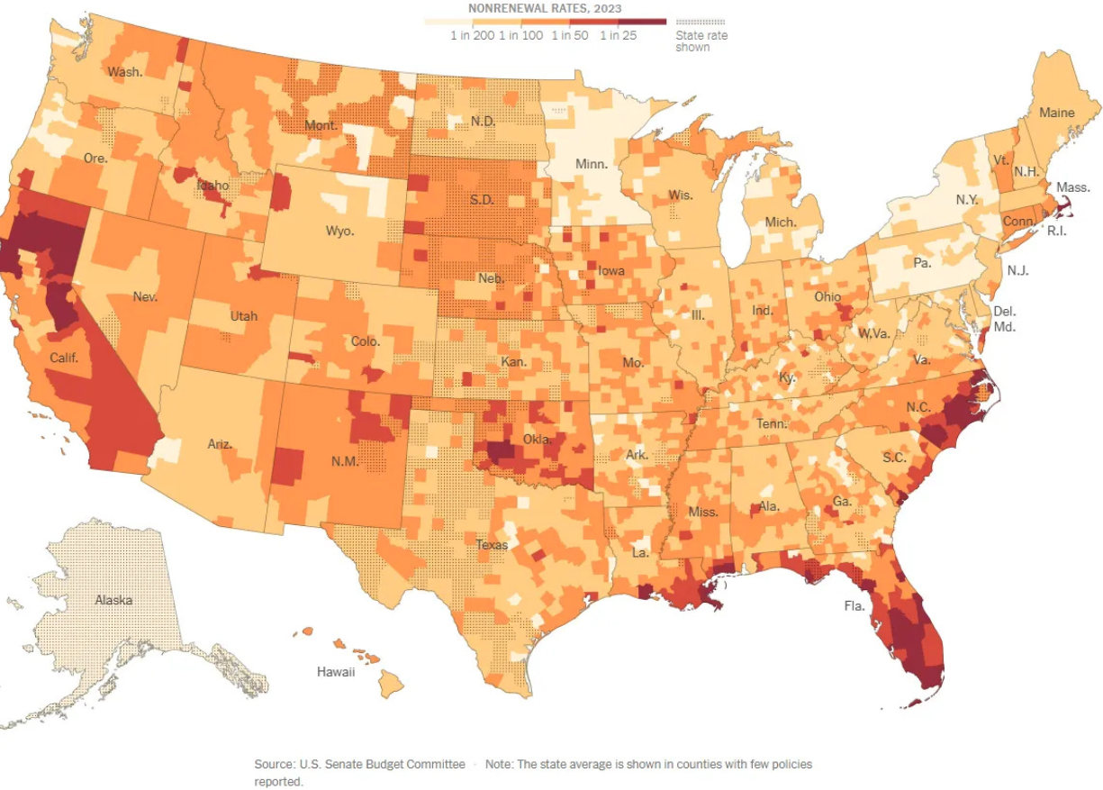
Chart of the Day: Higher Home-Owner Insurance
Today’s two charts illustrate that Florida continues to struggle with increasingly more expensive homeowner's insurance.
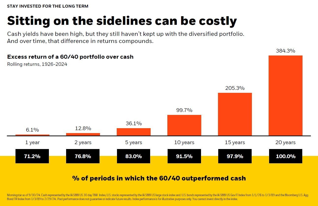
Chart of the Day: Cash Can Cost
Today's Chart of the Day, from BlackRock, illustrates the potential downside of staying in cash for too long. It highlights the excess returns of a..
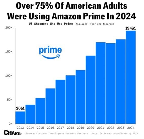
Chart of the Day: 75% Use Prime
Today’s Chart of the Day from Chartr shows that over 75% of American’s are using Amazon Prime as of 2024. Amazon is now the 4th largest company in..
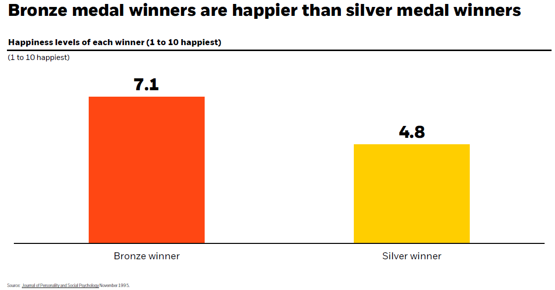
Chart of the Day: Bronze Happier Than Silver
Today’s Chart of the Day has data from the Journal of Personality and Social Psychology used by our partners at BlackRock (the company that owns..
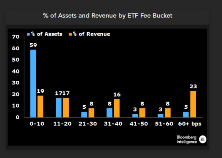
Chart of the Day: Fees go on Forever
Today’s Chart of the Day from Bloomberg shows the percentage of assets and revenue by ETFs (Exchange Traded Funds), which we use extensively in..
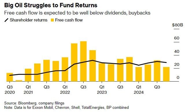
Chart of the Day: The Value Stocks of Big Oil
Today’s Chart of the Day, shared by my colleague Angie Parsons, is from an article in Bloomberg which illustrates what a “value” stock is.
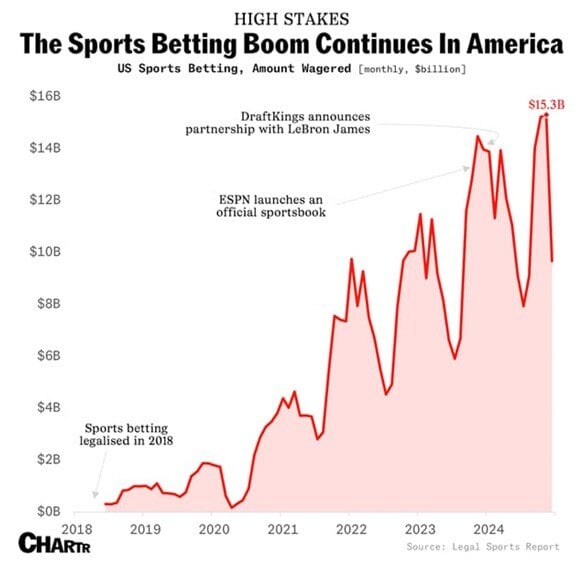
Chart of the Day: Online Sports Betting
As we near the Super Bowl, today’s Chart of the Day is from Chartr and shows the boom in online monthly sports betting.
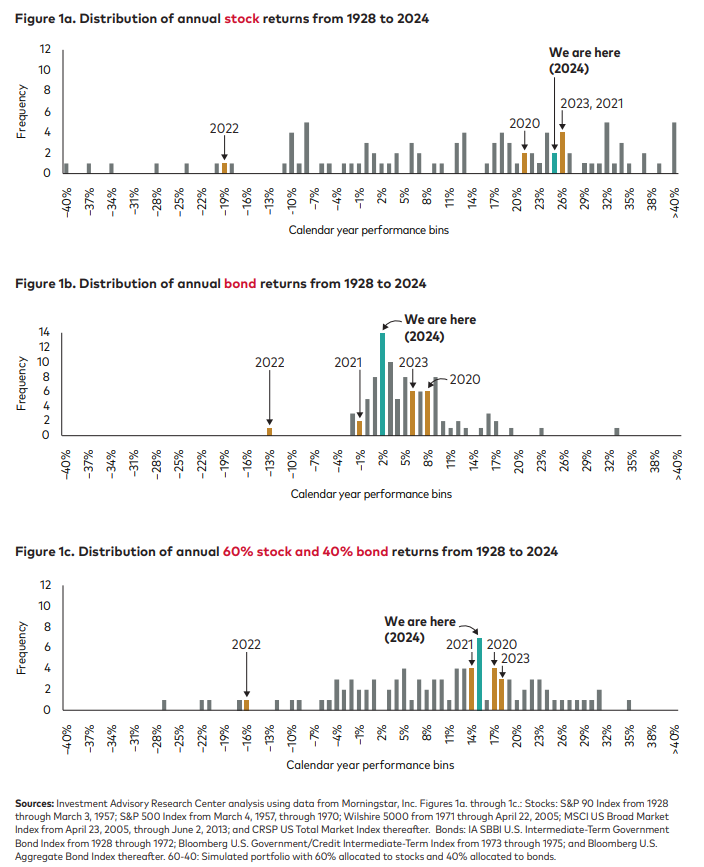
Chart of the Day: Return Distributions
Today’s Chart of the Day from Vanguard shows the distribution of returns from 1928 to 2024, for stocks, bonds, and a combined 60% stock/40% bond..
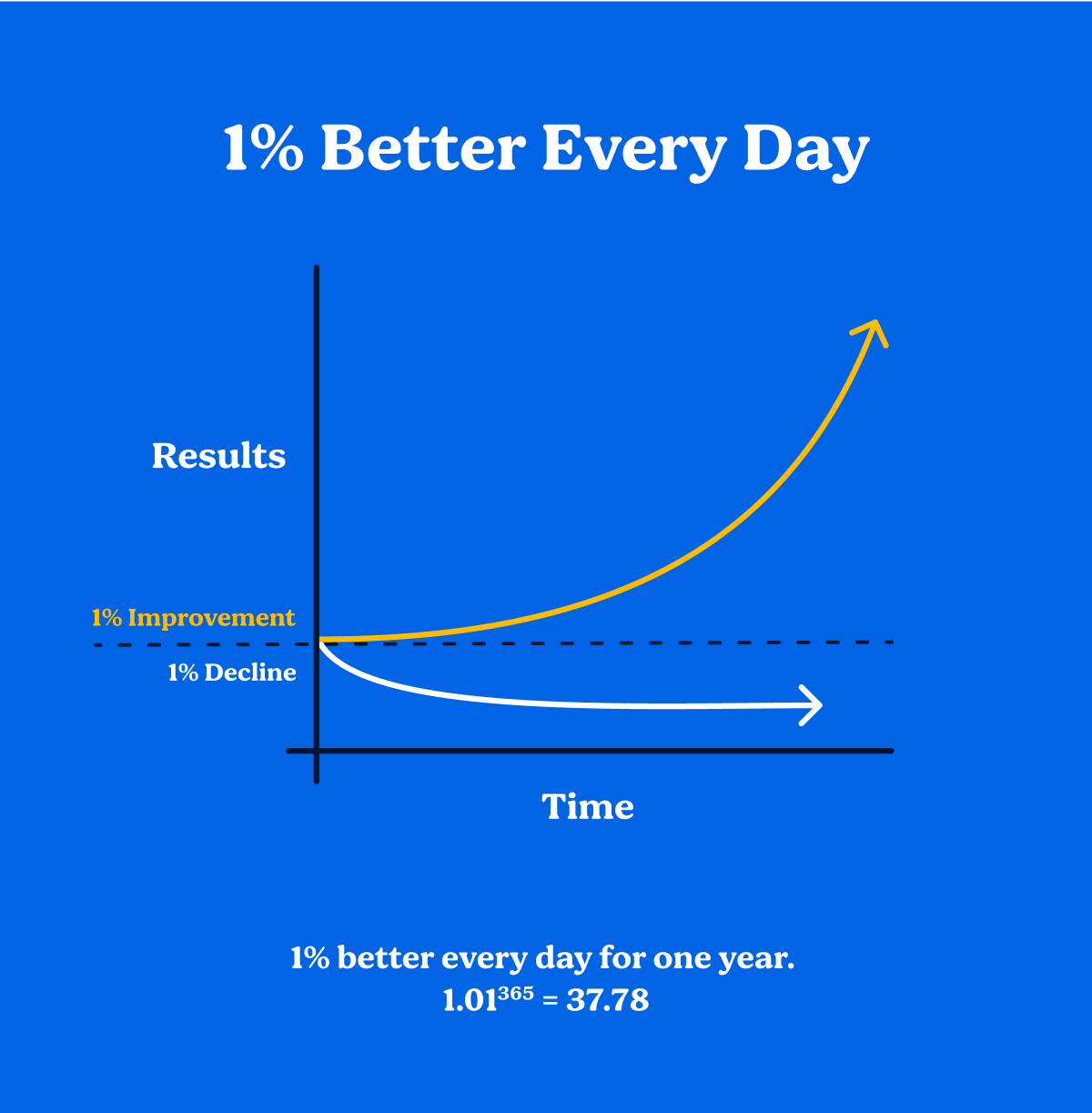
Chart of the Day: Atomic Habit of 1%
Today’s Chart of the Day is a little different than others, but one to think about. It’s from the book Atomic Habits by James Clear written in 2018.