
Chart of the Day: Imbalance of Rent vs. Buy
Today’s Chart is from Zillow showing that typically the share of income spent on housing costs for homeowners, such as mortgage, taxes, and insurance, has been lower than what renters pay for rental units.
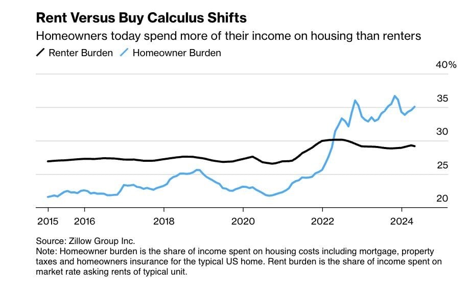
Today’s Chart is from Zillow showing that typically the share of income spent on housing costs for homeowners, such as mortgage, taxes, and..
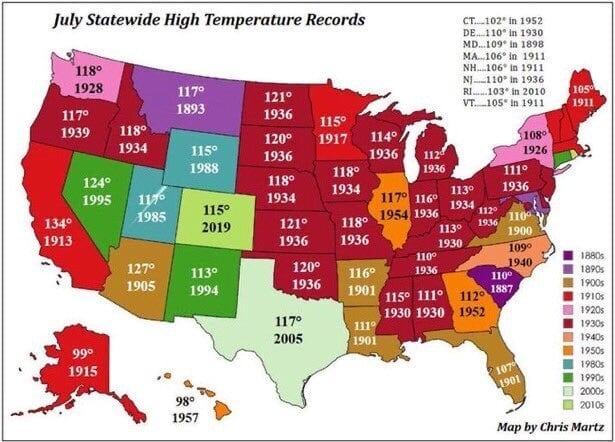
As we all walk outside this month and think, “It is hot!", remember today’s Chart of the Day from the Statewide High Temperature Records set during..

Today’s Chart of the Day is from Jon Erlichman and shows what I like to call the “Brand Wheel".
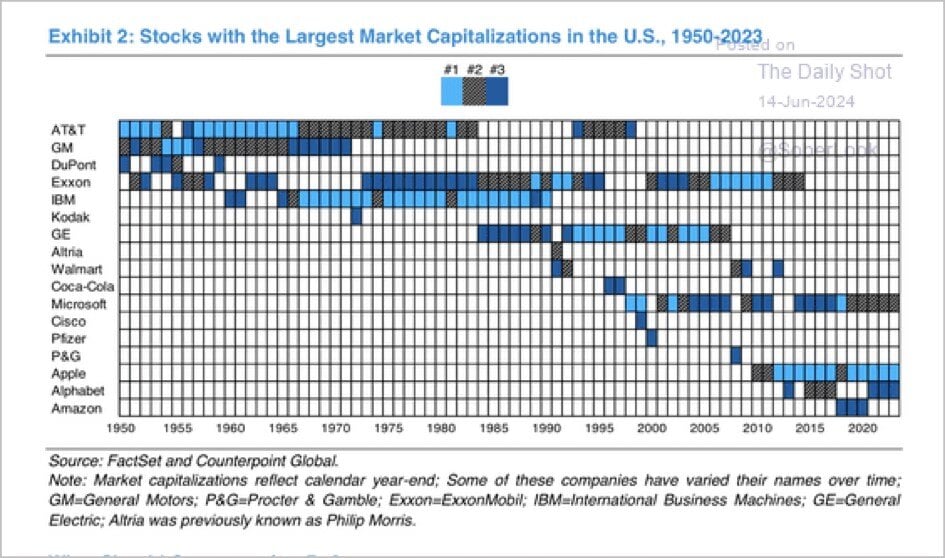
Today’s Chart of the Day is from Counterpoint Global with data from FactSet. It shows the top three largest US companies from 1950 to 2023. AT&T..

Today’s Chart of the Day is from the Financial Times and shows the number of annual hours worked, per worker, for select economies since 1974.

Owning a business is a significant achievement but with it comes the responsibility of planning for its future. Whether you intend to keep the..
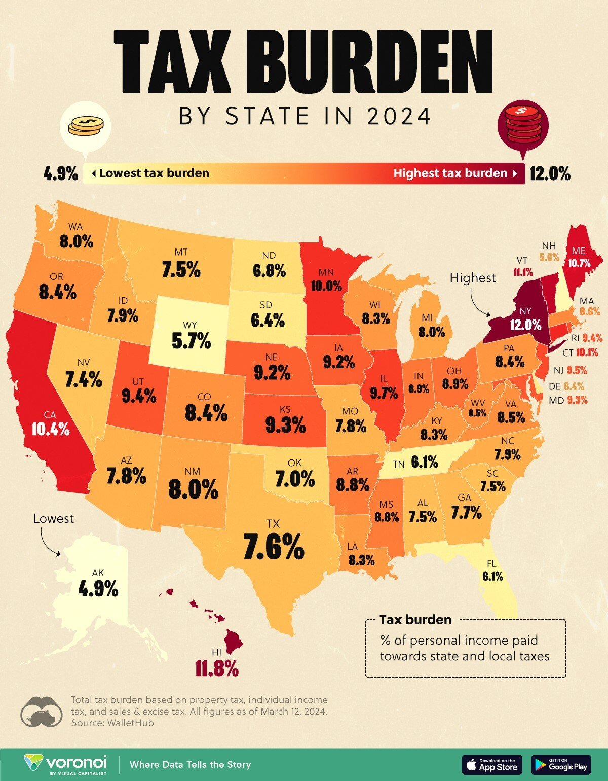
Today’s Chart of the Day is from Visualcapitalist.com and shows the percentage of personal income paid toward state and local taxes by state in 2024.
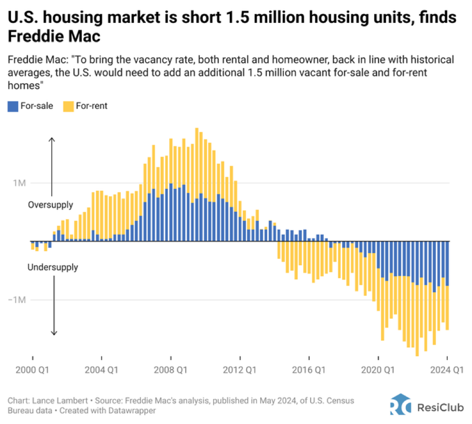
Today’s Chart of the Day from ResiClub shows that the US housing market is short 1.5 million housing units. As with all things, the causes, fixes,..
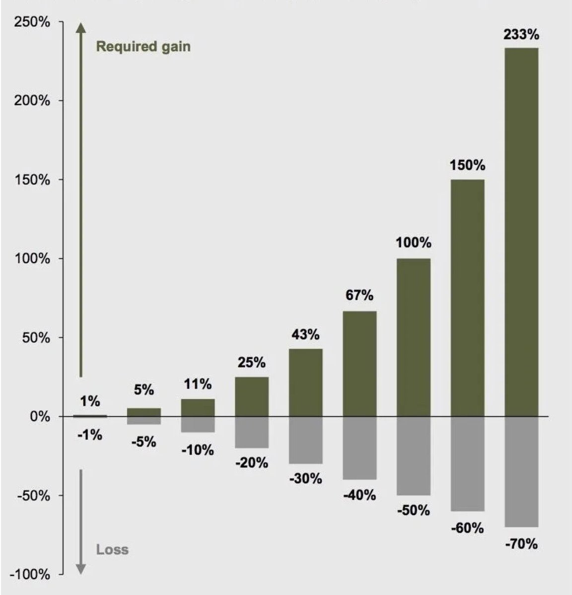
Today’s Chart of the Day is from Compounding Quality ( Compounding Quality (@QCompounding) / X) and shows the percentage gain needed to recover from..
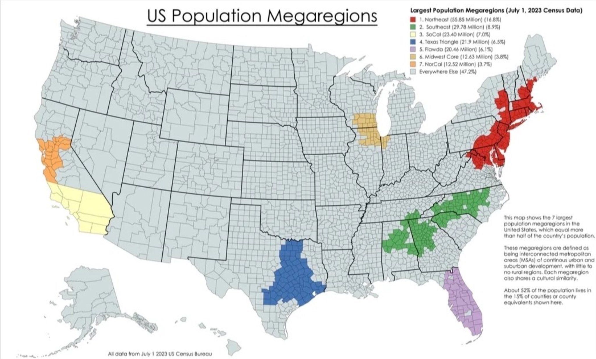
Today’s Chart of the Day with data from the US Census Bureau compiled by Michael Arouet shows that 52% of the US population lives in seven “Mega..

Today’s Chart of the Day from Epic Maps, @Locati0ns on X, shows that 50% of the world’s Gross Domestic Product (aka GDP, which is a measure of all..
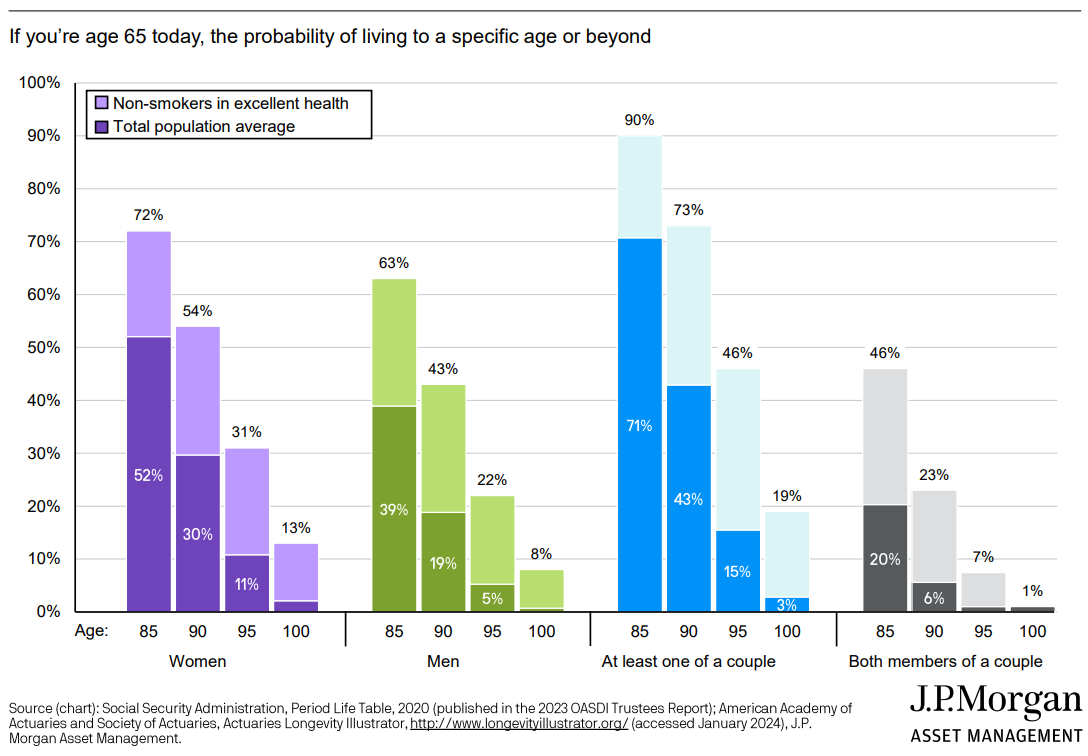
Today’s Chart of the Day from JP Morgan shows the probability of how long you'll live if you reach age 65.
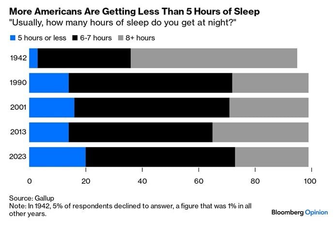
Today’s Chart of the Day is from Bloomberg and shows the amount of sleep Americans are getting is less and less.
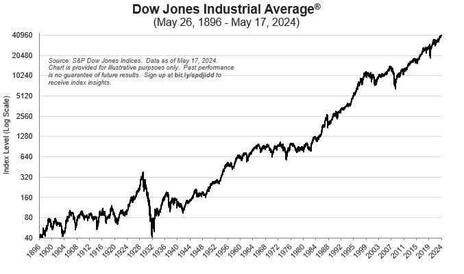
Today’s Chart of the Day is from the S&P Dow Jones Indices showing the history of the Dow Jones Industrial Average index. It started in 1896 at 40..
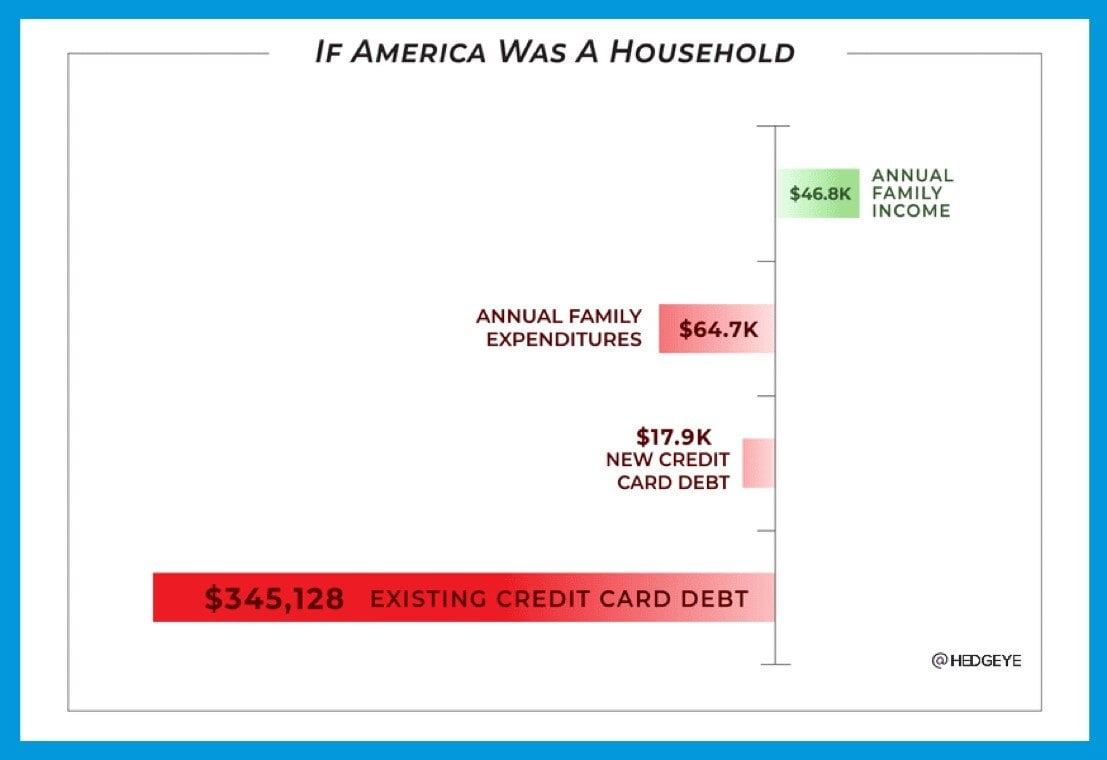
Today’s Chart of the Day is from @hedgeye on X, formerly known as Twitter, and shows what a typical family income would look like if the US was a..