
Chart of the Day: Government Bonds Dominate the US Bond Market
Today’s Chart of the Day is from Avantis Investors and shows the weighted percentage of bonds issued by various sectors of the market.
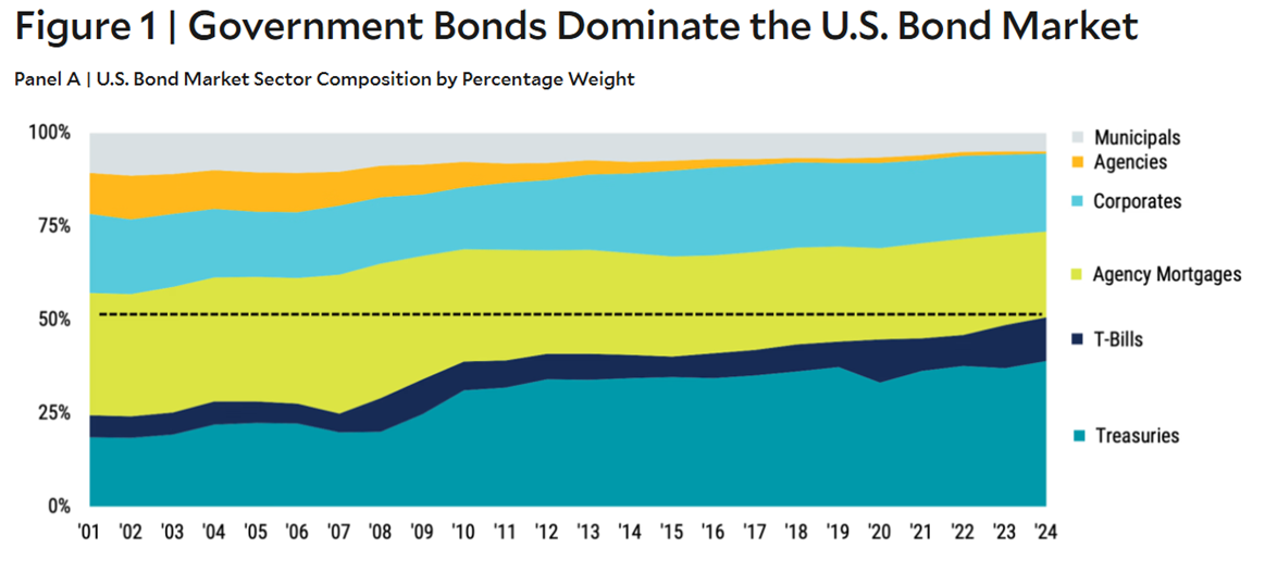
Today’s Chart of the Day is from Avantis Investors and shows the weighted percentage of bonds issued by various sectors of the market.

Today’s Chart of the Day is from a study by Cornell University (arXiv.org) published in July 2025, called “Working with AI: Measuring the..
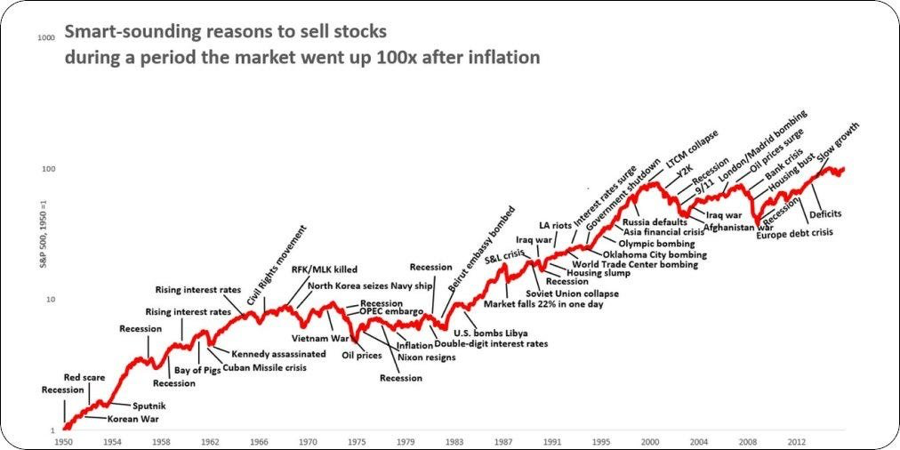
Today’s Chart is from @QCompounding showing 50+ "smart-sounding" reasons used to sell stocks since 1950 to 2020, all while the market went up 100(x)..
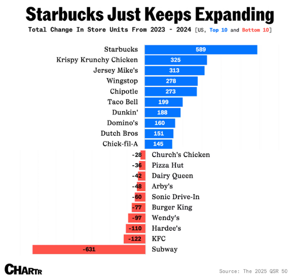
Today’s Chart of the Day is from Chartr and confirms you are not imaging things while driving around. Yes, you are seeing more and more Starbucks pop..
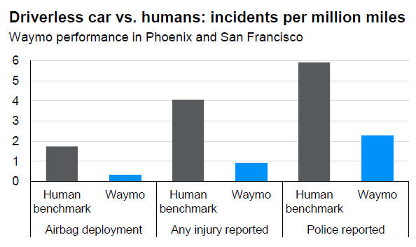
Today’s Chart of the Day is from a Waymo*/Stanford report shared by JP Morgan that shows the “incidents per million miles" comparing human drivers,..
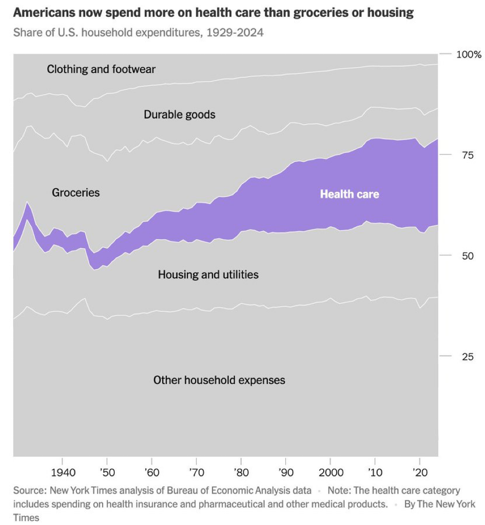
Today’s Chart of the Day from The New York Times shows the share of US household expenditures in various consumer categories, such as groceries,..
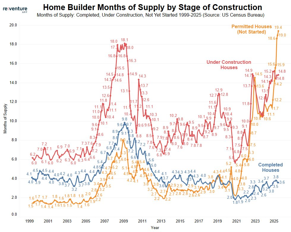
Today’s Chart of the Day is from re:venture and shows the history of home builder months of supply by stage of construction.
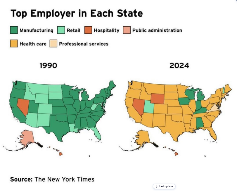
Today’s Chart of the Day, shared by my colleague Jackson Garner, is from an article in The New York Times showing the change in the top employer (by..
As we closed out the first half of 2025, all I could think is, “That was a wild ride!”
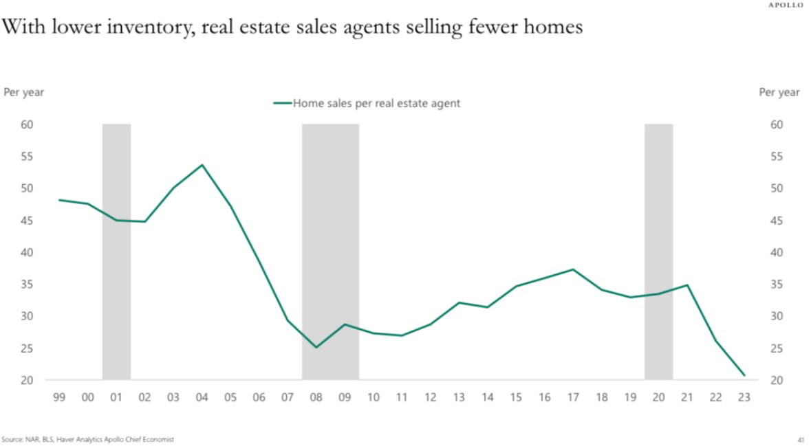
Today’s Chart of the Day is from Torsten Slok of Apollo Global Management's US Housing Outlook report, showing home sales per real estate agent since..

Join Christine Hause, Vice President and Senior Wealth Strategist, and me, Chart of the Day author Samuel A. Kiburz, Senior Vice President, Chief..
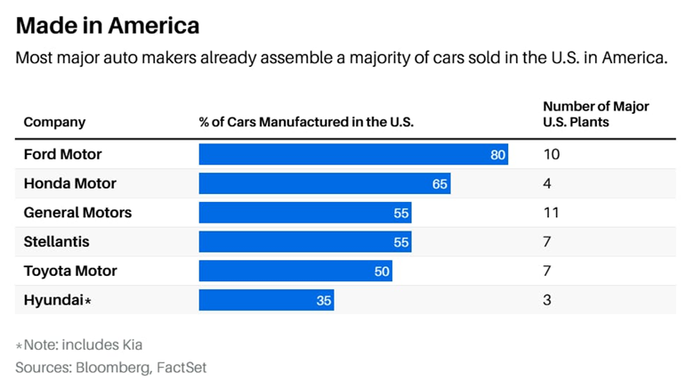
Today’s Chart of the Day, from Barron’s with data from Bloomberg, shows what percentage of a car is assembled in the US by manufacturer and the..
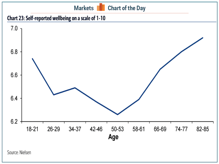
Today’s Chart of the Day, based on a Nielsen survey, shows the changes in the level of self-reported wellbeingon a scale from 1-10, by age.
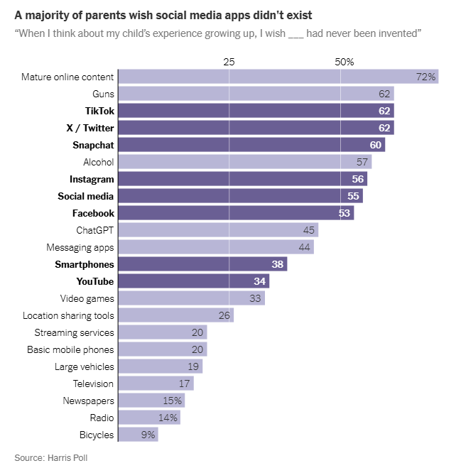
Today’s Chart of the Day, “We Don’t Have to Give in to the Smartphones,” is from a New York Times article.
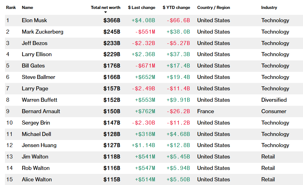
Today’s Chart of the Day is from Bloomberg’s Billionaires Index, listing the 15 wealthiest individuals on the planet.