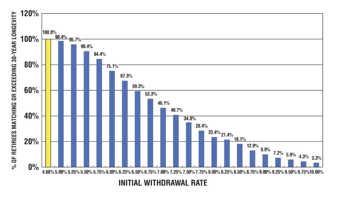
Skip to content

Learn about our Refer-a-Friend Program. Terms and conditions apply.

Hurricane season is unpredictable. Your finances shouldn’t be. A Home Equity Line of Credit (HELOC) gives you access to funds when you need them most.

Get Started 863-222-7005

Blog

Your Weekly
Financial Forecast


Stay informed with sound financial know-how

Chart illustrating Total Risk, with unsystematic risk noted in light blue and systematic risk in darker blue.

Chart of the Day: More Investments = Less Risk (To a Point)

Today’s Chart of the Day spotlights an important investment concept which was pioneered by Harry Markowitz, a Nobel Prize winner and pioneer of the..

Read More

black bar chart

Chart of the Day: Work from Home Figures Sticky at 30%

Today’s Chart of the Day from Wolfstreet shows that Work from Home, a.k.a. WFH, is getting “sticky” at 30% after peaking at 60% during the pandemic.

Read More

Line graph illustrating the median age of homebuyers from 1981 to 2024

Chart of Day - Median Age of Homebuyers

Today’s Chart of the Day uses data from the National Association of Realtors compiled by Torsten Sølk with Apollo, showing the history of the median..

Read More

 Map of US with orange highlights from light to dark with the darker the shade indicates the higher number of insurance non-renewals. Map of the US with blue highlights from light to dark illustrating the 3-year insurance premium change with the darker the shade indicating the higher the increase.

Chart of the Day: Higher Homeowner Insurance

Today’s two charts illustrate that Florida continues to struggle with increasingly more expensive homeowners' insurance.

Read More

Bar graph illustrating cash vs 60/40 portfolio results over 1, 2, 5, 10, 15 and 20 years. Red bars indicate the percentage of time the 60/40 outperformed cash, while black bars show the percentage of time that cash underperformed during that same time period.

Chart of the Day: Cash Can Cost

Today's Chart of the Day, from BlackRock, illustrates the potential downside of staying in cash for too long. It highlights the excess returns of a..

Read More

bar chart in amazon blue showing growth of use over time

Chart of the Day: 75% Use Prime

Today’s Chart of the Day from Chartr shows that over 75% of American’s are using Amazon Prime as of 2024. Amazon is now the 4th largest company in..

Read More

Graph showing the happiness level of Olympic bronze (red) and silver medalists (yellow) on a scale of 1 (lowest) to 10 (highest)

Chart of the Day: Bronze Happier Than Silver

Today’s Chart of the Day has data from the Journal of Personality and Social Psychology used by our partners at BlackRock (the company that owns..

Read More

percentage of assets shown in blue, percentage of funds in orange

Chart of the Day: Fees go on Forever

Today’s Chart of the Day from Bloomberg shows the percentage of assets and revenue by ETFs (Exchange Traded Funds), which we use extensively in..

Read More

Yellow bar graph by year, from 2020 to 2024, comparing the history of stockholder returns (black line) for Big Oil

Chart of the Day: The Value Stocks of Big Oil

Today’s Chart of the Day, shared by my colleague Angie Parsons, is from an article in Bloomberg which illustrates what a “value” stock is.

Read More

red line chart showing the stark rise in sports betting since 2018

Chart of the Day: Online Sports Betting

As we near the Super Bowl, today’s Chart of the Day is from Chartr and shows the boom in online monthly sports betting.

Read More

Three charts showing returns

Chart of the Day: Return Distributions

Today’s Chart of the Day from Vanguard shows the distribution of returns from 1928 to 2024, for stocks, bonds, and a combined 60% stock/40% bond..

Read More

blue chart showing 1% increase overtime

Chart of the Day: Atomic Habit of 1%

Today’s Chart of the Day is a little different than others, but one to think about. It’s from the book Atomic Habits by James Clear written in 2018.

Read More

Line chart illustrating the real US Housing Index starting in 1890 to present.

Chart of the Day: Long Term Real Estate Prices

Today’s Chart of the Day, from OfDollarsndData, shows the Shiller inflation-adjusted value for US housing since 1890 and is the longest historical..

Read More

price of diamonds indicated by blue line on the chart

Chart of the Day: Are Diamonds Not Forever?

Today’s Chart of the Day comes from Bank of America and shows the price of diamonds going back 22 years. After spiking in 2022, diamond prices are..

Read More

Colored grid illustrating the GDP of various countries, color grouped by region.

Chart of the Day: Size of the World

Today’s Chart of the Day is from Visual Capitalist, looking at the $115 trillion world economy in 2025, broken down by county.

Read More

Samuel A. Kiburz, Senior Vice President, Chief Investment Officer

Samuel serves as Senior Vice President, Chief Investment Officer for the Crews family of banks. He manages the individual investment holdings of his clients, including individuals, families, foundations, and institutions throughout the State of Florida. Samuel has been involved in banking since 1996 and has more than 20 years experience working in wealth management.

Investments are not a deposit or other obligation of, or guaranteed by, the bank, are not FDIC insured, not insured by any federal government agency, and are subject to investment risks, including possible loss of principal.

Find me on:

Recent Posts

Chart of the Day: More Investments = Less Risk (To a Point)

Today’s Chart of the Day spotlights an important investment concept which was pioneered by Harry Markowitz, a Nobel Prize winner and pioneer of the Modern Portfolio Theory in 1952. 

More

Chart of the Day: Work from Home Figures Sticky at 30%

Today’s Chart of the Day from Wolfstreet shows that Work from Home, a.k.a. WFH, is getting “sticky” at 30% after peaking at 60% during the pandemic.

More

Chart of Day - Median Age of Homebuyers

Today’s Chart of the Day uses data from the National Association of Realtors compiled by Torsten Sølk with Apollo, showing the history of the median age of all homebuyers. In 1981 the median age was 31 and in 2024 it peaked to a high of 56. 

More

Chart of the Day: Higher Homeowner Insurance

Today’s two charts illustrate that Florida continues to struggle with increasingly more expensive homeowners' insurance.

More

Chart of the Day: Cash Can Cost

Today's Chart of the Day, from BlackRock, illustrates the potential downside of staying in cash for too long. It highlights the excess returns of a 60% stock/40% bond portfolio compared to cash since 1926. The top bars (red) show these returns; for instance, a 10-year holding period yields returns 100% higher than cash.

The black boxes below show the percentage of time cash underperforms; for 10 years, that is 91% of the time.

This highlights the old adage, "It’s not about timing the market, but time in the market." If you have funds that you will not need for more than 10+ years, historically, stocks have been your best bet.

More

Chart of the Day: 75% Use Prime

Today’s Chart of the Day from Chartr shows that over 75% of American’s are using Amazon Prime as of 2024. Amazon is now the 4th largest company in the United States and has an annual return of 27% a year vs. 15% for the S&P 500 over the same time frame.

More

Chart of the Day: Bronze Happier Than Silver

Today’s Chart of the Day has data from the Journal of Personality and Social Psychology used by our partners at BlackRock (the company that owns iShares) for a presentation they recently provided to our clients.

More

Chart of the Day: Fees go on Forever

Today’s Chart of the Day from Bloomberg shows the percentage of assets and revenue by ETFs (Exchange Traded Funds), which we use extensively in portfolios.

More

Chart of the Day: The Value Stocks of Big Oil

Today’s Chart of the Day, shared by my colleague Angie Parsons, is from an article in Bloomberg which illustrates what a “value” stock is.

More

Chart of the Day: Online Sports Betting

As we near the Super Bowl, today’s Chart of the Day is from Chartr and shows the boom in online monthly sports betting.

More

Chart of the Day: Return Distributions

Today’s Chart of the Day from Vanguard shows the distribution of returns from 1928 to 2024, for stocks, bonds, and a combined 60% stock/40% bond portfolio. It also shows where we have ended up in the last four years.

More

Chart of the Day: Atomic Habit of 1%

Today’s Chart of the Day is a little different than others, but one to think about. It’s from the book Atomic Habits by James Clear written in 2018.

More

Chart of the Day: Long Term Real Estate Prices

Today’s Chart of the Day, from OfDollarsndData, shows the Shiller inflation-adjusted value for US housing since 1890 and is the longest historical chart I’ve ever seen for real estate values.

More

Chart of the Day: Are Diamonds Not Forever?

Today’s Chart of the Day comes from Bank of America and shows the price of diamonds going back 22 years. After spiking in 2022, diamond prices are now the lowest ever.

More

Chart of the Day: Size of the World

Today’s Chart of the Day is from Visual Capitalist, looking at the $115 trillion world economy in 2025, broken down by county.

More