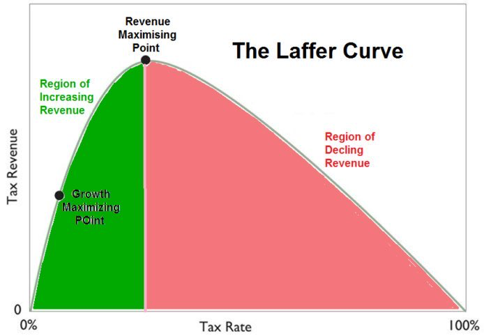
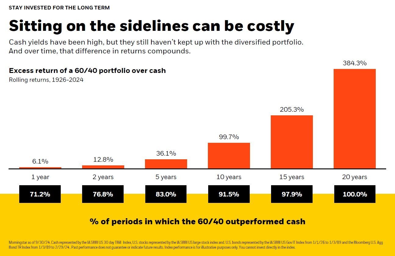
Chart of the Day: US Work Ethic
Today’s Chart of the Day is from the Financial Times and shows the number of annual hours worked, per worker, for select economies since 1974.
Learn about our Refer-a-Friend Program. Terms and conditions apply.
Today’s Chart of the Day is from the Financial Times and shows the number of annual hours worked, per worker, for select economies since 1974.
Owning a business is a significant achievement but with it comes the responsibility of planning for its future. Whether you intend to keep the..
Today’s Chart of the Day is from Visualcapitalist.com and shows the percentage of personal income paid toward state and local taxes by state in 2024.
Today’s Chart of the Day from ResiClub shows that the US housing market is short 1.5 million housing units. As with all things, the causes, fixes,..
Today’s Chart of the Day is from Compounding Quality ( Compounding Quality (@QCompounding) / X) and shows the percentage gain needed to recover from..
Today’s Chart of the Day with data from the US Census Bureau compiled by Michael Arouet shows that 52% of the US population lives in seven “Mega..
Today’s Chart of the Day from Epic Maps, @Locati0ns on X, shows that 50% of the world’s Gross Domestic Product (aka GDP, which is a measure of all..
Today’s Chart of the Day from JP Morgan shows the probability of how long you'll live if you reach age 65.
Today’s Chart of the Day is from Bloomberg and shows the amount of sleep Americans are getting is less and less.
Today’s Chart of the Day is from the S&P Dow Jones Indices showing the history of the Dow Jones Industrial Average index. It started in 1896 at 40..
Today’s Chart of the Day is from @hedgeye on X, formerly known as Twitter, and shows what a typical family income would look like if the US was a..
Today’s Chart of the Day was shared by my colleague Christine Davis, Director of Commercial Banking Services at Crews Bank & Trust.
Today’s Chart of the Day from Our World in Data shows the death rate from cancer per 100,000 people going back to 1950.
Today’s Chart of the Day is from the Wall Street Journal and shows the percentage of the World’s Gross Domestic Product (GDP) provided by the largest..
Today’s Chart of the Day from Yahoo Finance shows the annual returns of the stock market by year for the last 40 years, which resulted in an average..
Samuel serves as Senior Vice President, Chief Investment Officer for the Crews family of banks. He manages the individual investment holdings of his clients, including individuals, families, foundations, and institutions throughout the State of Florida. Samuel has been involved in banking since 1996 and has more than 20 years experience working in wealth management.
Investments are not a deposit or other obligation of, or guaranteed by, the bank, are not FDIC insured, not insured by any federal government agency, and are subject to investment risks, including possible loss of principal.
Today’s Chart of the Day is from the Financial Times and shows the number of annual hours worked, per worker, for select economies since 1974.
Owning a business is a significant achievement but with it comes the responsibility of planning for its future. Whether you intend to keep the business within your family, sell it, or ensure its smooth operation after you pass away, adequate planning is crucial. Careful estate planning can protect your business from unexpected tax liabilities and ensure its continuity according to your wishes.
Today’s Chart of the Day is from Visualcapitalist.com and shows the percentage of personal income paid toward state and local taxes by state in 2024.
Today’s Chart of the Day from ResiClub shows that the US housing market is short 1.5 million housing units. As with all things, the causes, fixes, and effect on our economy are part of a long equation, much too long for this post.
Today’s Chart of the Day with data from the US Census Bureau compiled by Michael Arouet shows that 52% of the US population lives in seven “Mega Regions” which are made up of only 15% of the total land in the US.
Today’s Chart of the Day from Epic Maps, @Locati0ns on X, shows that 50% of the world’s Gross Domestic Product (aka GDP, which is a measure of all the things produced) comes from these green areas, which in turn makes up only 3.6% of the total land mass of the world. Yes, it includes Florida.
Today’s Chart of the Day from JP Morgan shows the probability of how long you'll live if you reach age 65.
Today’s Chart of the Day is from Bloomberg and shows the amount of sleep Americans are getting is less and less.
Today’s Chart of the Day is from the S&P Dow Jones Indices showing the history of the Dow Jones Industrial Average index. It started in 1896 at 40 and recently reached 40,000.
Today’s Chart of the Day is from @hedgeye on X, formerly known as Twitter, and shows what a typical family income would look like if the US was a typical household.
Today’s Chart of the Day was shared by my colleague Christine Davis, Director of Commercial Banking Services at Crews Bank & Trust.
Today’s Chart of the Day from Our World in Data shows the death rate from cancer per 100,000 people going back to 1950.
Today’s Chart of the Day is from the Wall Street Journal and shows the percentage of the World’s Gross Domestic Product (GDP) provided by the largest countries over the last 20 years.
Today’s Chart of the Day from Yahoo Finance shows the annual returns of the stock market by year for the last 40 years, which resulted in an average return of 12%.
current_page_num+2: 8 -