



- Financial Resources
- Blog
Blog
Your Weekly
Financial Forecast
Stay informed with sound financial know-how
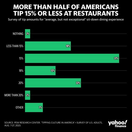
Chart of the Day: Tipping of 15%
Today’s Chart of the Day comes from Yahoo Finance and shows the tipping amount percentages for “average" service.
Chart of the Day: Stocks From 1824 to Today
Today’s Chart of the Day comes from Bank of America research provided by Ibbotson, which is an investment research company. It is a nice follow up..
Chart of the Day: Buy the Dip
Today’s Chart of the Day comes from Vanguard, and though it is not true in all cases, it is true in most, that since 1980 the best time to buy is..
Chart of the Day: High Price to Pay
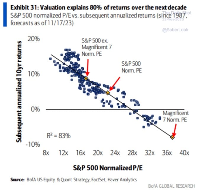
Today’s Chart of the Day from Bank of America Equity & Quant Strategy shows the price you pay for future earnings explains 80% of the returns for the..
Chart of the Day: Amazon Bests UPS
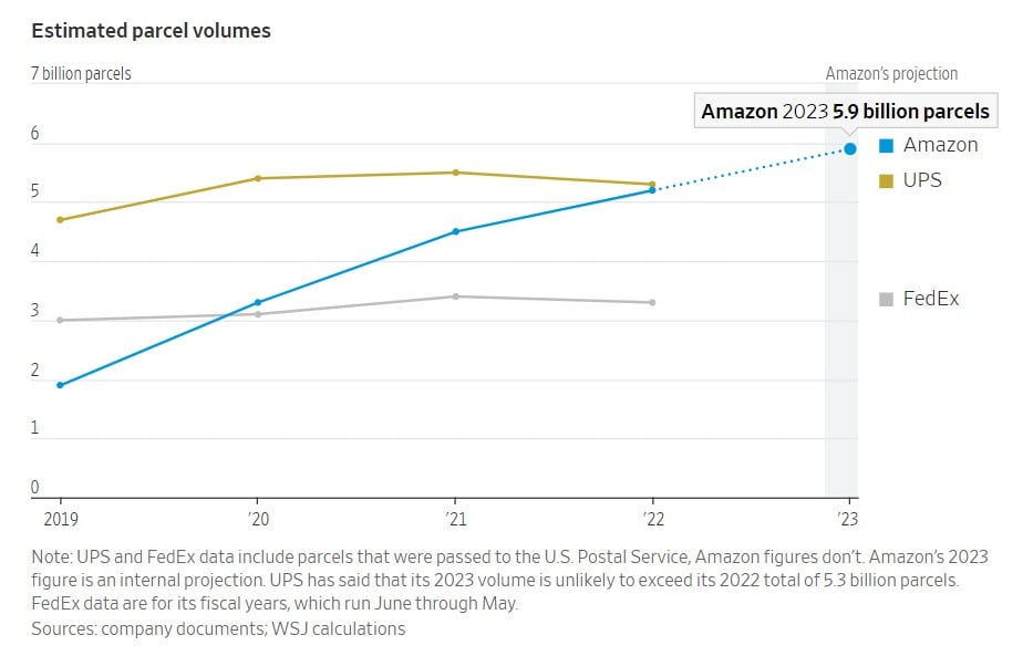
While receiving packages this holiday season, remember today’s Chart of the Day from an article in the Wall Street Journal titled, “The Biggest..
Chart of the Day: Hot Desking
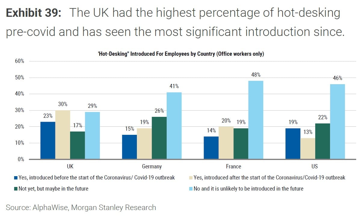
Today’s Chart of the Day comes from AlphaWise in a Bloomberg article about the rise of “Hot Desking.” This is when work areas, such as desks, are not..
Chart of the Day: Biggest Imports to the US
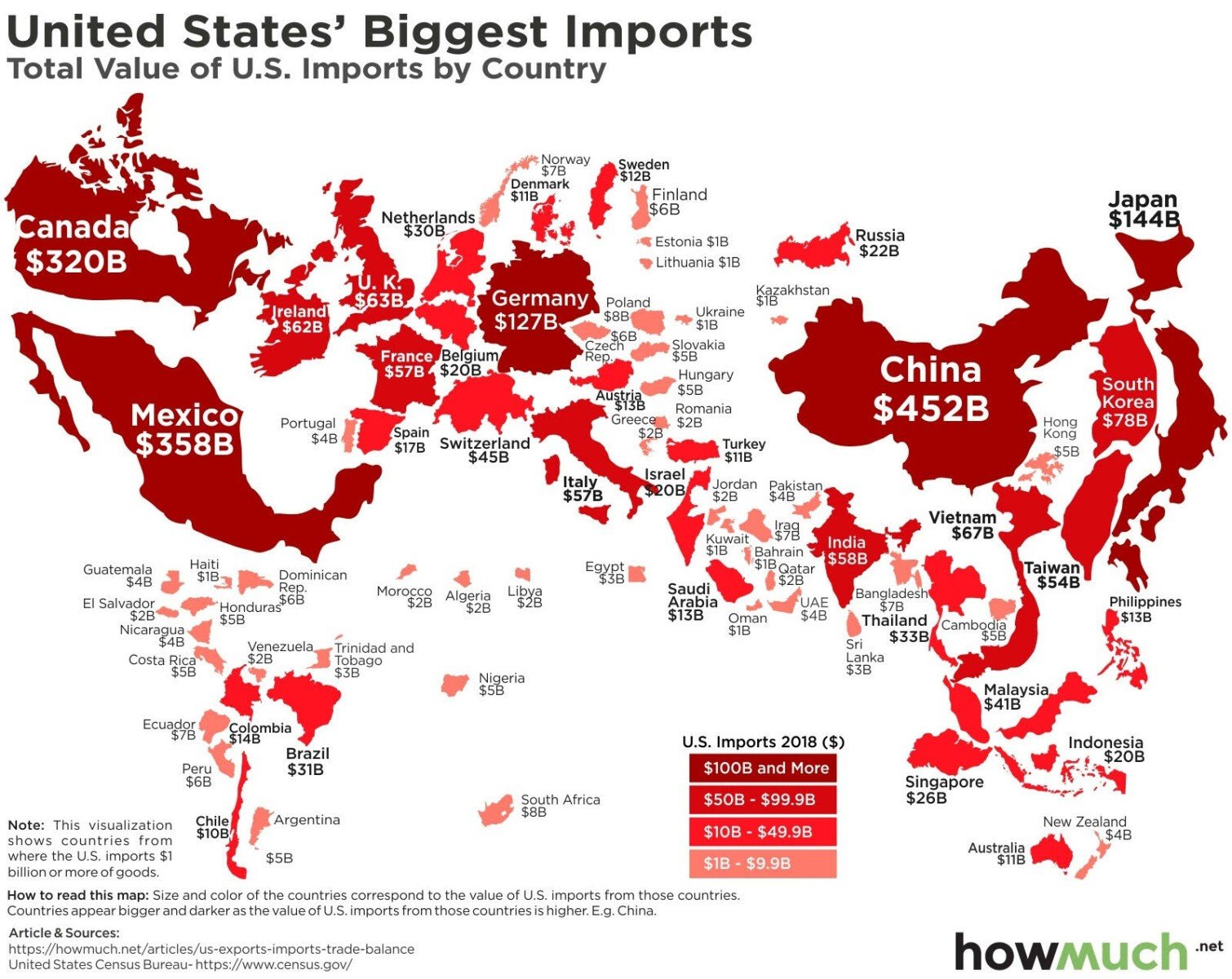
Today’s Chart of the Day is a chart from howmuch.net shared by ritholz.com showing the biggest imports into the US per country.
Chart of the Day: Invest Early, Save Often
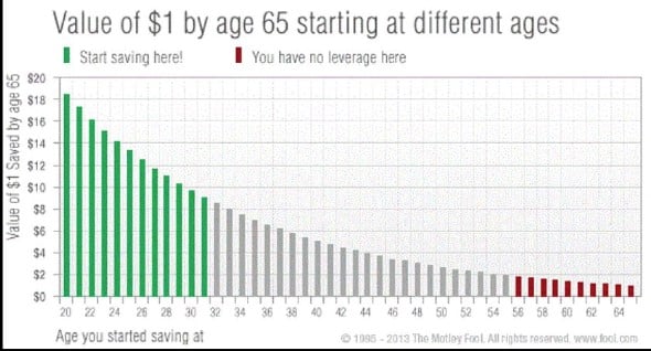
There are three big factors that influence investments one has by retirement: how much, what investments, and how long. Today’s Chart of the Day from..
Why You Should Opt for Online Bank Statements
In the digital age, more and more people are choosing to receive their bank statements online. Here are some compelling reasons why you should..
Chart of the Day: Missing Best 20 Days
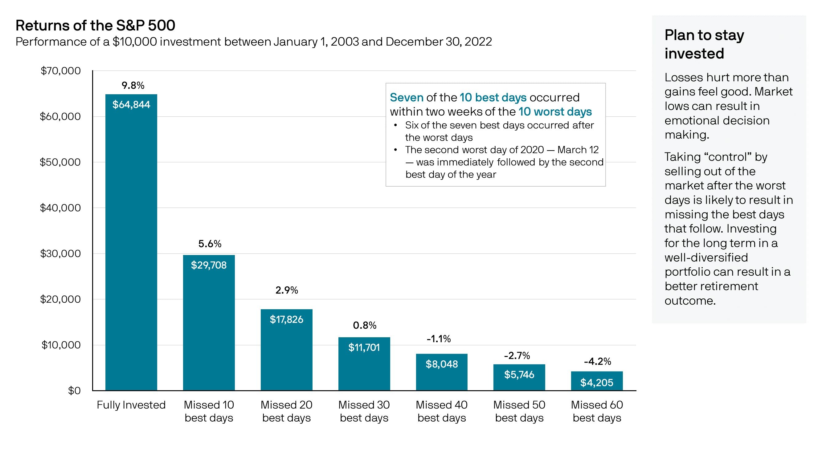
Today’s Chart of the Day from JP Morgan shows the returns of the stock market if you missed a certain amount of “best days” dating back 20 years.
Chart of the Day: This Year's Winners are Last Year's Losers
Today’s Chart of the Day is from @CharlieBilello on X and shows that last year’s losers (in red) are this year’s to-date winners (in blue) and vice..
Hometown Banking at Your Fingertips: The Crews Bank App
In today's fast-paced world, convenience and simplicity are key factors when it comes to managing finances. The advent of mobile banking has..
Chart of the Day: US Teens On Their Phones
Today’s Chart of the Day is from Gallup and shows the hours per day spent on social media (aka their phones). The 4.8 hours a day is something to..
Chart of the Day: Treasury vs. Real Estate
Today’s Chart of the Day comes from Re:venture Consulting and shows the history of the 10-year treasury rate (in yellow) vs. the CAP, Capital Asset..
Chart of the Day: Eight Chickens Per Person
Today’s Chart of the Day from the Financial Times shows that chicken meat recently overtook pork as the most produced meat on the planet. Why?
On Our Minds
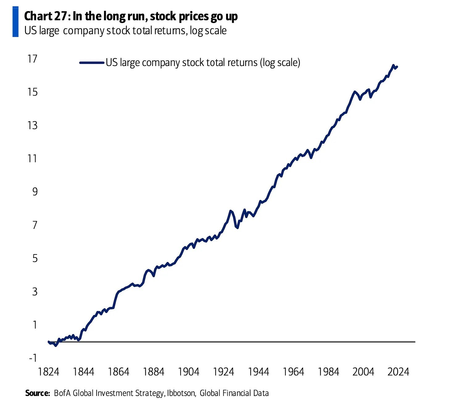
Chart of the Day: Stocks From 1824 to Today
Today’s Chart of the Day comes from Bank of America research provided by Ibbotson, which is an investment research company. It is a nice follow up chart to the View from the Top of the Hill presentation we recently provided.
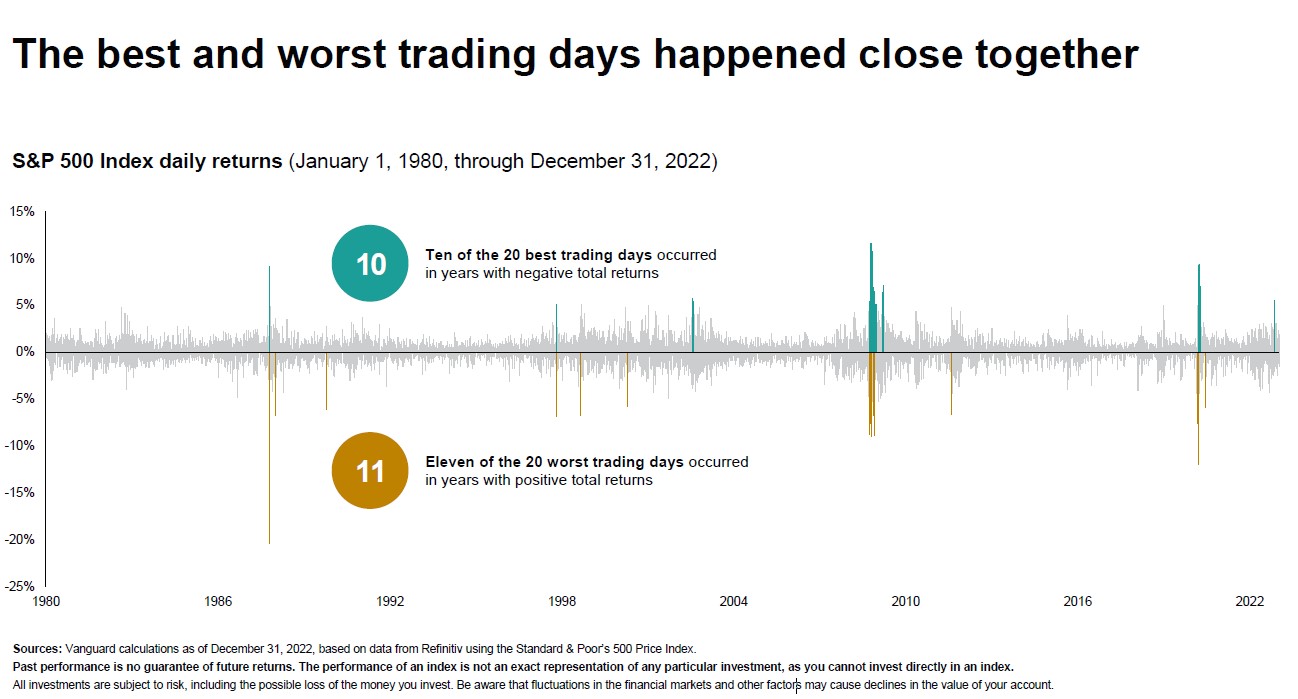
Chart of the Day: Buy the Dip
Today’s Chart of the Day comes from Vanguard, and though it is not true in all cases, it is true in most, that since 1980 the best time to buy is right after a sharp decline in prices.
Chart of the Day: High Price to Pay
Today’s Chart of the Day from Bank of America Equity & Quant Strategy shows the price you pay for future earnings explains 80% of the returns for the next 10 years.
Chart of the Day: Amazon Bests UPS
While receiving packages this holiday season, remember today’s Chart of the Day from an article in the Wall Street Journal titled, “The Biggest Delivery Business in the U.S. Is No Longer UPS or FedEx.”
Chart of the Day: Hot Desking
Today’s Chart of the Day comes from AlphaWise in a Bloomberg article about the rise of “Hot Desking.” This is when work areas, such as desks, are not assigned to specific employees.
Chart of the Day: Biggest Imports to the US
Today’s Chart of the Day is a chart from howmuch.net shared by ritholz.com showing the biggest imports into the US per country.
Chart of the Day: Invest Early, Save Often
There are three big factors that influence investments one has by retirement: how much, what investments, and how long. Today’s Chart of the Day from the Motley Fool shows the importance of the third one, how long.
Why You Should Opt for Online Bank Statements
In the digital age, more and more people are choosing to receive their bank statements online. Here are some compelling reasons why you should consider making the switch:
Chart of the Day: Missing Best 20 Days
Today’s Chart of the Day from JP Morgan shows the returns of the stock market if you missed a certain amount of “best days” dating back 20 years.
Chart of the Day: This Year's Winners are Last Year's Losers
Today’s Chart of the Day is from @CharlieBilello on X and shows that last year’s losers (in red) are this year’s to-date winners (in blue) and vice versa.
Hometown Banking at Your Fingertips: The Crews Bank App
In today's fast-paced world, convenience and simplicity are key factors when it comes to managing finances. The advent of mobile banking has revolutionized the way customers can interact with their Bank, providing the power to manage accounts, conduct transactions, and stay on top of finances right from the palm of their hand.
Chart of the Day: US Teens On Their Phones
Today’s Chart of the Day is from Gallup and shows the hours per day spent on social media (aka their phones). The 4.8 hours a day is something to behold.
Chart of the Day: Treasury vs. Real Estate
Today’s Chart of the Day comes from Re:venture Consulting and shows the history of the 10-year treasury rate (in yellow) vs. the CAP, Capital Asset Pricing, rate (in blue).
Chart of the Day: Eight Chickens Per Person
Today’s Chart of the Day from the Financial Times shows that chicken meat recently overtook pork as the most produced meat on the planet. Why?
current_page_num+2: 26 -
