
Chart of the Day: Working Less
Today’s Chart of the Day from Bloomberg is called, “Americans are Working Less.” After the pandemic, many are working fewer hours a week.
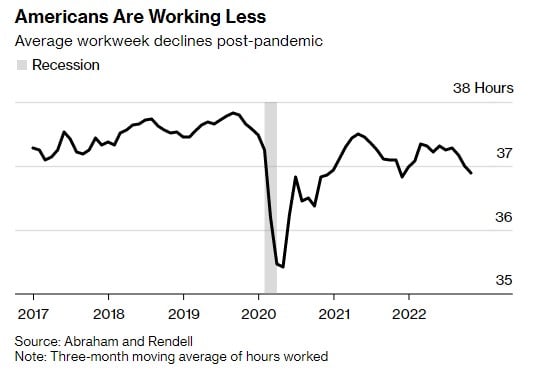
Today’s Chart of the Day from Bloomberg is called, “Americans are Working Less.” After the pandemic, many are working fewer hours a week.
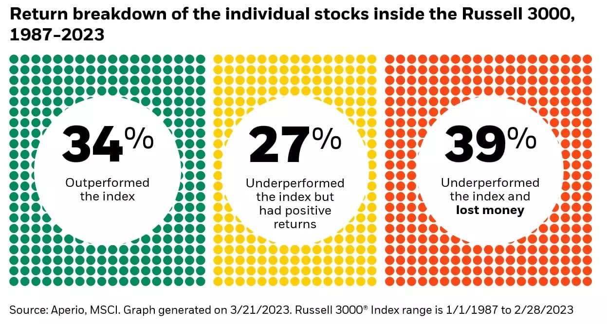
Today’s Chart of the Day from BlackRock shows that only 34%, or roughly one out of three, stocks outperformed the index for the last 35 years.

By giving to a community foundation, you can support the causes that matter most to you and make a real difference in the lives of others...

Today’s Chart of the Day is a sidestep from my typical financial ones. The chart shows the combined market area after the Crews family of banks..
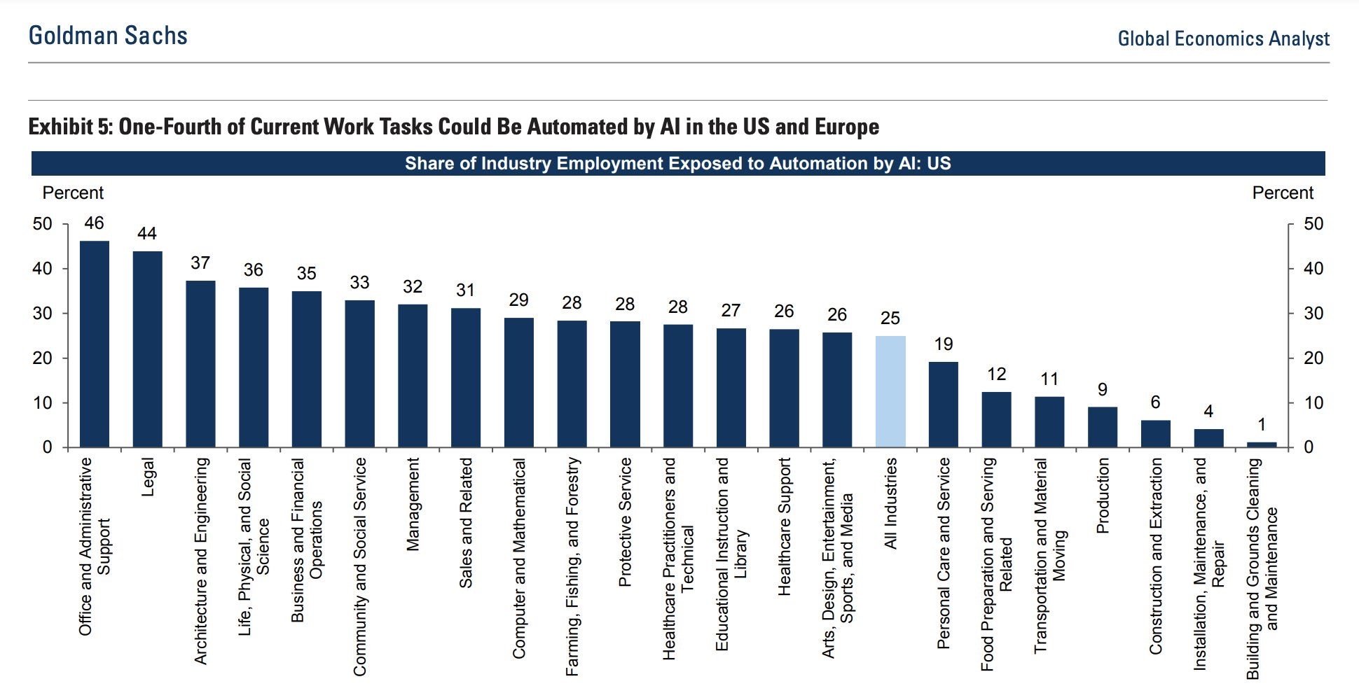
Today’s Chart of the Day from Goldman Sachs shows the percentage of tasks per industry that could be automated by artificial intelligence...
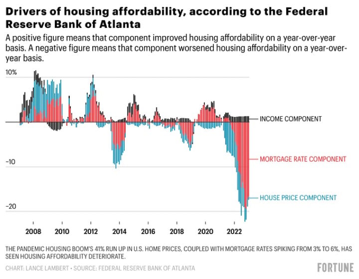
Today's Chart of the Day from Fortune illustrates the components of housing affordability, which include changes in incomes, rates, and prices. There..
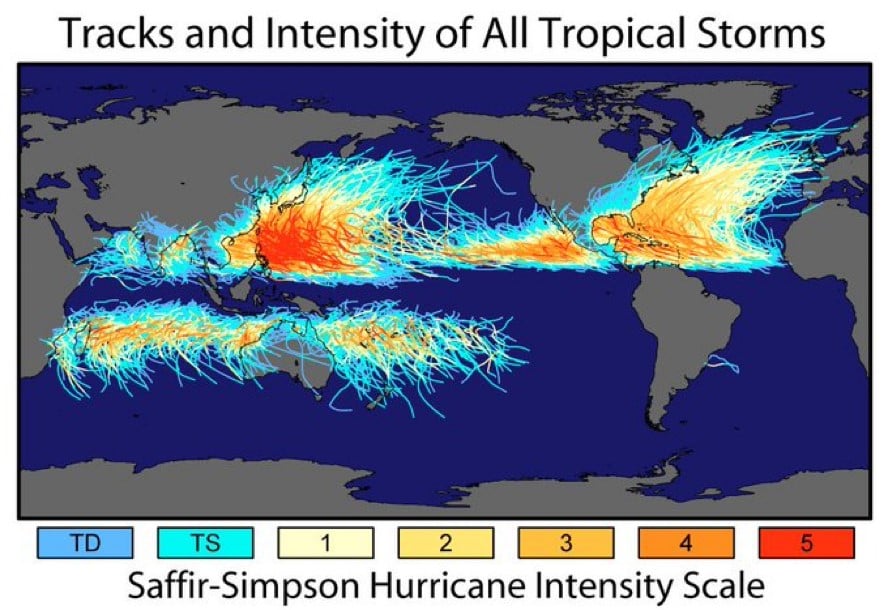
Today’s Chart of the Day is not finance related, but still fascinating. Shared by the NASA Earth Observatory, the Coriolis forces at the equator are..
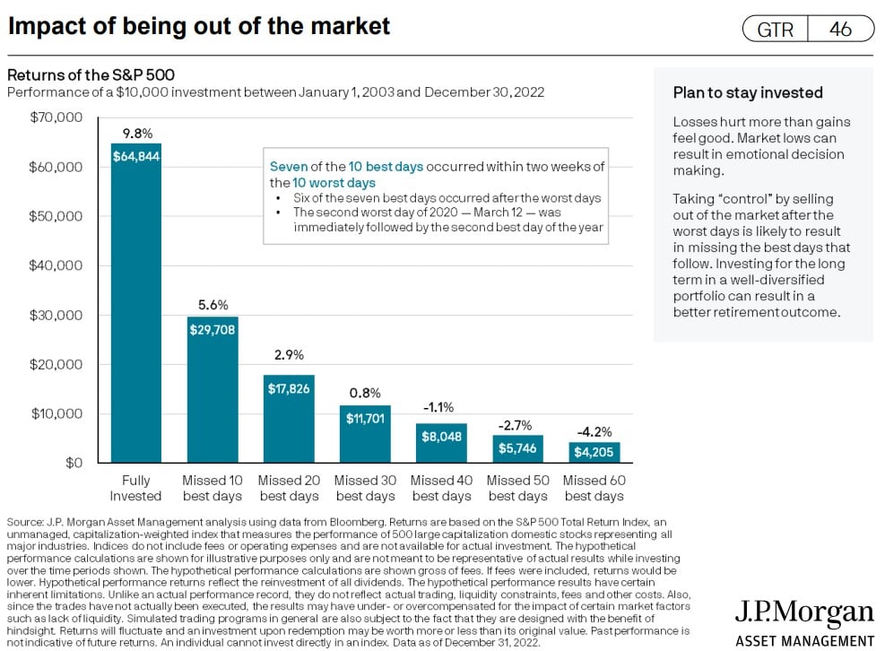
Today’s Chart of the Day is from J.P. Morgan’s updated Guide to Retirement. It calculates your total return having missed the 30 best days for last..
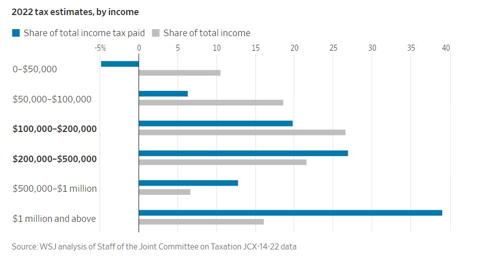
Today’s Chart of the Day from the Wall Street Journal shows the share of taxes paid vs. the share of total income. The $100,000-$500,000 range is..

Using a personal credit card can seem complicated, especially if you’re working to build credit. It’s a balance between spending enough to build your..

A Home Equity Line of Credit (HELOC) is a popular and versatile financing option that allows homeowners to access the equity in their homes as..
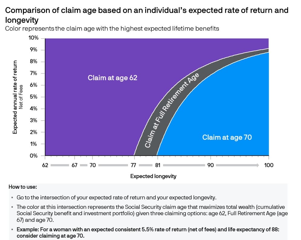
Today’s Chart of the Day from J.P. Morgan shows when to take social security to maximize benefits.
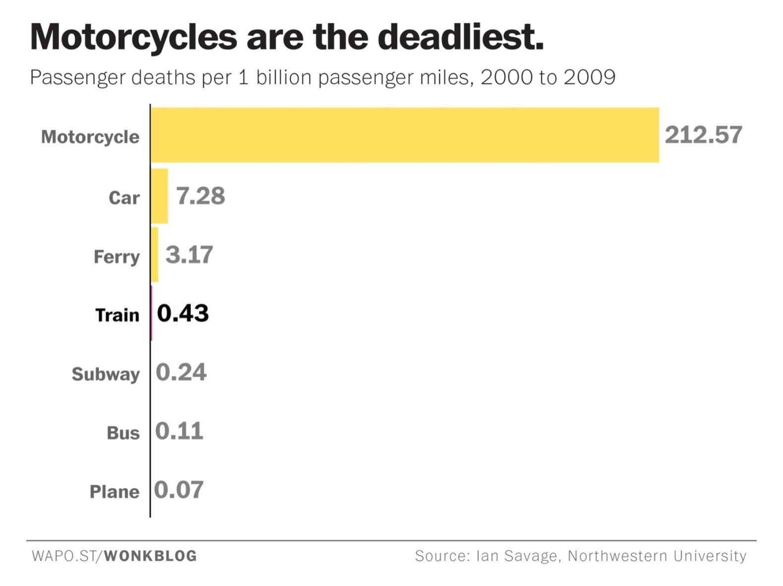
Today's Chart of the Day looks at the statistics of transportation safety. I think everyone already suspects this, but I was surprised by the scale...
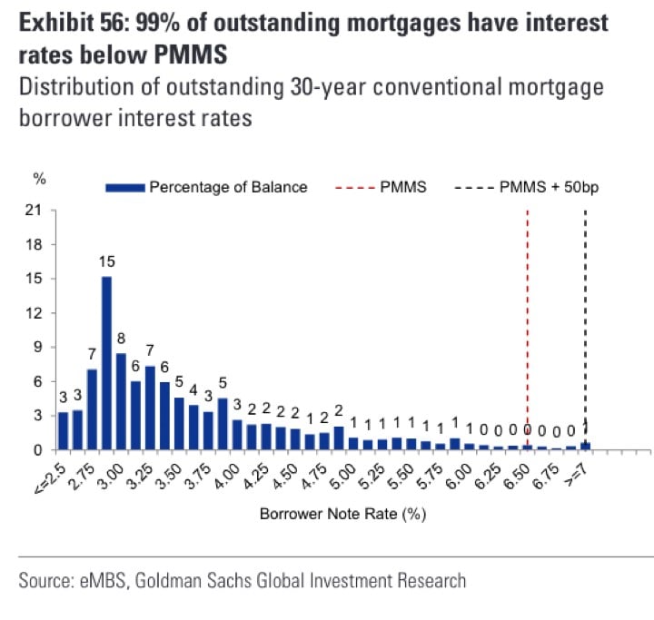
Today's Chart is from the Primary Mortgage Market Survey (PMMS) from Freddie Mac, the government agency that provides mortgage loans.
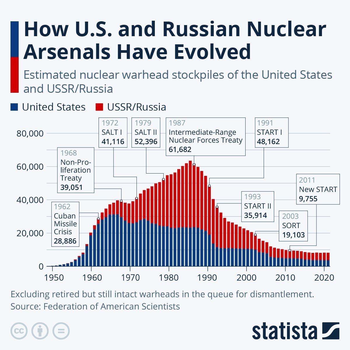
Today's Chart of the Day looks at the number of nuclear stockpiles in the United States and the USSR/Russia dating back to the 1950s.