
Chart of the Day: Winners May Not Always be Winners
Today’s Chart of the Day comes from A Wealth of Common Sense and shows the top 10 companies in the stock market going back to 1980.
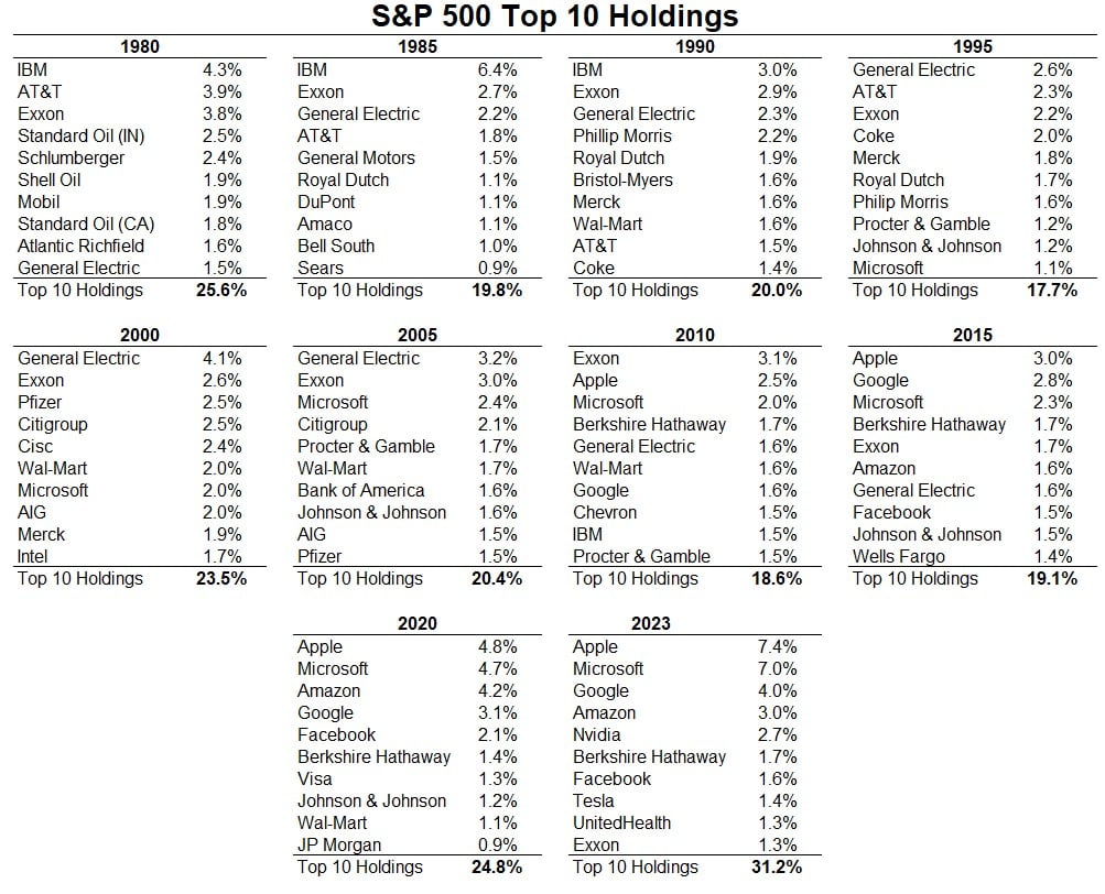
Today’s Chart of the Day comes from A Wealth of Common Sense and shows the top 10 companies in the stock market going back to 1980.
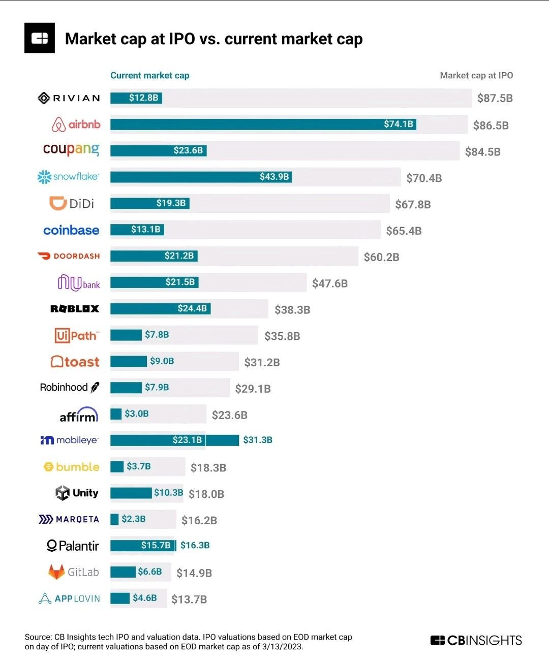
Today’s Chart of the Day comes from @QCompounding on Twitter and shows the value of some well-known companies now vs. when they became publicly owned.
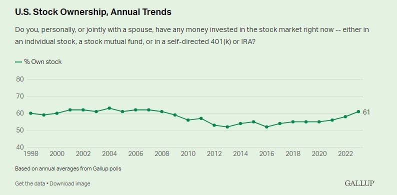
Today’s Chart of the Day from an article called “Best Time to Buy Stocks” shows the percentage of households that own stocks of any form. Besides a..
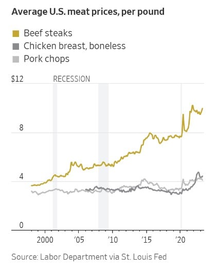
Today’s Chart of the Day from the Wall Street Journal shows that you aren’t imagining that beef prices have gone up. Beef prices have increased..
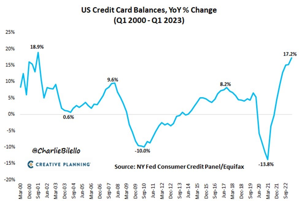
Today’s Chart of the Day from @CharlieBiello on Twitter shows the annual change in credit card balances dating back to 2000. The latest data shows a..
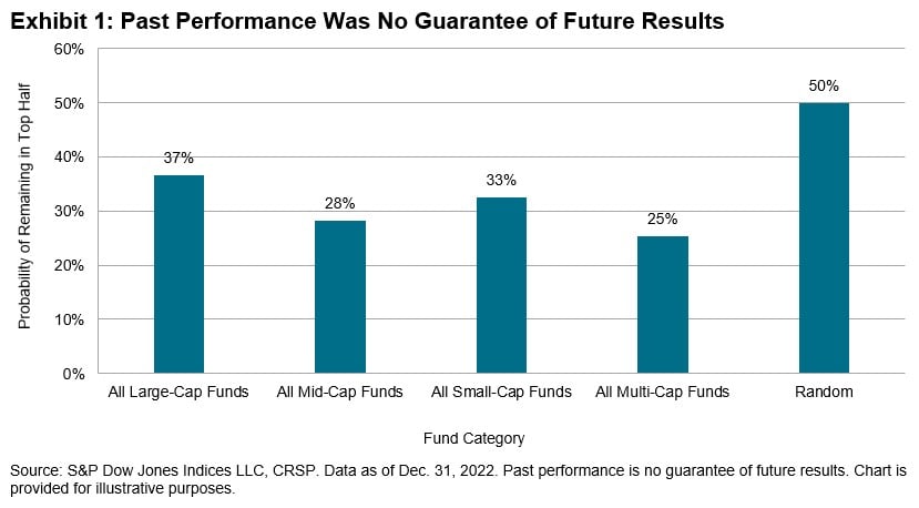
Today’s Chart of the Day comes from Craig Lazzara's article “Persistently Disappointing.” It asks if top fund managers outperform due to skill or..
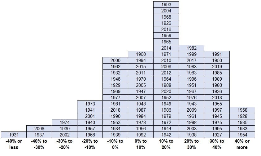
Today’s Chart of the Day comes from A Wealth of Common Sense showing the range of annual returns over the last 95 years. The long-term average is 10%..
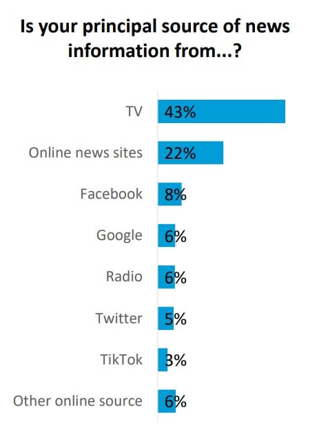
Today’s Chart of the Day is from the recent Harvard Caps/Harris poll. After all of these years, at 43%, TV is still the principal place people get..
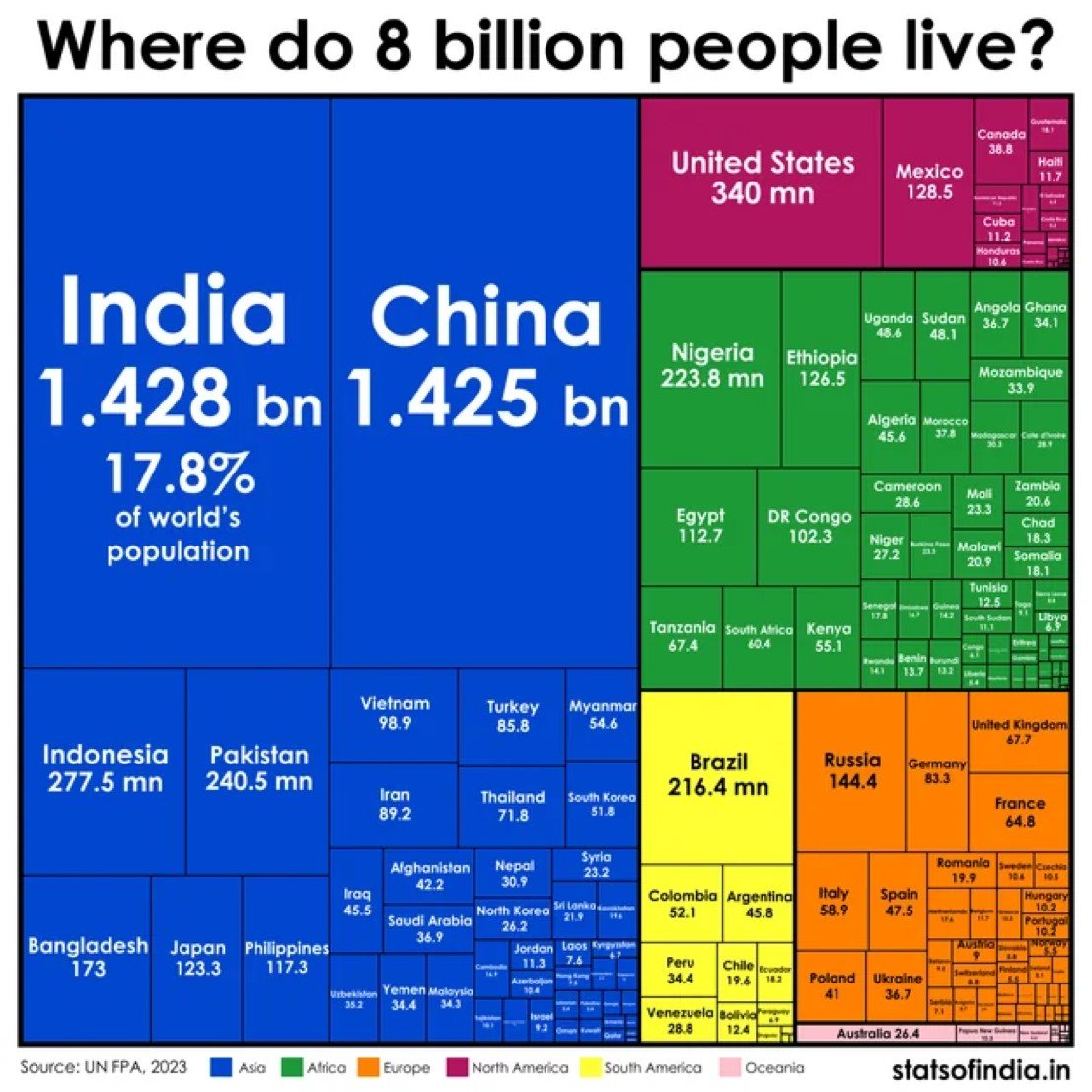
Today’s Chart of the Day comes from statsofindia.in with information from the United Nations Population Fund. It shows where everyone lives on earth.
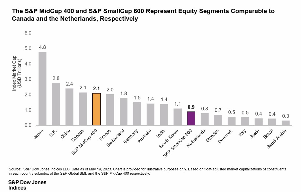
Today’s Chart of the Day from S&P Global shows the size of the United States S&P 400 Mid-Cap and S&P 600 Small-Cap Indexes vs. the size of other..
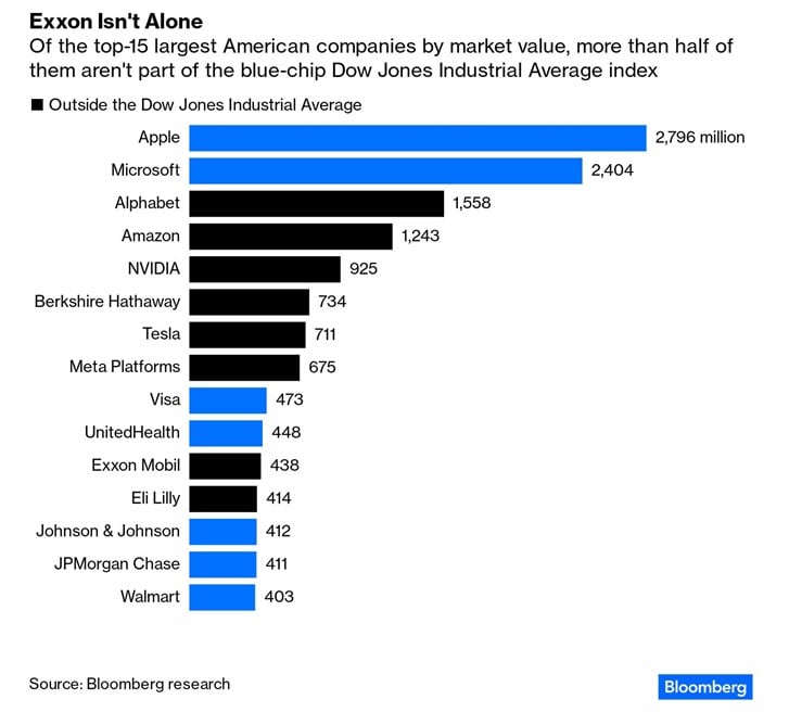
Today’s Chart of the Day from a Bloomberg article discusses Exxon Mobil's exclusion from the Dow Jones Industrial Average Index. The chart shows that..
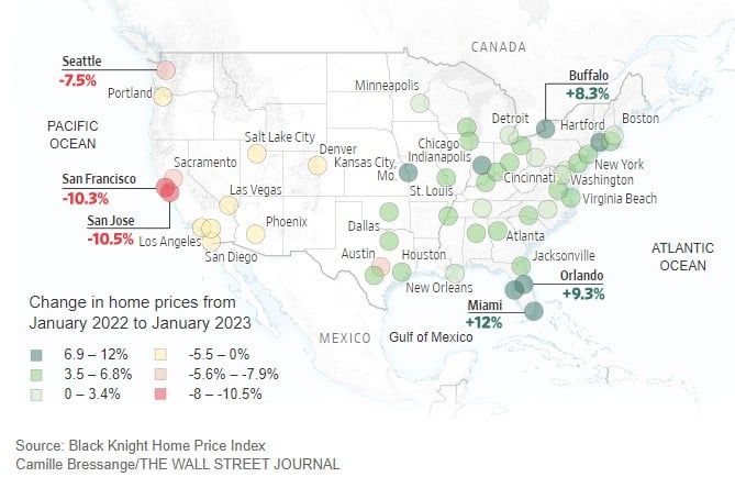
Today’s Chart of the Day from the Wall Street Journal shows that home prices are falling on the West Coast of the U.S. and rising in the East.
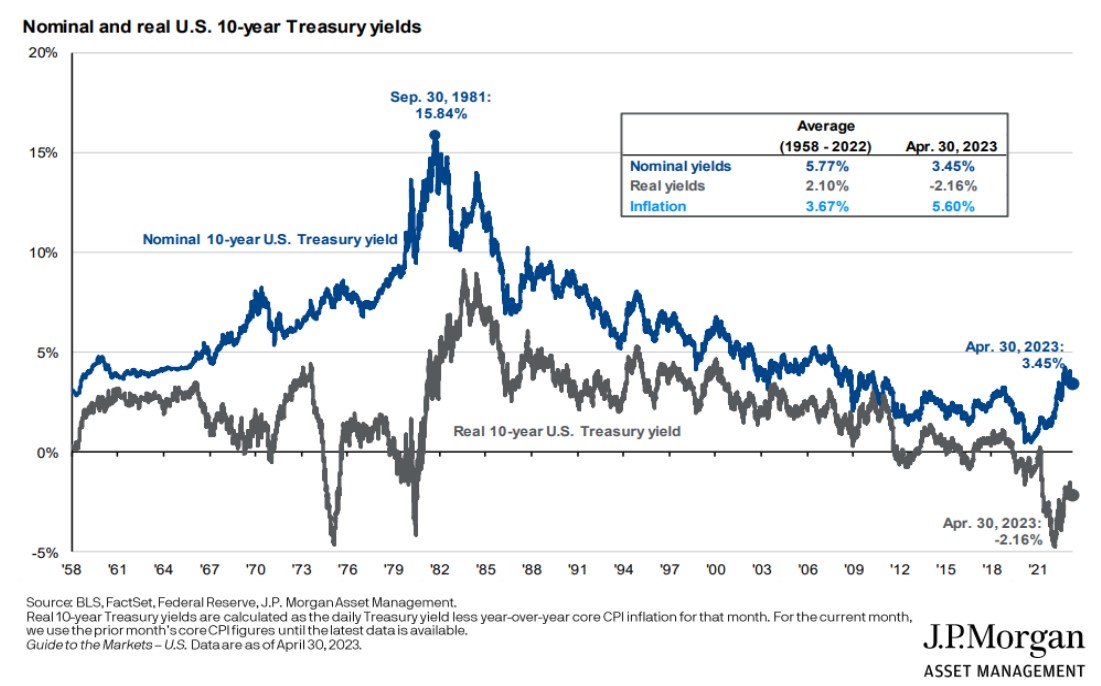
Today’s Chart of the Day from J.P. Morgan shows the history of the 10-year Treasury yield and the “real” yield, which is what you have left after you..

Today’s Chart of the Day is a great checklist from MarketWatch.com. As an example, I store this information in the notes of “My Card," in Contacts on..
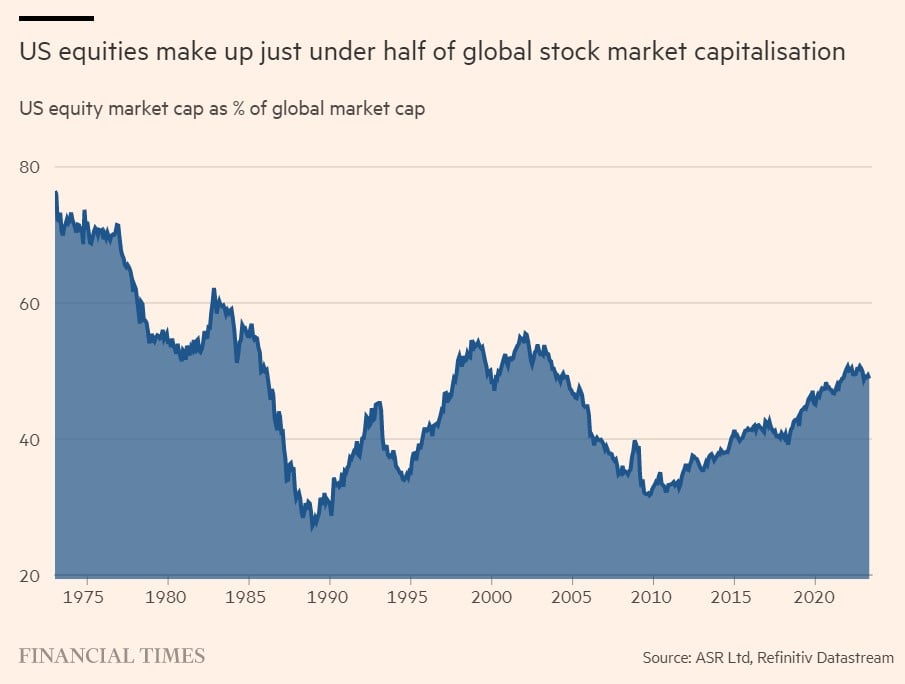
Today’s Chart of the Day from the Financial Times shows that the U.S. currently makes up about half of the world's stock market.