
Chart of the Day: Bond ETFs Take Off
Today’s Chart of the Day from the Financial Times shows the growth of Bond ETFs from 2007 to present.
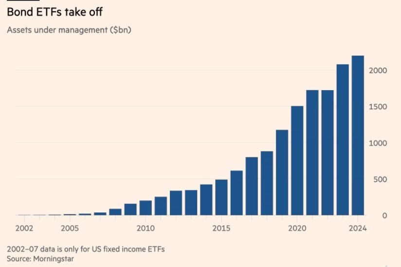
Today’s Chart of the Day from the Financial Times shows the growth of Bond ETFs from 2007 to present.
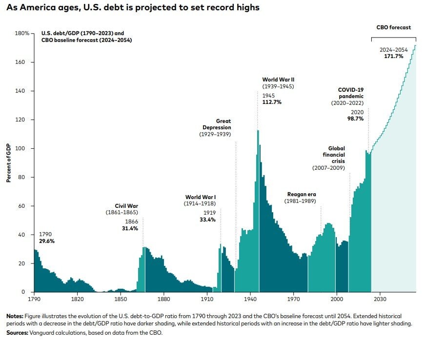
Today’s Chart of the Day from Vanguard shows the US debt as a percentage of GDP (Gross Domestic Product), which is a measure of all the goods and..
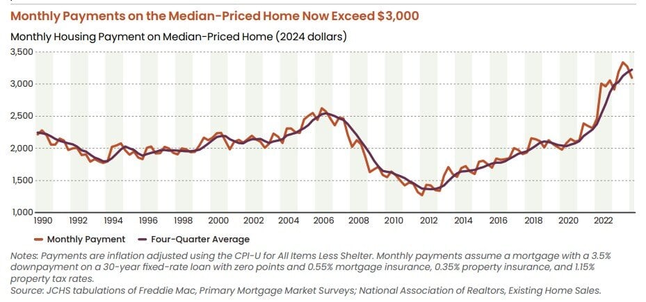
Today’s Chart of the Day is from the 2024 State of the Nation's Housing Report from the Joint Center for Housing Studies at Harvard University.
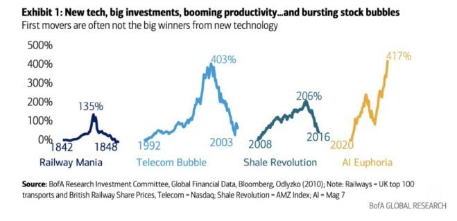
Today’s Chart of the Day from Bank of America is more of a “buyer beware” to those oversaturated in AI. It's important to understand the risks that..
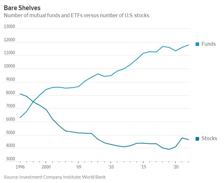
Today’s Chart of the Day is from a Wall Street Journal article titled “Where Have All the Good Stocks Gone?” and shows the amount of investment funds..
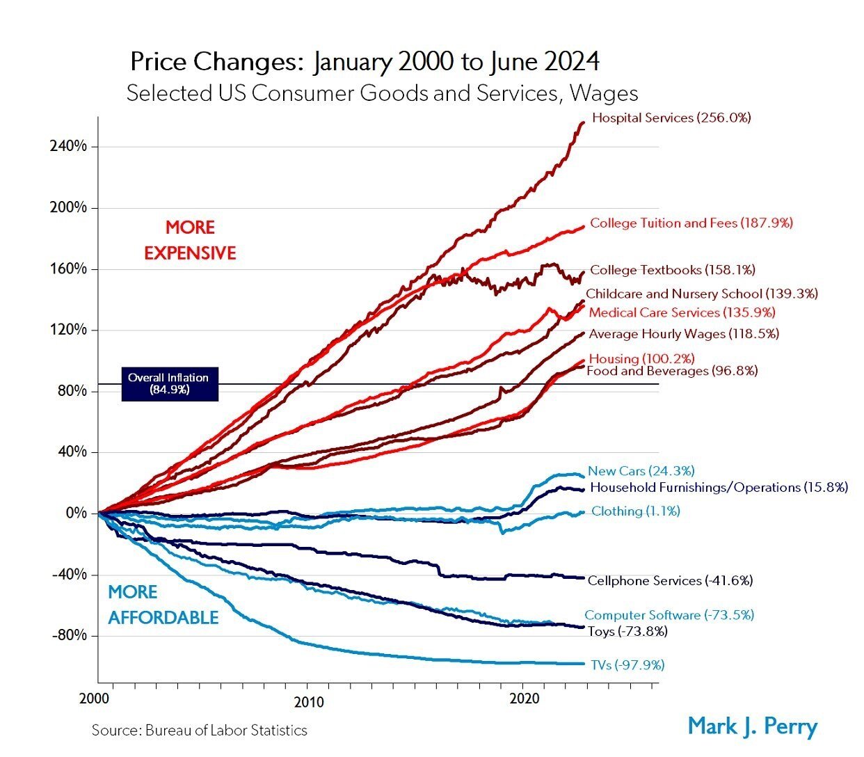
Today’s Chart of the Day from Mark Perry shows the price changes for various goods and services over the last 24 years, from January 2000 to June..
Today’s Chart of the Day is based on calculations I did from discussions with a client. It is important to remember, there are only two ways to get..
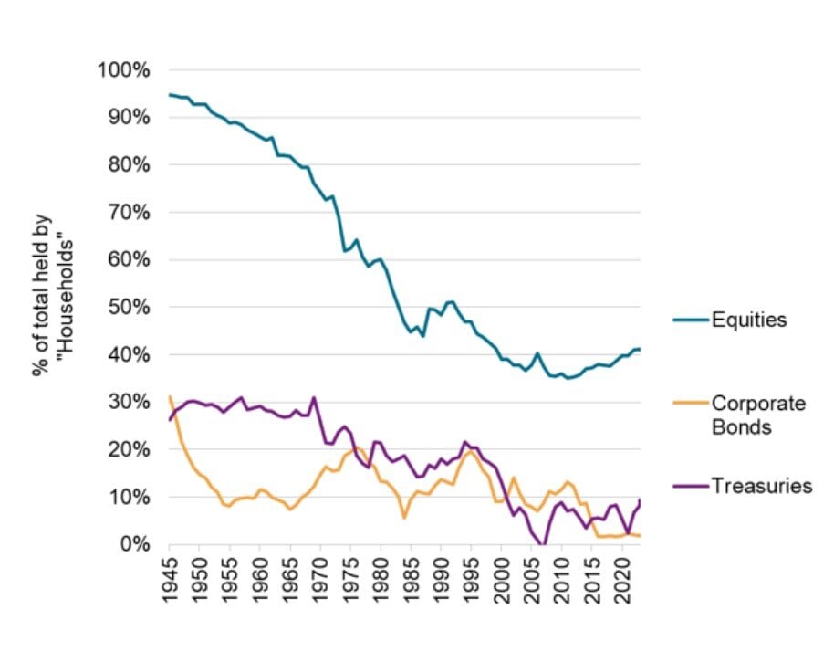
Today’s Chart of the Day from S&P Global shows the overall market share owned by individuals.
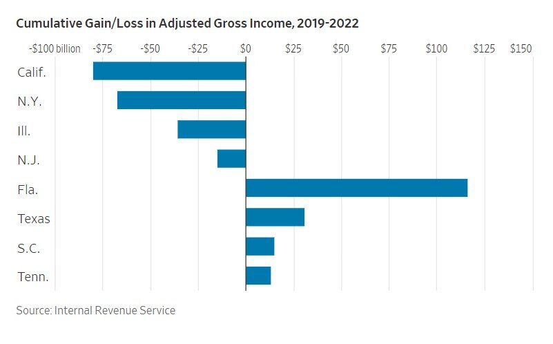
Today’s Chart of the Day is from a Wall Street Journal article recommended by Doug F., a subscriber of Chart of the Day. It is called “The Blue-State..
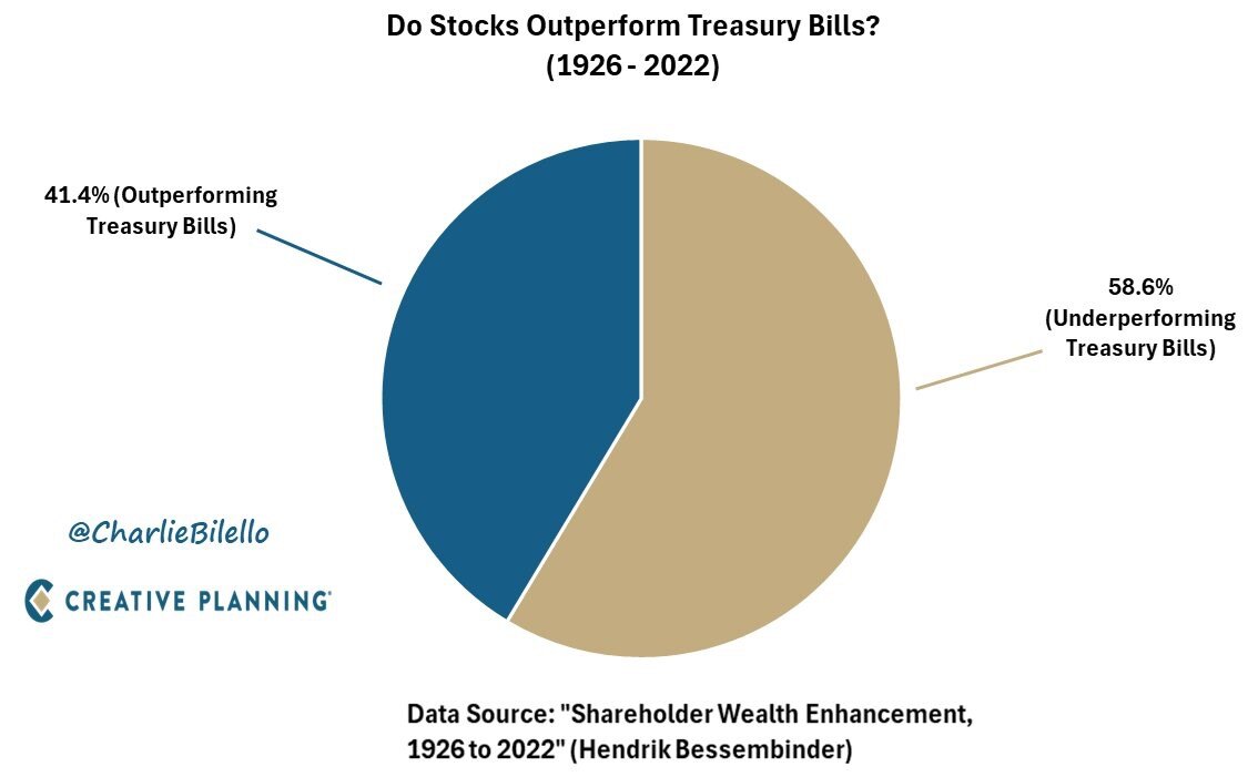
Today’s Chart of the Day was prepared by @CharlieBilello on X using data from a groundbreaking paper in 2022 by Hendrick Bessembinder.
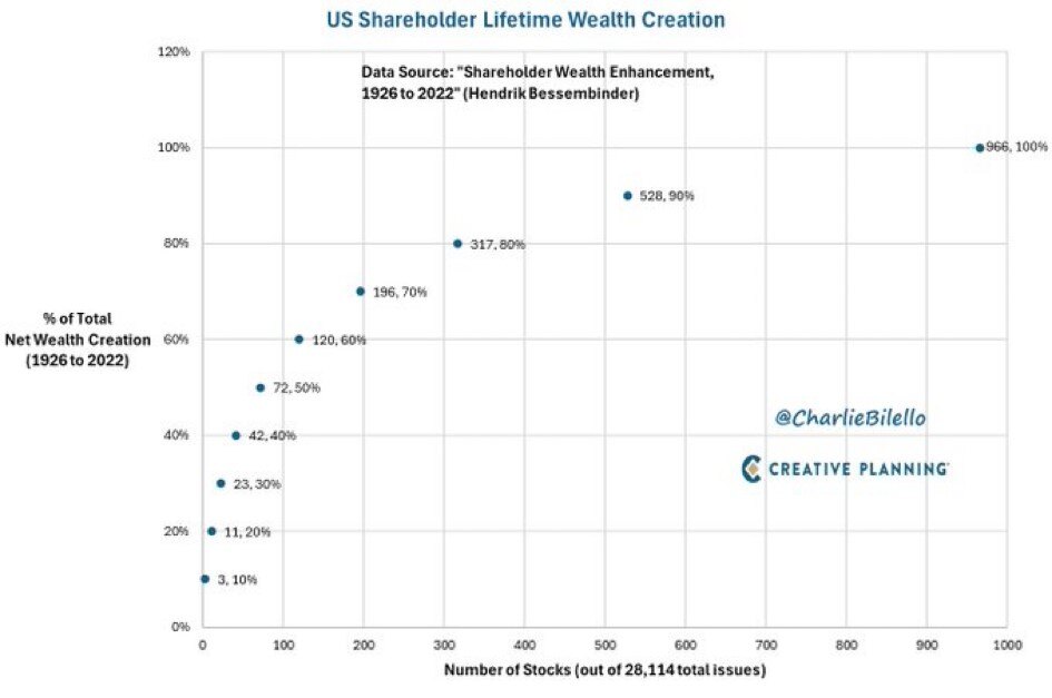
Today’s Chart of the Day is from @CharlieBilello from the Hendrick Bessembinder paper called “Shareholder Wealth Enhancement” published in 2023.
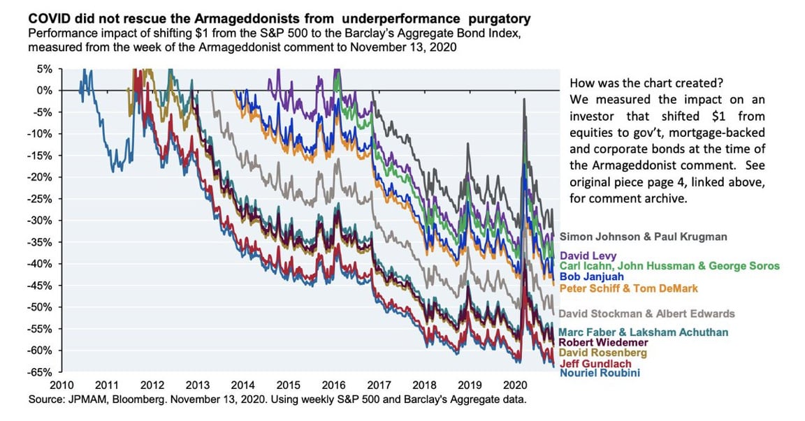
Today’s Chart of the Day from JP Morgan shared by @StevenKelly49 on X shows the results of popular economists who predicted “Doomsday” scenarios and..
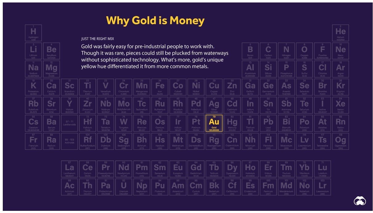
Today’s Chart of the Day is a classic from Visual Capitalist outlining why “Gold is Money” and the other 117 elements are not.
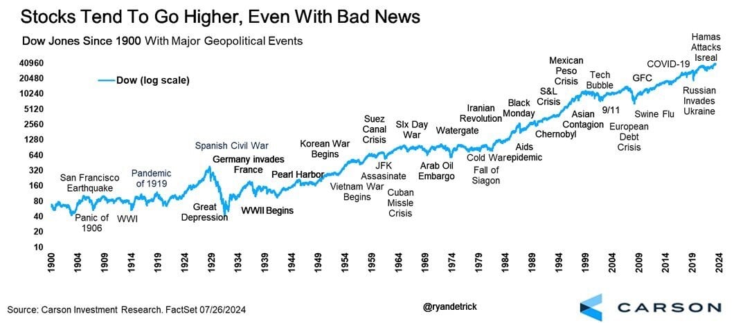
Today’s Chart of the Day from Carson Investment Research shows the 35 major “bad news” events in the stock market going back to 1900.
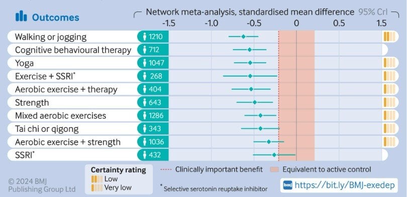
Today's Chart of the Day is from a research article in the British Medical Journal titled “Effect of Exercise for Depression.”