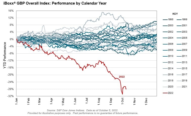
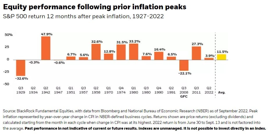
The Chart of the Day is from S&P Global. As eternal optimists, which has worked for our clients over the last 20+ years, we like to say, “It could always be worse.” Though the United States equivalent investment grade bond index in the US is down 20%, the iBoxx GPB (which stands for the Great Britain Pound) bond index is down 28%, which is the worst in 25 years.
They are calling it “the Bondmaggeddon.”
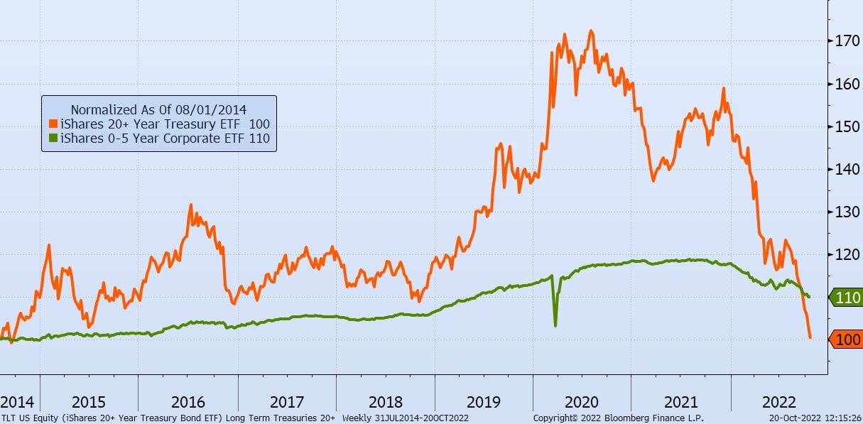
Though we may have some of these US equivalent bond ETFs in the portfolio we manage, they are more than offset by many shorter-term bonds, which in most cases have resulted in a total loss of only 6%. Still not great, but it could have been worse.
More