- Financial Resources
- Blog
Blog
Your Weekly
Financial Forecast
Stay informed with sound financial know-how
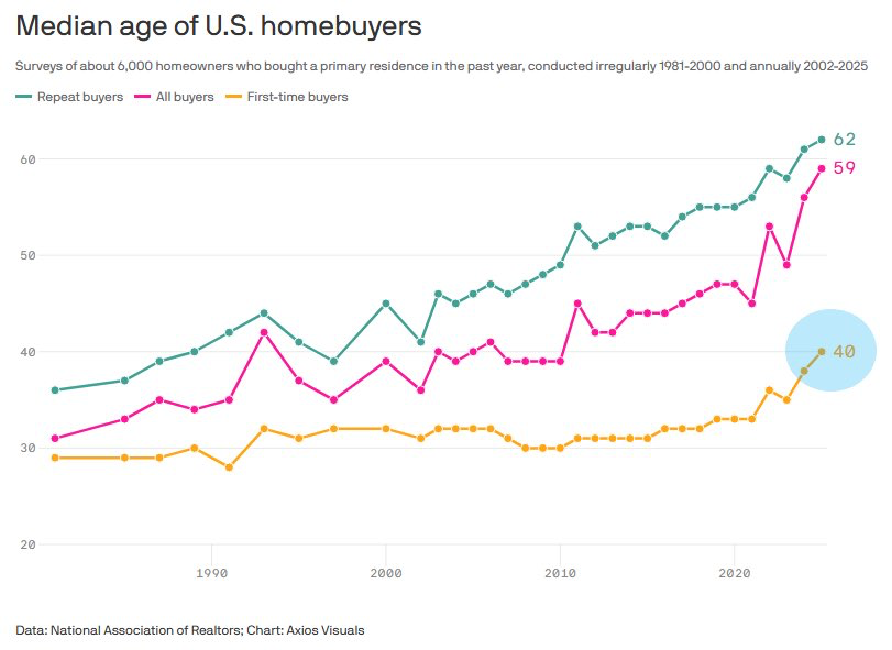
Chart of the Day: First-Time Home Buyers Are Holding Off
Today’s Chart of the Day is from Axios Visuals with data from the National Association of Realtors.
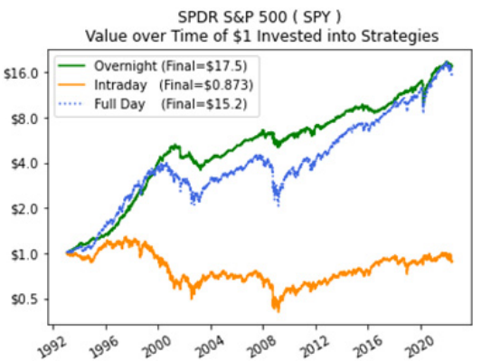
Chart of the Day: Day or Night Trading
The topic of Today’s Chart of the Day is something that often crosses my mind in the morning when I look at how the market is going to open.
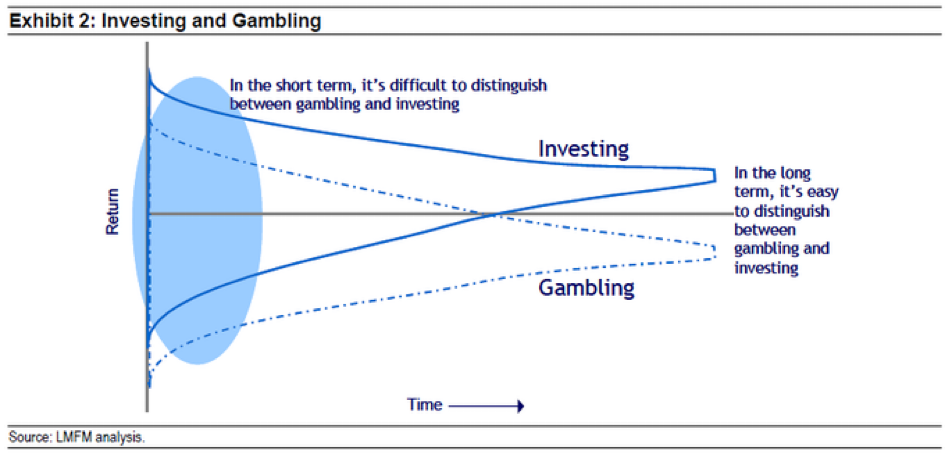
Chart of the Day: Investing vs. Gambling
Today’s Chart of the Day is from Michael Mauboussin and highlights the difference between investing vs. gambling. 
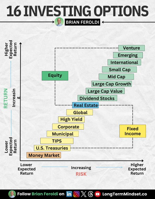
Chart of the Day: 16 Investment Options
Today’s Chart of the Day is from Brian Feroldi with a great infographic breaking down all investments into 16 options.
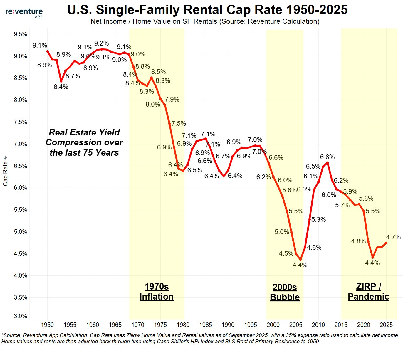
Chart of the Day: History of Rental Rates
Today’s Chart of the Day comes from re:venture, a provider of real estate market data. The chart highlights single-family rental capitalization (cap)..

Your Money, Your Way: Online Banking Makes Life Easier
Let’s be realistic, life doesn’t always happen between 9 and 5. And you need to be able to pay bills while you’re in your pajamas, or send money from..
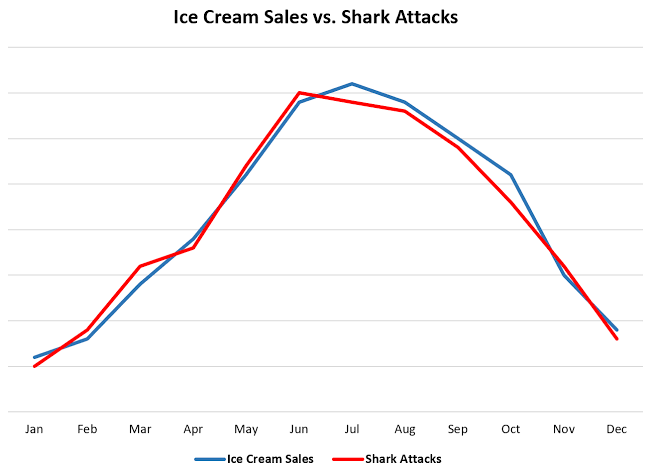
Chart of the Day: Ice Cream vs. Shark Attacks
Today’s Chart of the Day is a little different than what I usually share. The chart compares ice cream sales and shark attacks over the course of a..
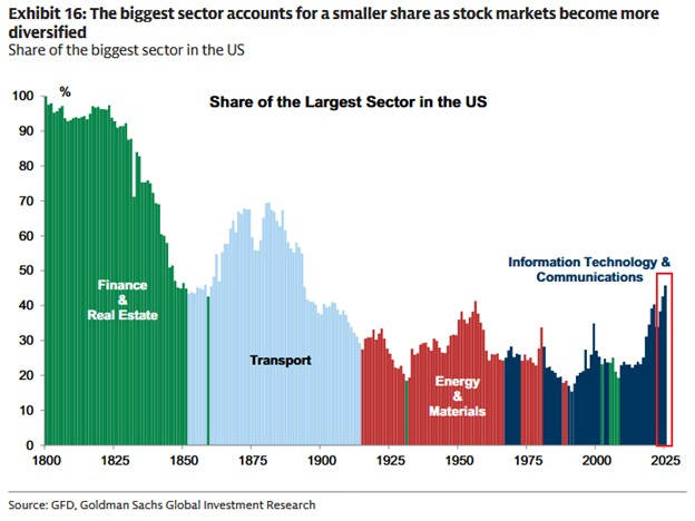
Chart of the Day: Evolution of the Market Sectors
Today’s Chart of the Day from Goldman Sachs takes a look at how the biggest sector in the U.S. stock market has changed over time, from 1800 to..
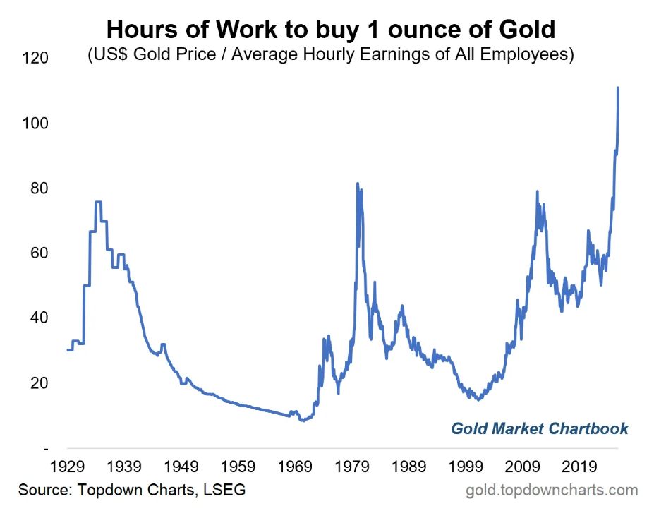
Chart of the Day: Gold vs Hourly Wage
Today’s Chart of the Day comes from the Gold Market Chartbook and shows how many hours of work it takes to buy one ounce of gold.
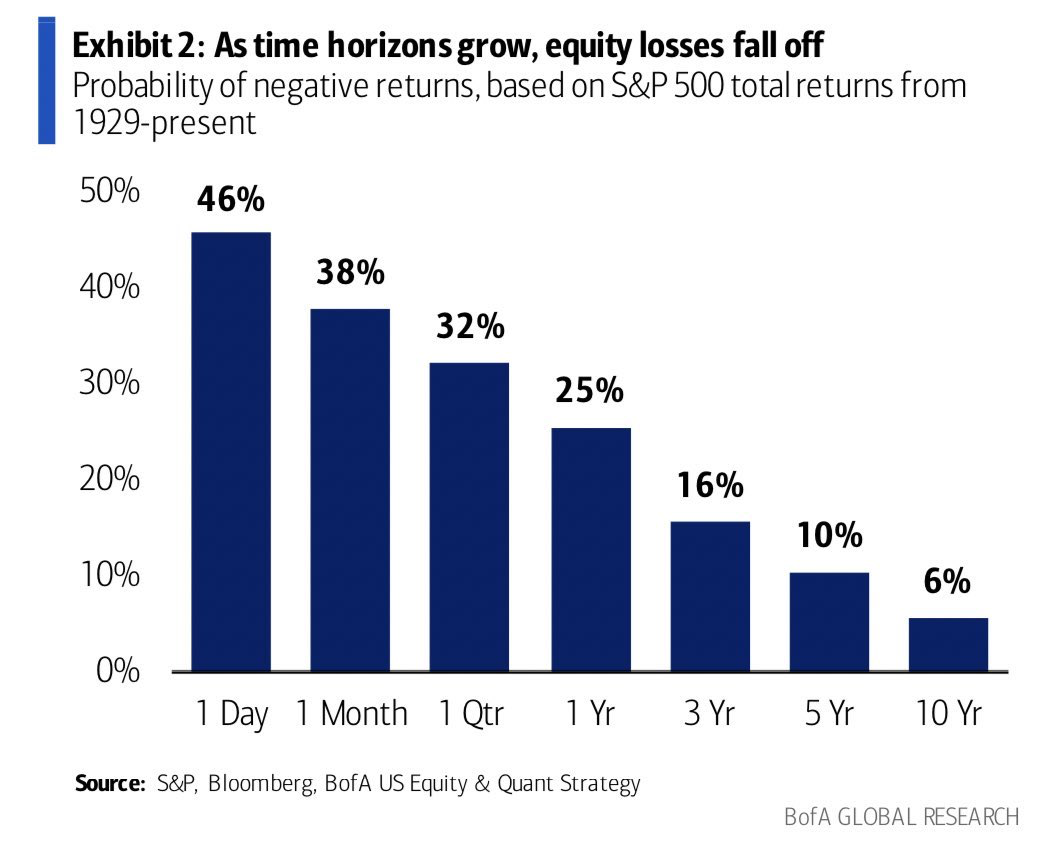
Chart of the Day: Possibility of Loss
Today’s Chart of the Day is from Brian Feroldi from Bank of America Global Research, showing a chart from 1929 that shows as time horizons grow, the..
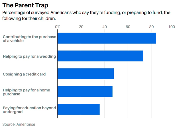
Chart of the Day: Percent That Give to Children
Today’s Chart of the Day is from Barrons with data from Ameriprise showing the percentage of Americans who fund or are preparing to fund certain..
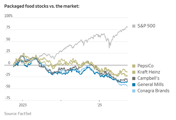
Chart of the Day: Rise of Niche Brands
Today’s Chart of the Day from FactSet was included in an article titled, “Startups Are Eating Big Food’s Lunch”, featured in the Wall Street Journal.

Chart of the Day: View on Sports Betting
With a nod to all the sporting events that take place in the fall, sharing today’s Chart of the Day from Topley’s Top 10, with data from the Pew..
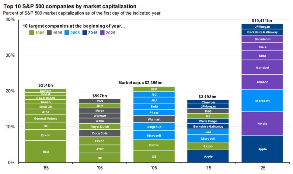
Chart of the Day: Top 10 Now, Not Then
Today’s Chart of the Day is from Mike Zaccardi @MikeZaccardi and shows the ten largest companies in the S&P in 10-year spans for the last 40 years..

Chart of the Day: How Long Will It Last?
Today’s Chart of the Day is from the National Association of Home Builders showing the life expectancy of parts and systems in your home.
On Our Minds
Chart of the Day: Day or Night Trading
Chart of the Day: Investing vs. Gambling
Today’s Chart of the Day is from Michael Mauboussin and highlights the difference between investing vs. gambling. 
Chart of the Day: 16 Investment Options
Chart of the Day: History of Rental Rates
Your Money, Your Way: Online Banking Makes Life Easier
Let’s be realistic, life doesn’t always happen between 9 and 5. And you need to be able to pay bills while you’re in your pajamas, or send money from the beach, or check your account balance at 6 a.m. while waiting for your coffee to brew— your banking should be as flexible as you need it to be.
Chart of the Day: Ice Cream vs. Shark Attacks
Today’s Chart of the Day is a little different than what I usually share. The chart compares ice cream sales and shark attacks over the course of a year, both which peak during the summer.
Chart of the Day: Evolution of the Market Sectors
Chart of the Day: Gold vs Hourly Wage
Today’s Chart of the Day comes from the Gold Market Chartbook and shows how many hours of work it takes to buy one ounce of gold.
Chart of the Day: Possibility of Loss
Chart of the Day: Percent That Give to Children
Today’s Chart of the Day is from Barrons with data from Ameriprise showing the percentage of Americans who fund or are preparing to fund certain financial events for their children.
Chart of the Day: Rise of Niche Brands
Today’s Chart of the Day from FactSet was included in an article titled, “Startups Are Eating Big Food’s Lunch”, featured in the Wall Street Journal.
Chart of the Day: View on Sports Betting
With a nod to all the sporting events that take place in the fall, sharing today’s Chart of the Day from Topley’s Top 10, with data from the Pew Research Center, feels appropriate.
Chart of the Day: Top 10 Now, Not Then
Today’s Chart of the Day is from Mike Zaccardi @MikeZaccardi and shows the ten largest companies in the S&P in 10-year spans for the last 40 years starting in 1985.
Our memories can be short, and we often think that what is now has always been and will always continue. But from 20 years ago in 2005, the only company that is still in the top 10 is Microsoft. Just ten years ago, only four were.
But of course, things change—new companies and industries emerge as others wane—and in fact, many of the top ten companies from 20 to 30 years ago significantly underperformed the overall market afterwards and are no longer anywhere near the top.
Chart of the Day: How Long Will It Last?
current_page_num+2: 6 -

