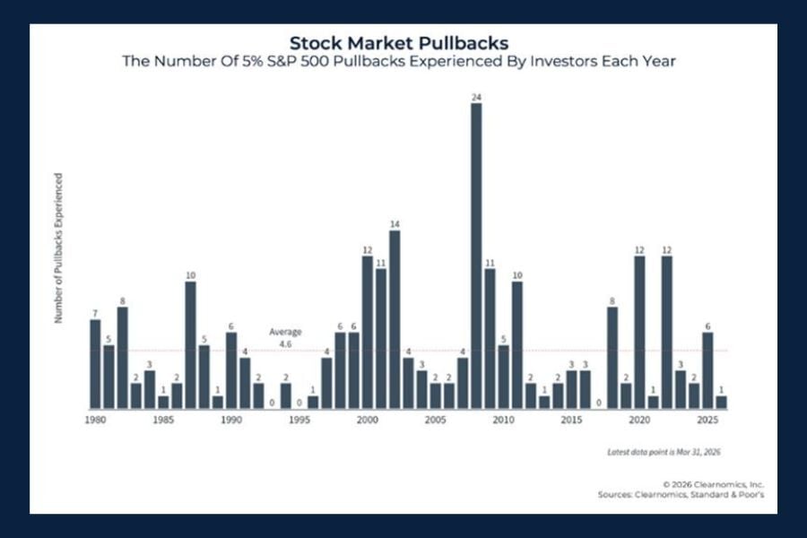
Risk of Stocks vs. Bonds
Today’s Chart of the Day comes from @brianferoldi on Twitter who does a great job of making complex things easy to understand.
Are You Prepared? Get expert advice to help ensure and protect your financial legacy at our free educational seminars.
Today’s Chart of the Day comes from @brianferoldi on Twitter who does a great job of making complex things easy to understand.
Today’s Chart of the Day comes from OfDollarsAndData.com and shows the percentage of years with positive returns per 10-year spans going back to 1900.
Today’s Chart of the Day comes from Robert Schiller’s book called Irrational Exuberance, which was summarized by Leandro, @Invesquotes on Twitter.
Most of us get up and work hard every day so that someday we don’t have to. That day is called retirement. Getting to that point requires you to learn how to manage your money week to week and month to month. Retirement is a whole new game; it requires a lifelong perspective. Your early decisions will impact the next 20 or 30 years. Many people don’t give retirement planning the time it deserves until too late in the game.
Today’s Chart of the Day comes from Morningstar Direct and shows the openings and closings of mutual funds vs. exchange traded funds (ETFs) since 2012.
Today’s Chart of the Day comes from the Wall Street Journal and highlights why investing in Non-Traded, or illiquid, assets pose additional risk.
Today’s Chart of the Day comes from the Financial Times and includes an article asking if higher wage demands will increase inflation like in the 1970s. However, this time it is different since the workforce is shrinking as shown by the Participation Rate, the falling orange line in the chart. The participation rate is defined as the percentage of healthy people 16 or older who are actively working or looking to do so.
Today’s Chart comes from Benedek Voros from S&P Dow Jones Indices. I always like to point out firsts, and this year there have been many.
current_page_num+2: 4 -