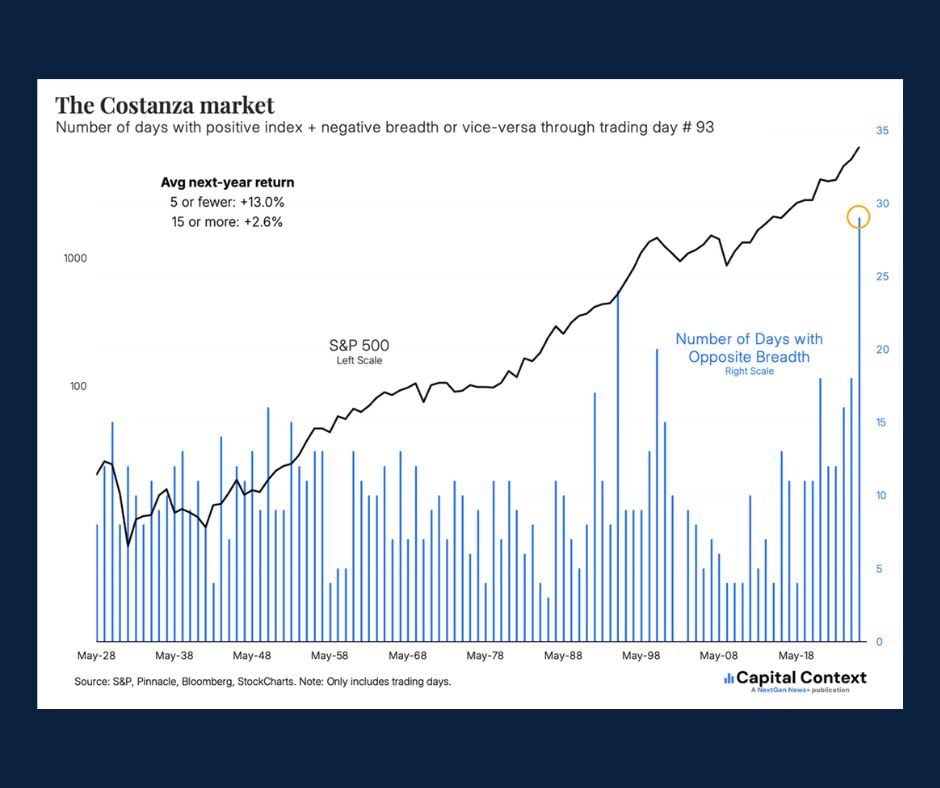
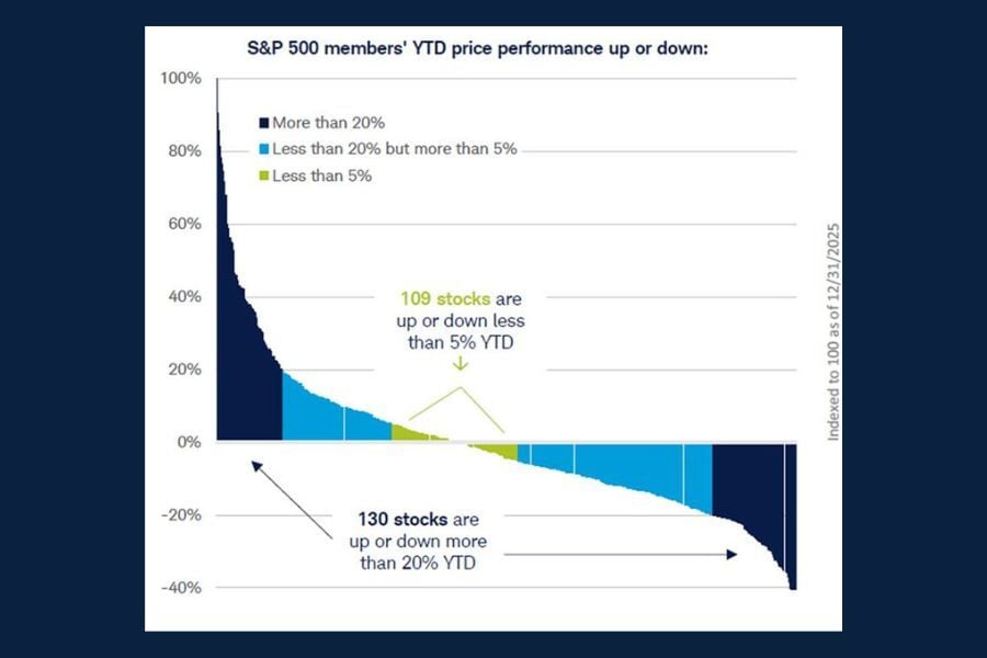
Skip to content

Be financially ready for hurricane season. Access funds when you need them with a Home Equity Line of Credit (HELOC). Loans subject to credit approval. NMLS #406389 

Get Started 863-222-7005

Blog

Your Weekly
Financial Forecast


Stay informed with sound financial know-how

Bar graph showing worldwide semiconductor revenue through 2025 and forecasted for 2026-27 to grow beyond the $1 trillion mark.

Chart of the Day: Global Semiconductor Demand

Today’s Chart of the Day is from the article "How the AI Boom Has Transformed the Chip Industry into a Market Monster" in the Wall Street Journal and..

Read More

Triple image of various hurricane prep home repairs being done - installing hurricane shutters, whole home generator and hurricane proof windows.

The Hurricane Prep You Might Not be Thinking About: HELOC

Between 2020 and 2025, Floridians in Central and Southwest Florida were impacted by five major hurricanes. With hurricane season looming once again,..

Read More

 Stacked bar chart showing various components, such as tickets sales and merch, that comprise the global major league baseball market, from 2019 and forecasted to 2030.

Chart of the Day: M.L.B. Market

With baseball season in full swing, today’s Chart of the Day from Future Data Stats displays "striking" growth across the global market projected..

Read More

Pie chart breaking down average U.S. retiree spending by category such as housing, transportation and health care.

Chart of the Day: Retiree Spending

Today’s Chart of the Day from The Motley Fool breaks down key data on retirement spending.

Read More

Bar graph showing by percentage of the U.S. population each group's attitude towards healthier eating.

Chart of the Day: Are Americans Eating Healthier?

Today's Chart of the Day from Statista shows us the attitudes of US adults towards eating healthy foods.

Read More

Line graph illustrating, by decade, the net worth across major wealth tiers.

Chart of the Day: U.S. Households' Net Worth

Today’s Chart of the Day from the article "They're Rich but Not Famous - and They're Suddenly Everywhere," in the Wall Street Journal highlights..

Read More

Chart showing the percentage rate of personal savings in the U.S., starting in 1981 through 2025, using shades of green to show highest percentage and reds to show the lowest.

Chart of the Day: U.S. Personal Savings Rates

Today’s Chart of the Day from CharlieBilello gives us data for over 60 years of U.S. personal savings rates.

Read More

Horizontal bar graph showing cyberattack complaints and losses reported by age group.

Chart of the Day: Adults Over 60 Report the Most

Today's Chart of the Day from USAFacts highlights cybercrime trends across different age groups.

Read More

Upright stacked bar graph with separate bars representing paid and unpaid work for men and women, using blue to illustrate paid work and orange for unpaid work.

Chart of the Day: Women Work More Than Men

Today’s Chart of the Day from Statista breaks down how men (arrow) and women (cross) around the world spend their time on both paid and unpaid work..

Read More

Middle-aged African American woman in orange jacket using her cellphone's mobile wallet to pay at a coffee shop.

Debit Card + Mobile Wallet = A Smart Way to Pay

Credit cards, cash and checks all have their place, but if you are looking for simplicity with security and budget control, look no further – your..

Read More

Map of the United States with shading to illustrate the percentage of Adjustable-Rate Mortgages by state, with the color deepening as the percentage increases.

Chart of the Day: ARM Loans

Today's Chart of the Day from the Wall Street Journal article " How Homeowners Are Turning to Adjustable-Rate Mortgages, in Charts" addresses the..

Read More

Pie chart showing the breakdown of mortgages by interest rate.

Chart of the Day: Outstanding Mortgages by Interest Rates

Today’s Chart of the Day from ResiClub gives a clear snapshot of the interest rates attached to currrent outstanding mortgages.

Read More

Bar graph illustrating the odds of predicting a flawless March Madness bracket.

Chart of the Day: It's Tough Being Perfect

Today’s Chart of the Day from FiveThirtyEight highlights some truly eye‑popping statistics surrounding the NCAA March Madness Tournament.

Read More

Bar graph from Q1-21 to Q4 - 25, showing the S&P 500's quarterly net profit.

Chart of the Day: S&P Net Profit

Today’s Chart of the Day, sourced from FactSet, highlights five years of quarterly data on the S&P 500’s net profit margin.

Read More

Dual line graphs, showing the change in people aged 70+ and their corresponding net worth, from 1989 to 2025.

Chart of the Day: Wealthiest Population

Today's Chart of the Day comes from the Wall Street Journal article, " Over 65? Congratulations, You Own the Economy," and highlights population and..

Read More

On Our Minds

List Grid
Browse by topic

Chart of the Day: Global Semiconductor Demand

Today’s Chart of the Day is from the article "How the AI Boom Has Transformed the Chip Industry into a Market Monster" in the Wall Street Journal and shows how artificial intelligence is reshaping global demand for semiconductors. 

More

The Hurricane Prep You Might Not be Thinking About: HELOC

Between 2020 and 2025, Floridians in Central and Southwest Florida were impacted by five major hurricanes. With hurricane season looming once again, it’s time to begin preparing our homes for the possibility of more severe weather. Because your home is likely one of the biggest investments you will ever make, protecting it before a storm and repairing it afterward is a top priority.

More

Chart of the Day: M.L.B. Market

With baseball season in full swing, today’s Chart of the Day from Future Data Stats displays "striking" growth across the global market projected through 2030.

More

Chart of the Day: Retiree Spending

Today’s Chart of the Day from The Motley Fool breaks down key data on retirement spending.

More

Chart of the Day: Are Americans Eating Healthier?

Today's Chart of the Day from Statista shows us the attitudes of US adults towards eating healthy foods.

More

Chart of the Day: U.S. Households' Net Worth

 Today’s Chart of the Day from the article "They're Rich but Not Famous - and They're Suddenly Everywhere," in the Wall Street Journal highlights inflation-adjusted net worth across major wealth tiers.

More

Chart of the Day: U.S. Personal Savings Rates

Today’s Chart of the Day from CharlieBilello gives us data for over 60 years of U.S. personal savings rates.

More

Chart of the Day: Adults Over 60 Report the Most

Today's Chart of the Day from USAFacts highlights cybercrime trends across different age groups.

More

Chart of the Day: Women Work More Than Men

Today’s Chart of the Day from Statista breaks down how men (arrow) and women (cross) around the world spend their time on both paid and unpaid work each day.

More

Debit Card + Mobile Wallet = A Smart Way to Pay

Credit cards, cash and checks all have their place, but if you are looking for simplicity with security and budget control, look no further – your Crews Bank & Trust Visa debit card will do all that for you. And by adding it to your mobile wallet, you have that option wherever and whenever you need it. Below are eight reasons why using your debit card is a smart choice.

More

Chart of the Day: ARM Loans

Today's Chart of the Day from the Wall Street Journal article " How Homeowners Are Turning to Adjustable-Rate Mortgages, in Charts" addresses the data behind ARM (Adjustable-Rate Mortgage) loans across the country.

More

Chart of the Day: Outstanding Mortgages by Interest Rates

Today’s Chart of the Day from ResiClub gives a clear snapshot of the interest rates attached to currrent outstanding mortgages.

More

Chart of the Day: It's Tough Being Perfect

Today’s Chart of the Day from FiveThirtyEight highlights some truly eye‑popping statistics surrounding the NCAA March Madness Tournament.

More

Chart of the Day: S&P Net Profit

Today’s Chart of the Day, sourced from FactSet, highlights five years of quarterly data on the S&P 500’s net profit margin.

More

Chart of the Day: Wealthiest Population

Today's Chart of the Day comes from the Wall Street Journal article, " Over 65? Congratulations, You Own the Economy," and highlights population and wealth statistics for people aged 70 or older.

More