
Chart of the Day: Average Inheritance
Today’s Chart of the Day is the Average Inheritance by Age Group from a University of Pennsylvania survey of individuals who have received an inheritance.
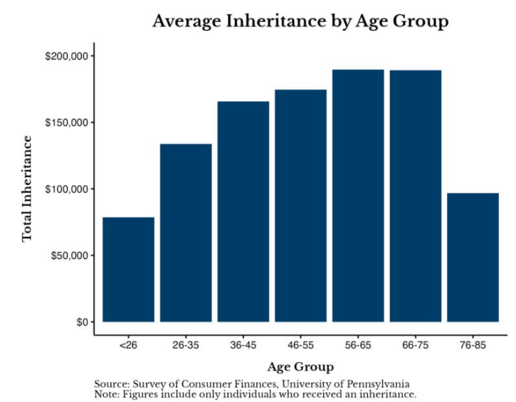
Today’s Chart of the Day is the Average Inheritance by Age Group from a University of Pennsylvania survey of individuals who have received an..
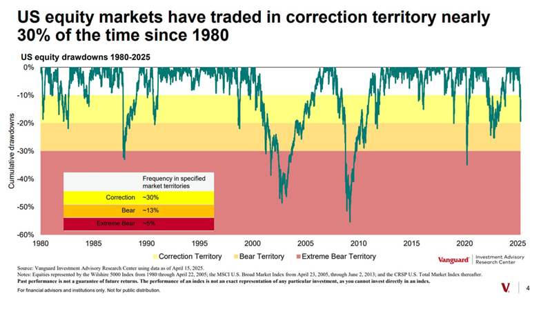
Today’s Chart of the Day is from Vanguard and shows that, since 1980, the stock market has traded in the 10%-20% down range, aka Correction..
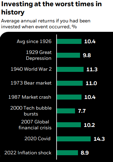
Today’s Chart of the Day is from Mark Peterson with BlackRock. The chart, going back to 1926, shows the returns if you had been invested on the day..
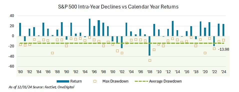
Today’s Chart of the Day from OneDigital shows the return of the S&P 500 each calendar year since 1980 as well as the maximum drawdown during the..

Estate planning often gets put on the back burner. Like the all-too-familiar ritual of tax filing procrastination, many of us recognize its..
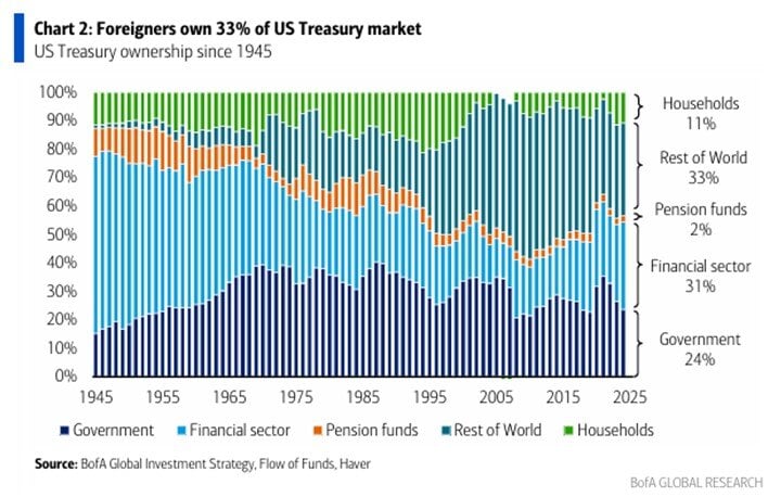
Today’s Chart of the Day from BofA Global Research shows the percentages of US treasury bond ownership spanning from 1945 to 2025.
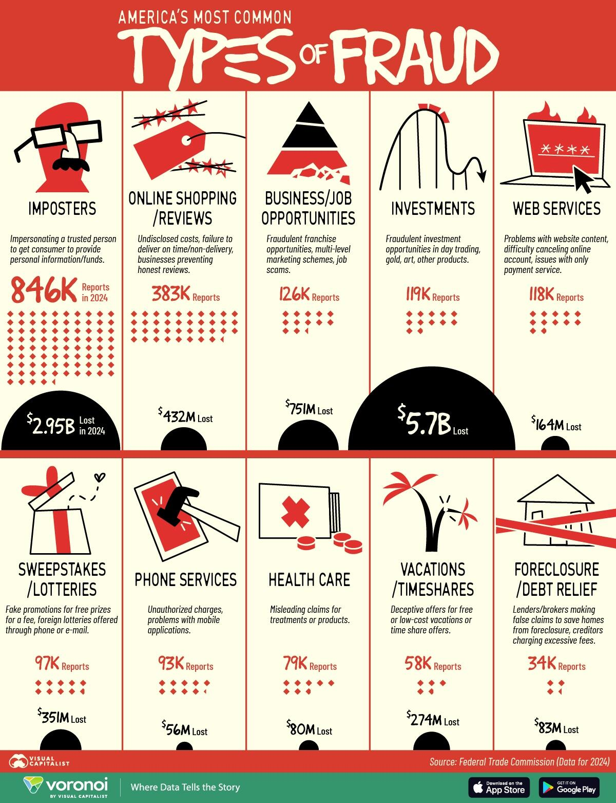
Today’s Chart of the Day is from Visual Capitalist detailing and ranking common types of fraud. The report suggests losses are half a trillion..

Teaching children about money from an early age helps them develop valuable financial habits that will last a lifetime. The lessons you teach should..
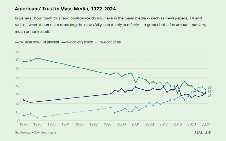
Today’s Chart of the Day is from Gallup and shows the change in American’s Trust in Mass Media from 1972 to 2024. The choice of “None at all” went..
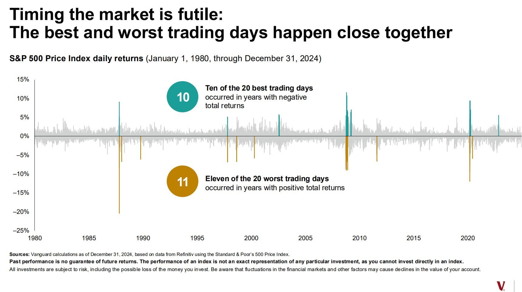
Today’s Chart of the Day is a classic one provided by Vanguard and was recently updated to reflect 2024 performance. It highlights the best and worst..

We opened our first branch in Wauchula in 1929 and never looked back. Now, as Crews Bank & Trust, we have been a cornerstone of Central and Southwest..
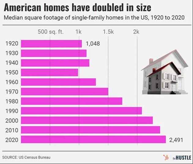
Today’s Chart of the Day is from theHUSTLE with data from the US Census Bureau showing that the median square footage of houses in the US has..
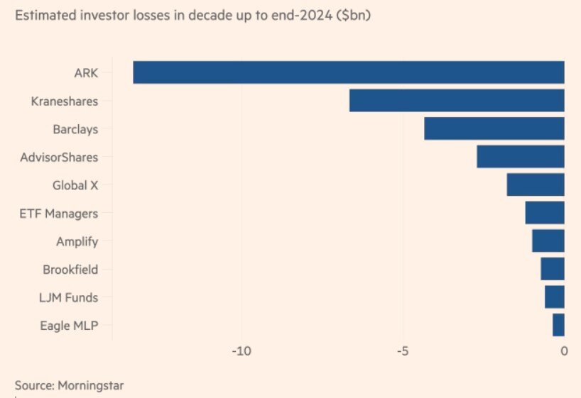
Today’s Chart of the Day is from the Financial Times in an article titled “Which funds have incinerated the most value over the past decade?” The..

Spring cleaning isn’t just for deep cleaning your home - your finances should get a yearly cleaning too. Now’s the perfect time to review your..
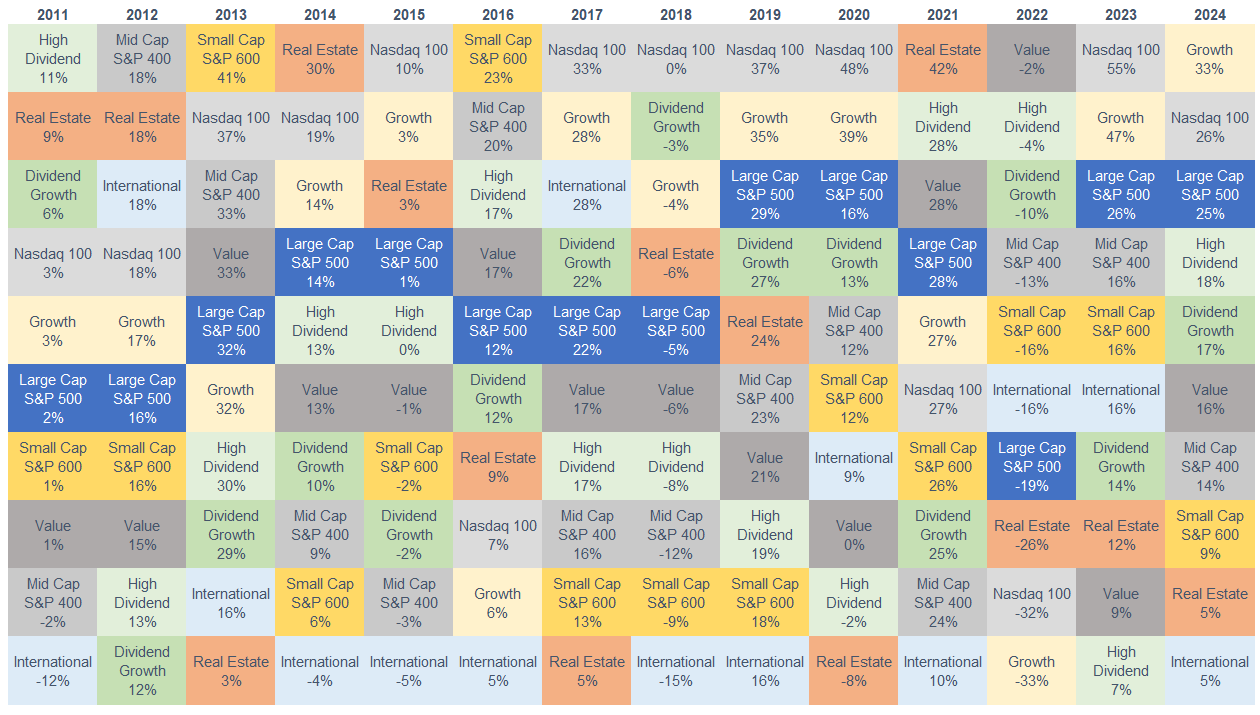
Today’s Chart of the Day, often referred to as the Chicklets Chart, is updated annually to reflect the returns of the major factors in the equity..