
Chart of the Day: Against Traffic
Today’s Chart of the Day is from CNN and shows the percentage of US deaths by transportation type.
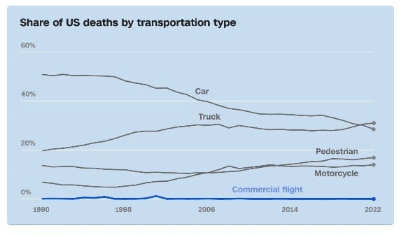
Today’s Chart of the Day is from CNN and shows the percentage of US deaths by transportation type.

Today’s Chart of the Day is from Statista and shows America’s favorite clothing brands.

Consumer loans play an important role in helping our customers manage financial needs, whether for purchasing or refinancing a car, consolidating..
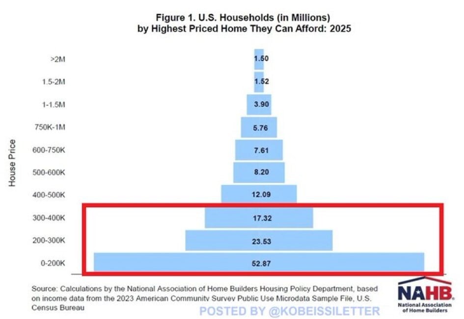
Today’s Chart of the Day is from @kobeissiletter with data from the National Association of Home Builders (NAHB) showing the number of US households..
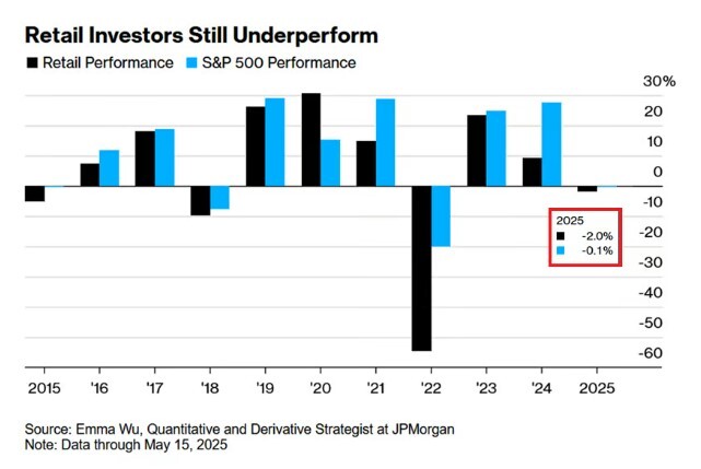
Today’s Chart of the Day from JP Morgan shows that as of May 15, 2025, the average retail investor is underperforming the market by 2%.

There is a myriad of scams that we need to be wary of these days. A very common scam that is easy to fall for is a tech support scam.
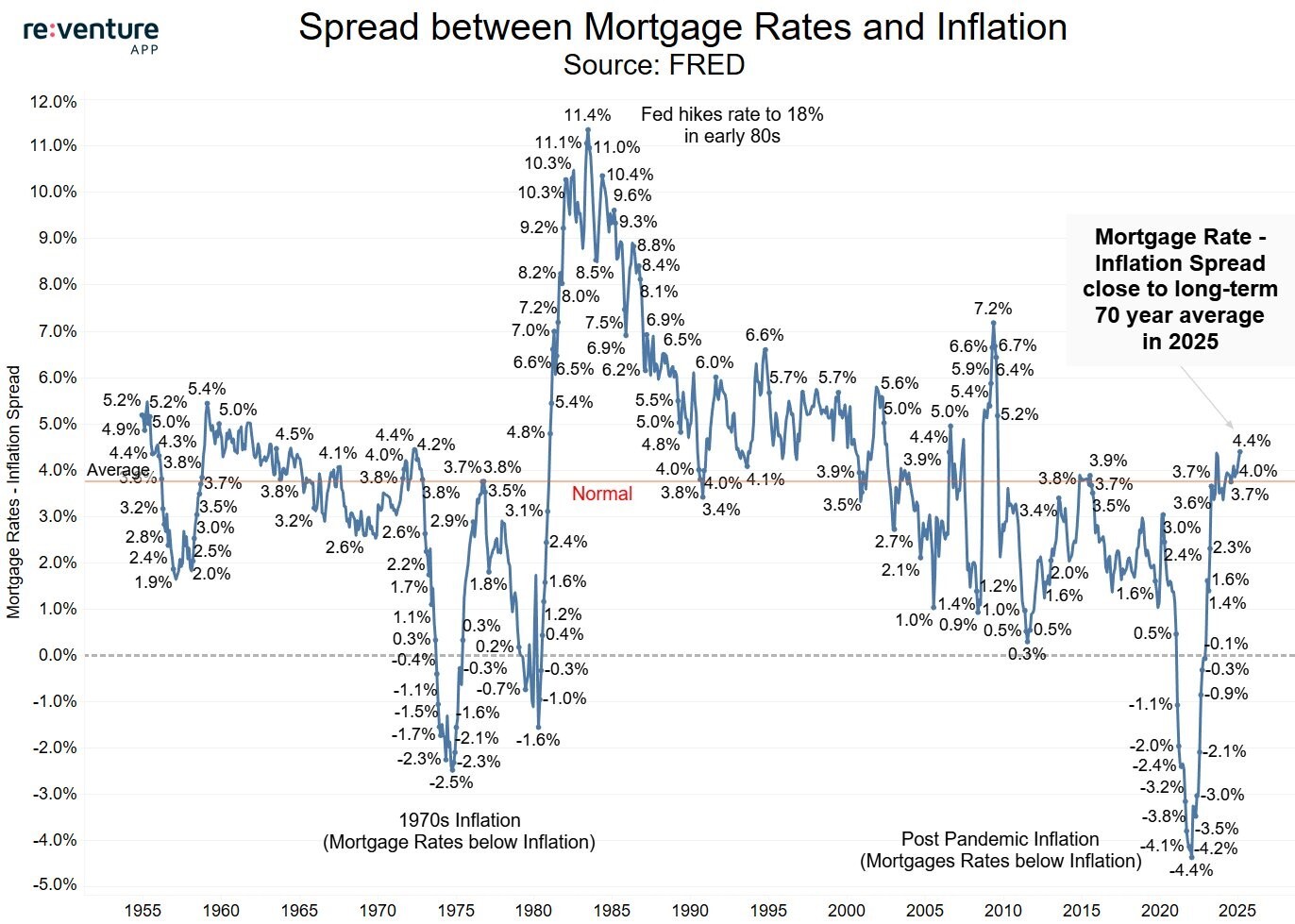
Today’s Chart of the Day from re:venture shows the difference between mortgage rates and inflation going back to 1955.
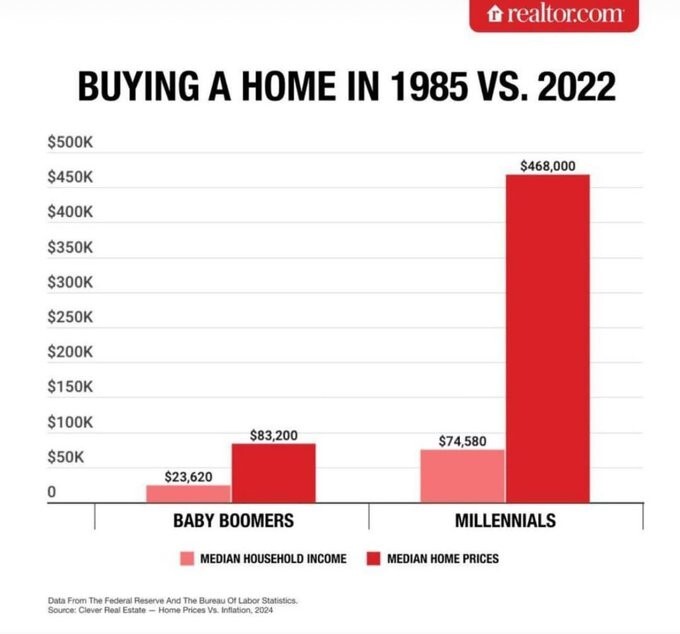
Today’s Chart of the Day comes from Realtor.com and shows the difference between the average price of homes vs. incomes. It took 3.5 years of income..
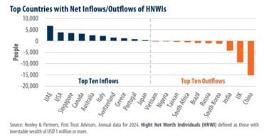
Today’s Chart of the Day from First Trust shows the top inflows and outflows of high-net-worth individuals (HNWI) who have $1,000,000 or more in..
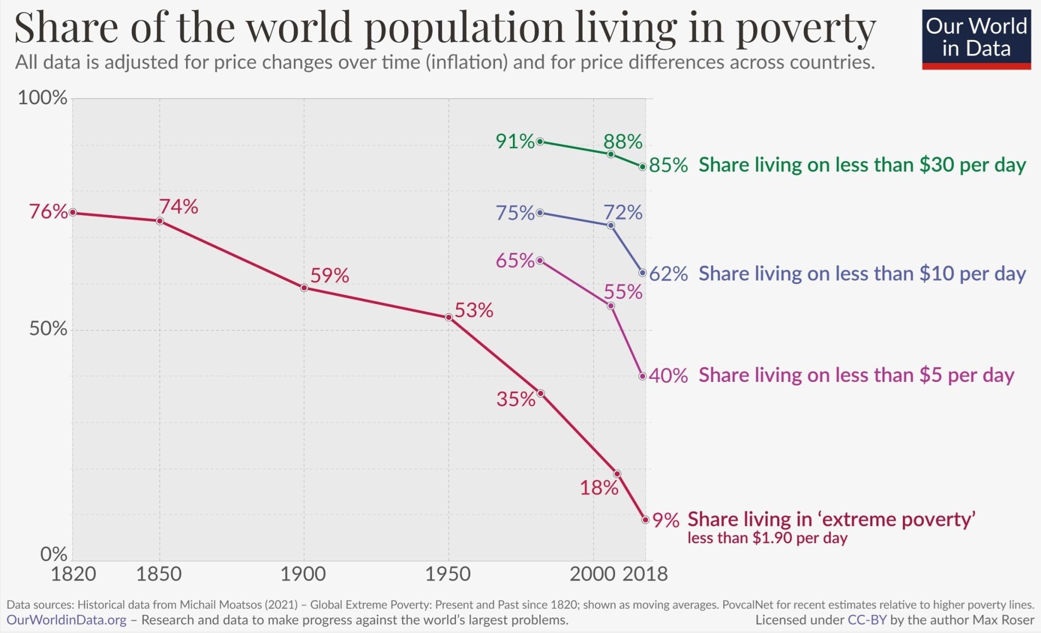
Today’s Chart of the Day from OurWorldData.org was shared by @petermallouk on X showing the share of the world living in poverty.
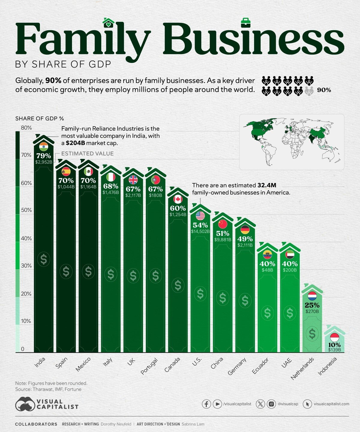
Today’s Chart of the Day and comments are shared by my fellow Portfolio Manager Angie Parsons. The chart from Visual Capitalist shows the percent of..
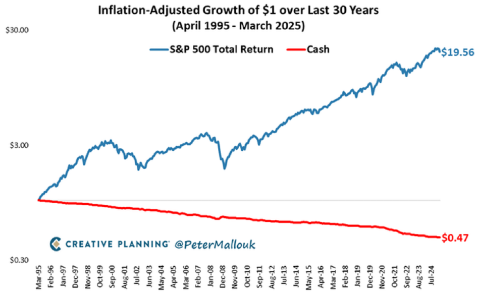
Today’s Chart of the Day from @petermallouk on X and shows the value of a dollar invested in the S&P 500 vs. sitting in cash for the last 30 years.

Hurricane season in Southwest and Central Florida can be unpredictable and we’ve certainly had our share of storms recently. The sight of snapped off..

Today’s Chart of the Day is provided by my colleague and fellow Portfolio Manager Angie Parsons. The chart, prepared by YCharts, shows the “Bull..
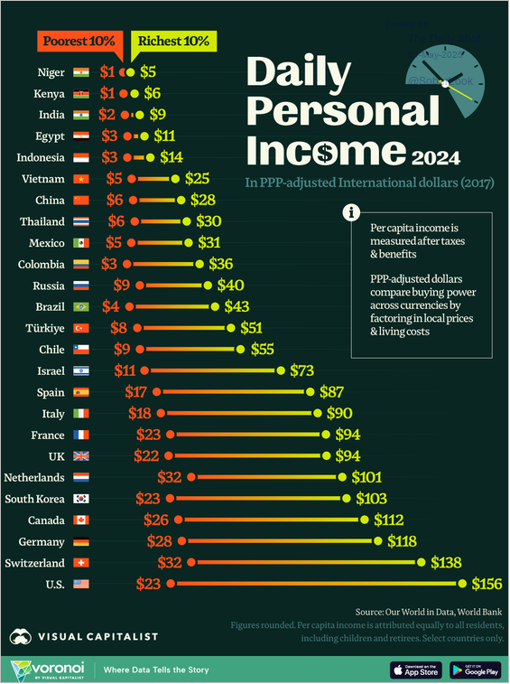
Today’s Chart of the Day from Visual Capitalist ranks the poorest 10% and richest 10% daily personal incomes in various countries.