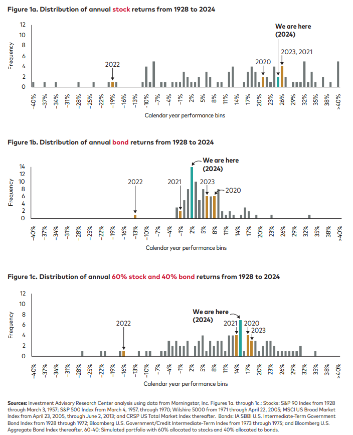
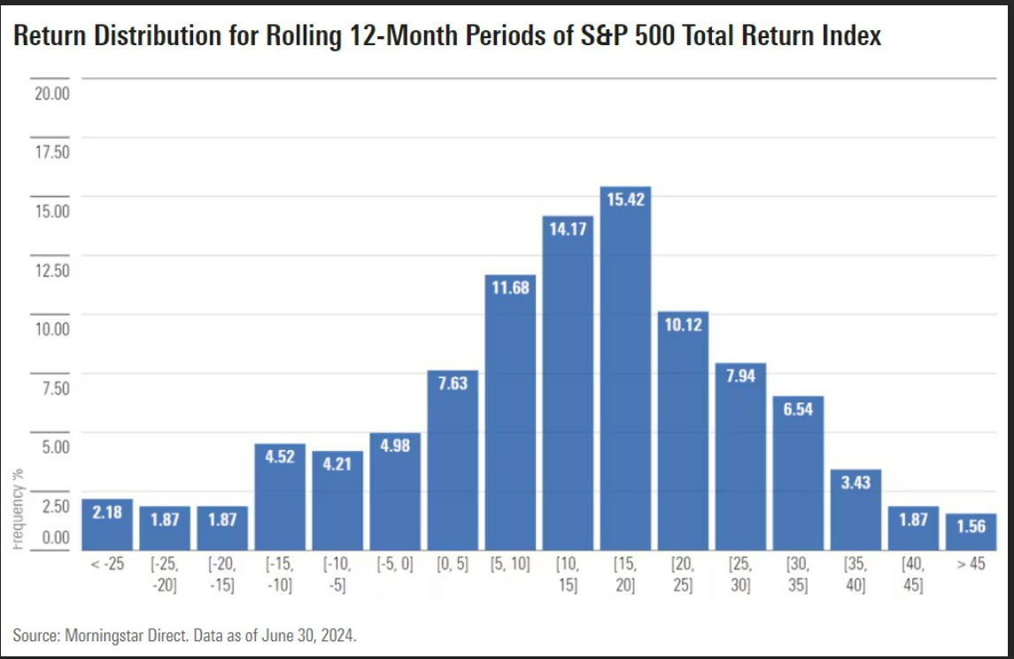
Skip to content
Follow us on Instagram @crews_bank.
Get Started 863-222-7005

Blog

Your Weekly
Financial Forecast


Stay informed with sound financial know-how

chart shows that 105 out of 112 asset classes lost money in 2022

Chart of the Day: Don't Feel Too Bad

Today’s Chart of the Day comes from BlackRock and shows that 105 of 112 asset classes lost money in 2022.

Read More

woman with laptop and phone

Important Tax Information on Hurricane Ian

As our communities continue to recover from recent hurricanes, and with everyone knee deep in tax season, we are updating a blog from December with..

Read More

chart breaks down the risk and return relationship into four quadrants: low return and low risk, high return and high risk, fraud, and stupid

Chart of the Day: Risk & Return

Today’s Chart of the Day comes from @genticici on Twitter. I was impressed by the simplicity of the concept, and it's very apropos to be on the back..

Read More

the $1 went to $10 in the first 20 years, vs. $500,000 to $2,300,000 in last 20

Chart of the Day: Stocks for the Long Run

Today’s Chart of the Day is a reoccurring one we like to keep updated with current data.

Read More

chart shows fluctuating residential rates with a blue line, Pre-Great Recession average represented with red line

Chart of the Day: Pre-Great Recession Average

Today's Chart of the Day, compiled from information from the Mortgage Bankers Association, shows the 30-year residential rates dating back to 1993.

Read More

Under 200k in purple, 200k - 300k in orange, 300k - 400k in blue, 400k - 500k in green, over 500k in red

Chart of the Day: Five Years in Real Estate

Today’s Chart of the Day comes from John Burns and shows the historical percentages of homes sold by sales price going back to 2010.

Read More

most brand in navy while Stellantis in red, Ford in light blue, and GM in green

Chart of the Day: Auto Supply

Today’s Chart of the Day comes from Wolfstreet and shows the supply of new vehicles in number of days.

Read More

blue bar chart of projected US budget deficit up to 2032

Chart of the Day: Not Going Away

Today’s Chart of the Day is the projected budget deficits for the next 10 years provided by the Congressional Budget Office. It is not a rosy picture.

Read More

Chart shows the percent of time the S&P 500 is positive, depending on your holding period, going all the way back to 1928

Chart of the Day: Time in the Market

Today’s Chart of the Day comes from @PeterMallouk on Twitter and shows the percent of time the S&P 500 is positive, depending on your holding period,..

Read More

The young investor represented by blue line, older investor represented by orange

Chart of the Day: Save Early and Save Often

Today’s Chart of the Day is from the Federal Reserve Bank of St. Louis supporting the mantra, "Save early, Save often."

Read More

India is represented in orange, China in red, Nigeria in green, and the USA in blue

Chart of the Day: Half in our Grandchildren's Lifetime

Today’s Chart of the Day comes from chartr with data provided by the United Nations.

Read More

Chart shows streamed music in purple and vinyl in green

Chart of the Day: Music Sales

Today’s Chart of the Day comes from Statista, a provider of market and consumer data. The chart shows that streaming music, purple, has taken over..

Read More

 chart shows bear markets since WWII with red and green colors as indicators

Chart of the Day: Three Years on Average

Today’s Chart of the Day comes from A Wealth of Commons Sense and shows the number of “bear markets,” years with a 20%+ loss, since World War II. We..

Read More

chart shows negative years in red and positive in green

Chart of the Day: Every 2.5 Years

Today's Chart of the Day comes from A Wealth of Common Sense and shows the annual returns of the stock market since 1928. There were 69 positive..

Read More

Chart shows a 68% cancel rate in 2022 versus 13% for the same quarter in 2021

Chart of the Day: Real Estate Cancellation Rate

Today’s Chart of the Day is a heads up from @Nickgerli1 on Twitter about the current state of home construction.

Read More

On Our Minds

List Grid
Browse by topic

Chart of the Day: Don't Feel Too Bad

Today’s Chart of the Day comes from BlackRock and shows that 105 of 112 asset classes lost money in 2022.

More

Important Tax Information on Hurricane Ian

As our communities continue to recover from recent hurricanes, and with everyone knee deep in tax season, we are updating a blog from December with information from local tax professionals that might help those who have losses or damage.

More

Chart of the Day: Risk & Return

Today’s Chart of the Day comes from @genticici on Twitter. I was impressed by the simplicity of the concept, and it's very apropos to be on the back of a napkin.

More

Chart of the Day: Stocks for the Long Run

Today’s Chart of the Day is a reoccurring one we like to keep updated with current data.

More

Chart of the Day: Pre-Great Recession Average

Today's Chart of the Day, compiled from information from the Mortgage Bankers Association, shows the 30-year residential rates dating back to 1993.

More

Chart of the Day: Five Years in Real Estate

Today’s Chart of the Day comes from John Burns and shows the historical percentages of homes sold by sales price going back to 2010.

More

Chart of the Day: Auto Supply

Today’s Chart of the Day comes from Wolfstreet and shows the supply of new vehicles in number of days.

More

Chart of the Day: Not Going Away

Today’s Chart of the Day is the projected budget deficits for the next 10 years provided by the Congressional Budget Office. It is not a rosy picture.

More

Chart of the Day: Time in the Market

Today’s Chart of the Day comes from @PeterMallouk on Twitter and shows the percent of time the S&P 500 is positive, depending on your holding period, going all the way back to 1928.

More

Chart of the Day: Save Early and Save Often

Today’s Chart of the Day is from the Federal Reserve Bank of St. Louis supporting the mantra, "Save early, Save often."

More

Chart of the Day: Half in our Grandchildren's Lifetime

Today’s Chart of the Day comes from chartr with data provided by the United Nations.

More

Chart of the Day: Music Sales

Today’s Chart of the Day comes from Statista, a provider of market and consumer data. The chart shows that streaming music, purple, has taken over the music industry.

More

Chart of the Day: Three Years on Average

Today’s Chart of the Day comes from A Wealth of Commons Sense and shows the number of “bear markets,” years with a 20%+ loss, since World War II. We were awfully close to one in 2022 with a 19% loss.

More

Chart of the Day: Every 2.5 Years

Today's Chart of the Day comes from A Wealth of Common Sense and shows the annual returns of the stock market since 1928. There were 69 positive years versus 26 negative years. This results in a negative year on average of every 2.5 years. For the last few years, we’ve become used to a string of consecutive positive ones, which has made it tough to remember that negative ones are a normal course of business.

More

Chart of the Day: Real Estate Cancellation Rate

Today’s Chart of the Day is a heads up from @Nickgerli1 on Twitter about the current state of home construction.

More