
Chart of the Day: Cognitive Bias
Today’s Chart of the Day from PageTear was shared by Charlie Bilello. It shows 15 different Cognitive Biases, their definition, and examples.
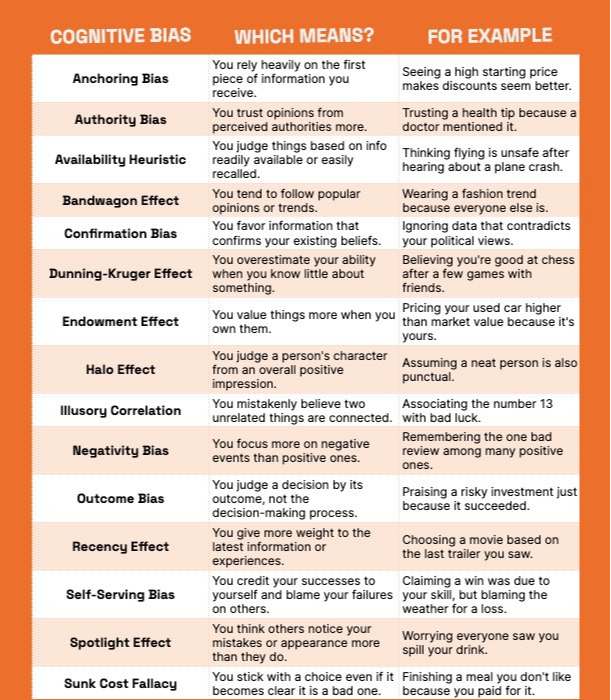
Today’s Chart of the Day from PageTear was shared by Charlie Bilello. It shows 15 different Cognitive Biases, their definition, and examples.
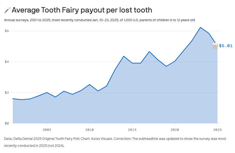
Today’s Chart of the Day is from Delta Dental and shows the average Tooth Fairy payout per lost tooth since 2001. A tongue in cheek survey but also..
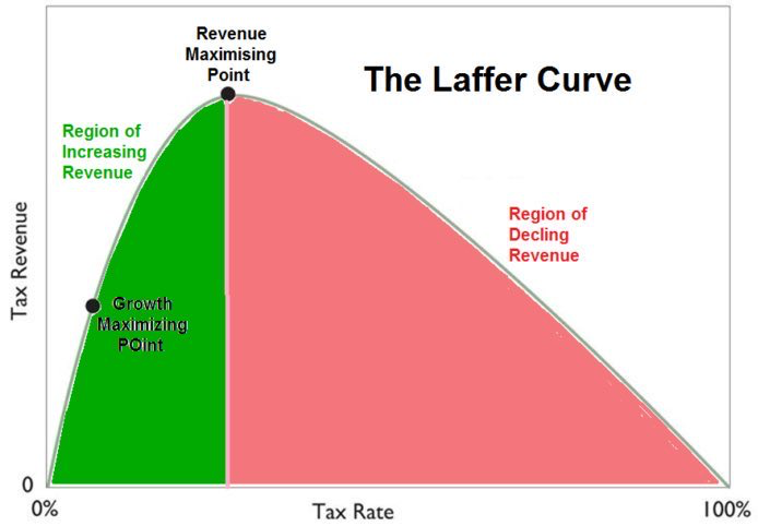
Today’s Chart of the Day highlights The Laffer Curve, an economic theory created by Arthur Laffer in 1974. It proposes that there is a maximum amount..
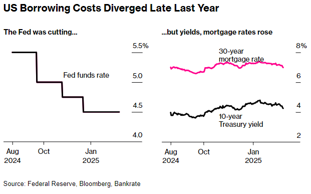
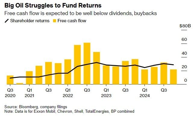
Today’s Chart of the Day was shared by my colleague, and fellow Portfolio Manger, Angie Parsons. It's a from Bloomberg article showing the changes in..
Today’s Chart of the Day and commentary is from Angie Parsons, my colleague and fellow Portfolio Manager. The chart from BlackRock shows stock..

Today’s Chart of the Day spotlights an important investment concept which was pioneered by Harry Markowitz, a Nobel Prize winner and pioneer of the..
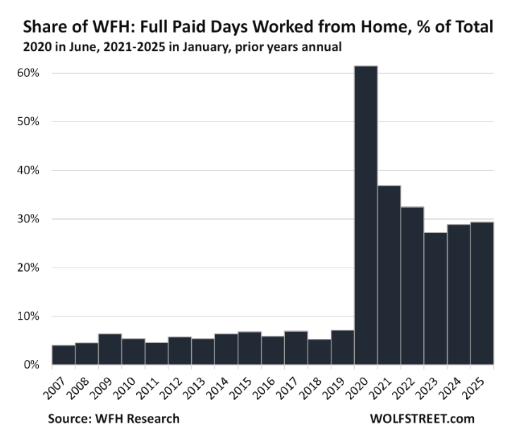
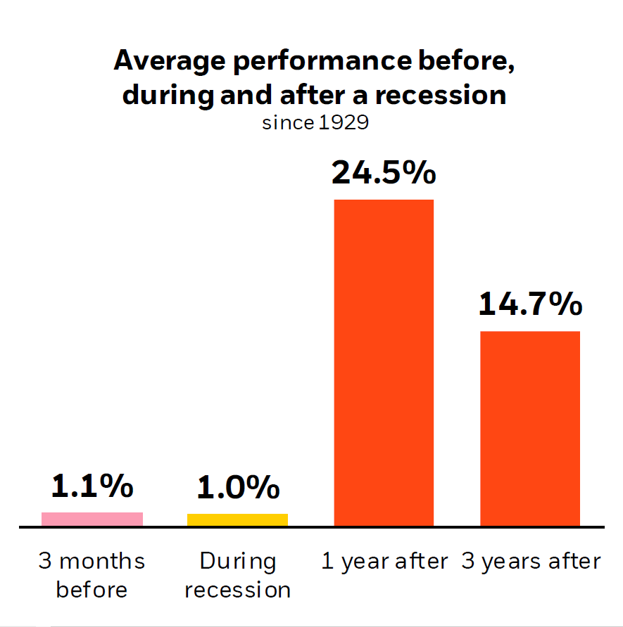
Today’s Chart of the Day from Wolfstreet shows that Work from Home, a.k.a. WFH, is getting “sticky” at 30% after peaking at 60% during the pandemic.
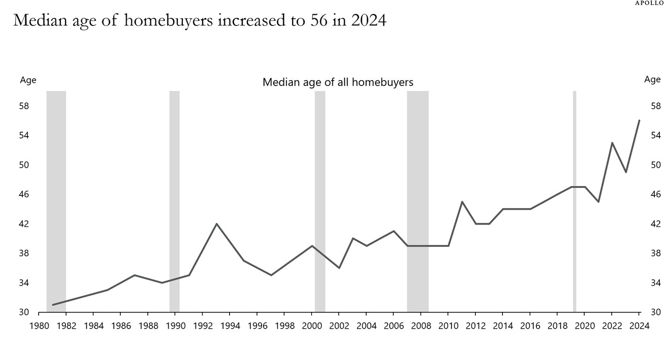
Today’s Chart of the Day uses data from the National Association of Realtors compiled by Torsten Sølk with Apollo, showing the history of the median..
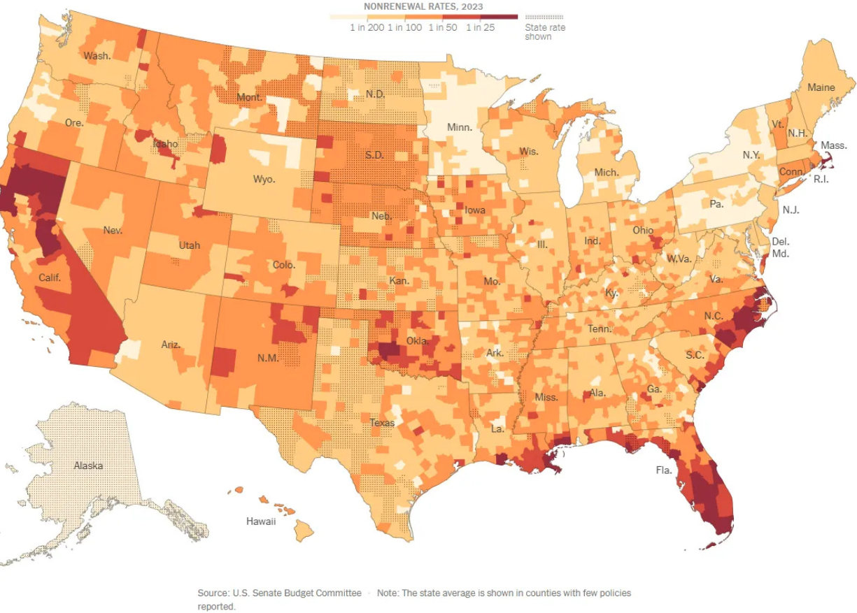
Today’s two charts illustrate that Florida continues to struggle with increasingly more expensive homeowners' insurance.
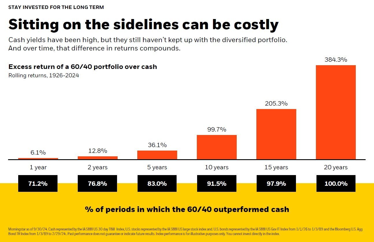
Today's Chart of the Day, from BlackRock, illustrates the potential downside of staying in cash for too long. It highlights the excess returns of a..
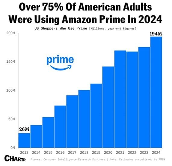
Today’s Chart of the Day from Chartr shows that over 75% of American’s are using Amazon Prime as of 2024. Amazon is now the 4th largest company in..
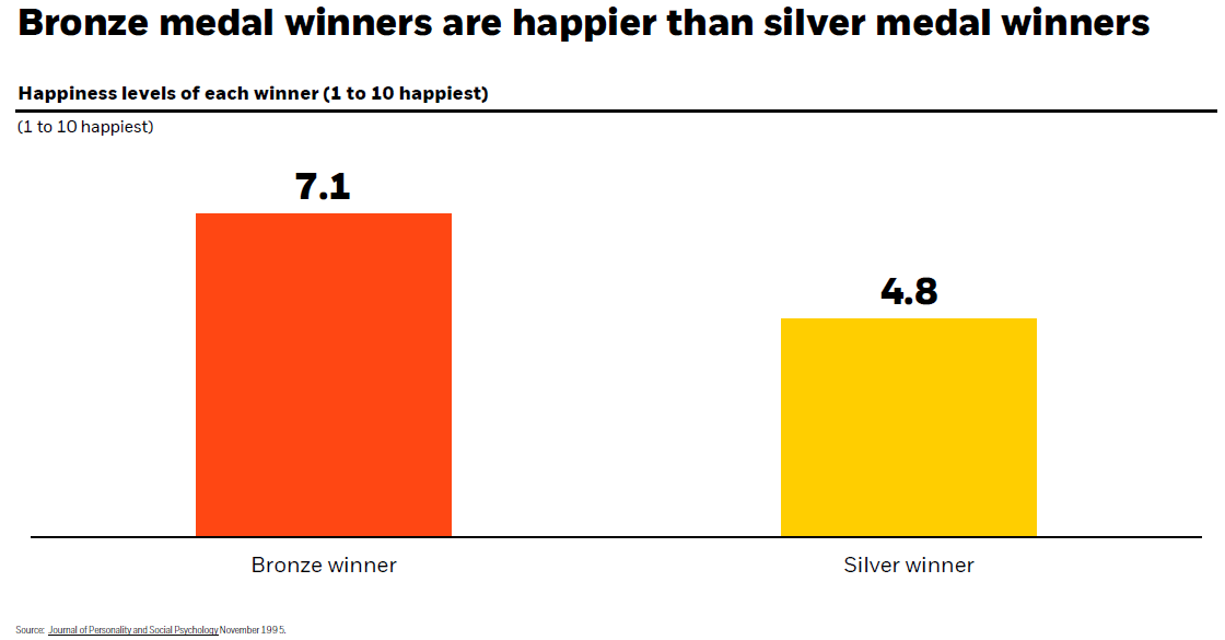
Today’s Chart of the Day has data from the Journal of Personality and Social Psychology used by our partners at BlackRock (the company that owns..
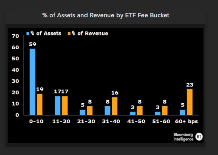
Today’s Chart of the Day from Bloomberg shows the percentage of assets and revenue by ETFs (Exchange Traded Funds), which we use extensively in..
Today’s Chart of the Day, shared by my colleague Angie Parsons, is from an article in Bloomberg which illustrates what a “value” stock is.
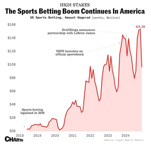
As we near the Super Bowl, today’s Chart of the Day is from Chartr and shows the boom in online monthly sports betting.